
Displaying a List of Contacts Using the LongListSelector
This second example looks at presenting a list of contacts, which represent people in a custom address book. This example illustrates some more advanced concepts, such as customizing the group picker using a custom GroupItemsPanel.
Each contact is represented by a custom Contact class. The Contact class includes the following properties:
Id
FirstName
LastName
EmailAddress
HomeNumber
MobileNumber
ImageUrl
Like the MarketplaceApp class from the first example, the Contact class includes a static GetRandomContacts method that generates a specified number of Contact objects, randomly selected from a set of predefined names in the RandomContactGenerator class.
The viewmodel for this section, called ContactListViewModel, includes a list of grouped Contact objects called ContactGroupings; shown in the following excerpt:
IEnumerable<CustomGrouping<Contact>> contactGroupings;
public IEnumerable<CustomGrouping<Contact>> ContactGroupings
{
get
{
return contactGroupings;
}
private set
{
Assign(ref contactGroupings, value);
}
}
ContactGroupings is initialized in the viewmodel constructor. A constant, called contactCount, determines how many Contact objects are generated:
const int contactCount = 35;
LINQ is used within the viewmodel constructor to build the list of grouped contacts. We first use the Contact class to generate a list of random contacts, ordered by last name and then first name. The first letter of each contact’s last name is used as the grouping key. The LINQ expression groups each contact by this key, creating a CustomGrouping object for each group. See the following excerpt:
List<CustomGrouping<Contact>> groupings
= (from contact in Contact.GetRandomContacts(contactCount)
orderby contact.LastName orderby contact.FirstName
group contact by Char.ToLower(contact.LastName.First()) into grouping
select new CustomGrouping<Contact>(
grouping.Key, grouping.AsEnumerable())).ToList();
The result of this expression is a set of groups, one for each unique first character. At this point, however, the result does not contain groups for letters of the alphabet not present in the list. This is not what you want because the LongListSelector would be unable to display a list of all letters. To remedy this situation, create another set of groupings, one for each letter of the alphabet and each containing an empty list of contacts:
const string groupCharacters = "abcdefghijklmnopqrstuvwxyz";
List<Contact> emptyList = new List<Contact>();
var allGroupings = from character in groupCharacters
where !groupings.Any(x => character.Equals(x.Key))
select new CustomGrouping<Contact>(character, emptyList).ToList();
The two sets of groupings are then merged to create a single set of groupings, with each letter of the alphabet properly represented:
contactGroupings = groupings.Union(allGroupings).OrderBy(x => x.Key);
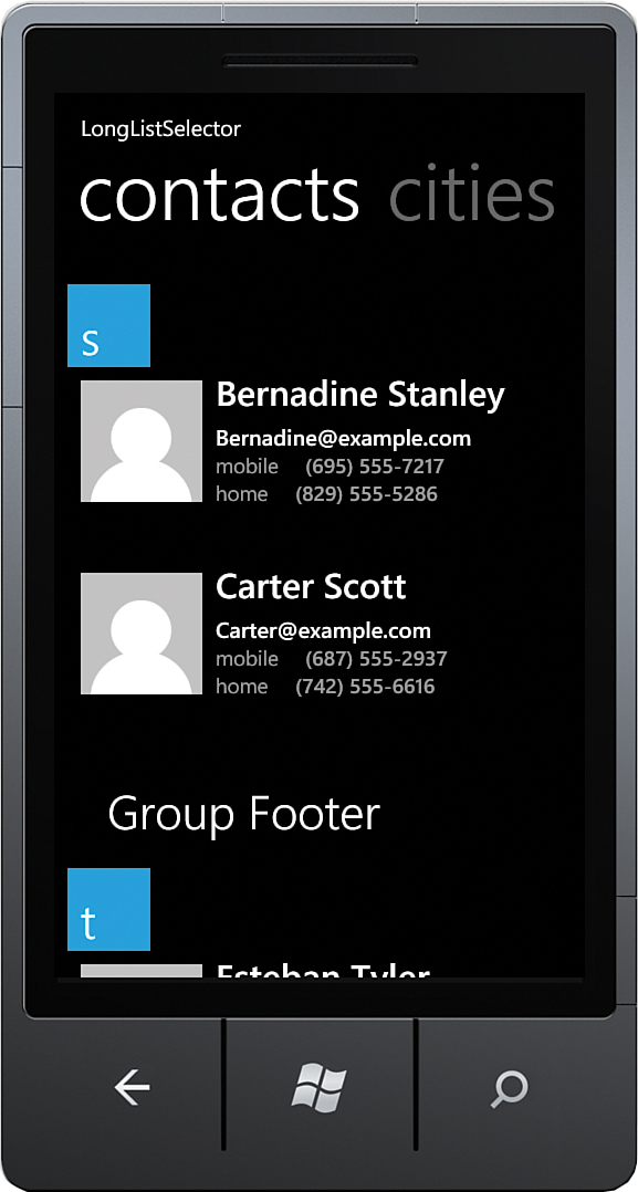
The LongListSelector in the view binds to the ContactGroupings property. Contact groups are presented in the same manner as were the MarketplaceApps in the previous section; the ItemTemplate specifies how each Contact object is presented.
This example differs from the Marketplace App List example in that the JumpListStyle uses a Grid LayoutMode rather than a List layout, which causes each group header to be placed side by side, and then dropped to a new line after they exceed the width of the container (see Listing 10.3). Pay particular attention to the LongListSelector.JumpListStyle, which is used to present each group when the LongListSelector is in the full-screen group selection mode.
Note
When the LongListSelector resided in the Silverlight Toolkit, customizing the layout of the group picker was achieved using the long list selector’s GroupItemsPanel property. This property does not exist in the Windows Phone SDK. The long list selector’s LayoutMode property is now used to either present items in a list or in a grid.
LISTING 10.3. Contacts LongListSelector (excerpt from LongListSelectorView.xaml)
<phone:LongListSelector
IsGroupingEnabled="True"
Background="Transparent"
ItemsSource="{Binding ContactGroupings}">
<phone:LongListSelector.ListHeader>
<TextBlock Text="ListHeader"
Style="{StaticResource PhoneTextTitle1Style}"/>
</phone:LongListSelector.ListHeader>
<phone:LongListSelector.GroupHeaderTemplate>
<DataTemplate>
<Border Background="Transparent">
<Border Background="{StaticResource PhoneAccentBrush}"
Width="75" Height="75"
HorizontalAlignment="Left">
<TextBlock Text="{Binding Key}"
Foreground="{StaticResource PhoneForegroundBrush}"
Style="{StaticResource PhoneTextExtraLargeStyle}"
VerticalAlignment="Bottom" />
</Border>
</Border>
</DataTemplate>
</phone:LongListSelector.GroupHeaderTemplate>
<phone:LongListSelector.ItemTemplate>
<DataTemplate>
<Grid Margin="{StaticResource PhoneTouchTargetOverhang}">
<Grid.ColumnDefinitions>
<ColumnDefinition Width="Auto" />
<ColumnDefinition Width="*" />
</Grid.ColumnDefinitions>
<Image Source="{Binding ImageUrl}"
Width="110" Height="150" VerticalAlignment="Top" />
<StackPanel Grid.Column="1" VerticalAlignment="Top">
<TextBlock Text="{Binding FullName}"
Style="{StaticResource PhoneTextLargeStyle}"
FontFamily="{StaticResource PhoneFontFamilySemiBold}"
Margin="12,-12,12,6" />
<TextBlock Text="{Binding EmailAddress}"
Style="{StaticResource PhoneTextNormalStyle}"
TextWrapping="Wrap"
FontFamily="{StaticResource PhoneFontFamilySemiBold}" />
<StackPanel Orientation="Horizontal">
<TextBlock Text="mobile"
Style="{StaticResource PhoneTextSmallStyle}" />
<TextBlock Text="{Binding MobileNumber}"
Style="{StaticResource PhoneTextSmallStyle}"
FontFamily="{StaticResource PhoneFontFamilySemiBold}" />
</StackPanel>
<StackPanel Orientation="Horizontal">
<TextBlock Text="home"
Style="{StaticResource PhoneTextSmallStyle}" />
<TextBlock Text="{Binding HomeNumber}"
Style="{StaticResource PhoneTextSmallStyle}"
FontFamily="{StaticResource PhoneFontFamilySemiBold}" />
</StackPanel>
</StackPanel>
</Grid>
</DataTemplate>
</phone:LongListSelector.ItemTemplate>
<phone:LongListSelector.JumpListStyle>
<Style TargetType="phone:LongListSelector">
<Setter Property="GridCellSize" Value="113,113"/>
<Setter Property="LayoutMode" Value="Grid" />
<Setter Property="ItemTemplate">
<Setter.Value>
<DataTemplate>
<Border
Background="{Binding
Converter={StaticResource BackgroundConverter}}"
Width="113" Height="113" Margin="6">
<TextBlock
Text="{Binding Key}"
FontFamily="{StaticResource PhoneFontFamilySemiBold}"
FontSize="48" Padding="6"
Foreground="{Binding
Converter={StaticResource ForegroundConverter}}"
VerticalAlignment="Center"/>
</Border>
</DataTemplate>
</Setter.Value>
</Setter>
</Style>
</phone:LongListSelector.JumpListStyle>
<phone:LongListSelector.GroupFooterTemplate>
<DataTemplate>
<Border Margin="{StaticResource PhoneTouchTargetOverhang}"
Padding="{StaticResource PhoneTouchTargetOverhang}">
<TextBlock Text="Group Footer"
Style="{StaticResource PhoneTextExtraLargeStyle}" />
</Border>
</DataTemplate>
</phone:LongListSelector.GroupFooterTemplate>
<phone:LongListSelector.ListFooter>
<TextBlock Text="ListFooter"
Style="{StaticResource PhoneTextTitle1Style}" />
</phone:LongListSelector.ListFooter>
</phone:LongListSelector>
Note
When using the Grid LayoutMode, the GridCellSize property must be set or an Exception is raised at runtime.
Figure 10.7 shows the contacts list, presented with the LongListSelector.
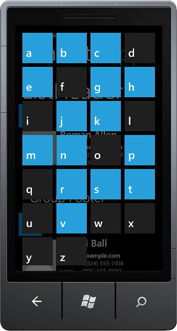
When the user taps a group header, the LongListSelector presents all groups as a jump list. By examining the JumpListStyle in more detail, you see that each header is presented within a Border. The SDK’s JumpListItemBackgroundConverter, which is declared as a page resource, changes the background of the Border depending on whether the group has any items in it. The foreground of the TextBlock is set using the JumpListItemForegroundConverter in the same manner.
Customizing the background and foreground colors of the group items can be achieved by using a custom IValueConverter. The sample includes an IValueConverter named BooleanToBrushConverter, which turns a Boolean value into one of two specified brushes (see Listing 10.4).
LISTING 10.4. BooleanToBrushConverter Class
public class BooleanToBrushConverter : IValueConverter
{
public Brush BrushIfFalse { get; set; }
public Brush BrushIfTrue { get; set; }
public object Convert(
object value, Type targetType, object parameter, CultureInfo culture)
{
return value != null && (bool)value ? BrushIfTrue : BrushIfFalse;
}
public object ConvertBack(
object value, Type targetType, object parameter, CultureInfo culture)
{
throw new NotImplementedException("Only supports a one way binding");
}
}
Define the BooleanToBrushConverter as a resource in the page resources, like so:
<phone:PhoneApplicationPage.Resources>
<ValueConverters:BooleanToBrushConverter x:Name="BooleanToBrushConverter"
BrushIfFalse="{StaticResource PhoneChromeBrush}"
BrushIfTrue="{StaticResource PhoneAccentBrush}" />
</phone:PhoneApplicationPage.Resources>
Then amend the Border element from the JumpListStyle as shown:
<Border
Background="{Binding HasItems,
Converter={StaticResource BooleanToBrushConverter}}"
Width="113" Height="113" Margin="6">
<TextBlock
Text="{Binding Key}"
.../>
</Border>
Thus, when a CustomGrouping HasItems property evaluates to true, the PhoneAccentBrush is used for the header background; otherwise, the PhoneChromeBrush is used.
Figure 10.8 shows the LongListSelector presenting the Contact headers using the grid layout.
The LongListSelector displays all groups regardless of whether they have any items in them. To hide empty groups, set the long list selector’s HideEmptyGroups property to true.