
Defining Validation Visual States in Windows Phone
When a binding error occurs, the data-binding system transitions the VisualState of the FrameworkElement to an invalid state. In Silverlight for the browser, various controls come ready to display validation errors. Unfortunately, those styles have not been incorporated into Windows Phone because the styles are not immediately transferable to the phone due to the reduced size of the phone display. Consequently, if you want to harness the existing validation infrastructure, you must replace the template for each control for which you intend to display validation errors.
Replacing a control’s template can be done using Expression Blend. A copy can be made of the template, and error related VisualStates can then be modified.
Note
Microsoft Expression Blend is installed as part of the Windows Phone SDK. You can find more information about Expression Blend at http://www.microsoft.com/expression/.
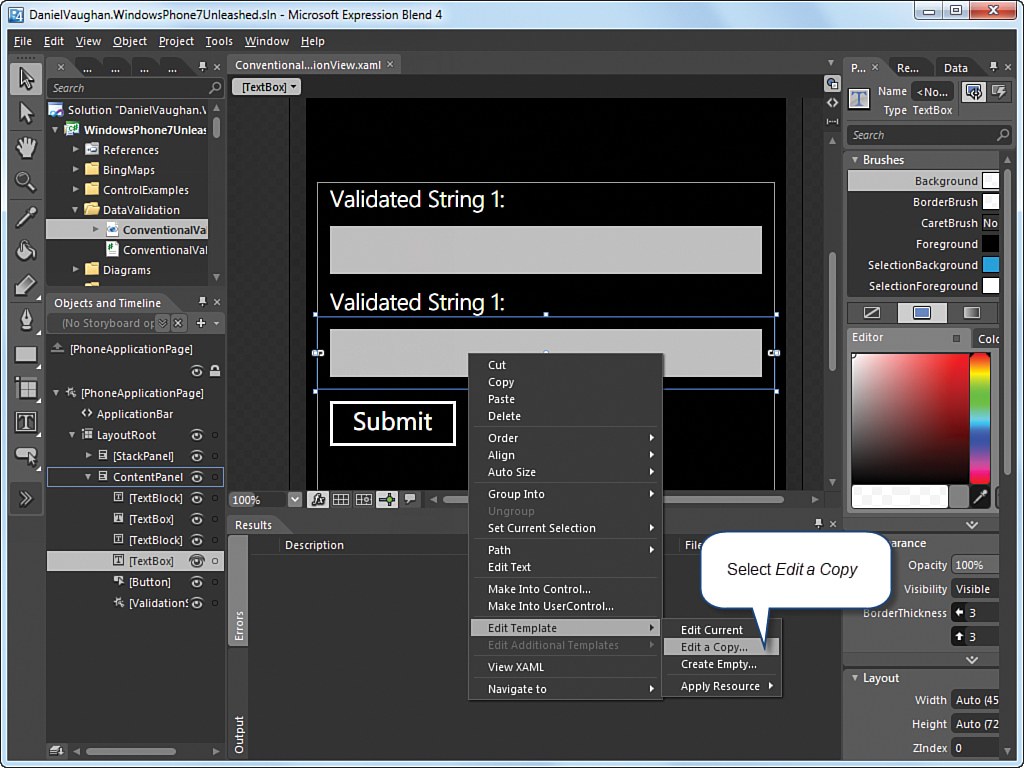
To make a copy of a control’s template, right-click a control within Expression Blend, select Edit Template, and then select Edit a Copy (see Figure 26.2).
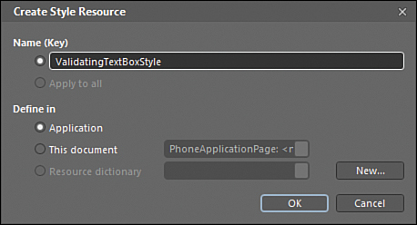
To allow the template to be reused across the entire app from any page, define the style at the application level (see Figure 26.3). This causes a style containing the template to be placed in the project’s app.xaml file.
After the style has been created, a new Style element is placed in the App.xaml file. See the following excerpt:
<Style x:Key="ValidatingTextBoxStyle" TargetType="TextBox">
...
</Style>
The States tab in Expression Blend allows you to define different ways of displaying the control, depending on its visual state. The control is placed into a named state by the VisualStateManager. To customize the way the control is displayed when a validation error occurs, select the InvalidUnfocused state (see Figure 26.4).
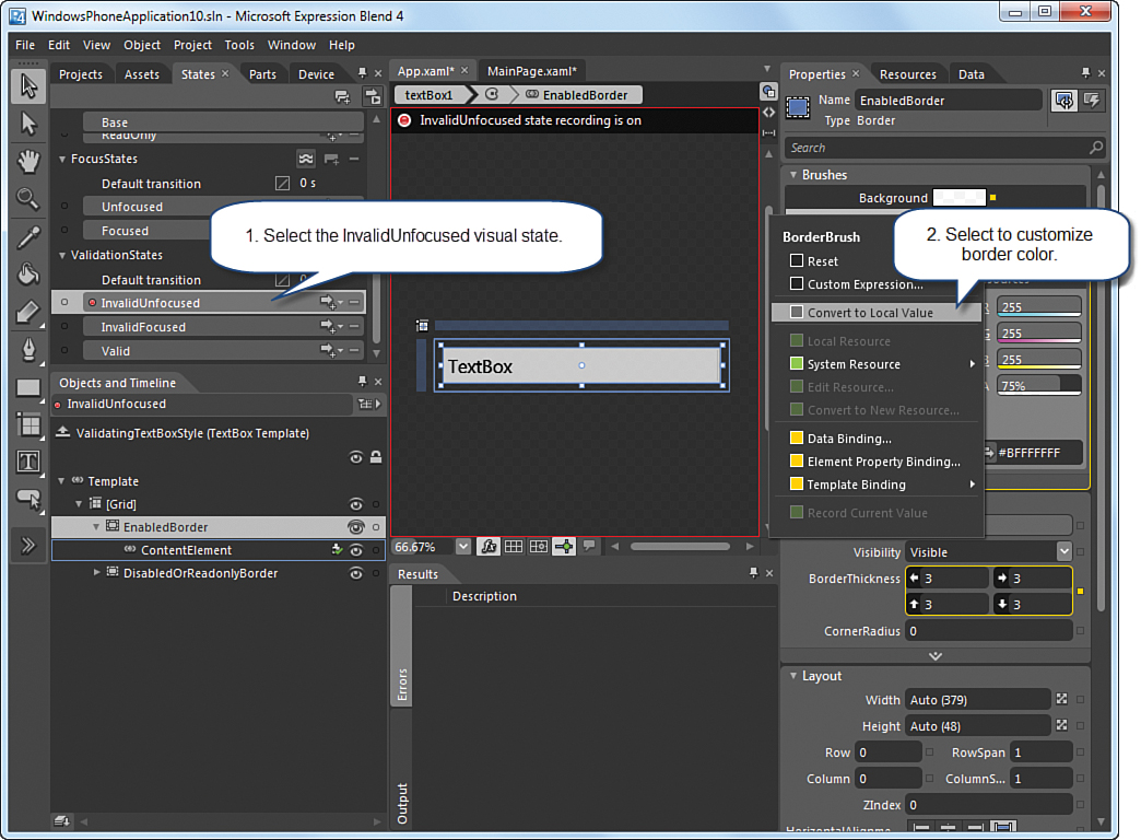
To modify the TextBox border so that it is displayed in a different manner when in the InvalidUnfocused state, select the yellow button next to the BorderBrush item in the Properties tab and choose Convert to Local Value.
Converting the BorderBrush to a local value allows the brush to be customized for the particular VisualState, and for its color to be set to one that better represents the state of the control when a validation error occurs.
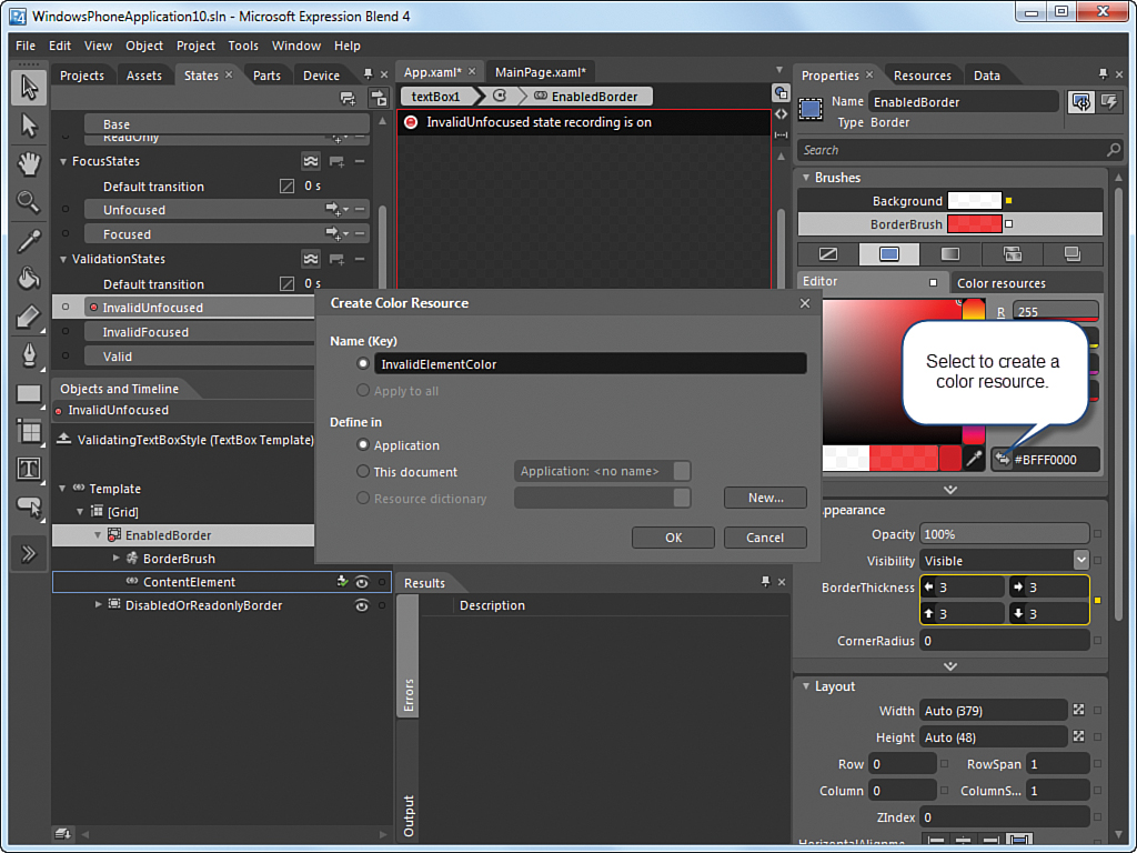
Just as the TextBox style was made globally available by placing it in the app’s resources, converting the new color to a resource enables its use in other styles (see Figure 26.5).
When the color resource has been created, the template in the style resource contains a definition for the InvalidUnfocused state, with a reference to the InvalidElementColor resource, as shown in the following excerpt:
<VisualState x:Name="InvalidUnfocused">
<Storyboard>
<ColorAnimation Duration="0"
To="{StaticResource InvalidElementColor}"
Storyboard.TargetProperty
="(Border.BorderBrush).(SolidColorBrush.Color)"
Storyboard.TargetName="EnabledBorder"
d:IsOptimized="True"/>
</Storyboard>
</VisualState>
Subsequently, whenever you want to display validation errors for a TextBox, the Style property of the TextBox is set to ValidatingTextBoxStyle, like so:
<TextBox Text="{Binding ValidatedString1, Mode=TwoWay,
NotifyOnValidationError=True}"
Style="{StaticResource ValidatingTextBoxStyle}" />
If a binding error occurs, the VisualState of the TextBox automatically transitions to the InvalidUnfocused state.
The following is an excerpt from the ConventionalValidationViewModel class in the downloadable sample code, which contains validation logic for the ValidatedString1 property:
public string ValidatedString1
{
get
{
return validatedString1;
}
set
{
if (string.IsNullOrEmpty(value))
{
throw new ArgumentException("Validated String 1 is required.");
}
validatedString1 = value;
}
}
When a user removes all the text from the TextBox that is bound to this property, the property set accessor raises an ArgumentException. The exception is handled by the data-binding system, and the TextBox is placed into the InvalidUnfocused state, which now provides visual indication that the value is invalid (see Figure 26.6).

FIGURE 26.6 ConventionalValidationView page. A TextBox with a validation error is displayed with the custom BorderBrush.
This approach can be used to validate a variety of semantic rules. For example, data can be made to conform to a valid range. If the data falls outside a specified range, an exception can be thrown.
Custom validation logic can be applied to other control types as well. In some cases, however, it is necessary to provide a style for the InvalidFocused state as well as the InvalidUnfocused state. The InvalidUnfocused state is used in this example because, by default, the TextBox.Text property is set only when the TextBox loses focus.