Organizations are as unique as people, and each project that an organization manages has its own particular needs. Each step in managing a project requires a specific set of information, as does responding to each new challenge that arises. In Microsoft Office Project 2007, you can control what information you see and how it is formatted, as well as whether to satisfy your own preferences or meet the specialized needs of a particular project or situation. Almost every aspect of viewing information in Office Project 2007 can be molded to your specifications, including the following:
Views
Tables
Fields
Groups
Filters
Note
You can also customize text-based and visual reports. For more information, see Chapter 12.
If you use codes to categorize information, such as accounting codes to assign tasks to lines in a budget or skill codes to identify resources, in Microsoft Project, customized outline codes can fulfill this purpose. You can adapt these codes to your organization’s standards; apply them to project tasks and resources; and then use them to sort, group, or filter information.
When you customize Microsoft Project, you can choose to keep your customizations in one project or make them available to every project you create. In addition, with the Organizer, you can manage customized elements and copy them to share with others. This chapter describes how to customize all these features and use them in your projects.
The right perspective on the right data can simplify your project management tasks, uncover potential problems, or show the way to potential solutions. Each view in Microsoft Project gives you a different perspective on project information. You don’t have to stick with the views that come with the program. You can specify the views you want to see, change the tables and fields that a view displays, and control the organization and appearance of information to inspect your project information the way you want. Project 2007 introduces one additional way to customize views—Background Cell Highlighting. With this new feature, you can apply highlight colors or patterns to the cells in the view tables, similar to highlighting cells in a Microsoft Office Excel spreadsheet, for example, to make key tasks stand out.
Note
For more information about working with built-in Microsoft Project views, see the section titled Using Views in Chapter 4.
Microsoft Project comes with numerous standard views that present task, resource, and assignment information. When these standard views don’t meet your needs, you can customize their content or create new views that are more suitable. For example, if you like to take into account the amount of work that tasks require, you can change your Gantt Chart view to show a table with the Work field. In single-pane views, you can specify which screen, table, group, and filter to apply when the view appears. For combination views, you can designate the views that appear in the top and bottom pane.
Note
Even though views such as the Gantt Chart and Task Usage view are made up of two panes, one on the left and one on the right, they’re still considered single-pane views.
Note
If you plan to use new tables, groups, or filters in a view, you must create those elements before you use them in a customized view. You must also create new single-pane views before you can include them in a combination view.
For elements that already exist, it doesn’t matter whether you customize them or assign them to customized views first.
To customize the content of an existing single-pane view—for example, the Gantt Chart, Resource Sheet, or Task Usage view—do the following:
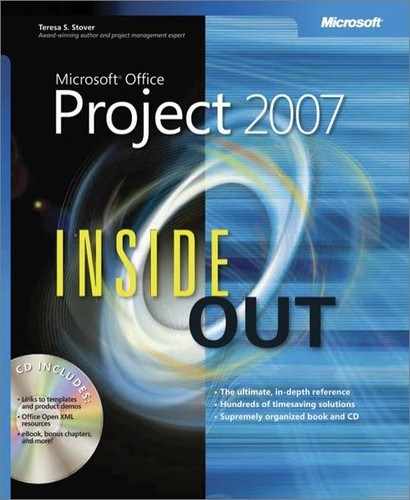
Click View, More Views.
In the More Views dialog box, in the Views list, click the view’s name (see Figure 25-1).
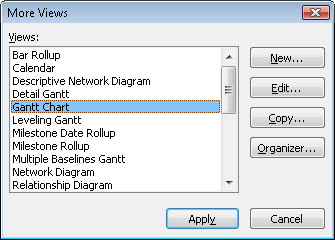
Click the Edit button. The View Definition dialog box appears (see Figure 25-2). If you want to create a new view that is similar to the selected view, click the Copy button and type a new name in the Name box.
In the Table box, click the table you want to appear in the customized view.
In the Group box, click the group you want to use.
If you don’t require a group, choose No Group.
In the Filter box, click the filter you want to apply.
If you don’t want a filter, choose All Tasks or All Resources (for a task or resource view, respectively).
Note
When you apply a filter to a view, by default, Microsoft Project hides the tasks or resources that don’t meet the filter’s criteria. If you want the view to show all tasks or resources, but emphasize the filtered tasks, select the Highlight Filter check box. This setting displays all tasks and resources but uses blue text for the ones that pass the filter tests.
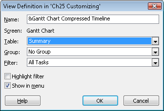
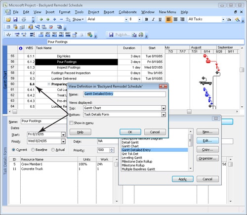
To customize the content of an existing combination view—for example, the Task Entry view or Resource Allocation view—follow these steps:
Click View, More Views.
In the More Views dialog box, in the Views list, click the view’s name.
To change the existing view, click the Edit button.
To create a new view based on the existing view, click the Copy button. In the View Definition dialog box, in the Name box, type a new name for the view.
In the Top box, click the view that you want to appear in the top pane (see Figure 25-3).
In the Bottom box, click the view that you want to appear in the bottom pane.
If none of the existing views come close to meeting your needs, you can craft an entirely new single pane or combination view. To do this, follow these steps:
Click View, More Views.
In the More Views dialog box, click New.
In the Define New View dialog box, select either the Single View or Combination View option and then click OK.
The View Definition dialog box for the type of view you selected appears and fills in the Name box with a default name, such as View 1.
If you are creating a new single-pane view, in the View Definition dialog box, choose the type of screen you prefer—a built-in view or form such as Gannt Chart or Task Form.
When you customize a single-pane view, the View Definition dialog box displays the type of screen, but you can’t modify it.
Specify the rest of the contents of the view, as described in the previous section, Changing the Content of a View.
By default, the font used throughout the Microsoft Project views is 8-point Arial. If your reading glasses nudge you toward a different font or larger size for text, you can adjust both the font and size for one or more elements in a particular view. To select the elements to change and the font and size to use, follow these steps:
Click Format, Text Styles.
To change the text characteristics for all text, in the Item To Change box, be sure that All is selected.
This changes the font for all text elements in the current view in this project, including column and row headings, Gantt bar text, and all field data such as task and resource names. If you want to change the text for a specific element, such as Summary Tasks, in the Item To Change box, click the element.
In the Font list, choose the font you want.
To apply bold or italic to the text, in the Font Style list, choose the formatting you want.
In the Size list, choose the font size for the text.
You can also apply a color to the text, which can emphasize important tasks. For instance, you might apply a bright blue or maroon color to the text for critical tasks so that they stand out in the task list as well as in the Gantt Chart.
To apply the changes, click OK.
The chart portion on the right side of the Gantt Chart view provides a graphical representation of your project schedule. You can emphasize information in your schedule by formatting individual Gantt bars or all Gantt bars of a certain type. Similarly, you can apply formatting to different categories of text or only to the text that is selected. Link lines and gridlines communicate important schedule information, but for high-level views, they might get in the way. Gantt Chart layout options and formatting for gridlines control how much you see of these elements.
The shape, fill pattern, and color of individual bars or types of Gantt bars are customizable. You can also customize the marks that appear at the beginning and end of those bars. For example, you can change the mark that designates milestone tasks, add color to summary task bars, or accentuate critical tasks that aren’t complete by making them red with red stars at each end of task bars.
To change the appearance of all Gantt bars of a particular type, follow these steps:
Click View and then click the Gantt Chart view whose bars you want to customize.
Your modifications will apply only to the Gantt bars in this specific Gantt Chart view.
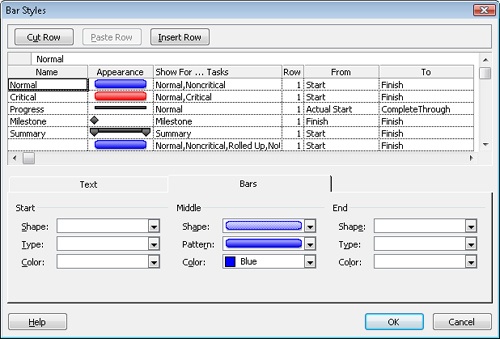
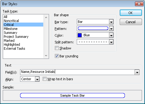
Click Format, Bar Styles.
The Bar Styles dialog box lists all the Gantt bar types for the current view with the settings for their appearance (see Figure 25-4). For example, Gantt bars appear blue for normal tasks, whereas summary Gantt bars are solid black with black end marks at both ends.
To select the Gantt bar to format, click its name in the table.
Click the Bars tab and then make the changes you want to the Start, Middle, and End of the bar.
The settings for the start and end determine the appearance of the markers at the beginning and end of the bar, whereas the settings for the middle control the appearance of the bar itself.
For the start and end, begin with the Shape box and choose the mark to add to the start or end of the bar, such as the downward pointing arrows for summary tasks. Then, in the Type box, choose whether the mark should be a solid color, framed with a line, or outlined with a dashed line. Finally, choose the color for the mark.
For the bar itself, under the Middle heading, choose the shape of the bar, such as a full rectangle for regular tasks or a half-height rectangle to show progress. In the Pattern and Color boxes, select the pattern and color for the bar.
For solid colors, in the Pattern box, choose the solid black entry.
To change the pattern, color, and shape of the Gantt bars for individual tasks (rather than all tasks of a particular type), do the following:
In addition to changing the styles of Gantt bars, you can also define new types of Gantt bars. For example, if you use the Marked field to flag high-risk tasks, you can set up a special bar style to show marked tasks in lime green. To format your own type of bar, follow these steps:
Apply a Gantt Chart view.
Click Format, Bar Styles.
Scroll to the end of the list of Gantt bar types and click in the first blank row.
If you want to insert the new Gantt bar type earlier in the list, click the row immediately below where you want to insert the type and then click Insert Row. Microsoft Project inserts a blank row above the selected row.
In the Name field, type the name of your new Gantt bar.
Click the cell in the Show For ... Tasks column.
Click the down arrow in the box and then click the category of task for which this bar should be displayed. For example, if you’re creating a style for tasks that are not finished, click Not Finished.
Note
If you want a Gantt bar style to appear when a task satisfies more than one condition, click the first condition, type a comma, and then click the second condition, such as Critical, Not Finished. You can also create a Gantt bar that appears when a condition is not true. Type Not in front of a selected task condition, such as Not Milestone or Critical, Not In Progress.
In the From and To columns, click the date fields that determine the beginning and end of the Gantt bar. For example, you might draw a progress bar from the Start date to the Complete Through date, or a bar from the Actual Start date to the Deadline date for critical tasks that aren’t yet finished.
Click the Bars tab and then specify the appearance for the Start, Middle, and End of the bar.
If you want to display text on the bar, click the Text tab and then click the box for the position where you want text to appear for the Gantt bar, such Left, Top, or Inside.
Click the down arrow in the box and then click the name of the task field whose content you want to appear for this Gantt bar type.
Note
If you want to call attention to tasks that don’t meet any of the task conditions listed in the Show For... Tasks field, you can create a new bar style that applies only to marked or flagged tasks. When you set a task’s Marked field or the appropriate flag field to Yes, its Gantt bar appears in that bar style.
You can add the Marked field to the sheet portion of your Gantt chart and then set the value to Yes for each task you want to mark. If you are already using the Marked field, insert a column for one of the custom flag fields, such as Flag1, and set it to Yes for those tasks. In the Bar Styles dialog box, create a new bar style to specify the bar appearance and associated text for marked or flagged tasks.
Displaying task field values next to Gantt bars makes it easy to correlate task information with bars in the chart. In addition, displaying text next to Gantt bars might reduce the number of columns needed in the sheet portion of the Gantt chart, leaving more room on the screen to show the chart portion of the view.
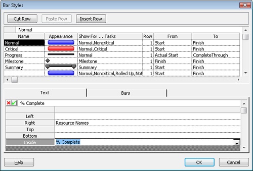
To specify the text for all Gantt bars of a particular type, follow these steps:
Click Format, Bar Styles.
Click the name of the Gantt bar type whose text you want to change.
Click the Text tab.
Click the box for the position, such as Left or Right, at which you want the text to appear for the Gantt bar type.
Click the down arrow in the box and then click the name of the task field whose content you want to appear for this Gantt bar type (see Figure 25-5).
For example, if you want the percentage of completion to appear to the right of the Gantt bar, click the Right box, click the down arrow, and then click % Complete. To remove text from a position, select the box for that position and then press Backspace.
When you’re done, click OK to close the Bar Styles dialog box.
To change the text accompanying the Gantt bar for selected tasks, do the following:
In the sheet portion of the view, click the task or tasks whose Gantt bar text you want to change.
Click Format, Bar and then click the Bar Text tab in the Format Bar dialog box.
On the Bar Text tab, click the box for the position—such as Left, Right, Top, or Bottom—where you want the text to appear for the Gantt bar.
Click the down arrow to the right of the box and then click the name of the task field whose content you want to appear for this Gantt bar.
Although you can change the text position and content for individual Gantt bars, you can’t change the font, style, or color of the text. Fortunately, you can change the text style for all Gantt bars of a particular type or the text style for the text at a specific position on a bar by performing the following steps:
Click Format, Text Styles.
In the Item To Change box, click the type of task whose text style you want to change.
For example, if you want the text accompanying all critical tasks to be 16-point, red type, start by clicking Critical Tasks in the Item To Change box. To specify the text style for text at a specific position on all bars, in the Item To Change box, choose the position, such as Bar Text - Left or Bar Text - Inside.
Make the changes you want in the Font, Font Style, Size, and Color boxes.
Note
The Text Styles command on the Format menu formats the text for tasks of a particular type (such as critical tasks) or all text at the same position on all bars (such as text at the left end of all Gantt bars). To change the attributes of only the selected text, use the Font command instead. Click Format, Font and then choose the font, font style, size, and color.
Link lines between dependent tasks show how tasks relate to each other. However, too many link lines can obscure the very information you are trying to communicate. If the schedule is too cluttered, you might want to modify the appearance of link lines, the height of Gantt bars, or whether splits and rolled-up bars are displayed. To change the layout of links and bars in a Gantt chart, do the following:
Click Format, Layout.
In the Layout dialog box, select the option for how you want the links between dependent tasks to appear.
For example, you can hide the link lines, draw them as S shapes between the ends of tasks, or display them as L shapes from the end of one task to the top of another task.
If you display date fields on Gantt bars, choose a date format to use.
For example, to keep text for dates to a minimum, choose a format that shows only the numeric month and day. If time or day of week is important, choose a format with these elements shown.
If you want to make Gantt bars thicker or thinner, in the Bar Height box, choose a number between 6 and 24, with 12 being the default thickness.
Choose other layout options to roll up Gantt bars, draw the bar length in increments of whole days, or show splits.
For example, you typically want to select the Always Roll Up Gantt Bars check box so that summary tasks display information about their subordinate tasks. If you are fine-tuning your project schedule, you might want to view where splits occur or see the duration of tasks down to the hour.
Gridlines separate elements such as columns and rows in the sheet portion of a Gantt chart, or the dates and tasks in the chart portion. For example, you might want to add horizontal lines to the chart to help correlate Gantt bars with their associated tasks in the sheet portion. To change the gridlines in a Gantt chart, follow these steps:
Click Format, Gridlines.
In the Line To Change box, click the element for the gridlines you want to add, remove, or change.
Elements for both the sheet portion and chart portion of the Gantt chart appear in the Line To Change list.
The current style appears in the Normal area.
In the Normal section, change the line type in the Type box and the color in the Color box.
If you want to display lines at certain intervals, such as after every fourth item, click the interval in the At Interval section.
Note
For information about modifying the timescale in the Gantt chart, see the section titled Modifying the Timescale later in this chapter.
Network diagrams display tasks as boxes, or nodes, with link lines showing the task dependencies. Because a network diagram doesn’t include a task sheet like the Gantt chart, it’s important to choose wisely when you select the fields that you want to appear inside the boxes. In addition, you can customize the appearance of the boxes and how they are arranged within the diagram.
Boxes in a network diagram are the equivalent of Gantt bars in a Gantt chart, so it should be no surprise that can change the appearance of boxes in a network diagram depending on the task type. Similar to selecting the fields that appear around or inside Gantt bars, the task fields that appear inside network diagram boxes are customizable as well.
To change the appearance and content for all boxes of a particular type, do the following:
Click View, Network Diagram.
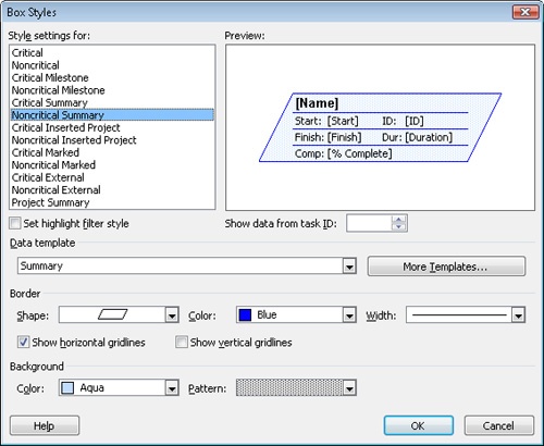
Click Format, Box Styles.
The Box Styles dialog box lists all the box types for the current view and the settings for their appearance (see Figure 25-6).
To customize a specific type of box, click its name in the Style Settings For list.
To change the fields that appear within the box, in the Data Template box, click a data template.
The Preview area shows the box with the fields that the selected data template specifies.
Note
To show exactly the fields you want, you can modify or create new data templates for the boxes in a network diagram. For example, you might want to include a custom field in a data template. Templates can contain fields that display graphical indicators.
To modify or create a template, click More Templates, click a template name, and then click Edit or Copy. To create a new template, click New. To insert a field into the data template, in the Choose Cells section, click the cell where you want to insert the field, click the down arrow, and then click the name of the field in the list.
If you wish, in the Border area, change the shape, color, and width of the box border.
If you want to display horizontal or vertical gridlines between the fields inside a box, select the Show Horizontal Gridlines and Show Vertical Gridlines check boxes.
If you want a color or pattern other than the default, choose a background color and pattern.
Caution!
Although you can select different colors and patterns for the box background, dark colors make it difficult to read the task information.
To change the displayed fields and border appearance for individual boxes (rather than all boxes showing a particular type of project information), follow these steps:
Choose the boxes you want to format in the network diagram.
Click Format, Box.
In the Data Template box, click the data template you want to use.
A preview of the box with the selected data template appears.
Make the changes you want to the shape, color, and width of the border.
Make the changes you want to the background color and pattern for the box.
The network diagram is much like a flowchart of the tasks in a project. The layout options for a network diagram control how boxes are positioned and aligned, the distance between the boxes, the appearance of links, and other settings.
To change the layout of a network diagram, do the following:
To open the Layout dialog box, click Format, Layout.
To position boxes manually by dragging, select the Allow Manual Box Positioning option.
If you’re happy to delegate layout to Microsoft Project, select the Automatically Position All Boxes option. The program uses the settings you choose to reposition the boxes in the network diagram.
In the Arrangement box, choose the order in which sequential boxes appear in the diagram.
For example, you can arrange the boxes from the top left down to the bottom right of the diagram. Another popular choice is Top Down - Critical First, which arranges boxes from the top down but also places critical tasks before others.
With the Row and Column boxes, specify the alignment, distance between rows and columns, and the width and height of the boxes.
The numbers in the Spacing boxes represent the number of pixels between boxes and must be between 0 and 200.
In the Link Style section, select how lines should be drawn between boxes, and whether arrows and link labels should be included.
If you want to show links in different colors, in the Link Color section, choose the colors you want for your links.
By default, network diagrams display noncritical links in blue and critical links in red, similar to noncritical and critical bars in a Gantt chart.
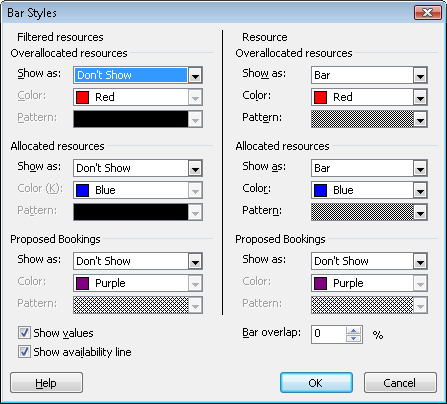
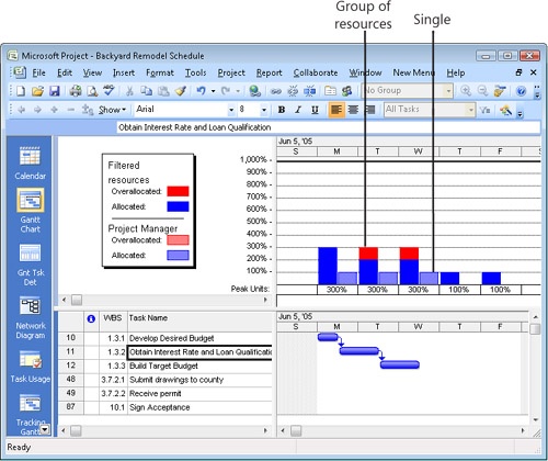
The Resource Graph shows resource allocation, cost, or work over periods of time. The horizontal axis represents time, and the vertical axis represents units such as resource availability, cost, or work. In addition to choosing the fields that appear in the graph, you can modify the appearance of bars and text of particular types as well as change the gridlines in the graph. Unlike Gantt charts, you cannot modify the appearance of individual bars or text.
The Bar Styles dialog box for the Resource Graph contains six areas, each of which controls the appearance of bars for different sets of information. For example, if you graph overallocations, the two top areas display overallocations, whereas the middle areas display allocations less than or equal to the maximum available units. The bottom areas show proposed assignments.
The areas on the left side of the dialog box control how data for an entire group appears. The areas on the right side of the dialog box control the appearance of data for a single selected resource.
Follow these steps to modify the appearance of Resource Graph bars of a particular type:
Click View, Resource Graph.
Click Format, Bar Styles.
Because the bars in the Resource Graph represent information that you don’t see in the Gantt chart, the Bar Styles dialog box for the Resource Graph, shown in Figure 25-7, contains a completely different set of choices than the Bar Styles dialog box for Gantt charts.
In the Bar Styles dialog box, choose the types of data you want to show, for example, allocated resources or proposed bookings.
For any information you do show, specify the color and pattern for its representative bars.
To choose which values appear in the Resource Graph, click Format, Details. On the shortcut menu that appears, choose the field you want to display:
Peak Units. Represents the highest percentage of units assigned to a resource during each period on the graph. Units that exceed the maximum units for the resource appear as an overallocation.
Work. Displays the amount of work assigned to a resource during the period. If the hours exceed the number of hours available for the resource, the excess hours appear as an overallocation. The hours available for a resource take into account both the resource calendar (working and nonworking time) and the resource’s maximum units.
Cumulative Work. Displays the total work assigned to the resource since the project began.
Overallocation. Includes only the hours that the resource is overallocated during the period, not work hours that fit in the resource’s workday.
Percent Allocation. Represents the work assigned to a resource as a percentage of his available time.
Remaining Availability. Shows the number of hours that the resource is available. This graph is helpful when you are trying to find someone to work on a new task.
Cost. Displays the labor cost and per-use cost of a resource for the period. The total cost of a task appears in the period in which the task begins or ends, depending on whether resource costs accrue at the start or end.
Cumulative Cost. Shows the running total of the cost since the start of the project. This choice shows the total cost of a project when you display the value for a group that includes all the project resources.
Work Availability. Represents the number of hours that a resource could work based on his or her maximum units and resource calendar. It doesn’t take into account any existing assignments. This field is helpful for identifying whether you have correctly created a resource calendar.
Unit Availability. Displays the same information as Work Availability, formatted as a percentage.
Note
You can control how values are presented in the Resource Graph. To change the unit for work, click Tools, Options and then click the Schedule tab. In the Work Is Entered In box, select the time unit you want for work. For example, for large projects, you might choose Days, whereas for short projects, Hours might be more useful.
To change the currency format for costs, click Tools, Options and then click the View tab. Under Currency Options, specify the currency format you want.
To modify which fields appear in the Resource Graph, follow these steps:
Right-click the background of the Resource Graph and then, on the shortcut menu, click the field to display in the Resource Graph.
For example, if you are trying to eliminate overallocations for a resource, click Overallocation or Percent Overallocation. On the other hand, if you are looking for an available resource, click Remaining Availability.
If you want to format the bars in the view, right-click the background of the Resource Graph and then click Bar Styles to adjust the appearance of the information.
For example, you can view overallocations for the selected resource and others in the same resource group (see Figure 25-8).
Note
To modify the text styles or gridlines in the Resource Graph, follow the steps described in the sections titled Formatting the Appearance of Gantt Bar Text and Formatting the Appearance of Gridlines earlier in this chapter.
You can change the Calendar view to display one week, several weeks, or a month. The bar styles, text styles, layout, gridlines, and timescale for task bars in the Calendar view are all customizable.
To choose the time period to display, use one of the following methods:
On the Standard toolbar, click Zoom In or Zoom Out.
By default, the Calendar view displays one month at a time. If you click Zoom In, Microsoft Project displays two weeks. Click Zoom In once more to show only one week. Click Zoom Out to switch from one week, to two weeks, to a full month.
Above the Calendar, click the button for a time period.
Click Month to display an entire month. Click Week to show one week. To show a specific time period, click Custom. In the Zoom dialog box, select the Number Of Weeks option and type the number in the box. You can also choose a start date and end date for the period.
Note
To navigate to the next or previous time period, above the Calendar, click the left arrow or right arrow. For example, if the Calendar shows one week, clicking the right arrow moves to the next week. Clicking the left arrow shows the previous week.
To display a monthly preview pane, do the following:
Right-click the Calendar and choose Timescale on the pop-up menu.
On the Week Headings tab, select the Display Month Pane checkbox.
Click OK.
To the left of the Calendar, Microsoft Project displays a pane that displays the current, next, and previous month,
To modify the bar styles for a particular type of task, do the following:
Click View, Calendar.
Click Format, Bar Styles.
Because the Calendar view presents information that you don’t see in the Gantt chart, the Bar Styles dialog box for Calendars contains different settings from the Bar Styles dialog box for Gantt charts.
To change the appearance of a specific type of Calendar bar, in the Task Type list, click its name, for example, Noncritical or Marked.
In the Bar Shape section, specify the Bar Type, Pattern, Color, and Split Pattern for the Calendar bar.
In the Text section, in the Field(s) box, click the field that you want to appear inside the Calendar bar.
If you want to show the contents of multiple fields with the Calendar bar, separate each field with a comma. For example, to see the task name and resource initials, select the Name field, type a comma, and then select Resource Initials (see Figure 25-9).
To modify the arrangement of tasks in the Calendar, follow these steps:
Click Format, Layout.
The Layout dialog box for the Calendar view appears.
To display as many tasks as you can in the Calendar boxes, select the Attempt To Fit As Many Boxes As Possible option.
This option sorts tasks by Total Slack and then by Duration. Otherwise, tasks appear in the current sort order.
Select the Automatic Layout check box to reapply the layout options as you add, remove, or sort tasks.
To modify the timescale in the Calendar, do the following:
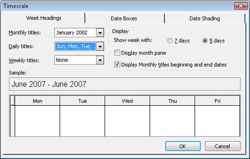
Click Format, Timescale.
In the Timescale dialog box, click the Week Headings tab and then choose the titles that you want to appear for months, weeks, and days in the calendar (see Figure 25-10).
Select the 7 Days option to display all days in a week. Select the 5 Days option to display only the workdays.
Select the Previous/Next Month Calendars check box to include a preview of the previous and following months in the view.
Click the Date Boxes tab to specify the information you want to appear in the heading for each date box.
For example, by default, the day of the month appears at the top-right corner of the box, and the overflow indicator is in the top-left corner. You can choose the format for the date and display the date in a different corner. Altneratively, you can show portions of the date in separate corners, such as the month in the upper-left and the day in the upper-right.
Click the Date Shading tab to customize how working and nonworking time for base and resource calendars appear on the calendar.
Note
For information about modifying the text styles in the Calendar, refer to the section titled Changing the Font for a View earlier in this chapter. To change gridlines in the Calendar, follow the steps described in the section titled Formatting the Appearance of Gridlines earlier in this chapter.
The Resource Sheet and the Task Sheet use a tabular layout to display information about your project resources and tasks. The Task Sheet appears as the sheet portion of a Gantt chart view. It’s easy to change the table that appears in the sheet view along with the height of rows and width of columns.
Note
For more information about customizing text, see the section titled Changing the Font for a View earlier in this chapter.
To change the table in the sheet view, use one of the following methods:
Click View, More Views. In the More Views dialog box, click a sheet view, for example, Task Sheet or Resource Sheet, and then click Apply.
Right-click the Select All box in the upper-left corner of the table (above row 1). A shortcut menu appears with tables for the sheet view. Click the name of the table that you want to appear.
For example, to see costs in the Task Sheet, click Cost on the shortcut menu. If the table you want doesn’t appear on the shortcut menu, click More Tables and then double-click the table you want in the Tables list.
To resize a column in the sheet, use one of the following methods:
Position the mouse pointer between two column headings until it changes to a two-headed arrow and then double-click the column edge to resize the column to fit all the values in the column.
Position the mouse pointer between two column headings until it changes to a two-headed arrow, and then click and drag until the column on the left is the desired width.
Double-click the column heading to display the Column Definition dialog box. Click the column width in the Width box or click Best Fit.
Note
You can wrap text in a table’s column headings by adjusting the column heading row height. To adjust the row height automatically to display the entire column title, click View, Table and then click More Tables. Click the table you want to modify and then click Edit. In the Table Definition dialog box, select the Auto-Adjust Header Row Heights check box. You can also drag to manually adjust the column heading row height.
You can change the height of one or more rows in a sheet. To change the height of a row, position the mouse pointer between the two row headings (beneath the row’s ID number) until the mouse pointer changes to a two-headed arrow, and then click and drag upward or downward to make the row shorter or taller, respectively.
Note
For information about resizing all rows in a table, as well as inserting, deleting, moving, and copying rows and columns in a table, see the section titled Customizing Tables later in this chapter.
Usage views, such as the Resource Usage and Task Usage view, display information divided across time periods. Usage views include a sheet view in the left pane and a timephased grid (the timephased portion of the view) with the field details in the right pane. You can customize the sheet and the timescale for the timephased portion as you can in the Gantt Chart and other views. You can also choose which fields you want to see in the timephased portion of the view.
To select and format the timephased fields shown in the timephased portion of a usage view, follow these steps:
Click View, Resource Usage or choose another usage view.
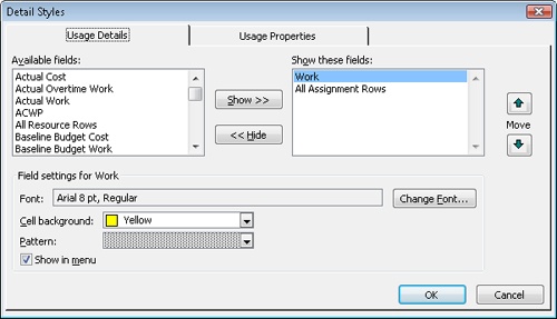
Right-click the timephased portion of the view, click Detail Styles, and then click the Usage Details tab.
The Usage Details tab lists the different timephased fields that you can display in the timephased portion of the view, such as Work, Actual Work, Overtime Work, and Cost (see Figure 25-11).
In the Available Fields list, click the field you want to add to the timephased portion of the Usage View and then click Show.
To include multiple fields, press Ctrl and then click each field to add it to the selection. Then click Show to add them all to the Show These Fields list.
To remove a field from showing in the timephased portion of the view, click its name in the Show These Fields list and then click Hide.
To change the order in which fields appear, click a field in the Show These Fields list and then click the Move up or down arrow buttons.
If you want to change a field’s appearance in the timephased portion of the view, choose the font, color, and pattern for the selected field.
Note
To quickly add a field, right-click the timephased portion of the view and then, on the shortcut menu, click the field you want to add. A check box appears in front of the field name on the shortcut menu, and another row of timephased information appears in the timephased portion of the view for each task.
To remove a field from the timephased portion of the view, right-click the timephased portion of the view and then, on the shortcut menu, click the field you want to remove.
The Usage Properties tab in the Detail Styles dialog box enables you to format the detail headers and the data within the timephased portion of the view:
To align the data in the timephased cells, click Right, Left, or Center in the Align Details Data box.
If you can’t see the field names on the left side of the timephased portion of the view, click Yes in the Display Details Header Column box.
If the field names are missing in some of the rows, select the Repeat Details Header On All Assignment Rows check box.
If the field names take up too much space, select the Display Short Detail Header Names check box.
Note
For information about modifying the text styles or gridlines in a Usage view, follow the steps described in the sections titled Changing the Font for a View and Formatting the Appearance of Gridlines earlier in this chapter. For information about formatting the sheet portion of the Usage view, see the sections titled Modifying a Sheet View earlier in this chapter and Customizing Tables later in this chapter. For information about formatting the timescale, see the section titled Modifying the Timescale later in this chapter.
The values in the timephased portion of the view often exceed the width of the columns. Instead of adjusting the width of columns in the Timescale dialog box, you can use the mouse to resize them in the timephased portion of the usage view timesheet. To resize columns in the timephased portion of the view, follow these steps:
Position the mouse pointer between two column headings in the timephased portion of the view until it changes to a two-headed arrow.
Click and then drag the pointer to the left or right until the columns are the desired width.
If the usage view is part of a combination view that’s displaying a timephased portion in both panes, changing the column width in one pane changes the width in the other pane so that the timephased columns always line up.
The timescale is a prominent feature in many Microsoft Project views, such as Gantt chart and usage views. A view can contain up to three timescales, for instance to show the fiscal year and fiscal quarters on two timescales; or to show the year, months, and days on three timescales. You can customize the units, the labels for time periods, and the label alignment for each timescale. In addition, you can choose how many timescales you want to use as well as the width of each period in the timescale.
Changes you make to the timescale apply only to the active view, but those changes become a permanent part of that view definition. Your timescale customizations appear each time you display that view.
To set the options for one or more tiers in the timescale, do the following:
Display a view that contains a timescale, such as Gantt Chart, Task Usage, or Resource Graph.
Right-click the timescale heading and then click Timescale on the shortcut menu.
The Timescale dialog box appears.
The Timescale dialog box has four tabs (see Figure 25-12): Top Tier, Middle Tier, Bottom Tier, and Non-Working Time. The Middle Tier tab is displayed by default. In the Show list under Timescale Options, click the number of tiers you want to display (one, two, or three).
To change the width of the timescale columns, click a percentage in the Size box.
If you use small time periods, choose a smaller percentage to fit a longer overall period in the view. If the values in the view appear as pound marks (#), choose a larger percentage to display the values.
Select the Scale Separator check box to draw lines between each timescale tier.
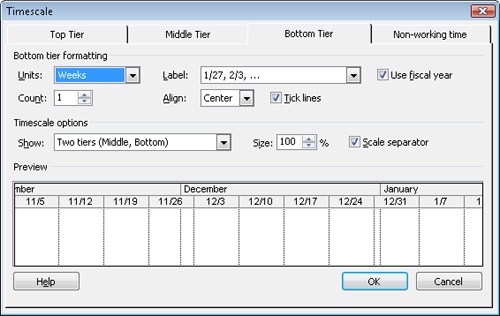
To set the options for each timescale tier, follow these steps:
In the Timescale dialog box, click the tab for the timescale tier you want to customize.
In the Units box, specify the time unit you want to display for the current tier. For example, you might choose Quarters for the top tier if your organization’s financial performance depends on this project.
To display the fiscal year in the timescale, select the Use Fiscal Year check box.
To display an interval of more than one unit, choose the number of units in the Count box.
For example, to display two-week intervals, click Weeks in the Units box and 2 in the Count box.
To change the label format, choose a format in the Label box, for example, 1st Quarter, Qtr 1, 2004, or 1Q04.
To position the label in the timescale, click Left, Right, or Center in the Align box.
If you chose to display more than one tier, click the tabs for the other tiers and repeat steps 2–6.
Caution!
When you click the Zoom In or Zoom Out buttons on the Standard toolbar or click Zoom on the View menu, changes you make to the labels in the timescales disappear.
You can also control how nonworking time appears in the timescale. To set the nonworking time options in the timescale, do the following:
In the Timescale dialog box, click the Non-Working Time tab.
To hide nonworking time, select the Do Not Draw check box.
If you display nonworking time, choose the color and pattern for the nonworking time shading.
Choose the calendar whose nonworking time you want to display in the Calendar box.
Note
The Non-Working Time tab in the Timescale dialog box changes only the appearance of nonworking time in the timescale. To modify the schedule for nonworking time, click Tools, Change Working Time. Alternatively, right-click the timescale heading and then click Change Working Time.
Note
For more information about changing working and nonworking time, see the section titled Setting Your Project Calendar in Chapter 3.