A confusion matrix is a table that we use to understand the performance of a classification model. This helps us understand how we classify testing data into different classes. When we want to fine-tune our algorithms, we need to understand how the data gets misclassified before we make these changes. Some classes are worse than others, and the confusion matrix will help us understand this. Let's look at the following figure:
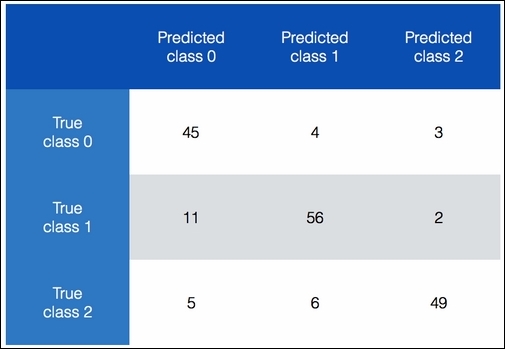
In the preceding chart, we can see how we categorize data into different classes. Ideally, we want all the nondiagonal elements to be 0. This would indicate perfect classification! Let's consider class 0. Overall, 52 items actually belong to class 0. We get 52 if we sum up the numbers in the first row. Now, 45 of these items are being predicted correctly, but our classifier says that four of them belong to class 1 and three of them belong to class 2. We can apply the same analysis to the remaining two rows as well. An interesting thing to note is that 11 items from class 1 are misclassified as class 0. This constitutes around 16% of the datapoints in this class. This is an insight that we can use to optimize our model.
- We will use the
confusion_matrix.pyfile that we already provided to you as a reference. Let's see how to extract the confusion matrix from our data:from sklearn.metrics import confusion_matrix y_true = [1, 0, 0, 2, 1, 0, 3, 3, 3] y_pred = [1, 1, 0, 2, 1, 0, 1, 3, 3] confusion_mat = confusion_matrix(y_true, y_pred) plot_confusion_matrix(confusion_mat)
We use some sample data here. We have four classes with values ranging from 0 to 3. We have predicted labels as well. We use the
confusion_matrixmethod to extract the confusion matrix and plot it. - Let's go ahead and define this function:
# Show confusion matrix
def plot_confusion_matrix(confusion_mat):
    plt.imshow(confusion_mat, interpolation='nearest', cmap=plt.cm.Paired)
    plt.title('Confusion matrix')
    plt.colorbar()
    tick_marks = np.arange(4)
    plt.xticks(tick_marks, tick_marks)
    plt.yticks(tick_marks, tick_marks)
    plt.ylabel('True label')
    plt.xlabel('Predicted label')
    plt.show()
We use the
imshowfunction to plot the confusion matrix. Everything else in the function is straightforward! We just set the title, color bar, ticks, and the labels using the relevant functions. Thetick_marksargument range from 0 to 3 because we have four distinct labels in our dataset. Thenp.arangefunction gives us thisnumpyarray. - If you run the preceding code, you will see the following figure:
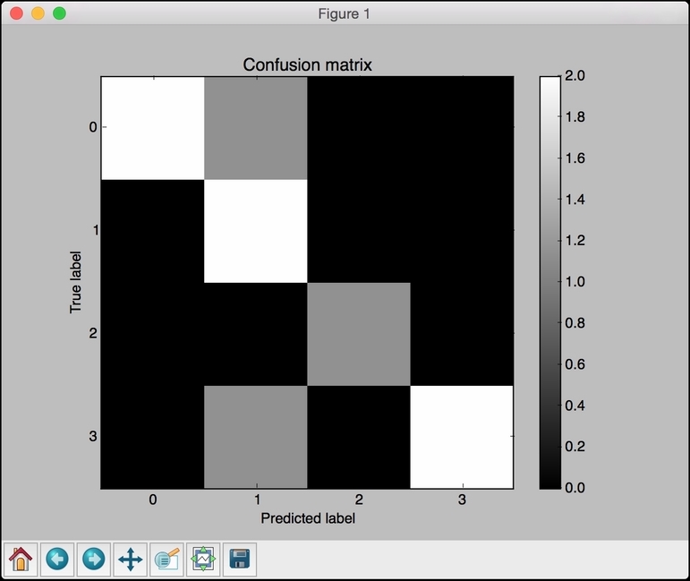
The diagonal colors are strong, and we want them to be strong. The black color indicates zero. There are a couple of gray colors in the nondiagonal spaces, which indicate misclassification. For example, when the real label is 0, the predicted label is 1, as we can see in the first row. In fact, all the misclassifications belong to class-1 in the sense that the second column contains three rows that are non-zero. It's easy to see this from the figure.