Despite the word regression being present in the name, logistic regression is actually used for classification purposes. Given a set of datapoints, our goal is to build a model that can draw linear boundaries between our classes. It extracts these boundaries by solving a set of equations derived from the training data.
- Let's see how to do this in Python. We will use the
logistic_regression.pyfile that is provided to you as a reference. Assuming that you imported the necessary packages, let's create some sample data along with training labels:import numpy as np from sklearn import linear_model import matplotlib.pyplot as plt X = np.array([[4, 7], [3.5, 8], [3.1, 6.2], [0.5, 1], [1, 2], [1.2, 1.9], [6, 2], [5.7, 1.5], [5.4, 2.2]]) y = np.array([0, 0, 0, 1, 1, 1, 2, 2, 2])
Here, we assume that we have three classes.
- Let's initialize the logistic regression classifier:
classifier = linear_model.LogisticRegression(solver='liblinear', C=100)
There are a number of input parameters that can be specified for the preceding function, but a couple of important ones are
solverandC. Thesolverparameter specifies the type of solver that the algorithm will use to solve the system of equations. TheCparameter controls the regularization strength. A lower value indicates higher regularization strength. - Let's train the classifier:
classifier.fit(X, y)
- Let's draw datapoints and boundaries:
plot_classifier(classifier, X, y)
We need to define this function, as follows:
def plot_classifier(classifier, X, y):
    # define ranges to plot the figure
    x_min, x_max = min(X[:, 0]) - 1.0, max(X[:, 0]) + 1.0
    y_min, y_max = min(X[:, 1]) - 1.0, max(X[:, 1]) + 1.0
The preceding values indicate the range of values that we want to use in our figure. The values usually range from the minimum value to the maximum value present in our data. We add some buffers, such as 1.0 in the preceding lines, for clarity.
- In order to plot the boundaries, we need to evaluate the function across a grid of points and plot it. Let's go ahead and define the grid:
    # denotes the step size that will be used in the mesh grid
    step_size = 0.01

    # define the mesh grid
    x_values, y_values = np.meshgrid(np.arange(x_min, x_max, step_size), np.arange(y_min, y_max, step_size))
The
x_valuesandy_valuesvariables contain the grid of points where the function will be evaluated. - Let's compute the output of the classifier for all these points:
# compute the classifier output mesh_output = classifier.predict(np.c_[x_values.ravel(), y_values.ravel()]) # reshape the array mesh_output = mesh_output.reshape(x_values.shape) - Let's plot the boundaries using colored regions:
    # Plot the output using a colored plot
    plt.figure()

    # choose a color scheme
    plt.pcolormesh(x_values, y_values, mesh_output, cmap=plt.cm.gray)
This is basically a 3D plotter that takes the 2D points and the associated values to draw different regions using a color scheme. You can find all the color scheme options at http://matplotlib.org/examples/color/colormaps_reference.html.
- Let's overlay the training points on the plot:
    plt.scatter(X[:, 0], X[:, 1], c=y, s=80, edgecolors='black', linewidth=1, cmap=plt.cm.Paired)

    # specify the boundaries of the figure
    plt.xlim(x_values.min(), x_values.max())
    plt.ylim(y_values.min(), y_values.max())

    # specify the ticks on the X and Y axes
    plt.xticks((np.arange(int(min(X[:, 0])-1), int(max(X[:, 0])+1), 1.0)))
    plt.yticks((np.arange(int(min(X[:, 1])-1), int(max(X[:, 1])+1), 1.0)))

    plt.show()
Here,
plt.scatterplots the points on the 2D graph.X[:, 0]specifies that we should take all the values along axis 0 (X-axis in our case) andX[:, 1]specifies axis 1 (Y-axis). Thec=yparameter indicates the color sequence. We use the target labels to map to colors usingcmap. Basically, we want different colors that are based on the target labels. Hence, we useyas the mapping. The limits of the display figure are set usingplt.xlimandplt.ylim. In order to mark the axes with values, we need to useplt.xticksandplt.yticks. These functions mark the axes with values so that it's easier for us to see where the points are located. In the preceding code, we want the ticks to lie between the minimum and maximum values with a buffer of one unit. Also, we want these ticks to be integers. So, we useint()function to round off the values. - If you run this code, you should see the following output:
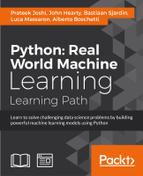
- Let's see how the
Cparameter affects our model. TheCparameter indicates the penalty for misclassification. If we set it to1.0, we will get the following figure:
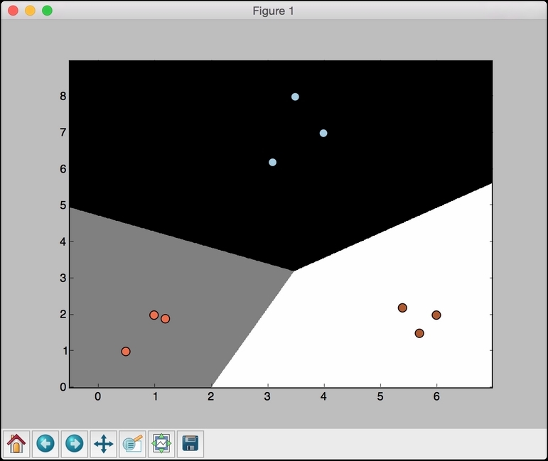
- If we set
Cto10000, we get the following figure:
As we increase
C, there is a higher penalty for misclassification. Hence, the boundaries get more optimal.