
Depending on the modeling technique that you're using, some of this work may be more valuable than other parts. Deep learning algorithms tend to perform better on less-engineered data than shallower models and it might be that less work is needed to improve results.
The key to understanding what is needed is to iterate quickly through the whole process from dataset acquisition to modeling. On a first pass with a clear target for model accuracy, find the acceptable minimum amount of processing and perform that. Learn whatever you can about the results and make a plan for the next iteration.
To show how this looks in practice, we'll work with an unfamiliar, high-dimensional dataset, using an iterative process to generate increasingly effective modeling.
I was recently living in Vancouver. While it has many positive qualities, one of the worst things about living in the city was the somewhat unpredictable commute. Whether I was traveling by car or taking Translink's Skytrain system (a monorail-meets-rollercoaster high-speed line), I found myself subject to hard-to-predict delays and congestion issues.
In the spirit of putting our new feature engineering skillset into practice, let's take a look at whether we can improve this experience by taking the following steps:
- Writing code to harvest data from multiple APIs, including text and climate streams
- Using our feature engineering techniques to derive variables from this initial data
- Testing our feature set by generating commute delay risk scores
Unusually, in this example, we'll focus less on building and scoring a highly performant model. Instead, our focus is on creating a self-sufficient solution that you can adjust and apply for your own local area. While it suits the goals of the current chapter to take this approach, there are two additional and important motivations.
Firstly, there are some challenges around sharing and making use of Twitter data. Part of the terms of use of Twitter's API is an obligation on the developer to ensure that any adjustments to the state of a timeline or dataset (including, for instance, the deletion of a tweet) are reproduced in datasets that are extracted from Twitter and publicly shared. This makes the inclusion of real Twitter data in this chapter's GitHub repository impractical. Ultimately, this makes it difficult to provide reproducible results from any downstream model based on streamed data because users will need to build their own stream and accumulate data points and because variations in context (such as seasonal variations) are likely to affect model performance.
The second element here is simple enough: not everybody lives in Vancouver! In order to generate something of value to an end user, we should think in terms of an adjustable, general solution rather than a geographically-specific one.
The code presented in the next section is therefore intended to be something to build from and develop. It offers potential as the basis of a successful commercial app or simply a useful, data-driven life hack. With this in mind, review this chapter's content (and leverage the code in the associated code directory) with an eye to finding and creating new applications that fit your own situation, locally available data, and personal needs.
In order to begin, we're going to need to collect some data! We're going to need to look for rich, timestamped data that is captured at sufficient frequency (preferably at least one record per commute period) to enable model training.
A natural place to begin with is the Twitter API, which allows us to harvest recent tweet data. We can put this API to two uses.
Firstly, we can harvest tweets from official transit authorities (specifically, bus and train companies). These companies provide transit service information on delays and service disruptions that, helpfully for us, takes a consistent format conducive to tagging efforts.
Secondly, we can tap into commuter sentiment by listening for tweets from the geographical area of interest, using a customized dictionary to listen for terms related to cases of disruption or the causes thereof.
In addition to mining the Twitter API for data to support our model, we can leverage other APIs to extract a wealth of information. One particularly valuable source of data is the Bing Traffic API. This API can be easily called to provide traffic congestion or disruption incidents across a user-specified geographical area.
In addition, we can leverage weather data from the Yahoo Weather API. This API provides the current weather for a given location, taking zip codes or location input. It provides a wealth of local climate information including, but not limited to, temperature, wind speed, humidity, atmospheric pressure, and visibility. Additionally, it provides a text string description of current conditions as well as forecast information.
While there are other data sources that we can consider tying into our analysis, we'll begin with this data and see how we do.
In order to meaningfully assess our commute disruption prediction attempt, we should try to define test criteria and an appropriate performance score.
What we're attempting to do is identify the risk of commute disruption on the current day, each day. Preferably, we'd like to know the commute risk with sufficient advance notice that we can take action to mitigate it (for example, by leaving home earlier).
In order to do this, we're going to need three things:
- An understanding of what our model is going to output
- A measure we can use to quantify model performance
- Some target data we can use to score model performance according to our measure
We can have an interesting discussion about why this matters. It can be argued, effectively, that some models are information in purpose. Our commute risk score, it might be said, is useful insofar as it generates information that we didn't previously have.
The reality of the situation, however, is that there is inalienably going to be a performance criterion. In this case, it might simply be my satisfaction with the results output by my model, but it's important to be aware that there is always some performance criterion at play. Quantifying performance is therefore valuable, even in contexts where a model appears to be informational (or even better, unsupervised). This makes it prudent to resist the temptation to waive performance testing; at least this way, you have a quantified performance measure to iteratively improve on.
A sensible starting point is to assert that our model is intended to output a numerical score in a 0-1 range for outbound (home to work) commutes on a given day. We have a few options with regard to how we present this score; perhaps the most obvious option would be to apply a log rescaling to the data. There are good reasons to log-scale and in this situation it might not be a bad idea. (It's not unlikely that the distribution of commute delay time obeys a power law.) For now, we won't reshape this set of scores. Instead, we'll wait to review the output of our model.
In terms of delivering practical guidance, a 0-1 score isn't necessarily very helpful. We might find ourselves wanting to use a bucketed system (such as high risk, mid risk, or low risk) with bucket boundaries at specific boundaries in the 0-1 range. In short, we would transition to treating the problem as a multiclass classification problem with categorical output (class labels), rather than as a regression problem with a continuous output.
This might improve model performance. (More specifically, because it'll increase the margin of free error to the full breadth of the relevant bucket, which is a very generous performance measure.) Equally though, it probably isn't a great idea to introduce this change on the first iteration. Until we've reviewed the distribution of real commute delays, we won't know where to draw the boundaries between classes!
Next, we need to consider how we measure the performance of our model. The selection of an appropriate scoring measure generally depends on the characteristics of the problem. We're presented with a lot of options around classifier performance scoring. (For more information around performance measures for machine learning algorithms, see the Further reading section at the end of this chapter.)
One way of deciding which performance measure is suitable for the task at hand is to consider the confusion matrix. A confusion matrix is a table of contingencies; in the context of statistical modeling, they typically describe the label prediction versus actual labels. It is common to output a confusion matrix (particularly for multiclass problems with more classes) for a trained model as it can yield valuable information about classification failures by failure type and class.
In this context, the reference to a confusion matrix is more illustrative. We can consider the following simplified matrix to assess whether there is any contingency that we don't care about:

In this case, we care about all four contingency types. False negatives will cause us to be caught in unexpected delays, while false positives will cause us to leave for our commute earlier than necessary. This implies that we want a performance measure that values both high sensitivity (true positive rate) and high specificity (false positive rate). The ideal measure, given this, is area under the curve (AUC).
The second challenge is how to measure this score; we need some target against which to predict. Thankfully, this is quite easy to obtain. I do, after all, have a daily commute to do! I simply began self-recording my commute time using a stopwatch, a consistent start time, and a consistent route.
It's important to recognize the limitations of this approach. As a data source, I am subject to my own internal trends. I am, for instance, somewhat sluggish before my morning coffee. Similarly, my own consistent commute route may possess local trends that other routes do not. It would be far better to collect commute data from a number of people and a number of routes.
However, in some ways, I was happy with the use of this target data. Not least because I am attempting to classify disruption to my own commute route and would not want natural variance in my commute time to be misinterpreted through training, say, against targets set by some other group of commuters or routes. In addition, given the anticipated slight natural variability from day-to-day, should be disregarded by a functional model.
It's rather hard to tell what's good enough in terms of model performance. More precisely, it's not easy to know when this model is outperforming my own expectations. Unfortunately, not only do I not have any very reliable with regard to the accuracy of my own commute delay predictions, it also seems unlikely that one person's predictions are generalizable to other commutes in other locations. It seems ill-advised to train a model to exceed a fairly subjective target.
Let's instead attempt to outperform a fairly simple threshold—a model that naively suggests that every single day will not contain commute delays. This target has the rather pleasing property of mirroring our actual behavior (in that we tend to get up each day and act as though there will not be transit disruption).
Of the 85 target data cases, 14 commute delays were observed. Based on this target data and the score measure we created, our target to beat is therefore 0.5.
Given that we're focusing this example analysis on the city of Vancouver, we have an opportunity to tap into a second Twitter data source. Specifically, we can use service announcements from Vancouver's public transit authority, Translink.
As noted, this data is already well-structured and conducive both to text mining and subsequent analysis; by processing this data using the techniques we reviewed in the last two chapters, we can clean the text and then encode it into useful features.
We're going to apply the Twitter API to harvest Translink's tweets over an extended period. The Twitter API is a pretty friendly piece of kit that is easy enough to work with from Python. (For extended guidance around how to work with the Twitter API, see the Further reading section at the end of this chapter!) In this case, we want to extract the date and body text from the tweet. The body text contains almost everything we need to know, including the following:
- The nature of the tweet (delay or non-delay)
- The station affected
- Some information as to the nature of the delay
One element that adds a little complexity is that the same Translink account tweets service disruption information for Skytrain lines and bus routes. Fortunately, the account is generally very uniform in the terms that it uses to describe service issues for each service type and subject. In particular, the Twitter account uses specific hashtags (#RiderAlert for bus route information, #SkyTrain for train-related information, and #TransitAlert for general alerts across both services, such as statutory holidays) to differentiate the subjects of service disruption.
Similarly, we can expect a delay to always be described using the word delay, a detour by the term detour, and a diversion, using the word diversion. This means that we can filter out unwanted tweets using specific key terms. Nice job, Translink!
Note
The data used in this chapter is provided within the GitHub solution accompanying this chapter in the translink_tweet_data.json file. The scraper script is also provided within the chapter code; in order to leverage it, you'll need to set up a developer account with Twitter. This is easy to achieve; the process is documented here and you can sign up here.
Once we've obtained our tweet data, we know what to do next—we need to clean and regularize the body text! As per Chapter 6, Text Feature Engineering, let's run BeautifulSoup and NLTK over the input data:
from bs4 import BeautifulSoup

tweets = BeautifulSoup(train["TranslinkTweets.text"])

tweettext = tweets.get_text()

brown_a = nltk.corpus.brown.tagged_sents(categories= 'a')

tagger = None
for n in range(1,4):
   tagger = NgramTagger(n, brown_a, backoff = tagger)

taggedtweettext = tagger.tag(tweettext)
We probably will not need to be as intensive in our cleaning as we were with the troll dataset in the previous chapter. Translink's tweets are highly formulaic and do not include non-ascii characters or emoticons, so the specific "deep cleaning" regex script that we needed to use in Chapter 6, Text Feature Engineering, won't be needed here.
This gives us a dataset with lower-case, regularized, and dictionary-checked terms. We are ready to start thinking seriously about what features we ought to build out of this data.
We know that the base method of detecting a service disruption issue within our data is the use of a delay term in a tweet. Delays happen in the following ways:
- At a given location
- At a given time
- For a given reason
- For a given duration
Each of the first three factors is consistently tracked within Translink tweets, but there are some data quality concerns that are worth recognizing.
Location is given in terms of an affected street or station at 22nd Street. This isn't a perfect description for our purpose as we're unlikely to be able to turn a street name and route start/end points into a general affected area without doing substantial additional work (as no convenient reference exists that allows us to draw a bounding box based on this information).
Time is imperfectly given by the tweet datetime. While we don't have visibility on whether tweets are made within a consistent time from service disruption, it's likely that Translink has targets around service notification. For now, it's sensible to proceed under the assumption that the tweet times are likely to be sufficiently accurate.
The exception is likely to be for long-running issues or problems that change severity (delays that are expected to be minor but which become significant). In these cases, tweets may be delayed until the Translink team recognizes that the issue has become tweet-worthy. The other possible cause of data quality issues is inconsistency in Translink's internal communications; it's possible that engineering or platform teams don't always inform the customer service notifications team at the same speed.
We're going to have to take a certain amount on faith though, as there isn't a huge amount we can do to measure these delay effects without a dataset of real-time, accurate Translink service delays. (If we had that, we'd be using it instead!)
Reasons for Skytrain service delays are consistently described by Translink and can fall into one of the following categories:
- Rail
- Train
- Switch
- Control
- Unknown
- Intrusion
- Medical
- Police
- Power
With each category described within the tweet body using the specific proper term given in the preceding list. Obviously, some of these categories (Police, Power, Medical) are less likely to be relevant as they wouldn't tell us anything useful about road conditions. The rate of train, track, and switch failure may be correlated with detour likelihood; this suggests that we may want to keep those cases for classification purposes.
Meanwhile, bus route service delays contain a similar set of codes, many of which are very relevant to our purposes. These codes are as follows:
- Motor Vehicle Accident (MVA)
- Construction
- Fire
- Watermain
- Traffic
Encoding these incident types is likely to prove useful! In particular, it's possible that certain service delay types are more impactful than others, increasing the risk of a longer service delay. We'll want to encode service delay types and use them as parameters in our subsequent modeling.
To do this, let's apply a variant of one-hot encoding, which does the following:
- It creates a conditional variable for each of the service risk types and sets all values to zero
- It checks tweet content for each of the service risk type terms
- It sets the relevant conditional variable to 1 for each tweet that contains a specific risk term
This effectively performs one-hot encoding without taking the bothersome intermediary step of creating the factorial variable that we'd normally be processing:
from sklearn import preprocessing

enc = preprocessing.OneHotEncoder(categorical_features='all', dtype= 'float', handle_unknown='error', n_values='auto', sparse=True)

tweets.delayencode = enc.transform(tweets.delaytype).toarray()
Beyond what we have available to use as a feature on a per-incident basis, we can definitely look at the relationship between service disruption risk and disruption frequency. If we see two disruptions in a week, is a third more likely or less likely?
While these questions are interesting and potentially fruitful, it's usually more prudent to work up a limited feature set and simple model on a first pass than to overengineer a sprawling feature set. As such, we'll run with the initial incidence rate features and see where we end up.
A major cultural development in 2010 was the widespread use of public online domains for self-expression. One of the happier products of this is the availability of a wide array of self-reported information on any number of subjects, provided we know how to tap into this.
Commute disruptions are frequently occurring events that inspire a personal response, which means that they tend to be quite broadly reported on social media. If we write an appropriate dictionary for key-term search, we can begin using Twitter particularly as a source of timestamped information on traffic and transit issues around the city.
In order to collect this data, we'll make use of a dictionary-based search approach. We're not interested in the majority of tweets from the period in question (and as we're using the RESTful API, there are return limits to consider). Instead, we're interested in identifying tweet data containing key terms related to congestion or delay.
Unfortunately, tweets harvested from a broad range of users tend not to conform to consistent styles that aid analysis. We're going to have to apply some of the techniques we developed in the preceding chapter to break down this data into a more easily analyzed format.
In addition to using a dictionary-based search, we could do some work to narrow the search area down. The most authoritative way to achieve this is to use a bounding box of coordinates as an argument to the Twitter API, such that any related query exclusively returns results gathered from within this area.
As always, on our first pass, we'll keep things simple. In this case, we'll count up the number of traffic disruption tweets in the current period. There is some additional work that we could benefit from doing with this data on subsequent iterations. Just as the Translink data contained clearly-defined delay cause categories, we could try to use specialized dictionaries to isolate delay types based on key terms (for example, a dictionary of construction-related terms and synonyms).
We could also look at defining a more nuanced quantification of disruption tweet rate than a simple count of recent. We could, for instance, look at creating a weighted count feature that increases the impact of multiple simultaneous tweets (potentially indicative of severe disruption) via a nonlinear weighting.
The next API we're going to tap into is the Bing Traffic API. This API has the advantage of being easily accessed; it's freely available (whereas some competitor APIs sit behind paywalls), returns data, and provides a good level of detail. Among other things, the API returns an incident location code, a general description of the incident, together with congestion information, an incident type code, and start/end timestamps.
Helpfully, the incident type codes provided by this API describe a broad set of incident types, as follows:
Accident.Congestion.DisabledVehicle.MassTransit.Miscellaneous.OtherNews.PlannedEvent.RoadHazard.Construction.Alert.Weather.
Additionally, a severity code is provided with the severity values translated as follows:
LowImpact.Minor.Moderate.Serious.
One downside, however, is that this API doesn't receive consistent information between regions. Querying in France, for instance, returns codes from multiple other incident types, (I observed 1, 3, 5, 8 for a town in northern France over a period of one month.) but doesn't seem to show every code. In other locations, even less data is available. Sadly, Vancouver tends to show data for codes 9 or 5 exclusively, but even the miscellaneous-coded incidents appear to be construction-related:
Closed between Victoria Dr and Commercial Dr - Closed. Construction work. 5
This is a somewhat bothersome limitation. Unfortunately, it's not something that we can easily fix; Bing's API is simply not sourcing all of the data that we want! Unless we pay for a more complete dataset (or an API with fuller data capture is available in your area!), we're going to need to keep working with what we have.
An example of querying this API is as follows:
importurllib.request, urllib.error, urllib.parse
import json

latN = str(49.310911)
latS = str(49.201444)
lonW = str(-123.225544)
lonE = str(-122.903931)

url = 'http://dev.virtualearth.net/REST/v1/Traffic/Incidents/'+latS+','+lonW+','+latN+','+lonE+'?key='GETYOUROWNKEYPLEASE'

response = urllib.request.urlopen(url).read()
data = json.loads(response.decode('utf8'))
resources = data['resourceSets'][0]['resources']

print('----------------------------------------------------')
print('PRETTIFIED RESULTS')
print('----------------------------------------------------')
for resourceItem in resources:
    description = resourceItem['description']
typeof = resourceItem['type']
    start = resourceItem['start']
    end = resourceItem['end']
print('description:', description);
print('type:', typeof);
print('starttime:', start);
print('endtime:', end);
print('----------------------------------------------------')


This example yields the following data;

----------------------------------------------------
PRETTIFIED RESULTS
----------------------------------------------------
description: Closed between Boundary Rd and PierviewCres - Closed due to roadwork.
type: 9
severity 4
starttime: /Date(1458331200000)/
endtime: /Date(1466283600000)/
----------------------------------------------------
description: Closed between Commercial Dr and Victoria Dr - Closed due to roadwork.
type: 9
severity 4
starttime: /Date(1458327600000)/
endtime: /Date(1483218000000)/
----------------------------------------------------
description: Closed between Victoria Dr and Commercial Dr - Closed. Construction work.
type: 5
severity 4
starttime: /Date(1461780543000)/
endtime: /Date(1481875140000)/
----------------------------------------------------
description: At Thurlow St - Roadwork.
type: 9
severity 3
starttime: /Date(1461780537000)/
endtime: /Date(1504112400000)/
----------------------------------------------------
Even after recognizing the shortcomings of uneven code availability across different geographical areas, the data from this API should provide us with some value. Having a partial picture of traffic disruption incidents still gives us data for a reasonable period of dates. The ability to localize traffic incidents within an area of our own definition and returning data relevant to the current date is likely to help the performance of our model.
On our first pass over the input data, we repeatedly made the choice to keep our initial feature set small. Though we saw lots of opportunities in the data, we prioritized viewing an initial result above following up on those opportunities.
It is likely, however, that our first dataset won't help us solve the problem very effectively or hit our targets. In this event, we'll need to iterate over our feature set, both by creating new features and winnowing our feature set to reduce down to the valuable outputs of that feature creation process.
One helpful example involves one-hot encoding and RFE. In this chapter, we'll use one-hot to turn weather data and tweet dictionaries into tensors of m*n size. Having produced m-many new columns of data, we'll want to reduce the liability of our model to be misled by some of these new features (for instance, in cases where multiple features reinforce the same signal or where misleading but commonly-used terms are not cleaned out by the data cleaning processes we described in Chapter 6, Text Feature Engineering). This can be done very effectively by RFE, the technique for feature selection that we discussed earlier in this chapter.
In general, it can be helpful to work using a methodology that applies the techniques seen in the last two chapters using an expand-contract process. First, use techniques that can generate potentially valuable new features, such as transformations and encodings, to expand the feature set. Then, use techniques that can identify the most performant subset of those features to remove the features that do not perform well. Throughout this process, test different target feature counts to identify the best available feature set at different numbers of features.
Some data scientists interpret how this is done differently from others. Some will build all of their features using repeated iterations over the feature creation techniques we've discussed, then reduce that feature set—the motivation being that this workflow minimizes the risk of losing data. Others will perform the full process iteratively. How you choose to do this is entirely up to you!
On our initial pass over the input data, then, we have a feature set that looks as follows:
{
  'DisruptionInformation': {
    'Date': '15-05-2015',
    'TranslinkTwitter': [{
      'Service': '0',
      'DisruptionIncidentCount': '4'
  }, {
      'Service': '1',
      'DisruptionIncidentCount': '0'
    }]
  },
  'BingTrafficAPI': {
    'NewIncidentCount': '1',
    'SevereIncidentCount': '1',
    'IncidentCount': '3'
  },
  'ConsumerTwitter': {
    'DisruptionTweetCount': '4'
  }
}
It's unlikely that this dataset is going to perform well. All the same, let's run it through a basic initial algorithm and get a general idea as to how near our target we are; this way, we can learn quickly with minimal overhead!
In the interest of expedience, let's begin by running a first pass using a very simple regression algorithm. The simpler the technique, the faster we can run it (and often, the more transparent it is to us what went wrong and why). For this reason (and because we're dealing with a regression problem with a continuous output rather than a classification problem), on a first pass we'll work with a simple linear regression model:
from sklearn import linear_model

tweets_X_train = tweets_X[:-20]
tweets_X_test = tweets_X[-20:]


tweets_y_train = tweets.target[:-20]
tweets_y_test = tweets.target[-20:]

regr = linear_model.LinearRegression()

regr.fit(tweets_X_train, tweets_y_train)

print('Coefficients:
', regr.coef_)
print("Residual sum of squares: %.2f" % np.mean((regr.predict(tweets_X_test) - tweets_y_test) ** 2))

print('Variance score: %.2f' % regr.score(tweets_X_test, tweets_y_test))

plt.scatter(tweets_X_test, tweets_y_test,  color='black')
plt.plot(tweets_X_test, regr.predict(tweets_X_test), color='blue',linewidth=3)

plt.xticks(())
plt.yticks(())
plt.show()
At this point, our AUC is pretty lousy; we're looking at a model with an AUC of 0.495. We're actually doing worse than our target! Let's print out a confusion matrix to see what this model's doing wrong:

According to this matrix, it's doing everything not very well. In fact, it's claiming that almost all of the records show no incidents, to the extent of missing 90% of real disruptions!
This actually isn't too bad at all, given the early stage that we're at with our model and our features, as well as the uncertain utility of some of our input data. At the same time, we should expect an incidence rate of 6% (as our training data suggests that incidents have been seen to occur roughly once every 16 commutes). We'd still be doing a little better by guessing that every day will involve a disrupted commute (if we ignore the penalty to our lifestyle entailed by leaving home early each day).
Let's consider what changes we could make in a next pass.
- First off, we could stand to improve our input data further. We identified a number of new features that we could create from existing sources using a range of transformation techniques.
- Secondly, we could look at extending our dataset using additional information. In particular, a weather dataset describing both temperature and humidity may help us improve our model.
- Finally, we could upgrade our algorithm to something with a little more grunt, random forests or SVM being obvious examples. There are good reasons not to do this just yet. The main reason is that we can continue to learn a lot from linear regression; we can compare against earlier results to understand how much value our changes are adding, while retaining a fast iteration loop and simple scoring methods. Once we begin to get minimal returns on our feature preparation, we should consider upgrading our model.
For now, we'll continue to upgrade our dataset. We have a number of options here. We can encode location into both traffic incident data from the Bing API's "description" field and into Translink's tweets. In the case of Translink, this is likely to be more usefully done for bus routes than Skytrain routes (given that we restricted the scope of this analysis to focus solely on traffic commutes).
We can achieve this goal in one of two ways;
- Using a corpus of street names/locations, we can parse the input data and build a one-hot matrix
- We can simply run one-hot encoding over the entire body of tweets and entire set of API data
Interestingly, if we intend to use dimensionality reduction techniques after performing one-hot encoding, we can encode the entire body of both pieces of text information without any significant problems. If features relating to the other words used in tweets and text are not relevant, they'll simply be scrubbed out during RFE.
This is a slightly laissez-faire approach, but there is a subtle advantage. Namely, if there is some other potentially useful content to either data source that we've so far overlooked as a potential feature, this process will yield the added benefit of creating features based on that information.
Let's encode locations in the same way we encoded delay types:
from sklearn import preprocessing

enc = preprocessing.OneHotEncoder(categorical_features='all', dtype= 'float', handle_unknown='error', n_values='auto', sparse=True)

tweets.delayencode = enc.transform(tweets.location).toarray()
Additionally, we should follow up on our intention to create recent count variables from Translink and Bing maps incident logging. The code for this aggregation is available in the GitHub repository accompanying this chapter!
Rerunning our model with this updated data produced results with a very slight improvement; the predicted variance score rose to 0.56. While not dramatic, this is definitely a step in the right direction.
Next, let's follow up on our second option—adding a new data source that provides weather data.
We've previously grabbed data that will help us tell whether commute disruption is happening—reactive data sources that identify existing delays. We're going to change things up a little now, by trying to find data that relates to the causes of delays and congestion. Roadworks and construction information definitely falls into this category (along with some of the other Bing Traffic API codes).
One factor that is often (anecdotally!) tied to increased commute time is bad weather. Sometimes this is pretty obvious; heavy frost or high winds have a clear impact on commute time. In many other cases, though, it's not clear what the strength and nature of the relationship between climatic factors and disruption likelihood is for a given commute.
By extracting pertinent weather data from a source with sufficient granularity and geo coverage, we can hopefully use strong weather signals to help improve our correct prediction of disruption.
For our purposes, we'll use the Yahoo Weather API, which provides a range of temperature, atmospheric, pressure-related, and other climate data, both current and forecasted. We can query the Yahoo Weather API without needing a key or login process, as follows:
import urllib2, urllib, json

baseurl = https://query.yahooapis.com/v1/public/yql?

yql_query = "select item.condition from weather.forecast where woeid=9807"
yql_url = baseurl + urllib.urlencode({'q':yql_query}) + "&format=json"
result = urllib2.urlopen(yql_url).read()
data = json.loads(result)
print data['query']['results']
To get an understanding for what the API can provide, replace item.condition (in what is fundamentally an embedded SQL query) with *. This query outputs a lot of information, but digging through it reveals valuable information, including the current conditions:
{
   'channel': {
     'item': {
      'condition': {
         'date': 'Thu, 14 May 2015 03:00 AM PDT', 'text': 'Cloudy', 'code': '26', 'temp': '46'
      }
    }
  }
}
7-day forecasts containing the following information:
{
    'item': {
      'forecast': {
        'code': '39', 'text': 'Scattered Showers', 'high': '60', 'low': '44', 'date': '16 May 2015', 'day': 'Sat'
      }
    }
}
And other current weather information:
'astronomy': {
     'sunset': '8:30 pm', 'sunrise': '5:36 am'

   'wind': {
     'direction':  '270', 'speed': '4', 'chill': '46'
For the purpose of building a training dataset, we extracted data on a daily basis via an automated script that ran from May 2015 to January 2016. The forecasts may not be terribly useful to us as it's likely that our model will rerun over current data on a daily basis rather than being dependent on forecasts. However, we will definitely make use of the wind.direction, wind.speed, and wind.chill variables, as well as the condition.temperature and condition.text variables.
In terms of how to further process this information, one option jumps to mind. One-hot encoding of weather tags would enable us to use weather condition information as categorical variables, just as we did in the preceding chapter. This seems like a necessary step to take. This significantly inflates our feature set, leaving us with the following data:
{
  'DisruptionInformation': {
    'Date': '15-05-2015',
    'TranslinkTwitter': [{
      'Service': '0',
      'DisruptionIncidentCount': '4'
    }, {
      'Service': '1',
      'DisruptionIncidentCount': '0'
    }]
  },
  'BingTrafficAPI': {
    'NewIncidentCount': '1',
    'SevereIncidentCount': '1',
    'IncidentCount': '3'
  },
  'ConsumerTwitter': {
    'DisruptionTweetCount': '4'
  },
  'YahooWeather':{
    'temp: '45'
    'tornado': '0',
    'tropical storm': '0',
    'hurricane': '0',
    'severe thunderstorms': '0',
    'thunderstorms': '0',
    'mixed rain and snow': '0',
    'mixed rain and sleet': '0',
    'mixed snow and sleet': '0',
'freezing drizzle': '0',
'drizzle': '0',
'freezing rain': '0',
'showers': '0',
'snow flurries': '0',
'light snow showers': '0',
'blowing snow': '0',
'snow': '0',
'hail': '0',
'sleet': '0',
'dust': '0',
'foggy': '0',
'haze': '0',
'smoky': '0',
'blustery': '0',
'windy': '0',
'cold': '0',
'cloudy': '1',
'mostly cloudy (night)': '0',
'mostly cloudy (day)': '0',
'partly cloudy (night)': '0',
'partly cloudy (day)': '0',
'clear (night)': '0',
'sunny': '0',
'fair (night)': '0',
'fair (day)': '0',
'mixed rain and hail': '0',
'hot': '0',
'isolated thunderstorms': '0',
'scattered thunderstorms': '0',
'scattered showers': '0',
'heavy snow': '0',
'scattered snow showers': '0',
'partly cloudy': '0',
'thundershowers': '0',
'snow showers': '0',
'isolated thundershowers': '0',
'not available': '0',
}
It's very likely that a lot of time could be valuably sunk into further enriching the weather data provided by the Yahoo Weather API. For the first pass, as always, we'll remain focused on building a model that takes the features that we described previously.
Note
It's definitely worth considering how we would do further work with this data. In this case, it's important to distinguish between cross-column data transformations and cross-row transformations.
A cross-column transformation is one where variables from different features in the same input case were transformed based on one another. For instance, we might take the start date and end date of a case and use it to calculate the duration. Interestingly, the majority of the techniques that we've studied in this book won't gain a lot from many such transformations. Most machine learning techniques capable of drawing nonlinear decision boundaries tend to encode relationships between variables in their modeling of a dataset. Deep learning techniques often take this capability a step further. This is part of the reason that some feature engineering techniques (particularly basic transformations) add less value for deep learning applications.
Meanwhile, a cross-row transformation is typically an aggregation. The central tendency of the last n-many duration values, for instance, is a feature that can be derived by an operation over multiple rows. Naturally, some features can be derived by a combination of column-wise and row-wise operations. The interesting thing about cross-row transformations is that it's usually quite unlikely that a model will train to recognize them, meaning that they tend to continue to add value in very particular contexts.
The reason that this information is relevant, of course, is that recent weather is a context in which features derived from cross-row operations might add new information to our model. Change in barometric pressure or temperature over the last n hours, for instance, might be a more useful variable than the current pressure or temperature. (Particularly, when that our model is intended to predict commutes to take place later in the same day!)
The next step is to rerun our model. This time, our AUC is a little higher; we're scoring 0.534. Looking at our confusion matrix, we're also seeing improvements:

If the issues are linked to weather factors, continuing to pull weather data is a good idea; setting this solution up to run over an extended period will gradually gather longitudinal inputs from each source, gradually giving us much more reliable predictions.
At this point, we're only a short distance away from our MVP target. We can continue to extend our input dataset, but the smart solution is to find another way to approach the problem. There are two actions that we can meaningfully take.
Note
Being human, data scientists tend to think in terms of simplifying assumptions. One of these that crops up quite frequently is basically an application of the Pareto principle to cost/benefit analysis decisions. Fundamentally, the Pareto principle states that for many events, roughly 80% of the value or effect comes from roughly 20% of the input effort, or cause, obeying what's referred to as a Pareto distribution. This concept is very popular in software engineering contexts among others, as it can guide efficiency improvements.
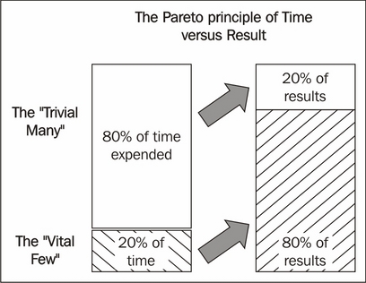
To apply this theory to the current case, we know that we could spend more time finessing our feature engineering. There are techniques that we haven't applied and other features that we could create. However, at the same time, we know that there are entire areas that we haven't touched: external data searches and model changes, particularly, which we could quickly try. It makes sense to explore these cheap but potentially impactful options on our next pass before digging into additional dataset preparation.
During our exploratory analysis, we noticed that some of our variables are quite sparse. It wasn't immediately clear how helpful they all were (particularly for stations where fewer incidents of a given type occurred).
Let's test out our variable set using some of the techniques that we worked with earlier in the chapter. In particular, let's apply Lasso to the problem of reducing our feature set to a performant subset:
fromsklearn.preprocessing import StandardScaler


scaler = StandardScaler()
X = scaler.fit_transform(DisruptionInformation["data"])
Y = DisruptionInformation["target"]
names = DisruptionInformation["feature_names"]

lasso = Lasso(alpha=.3)
lasso.fit(X, Y)

print "Lasso model: ", pretty_print_linear(lasso.coef_, names, sort = True)
This output is immediately valuable. It's obvious that many of the weather features (either through not showing up sufficiently often or not telling us anything useful when they do) are adding nothing to our model and should be removed. In addition, we're not getting a lot of value from our traffic aggregates. While these can remain in for the moment (in the hope that gathering more data will improve their usefulness), for our next pass we'll rerun our model without the poorly-scoring features that our use of LASSO has revealed.
There is one fairly cheap additional change, which we ought to make: we should upgrade our model to one that can fit nonlinearly and thus can fit to approximate any function. This is worth doing because, as we observed, some of our features showed a range of skewed distributions indicative of a nonlinear underlying trend. Let's apply a random forest to this dataset:
fromsklearn.ensemble import RandomForestClassifier, ExtraTreesClassifier
rf = RandomForestRegressor(n_jobs = 3, verbose = 3, n_estimators=20)
rf.fit(DisruptionInformation_train.targets,DisruptionInformation_train.data)

r2 = r2_score(DisruptionInformation.data, rf.predict(DisruptionInformation.targets))
mse = np.mean((DisruptionInformation.data - rf.predict(DisruptionInformation.targets))**2)

pl.scatter(DisruptionInformation.data, rf.predict(DisruptionInformation.targets))
pl.plot(np.arange(8, 15), np.arange(8, 15), label="r^2=" + str(r2), c="r")
pl.legend(loc="lower right")
pl.title("RandomForest Regression with scikit-learn")
pl.show()
Let's return again to our confusion matrix:
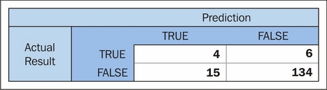
At this point, we're doing fairly well. A simple upgrade to our model has yielded significant improvements, with our model correctly identifying almost 40% of commute delay incidents (enough to start to be useful to us!), while misclassifying a small amount of cases.
Frustratingly, this model would still be getting us out of bed early incorrectly more times than it would correctly. The gold standard, of course, would be if it were predicting more commute delays than it was causing false (early) starts! We could reasonably hope to achieve this target if we continue to gather feature data over a sustained period; the main weakness of this model is that it has very few cases to sample from, given the rarity of commute disruption events.
We have, however, succeeded in gathering and marshaling a range of data from different sources in order to create a model from freely-available data that yields a recognizable, real-world benefit (reducing the amount of late arrivals at work by 40%). This is definitely an achievement to be happy with!