
Similarly, we can look at voter registration versus actual voting (using census data from https://www.census.gov/data/tables/time-series/demo/voting-and-registration/p20-580.html).
First, we load our dataset and display head information to visually check for accurate loading:
df <- read.csv("Documents/B05238_05_registration.csv")
summary(df)
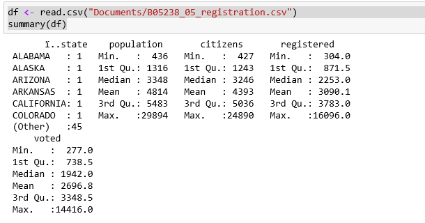
So, we have some registration and voting information by state. Use R to automatically plot all the data in x and y format using the plot command:
plot(df)
We are specifically looking at the relationship between registering to vote and actually voting. We can see in the following graphic that most of the data is highly correlated (as evidenced by the 45 degree angles of most of the relationships):

We can produce somewhat similar results using Python, but the graphic display is not even close.
Import all of the packages we are using for the example:
from numpy import corrcoef, sum, log, arange
from numpy.random import rand
from pylab import pcolor, show, colorbar, xticks, yticks
import pandas as pd
import matplotlib
from matplotlib import pyplot as plt
Reading a CSV file in Python is very similar. We call upon pandas to read in the file:
df
pandas will throw an error if there is string data in the data frame, so just delete the column (with state names):
del df['state'] #pandas do not deal well with strings
One approximate Python function is the corr() function, which prints out the numeric values for all of the cross-correlations among the items in the data frame. It is up to you to scan through the data, looking for correlation values close to 1.0:
#print cross-correlation matrix
print(df.corr())
Similarly, we have the corrcoef() function, which provides color intensity to similarly correlated items within the data frame. I did not find a way to label the correlated items:
#graph same
fig = plt.gcf()
fig.set_size_inches(10, 10)

# plotting the correlation matrix
R = corrcoef(df)
pcolor(R)
colorbar()
yticks(arange(0.5,10.5),range(0,10))
xticks(arange(0.5,10.5),range(0,10))
show()

We want to see the actual numeric value of the correlation between registration and voting. We can do that by calling the cor function to pass in the two data points of interest, as in:
cor(df$voted,df$registered)
0.998946393424037
With a correlation of 99 percent, we are almost perfect.
We can use the data points to arrive at a regression line using the lm function, where we are stating lm(y ~ (predicted by) x):
fit <- lm(df$voted ~ df$registered)
fit
Call:
lm(formula = df$voted ~ df$registered)

Coefficients:
  (Intercept)  df$registered
      -4.1690         0.8741
From this output, given a registered number, we multiply it by 87 percent and subtract 4 to get the number of actual voters. Again, the data is correlated.
We can display the characteristics of the regression line by calling the plot function and passing in the fit object (the par function is used to lay out the output—in this case a 2x2 matrix-like display of the four graphics):
par(mfrow=c(2,2))
plot(fit)

Then, in the second part of the 2x2 display, we have these two graphics:

From the preceding plots we can see the following:
- The residual values are close to zero until we get to very large numbers
- The theoretical quantiles versus standardized residuals line up very well for most of the range
- The fitted values versus standardized residuals are not as close as I would have expected
- The standardized residuals versus leverage show the same tight configuration among most of the values.
Overall, we still have a very good model for the data. We can see what the residuals look like for the regression calling the residuals function, as follows:
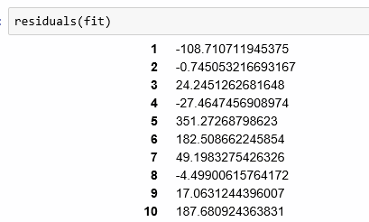
... (for all 50 states)
The residual values are bigger than I expected for such highly correlated data. I had expected to see very small numbers as opposed to values in the hundreds.
As always, let's display a summary of the model that we arrived at:
summary(fit)
Call:
lm(formula = df$voted ~ df$registered)

Residuals:
    Min      1Q  Median      3Q     Max
-617.33  -29.69    0.83   30.70  351.27

Coefficients:
               Estimate Std. Error t value Pr(>|t|)
(Intercept)   -4.169018  25.201730  -0.165    0.869
df$registered  0.874062   0.005736 152.370   <2e-16 ***
---
Signif. codes:  0 '***' 0.001 '**' 0.01 '*' 0.05 '.' 0.1 ' ' 1

Residual standard error: 127.9 on 49 degrees of freedom
Multiple R-squared:  0.9979,  Adjusted R-squared:  0.9979
F-statistic: 2.322e+04 on 1 and 49 DF,  p-value: < 2.2e-16
There are many data points associated with the model in this display:
- Again, residuals are showing quite a range
- Coefficients are as we saw them earlier, but the standard error is high for the intercept
- R squared of close to 1 is expected
- p value minimal is expected
We can also use Python to arrive at a linear regression model using:
import numpy as np
import statsmodels.formula.api as sm

model = sm.ols(formula='voted ~ registered', data=df)
fitted = model.fit()
print (fitted.summary())
We see the regression results in standard fashion as follows:

The warnings infer some issues with the data:
- We are using the covariance matrix directly, so it is unclear how we would specify this otherwise
- I imagine there is strong multicollinearity as the data only has the two items
We can also plot the actual versus fitted values in Python using a script:
plt.plot(df['voted'], df['registered'], 'ro')
plt.plot(df['voted'], fitted.fittedvalues, 'b')
plt.legend(['Data', 'Fitted model'])
plt.xlabel('Voted')
plt.ylabel('Registered')
plt.title('Voted vs Registered')
plt.show()

I think I like this version of the graph from Python better than the display from R. The added intensity circle on the bottom left is confusing.