Plotly is an interesting mix. It is a subscription website that provides significant data analysis graphing functionality. You can use the free version of the software, but you still need to log in with credentials to use it. The graphics functions are available in a variety of languages from Node.js to Python and the like.
Further, the graphics generated are available in Plotly and in your local notebook. If you mark the graphic as public, then you can access it from the notebook, just like any other graphic over the internet. Similarly, as a web graphic, you can select from the display and save locally as needed.
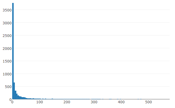
In this example, we use the voting histogram again, but using Plotly's capabilities.
The script becomes the following:
import plotly
import plotly.graph_objs as go
import plotly.plotly as py
import pandas as pd
import numpy as np

#once you set credentials they are stored in local space and referenced automatically
#you need to subscribe to the site to get the credentials
#the api key would need to be replaced with your key
#plotly.tools.set_credentials_file(username='DemoAccount', api_key='lr17zw81')

#we are generating a graphic that anyone can see it
plotly.tools.set_config_file(world_readable=True, sharing='public')

# load voting summary from other project
from_counts = np.load("from_counts.npy")
print(from_counts.shape)
(6110,)

#plotly expects a list in a data block
from_count_list = []
for from_count in from_counts:
    from_count_list.append(from_count)

data = [go.Histogram(x=from_count_list)]

# plot on plot.ly site
py.iplot(data, filename='basic histogram')
I think this is one of the nicer renderings that I have seen for a histogram using the out-of-the-box options/settings. We have the same histogram we had seen previously, just displayed using more eye-appealing attributes: