
There are a wide variety of social sites that produce datasets. In this example, we will gather one of the datasets and produce a histogram from the data. The specific dataset is the voting behavior on WIKI from https://snap.stanford.edu/data/wiki-Vote.html. Each data item shows user number N voted for user number X. So, we produce some statistics in a histogram to analyze voting behavior by:
- Gathering all of the voting that took place
- For each vote:
- Increment a counter that says who voted
- Increment a counter that says who was voted for
- Massage the data so we can display it in two histograms
The coding is as follows:
%matplotlib inline
# import all packages being used
import matplotlib.pyplot as plt
import pandas as pd
import numpy as np
import matplotlib

# load voting data drawn from https://snap.stanford.edu/data/wiki-Vote.html
df = pd.read_table('wiki-Vote.txt', sep=r"s+", index_col=0)

# produce standard summary info to validate
print(df.head())
print(df.describe())
            ToNodeId
FromNodeId
30              1412
30              3352
30              5254
30              5543
30              7478
            ToNodeId
count  103689.000000
mean     3580.347018
std      2204.045658
min         3.000000
25%      1746.000000
50%      3260.000000
75%      5301.000000
max      8297.000000
Next, we produce grouped totals by the number of votes by a person and number of votes for a person. I assume there is a built-in function that would do this more nicely, but I did not find it:
from_counter = {}
to_counter = {}
for index, row in df.iterrows():
    ton = row['ToNodeId']
    fromn = index

    #add the from entry
    if from_counter.has_key(fromn):
        # bump entry
        from_counter[fromn] = from_counter.get(fromn) + 1
    else:
        # create entry
        from_counter[fromn] = 1

    #add the to entry
    if to_counter.has_key(ton):
        # bump entry
        to_counter[ton] = to_counter.get(ton) + 1
    else:
        # create entry
        to_counter[ton] = 1

print(from_counter)
print(to_counter)
{3: 23, 4: 29, 5: 23, 6: 302, 7: 24, 8: 182, 9: 81, 10: 86, 11: 743,…
We can already see some big numbers in there, like 743:
#extract the count values
from_counts = from_counter.values()
to_counts = to_counter.values()
print("Most votes by a user",max(from_counts))
print("Most voted for",max(to_counts))
('Most votes by a user', 893)
('Most voted for', 457)
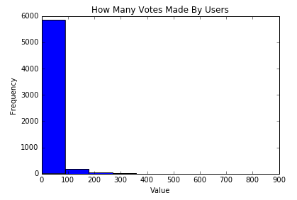
#make histogram of number of references made by a user
plt.hist(from_counts)
plt.title("How Many Votes Made By Users")
plt.xlabel("Value")
plt.ylabel("Frequency")
plt.show()
We see the following plot, with the now familiar display of votes by users. I think this is one of the plainer layouts I have seen:
Now we make a histogram of the references made for a user with the following code:
#make histogram of number of references made for a user
plt.hist(to_counts)
plt.title("How Many Votes Made for User")
plt.xlabel("Value")
plt.ylabel("Frequency")
plt.show()
We see the votes by users plot as follows. I hadn't expected such lopsided results: only a few people vote a lot and only a few people got significant votes:
