
R has built-in functionality for splitting up a data frame between training and testing sets, building a model based on the training set, predicting results using the model and the testing set, and then visualizing how well the model is working.
For this example, I am using airline arrival and departure times versus scheduled arrival and departure times from http://stat-computing.org/dataexpo/2009/the-data.html for 2008. The dataset is distributed as a .bz2 file that unpacks into a CSV file. I like this dataset, as the initial row count is over 7 million and it all works nicely in Jupyter.
We first read in the airplane data and display a summary. There are additional columns in the dataset that we are not using:
df <- read.csv("Documents/2008-airplane.csv")
summary(df)
...
CRSElapsedTime      AirTime          ArrDelay          DepDelay
 Min.   :-141.0   Min.   :   0     Min.   :-519.00   Min.   :-534.00
 1st Qu.:  80.0   1st Qu.:  55     1st Qu.: -10.00   1st Qu.:  -4.00
 Median : 110.0   Median :  86     Median :  -2.00   Median :  -1.00
 Mean   : 128.9   Mean   : 104     Mean   :   8.17   Mean   :   9.97
 3rd Qu.: 159.0   3rd Qu.: 132     3rd Qu.:  12.00   3rd Qu.:   8.00
 Max.   :1435.0   Max.   :1350     Max.   :2461.00   Max.   :2467.00
 NA's   :844      NA's   :154699   NA's   :154699    NA's   :136246
     Origin             Dest            Distance          TaxiIn
 ATL    : 414513   ATL    : 414521   Min.   :  11.0   Min.   :  0.00
 ORD    : 350380   ORD    : 350452   1st Qu.: 325.0   1st Qu.:  4.00
 DFW    : 281281   DFW    : 281401   Median : 581.0   Median :  6.00
 DEN    : 241443   DEN    : 241470   Mean   : 726.4   Mean   :  6.86
 LAX    : 215608   LAX    : 215685   3rd Qu.: 954.0   3rd Qu.:  8.00
 PHX    : 199408   PHX    : 199416   Max.   :4962.0   Max.   :308.00
 (Other):5307095   (Other):5306783                    NA's   :151649
    TaxiOut         Cancelled       CancellationCode    Diverted
 Min.   :  0.00   Min.   :0.00000    :6872294        Min.   :0.000000
 1st Qu.: 10.00   1st Qu.:0.00000   A:  54330        1st Qu.:0.000000
 Median : 14.00   Median :0.00000   B:  54904        Median :0.000000
 Mean   : 16.45   Mean   :0.01961   C:  28188        Mean   :0.002463
 3rd Qu.: 19.00   3rd Qu.:0.00000   D:     12        3rd Qu.:0.000000
 Max.   :429.00   Max.   :1.00000                    Max.   :1.000000
 NA's   :137058
  CarrierDelay      WeatherDelay        NASDelay       SecurityDelay
 Min.   :   0      Min.   :   0      Min.   :   0      Min.   :  0
 1st Qu.:   0      1st Qu.:   0      1st Qu.:   0      1st Qu.:  0
 Median :   0      Median :   0      Median :   6      Median :  0
 Mean   :  16      Mean   :   3      Mean   :  17      Mean   :  0
 3rd Qu.:  16      3rd Qu.:   0      3rd Qu.:  21      3rd Qu.:  0
 Max.   :2436      Max.   :1352      Max.   :1357      Max.   :392
 NA's   :5484993   NA's   :5484993   NA's   :5484993   NA's   :5484993
 LateAircraftDelay
 Min.   :   0
 1st Qu.:   0
 Median :   0
 Mean   :  21
 3rd Qu.:  26
 Max.   :1316
 NA's   :5484993
# eliminate rows with NA values
df <- na.omit(df)
Let's create our partitions:
# for partitioning to work data has to be ordered
times <- df[order(df$ArrTime),]
nrow(times)
1524735

# partition data - 75% training
library(caret)
set.seed(1337)
trainingIndices <- createDataPartition(df$ArrTime,p=0.75,list=FALSE)
trainingSet <- df[trainingIndices,]
testingSet <- df[-trainingIndices,]
nrow(trainingSet)
nrow(testingSet)
1143553
381182
Let's build our model of the arrival time (ArrTime) based on the fields:
- CRSArrTime: Scheduled arrival time
- ArrDelay: Arrival delay
- DepDelay: Departure delay
- Diverted: Whether the plane used a diverted route
- CarrierDelay: Delay by the carrier systems
- WeatherDelay: Delay due to weather
- NASDelay: Delay due to NAS
- SecurityDelay: Delay due to security
- LateAircraftDelay: Plane arrived late due to other delay
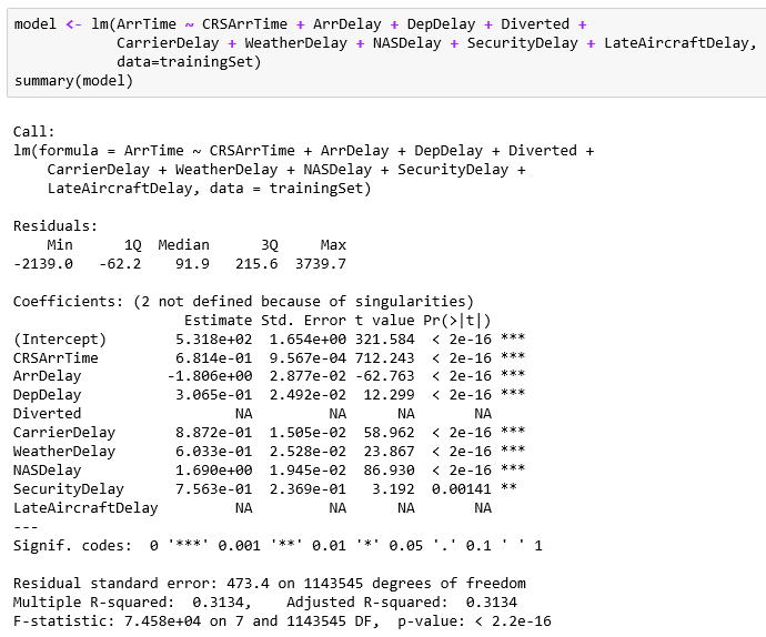
Two of the data items are just flags (0/1), unfortunately. The greatest predictor appears to be the scheduled arrival time. The other various delay factors have small effects. I think it just feels as if it's taking an extra 20 minutes for a security check or the like; it's a big deal when you are traveling.
Now that we have a model, let's use the testing set to make predictions:
predicted <- predict(model, newdata=testingSet)
summary(predicted)
summary(testingSet$ArrTime)
   Min. 1st Qu.  Median    Mean 3rd Qu.    Max.
   -941    1360    1629    1590    1843    2217
   Min. 1st Qu.  Median    Mean 3rd Qu.    Max.
      1    1249    1711    1590    2034    2400
Plot out the predicted versus actual data to get a sense of the model's accuracy:
plot(predicted,testingSet$ArrTime)

Visually, the predictions match up well with the actuals as shown by the almost 45 degree line. That whole set of predicted points on the lower-right portion of the graphic is troublesome. There appears to be many predictions that are well below the actuals. There must be additional factors involved, as I would have expected all of the data to plot in one area rather than two.