
Now we have introduced the rudimentary basics of creating an analysis, let's look at the options when building effective analyses in more detail.
First, we need to create a new analysis to work on, in the same way we did in the preceding section:
- Click on New.
- Click on Analysis.
- Pick the Subject Areas (choose Sample Sales Lite again).
The page you are presented with has the following sections (marked here with green squares):

- Menu Bar: This is where we can navigate to other content, or create new content.
- Subject Areas: This is where we can explore and choose from the attributes and Measures that we previously set up in the
.rpdfile. Normally, you would use a single Subject Area, but you can add other Subject Areas by clicking on the little box icon. Subject Areas will consist of Measures that are on one or more Fact tables, and attributes, that come from one or more dimensions. The Subject Area was defined in the.rpdfile. - Columns: Once we have chosen objects from the Subject Areas, then these will appear in this pane and form the basis of our analysis. Columns can be dragged into this panel, or if you double-click they will appear. Dragging gives you greater control on where they end up.
- Filters: This is where we can add and amend any Filters which are applied to the result set produced by our Selected Columns. Filters are created either by clicking the Filter icon on a selected column, or by clicking on the Filter icon on the Filters header bar. Filters can be defined using the Filter dialog box, or they can be handcrafted SQL.
Filters can be saved for use in other analyses. This means that several analyses can use the same shared Filter which saves time if you need to make a change to the filtering.
- Catalog: Here we can access any previously created and already saved items; for example, Filters or calculations that we may want to use in our current analysis.
Let's explore the options available on each column:
- Select the column
Brandfrom theProductsfolder in the Subject Areas panel by double-clicking it. It will appear in the Columns panel. - Now click on the little cog wheel and you will see the menu shown below:

- Sort: Does what it says on the tin! Note that you can add sorts to an analysis that already contains a sort column. You can remove individual sorts or remove them all in one go.
- Click on Sort Descending.
- Edit formula: Selecting this will open a dialog box with a large number of options, too many to cover in this book, but let's look at the most commonly used features.
- Click on Edit formula:
You are presented with the following dialog box that has the available columns on the left panel, the main formula box on the right, and some quick link buttons at the bottom:

For now, we will enter a formula directly into the box:
- Enter
"Products"."Brand"into the preceding formula box. - Click OK.
- Click on the Results tab to see the brands in capitals.
- Column Properties: It opens another dialog which provides many options on how the column is formatted. You may notice that the title for the
Brandcolumn is now,Brand, so let's change the title to something more friendly:
- Column Properties: It opens another dialog which provides many options on how the column is formatted. You may notice that the title for the
- Click on Column Properties.
- Click on the tab heading Column Format.
- Check the box Custom Headings - This unlocks the preceding box.
- Replace the words with
Brand:
Note that Suppress is selected, which means that if two rows have the same value, they are merged into one box.
- Click OK.
To explore the other Column Properties options, we will add some more columns into our analysis:
- Double-click on the
Calendar Datecolumn twice to add it to our analysis. - Double-click on the
Revenuecolumn. - Check the results by clicking on the Results tab.
- Click on the Criteria tab.
Column Style
- Click on the Column Properties link on the first Calendar Date field.
- Change the Horizontal Alignment to Right.
- Font Color to blue.
- Font Style to Italic.
- Cell Background Color to grey:

Data Format
Now we will change the way the information in the
Datecolumn is presented: - Click on the Data Format tab.
- Tick the Override Default Data Format box (which makes the option available to edit).
- Select a format:

- Click OK.
- On the second
Calendar Datecolumn, set the Date Format option as Custom and enterddddinto the Custom Date Format box:
- Click OK.
Conditional Format
Next, we will explore how to change the format of the data presented, based upon a condition. For example, make
Revenuenumbers red if they are below 1,000 and green if they are above 5,000: - Select Column Properties for the
Revenuecolumn. - Select the Conditional Format tab.
- Click on Add Condition, and select
Revenue. - Set the parameter, less than
1000: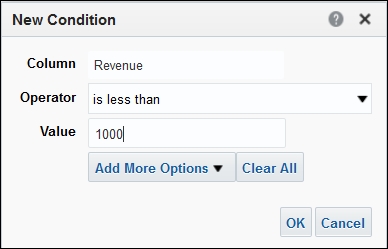
- Click OK.
- Now set the format we would like. Choose yellow bold font on a red background.
- Click OK.
- Add another condition.
- Select
Revenue. - Greater than 5000.
- Set the format to a green background.
- Click OK.
Let's see all those formatting changes now:
- Click on the Results tab:

Interaction
The next column property to explore is the Interaction tab. This enables users to interact with the data they see, perhaps to see more details or view a web page. We will use an example link to a page on a Dashboard:
- Click on Column Properties of the
Revenuecolumn. - Select the Interaction tab.
- Change the value Primary Interaction to Action Links.
- Click on the plus sign.
- Enter a name in the Action Name box.
- Click on the little plus sign (the left-hand running man):

- Select the first option, Navigate to BI Content.
- Select the Sales Summary page on the Quick Start Dashboard (located in folder
Shared FoldersSample LiteDashboardsQuick StartSales Summary). - Click OK, Click OK, Click OK.
At this stage, we need to save our work, so let's save it as
Analysis Twoin theBookfolder: - Click Save As.
- Navigate to the
Bookfolder. - Enter the Name
Analysis Two. - Click OK.
Now you can test the link by running the report (click on the Results tab) and click on one of the
Revenuenumbers. It will now load the Sales Summary page.Reopen our
Analysis Twoby clicking on the breadcrumb link in the bottom left-hand corner.Continuing with the Column options available...
Filters are used to pre-select data. You can use them to limit your results sets, and you can use them to allow users to limit results on a Dashboard. Let's see them in action:
- Click the Filter option on the
Brandcolumn.This opens the Filter dialog box.
You can now click on the Value box and it will display available values:
- Select BIZTECH.
- Click OK:

When you run the results now, only Biztech brands will be listed.
Filters can also be applied to columns that are not displayed in your analysis. In the bottom panel, you can see a Filter button (looks like a funnel).
- Click on the Filter button.
- Click on More Columns....
It will open the Select Column dialog:
- Select the column you would to Filter. We will choose
Per Name Yearfrom theTimefolder. - Change the Operator to is greater than.
- Enter
2008in the Value box. - Click OK.
To create a SQL Filter, you tick the box Convert to SQL and press OK. This will display a SQL statement that represents the Filter you have created.
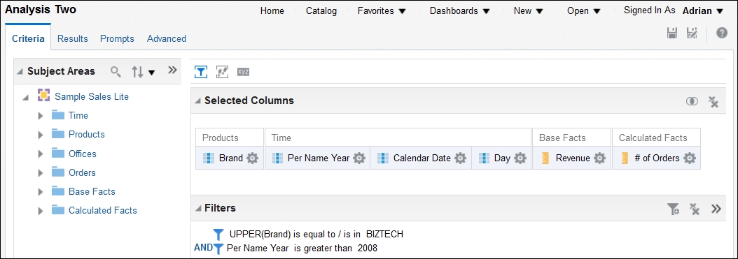
We will add some more columns to our analysis now. Find the column in the left-hand panel and then double-click it or drag to the right-hand panel:
- Add the column
Per Name Yearbetween theBrandandCalendar Datecolumns. - Add the column
# Of Ordersfrom theCalculated Factsfolder.We now have an analysis ready to go:
- Save your analysis again.
After you have saved your work, let's see what it looks like:
- Click on Results.
You can now see a title and a table with our columns in. In the bottom-left panel (called Views) we can see the title and table object. Each analysis can have multiple views, including multiples of the same type.
As you build different views of your data, they are listed in the Views panel. You can add the same type more than once, for example, two Pivot Tables could be created, one with Years in columns, the other with Quarters.
Views each have their own container which have layout and style properties. Looking at Analysis One, we can see that the default horizontal alignment for a table container is to the center.
Let's examine some of the most commonly-used views.
By default, you get one table.
The default properties for a table are that the column headings are fixed, and there is a scroll bar on the right side for viewing results further down the dataset. If we had lots of columns in our analysis, then only the first few would be visible, but there will be another scroll bar at the bottom to view more columns. There are alternative settings that we can set.
We will now edit the properties of the table:
- Click on the Edit Table Properties icon (small pencil at the top-right of the view):
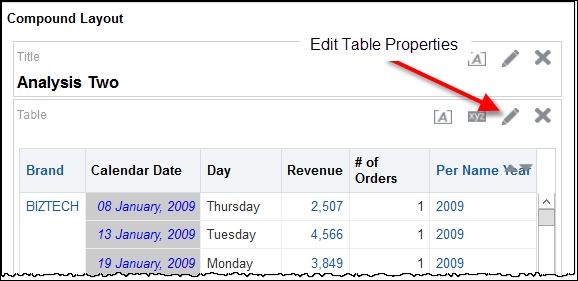
This will open the Edit Table View page:

On this page, we can change what columns are presented, in what order, and where in the view. Note the Table Prompts, Sections, and Excluded boxes. In the preceding image, we are only showing the Layout and Selection steps. You can show or hide parts of the editor using the icons on the menu bar:

- Click on the Properties icon.
- Change the Data Viewing option to Content Paging.
- Enter
5into the Rows per Page box. - Check the box for Row Styling (the default is green and white rows).
- Change the Column headings to As separate rows:

- Click OK.
We will now move some columns around to see the effect:
- Move (by dragging) the
Per Name Yearcolumn to the Table Prompts box. - Move the
Daycolumn to the Excluded box.Now add a total row at the bottom of the table:
- Click on the sum sign next to Columns and Measures:

- Click OK.
- Click Save.
Let's see the results:
- Click on the Results tab:

Try changing the Year Prompt and you will see the results changing.
Click on the small Graph button on the top bar.
This displays all the possible ways of viewing the data we can retrieve in our analysis. In the following image we show the different types of Bar Graphs that are available:

Like tables, Graphs have Prompts, Sections, and Exclude boxes:
- Select the Vertical Bar Graph.
- Take some time to explore Bar Graphs. Experiment with dragging the columns to the various boxes.
- Change the Graph type to Line.
- Move the
Yearcolumn to the Sections box. - Move the
Datecolumn to the Horizontal Axis. - Click on the Properties box (the small xyz icon) and change the scale to 900 width:

- Click on the Titles and Labels tab.
- Change the Horizontal Axis Labels (click on the icon next to the option).
- Set the Axis Labels option to Hide.
- Click OK, Click OK.
- Click Done.
Your analysis now has three views on the page, a title, a table, and a Line Graph.
- Save your analysis.
Pivot Tables are used to move values into columns, just like in Excel.
Here we show a pivot table with Brand in rows, and Year in columns. Pivot Tables also have Prompts, Sections, and Excluded boxes:

The preceding is created in a new analysis:
- Click New.
- Choose Analysis.
- Select the Sample Sales Lite Subject Area.
- Add the columns,
Brand,Per Name Year, andRevenue. - Click on the Results tab.
- Click on the Graph icon and select Pivot Table.
- Move the
Yearcolumn to theColumnssection: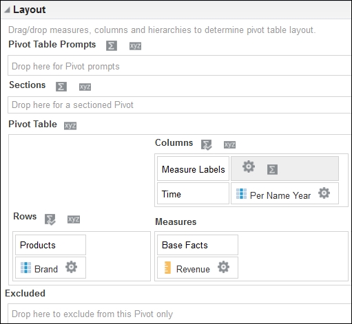
- Click Done.
- Now remove the table from the page by clicking on the little x in the top right corner.
- Save your analysis as
Analysis Three.
Narrative views are very useful for when you want to present your data in a precise manner, usually (but not always) using HTML and CSS. We can mix words, images, and column data to produce impressive output.
A simple narrative example:
- Open
Analysis Threeand go to the Results tab. - Click on the Add View icon and select Narrative - you will find it in the Other Views list.
- In the Prefix box enter
<font size=3>[u]Summary[/u]</font>[br/][br/]. - In the Narrative box enter
[b]@1[/b] Sales in [b]@2[/b] were $@3[br/][br/]. - Enter some text into the Postfix box.
- Click on Done.

As you can see, Narrative views can provide flexibility in how one presents data.
Performance Tiles present a single number in a box. This can be a very effective way to get an import measure presented to users. Any measure that is within an analysis can be used in a tile. We will create a new example analysis to explore performance tiles and also introduce the Filter By function:
- Create a new analysis using the Sample Sales Lite Subject Area.
- Add the
Revenuecolumn four times. - Add a Filter for
Per Year Name = 2010(note we do not need theYearcolumn in the analysis. - Edit the formula for the second
Revenuecolumn. - Click on the Filter... button at the bottom of the box.
- Find Brand in the left pane and double-click it.
- Select BizTech in the criteria.
- Deselect the Filter by Brand Key option.
You should now have a screen like shown in the following screenshot:

- Click OK.
The formula is set so that it will sum the
Revenuecolumn where the"Brand" = Biztech. Your formula will now look as follows:FILTER("Base Facts"."Revenue" USING ("Products"."Brand" ='BizTech')) - Change the column name to
Biztech Revenue. - Edit the third
Revenuecolumn - this time we will sum theTarget Revenue. Set the formula to:FILTER("Base Facts"."Target Revenue" USING ("Products"."Brand" = 'BizTech')) - Change the column name to
BizTech Target. - Edit the fourth
Revenuecolumn. Create a variance percentage column which will show the percentage actualRevenueis under, or over,Target Revenue. Set the formula to:(FILTER("Base Facts"."Revenue" USING ("Products"."Brand" = 'BizTech')) - FILTER("Base Facts"."Target Revenue" USING ("Products"."Brand" = 'BizTech'))/ FILTER("Base Facts"."Target Revenue" USING ("Products"."Brand" = 'BizTech')))*100.0 - Change the column name to
Variance.Now change the Data Format of the
Variance. - Edit Column Properties for the
Variancecolumn. - Select the Data Format tab.
- Tick the Override Default Data Format.
- Change the option Treat Number As to Percentage, and set decimal places to one.
Before we move on, we will add a conditional format on the variance column. We will create a simple red format when the
Revenueis less than theTarget Revenue. First, values less than zero, that is, poor performance against the target. - Click on the Column Properties for the Variance column.
- Select the Conditional Format tab.
- Add a condition.
- Select the
Variancecolumn from the list. - Set the Operator to is less than and put
0(zero) into the Value box. - Click OK.
- Set the format of the font to red and bold.
- Set the background color to
#ff8080(you enter this directly into the box). - Click OK.
Now values more than 10 percent, that is, good performance against target.
- Add condition.
- Select the
Variancecolumn from the list. - Set the Operator to
is greater thanand put10into the Value box. - Click OK.
- Set the background color to
#669966(you enter this directly into the box). - Save the analysis as
Analysis Four.That's the data created, we will now add a Performance Tile:
- View the results.
- Add a view, selecting Performance Tile.
- Set the Measure to the
Variancecolumn. - Untick the Use Measure Description option and edit the Description box. Set it to
Revenue vs Target:
- Click Done.
- Save the analysis.
We now have a Performance Tile which can be added to the page.
Experiment now with different Years to see the results:
- Change the Filter for
Yearto2008. - View the results.
You should now see a green box instead of a white one:

So far in this chapter, we have covered creating a simple analysis, adding a Graph, and saving as Analysis One. We then created a Dashboard and put our Analysis One onto a page. Next, we looked at column sorting, formulae, and column properties, which included the Data Formats, Conditional Formatting, and Interaction features. We also reviewed the most common views that an analysis can present; tables, Graphs, Pivot Tables, narratives, and Performance Tiles.
There are 46 different view types in OBIEE 12c, so you should take some time to experiment with some of those we haven't covered in detail. Check out the Heatmap view and Gauge views for yourself.
In the next part of this chapter, we will look at how you present your analysis on Dashboard pages, and how users can interact with your Dashboards.
In most of our example analyses, we have been setting Filters for specific values, for example, we added the Filter Per Name Year is greater than 2008 into Analysis Two.
Instead of predetermining what Year the user would like to see, we can give the user the option of choosing the Year when the analysis is run. This turns a static analysis into an interactive analysis.
There are two ways to make an interactive analysis, either ask users within the analysis, by using the Prompts tab, or by placing the analysis onto a Dashboard which has a Dashboard Prompt object on it.
We will now examine the Prompts held within an analysis:
- Create a new analysis, using Samples Sales Lite.
- Add the columns,
Per Name Year,Per Name Quarter, andRevenue. - Click on the Prompts tab.
- Click on the green plus sign to add a new Prompt.
- Select Column Prompt
Per Name Year. - Change the Label to
Choose Year. - Change the User Input to List Box.
- Change the Default Selection to Specific Values and add
2009. - Click OK:
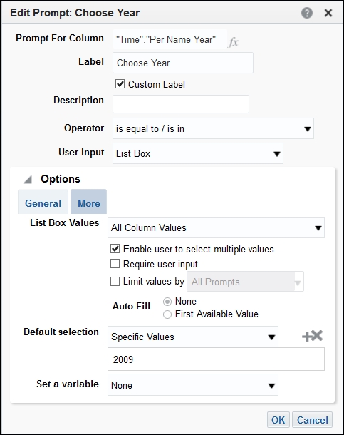
- Save your work as
Analysis Fivein theBookfolder. - Click on the Home tab.
Analysis Fiveis listed in the recent section. - Click on the Open link under the title of
Analysis Five:
The analysis will now open with the Prompts page. You select the Years you are interested in seeing and when you press OK, the results will appear.
We can also see similar behavior when we place the analysis onto a Dashboard page:
- Edit Dashboard One (click on the Edit link on the home page).
- Click on the Add Dashboard Page icon and select Add Dashboard Page.
- Enter
Page Twoin the Page Name box. - Click OK.
- Drag
Analysis Fivefrom theCatalogonto the page. - Click on the Save icon.
- Click on the Run icon.
- Select the
Yearfrom the Prompt box and click OK.
Now we will look at the other method, using a Dashboard Prompt object on the Dashboard.
There are two tasks when creating an interactive Dashboard. First, you make your analysis responsive by adding Filters, and then you create a corresponding Prompt on the Dashboard Prompt object. The good news is that you can set a column to any of the available Prompt types, including a simple Is Prompted option.
A column in an analysis will only respond to a Dashboard Prompt if the column has a Filter.
We will create the analysis first, which will be similar to Analysis Five:
- Create a new analysis, using Samples Sales Lite.
- Add the columns,
Per Name Year,Per Name QuarterandRevenue. - Add a Filter to the
Per Name Yearcolumn. - Set the Operator to is prompted:

- Save your analysis as
Analysis Six.Now we create a Dashboard Prompt:
- Click on New.
- Choose Dashboard Prompt.
- Pick the
Sample Sale LiteSubject Area. - Click on the green plus icon to add a Column Prompt.
- Select the
Per name Yearcolumn. - Experiment with the available options. Choose a default specific value, and Require User input:

- Click OK.
- Save the Dashboard Prompt in the
Bookfolder asPrompt One.Now we have created the two ingredients, let's put them together on a Dashboard page.
- On the Home page, click on the Edit link for Dashboard One.
- Add a new page,
Page Three. - Drag the
Prompt Oneonto the page, and then theAnalysis Sixbelow it:
- Save the page, then run it:

Experiment by selecting different Prompt values and pressing Apply. See how the results change depending upon what values you choose.
Remember, only columns that have a Filter on will respond to a Dashboard Prompt.
All of the analyses we have built so far have used the default way of presenting the results. The default place to see results is on the Compound Layout screen. This is a results page that has our views on. We can choose which views to place on the compound layout, and we can also create more than one compound layout screen.
To demonstrate this feature, we will create a new analysis, and on this analysis, we will create three separate layouts. We will then place these on a Dashboard page:
- Create a new analysis based upon Sample Sales Lite.
- Add the columns
Per Name Year,Brand,Product,Revenue,Target Revenue. - Save it as
Analysis Sevenin theBookfolder. - View the results.
By default, you will see a title and a table view. We will now create a few more views so that we can place them on different layouts.
- Create a new Table view using the Add View icon on the views menu bar:

- Remove the
BrandandProductscolumns to the excluded section. - Click Done.
- Rename the view using the rename icon on the Views menu bar:

- Rename the Table to
Year Totals Table. - Add a Graph view. Choose Line Graph and place
Brandin the Prompts section,Yearin the Group By section and Measure Labels in the Vary Color by section. - Click Done.
- Rename the view as
Revenue Lines graph.
We now have four views; one title, two tables and one Graph view.
Now we will create a new layout:
- Click on the create Compound Layout icon:

When you create a new layout, the system will automatically create a new title view:
- Rename the layout as
Year Layout. - Drag the
Year Totaltable over below the title. - Add another Compound Layout.
- Rename it
Graph Revenue Layout. - Add the Graph view,
Revenue Lines graph. - Save it as
Analysis Seven.The analysis is now ready to place on a Dashboard:
- Open Dashboard One in Edit mode.
- Add a new page, calling it
Compound Example One. - Drag
Analysis Sevenonto the new page. - Now click on the analysis properties (xyz icon).
- Hover over Show View and the list of available views will appear.
- Select Year Layout:

- Save your page and run it.
What you are now looking at is the Year Totals Table and a title which are both on the Compound Layout - Year Totals Layout.
So far, we have viewed analysis results on the Dashboard page. Another option when viewing Analysis results from a Dashboard is to launch the analysis from the page and view in another window.
Let's see this in action using Analysis Seven, and also introduce the new 12c feature of sub pages:
- Open the Compound Example page of the Dashboard in edit mode.
- Add a sub page (available from the add page icon) and call it
Example Sub Page. - Drag
Analysis Sevenonto the sub page. - Change the view shown to Graph Revenue Layout.
- From the analysis properties icon, hover over Display Results.
- Click on Link - In A Separate Window:

- Save the page and run it.
All we see now is a link. To view the results, click on the link and a window will pop open showing the Graphs.
One feature to explore while we are here, is the Report Links option on the properties menu.
Report links are presented at the bottom of the view and can be customized for each view. The users' favorite link is the Export one!:

Add the links as shown above, then re-run the page and you will see the links at the bottom.
When we run a Dashboard page, we sometimes want to switch views quickly but stay on the page. The good news is that there is a feature for that in the analysis views:
- Open
Analysis Sevenin edit mode. - View the results.
- Add a view called
View Selector(from the other views link). - Enter a Caption (
Select View). - Select some views from the list in the left-hand box and move them to the right side (the first one will be the default view):

- Save the analysis.
- Open Dashboard One in Edit mode and add another page.
- Call it
Selector Example. - Drag
Analysis Sevenonto the page. - Change the view to
View Selector 1. - Save and run the page:

Now you can switch views quickly.
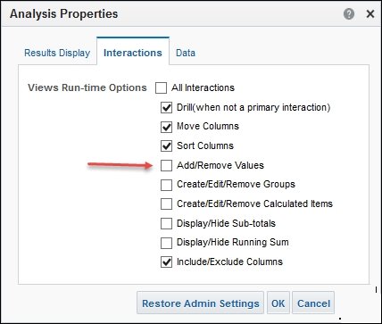
When we place a view on a Dashboard, we set the default columns that are displayed. We can allow users to show columns that are excluded from the view, or exclude columns from the view.
To enable column hiding, set the Interaction Properties (available on the Analysis Properties):
One of the best aspects of OBIEE is the ability to direct the user to the most useful information. Sections on a Dashboard page can be hidden or displayed conditionally. The condition can be a specific analysis or can be a saved condition object.
We will put together an example using the condition object. The steps will be the following:
- Create an analysis
- Create a condition object
- Create a Dashboard Prompt - we include this to help demonstrate the concept
- Create a Dashboard page
- Add a section and set it to conditionally display
Let's get on with it:
- Create an analysis, based upon Sample Sales Lite.
- Add the columns
Per Name MonthandRevenue. - Add a Filter to the
Yearcolumn, set it to2011 / 12. - Add a Filter to the
Revenuecolumn, set it toless than 100000. - Save the analysis as
Analysis Eight:
Now create the condition:
- From the New menu, select Condition.
- Browse to and select the
Analysis Eight. - Save it as
Condition One.Next, we create the Dashboard Prompt:
- From the New menu, select Dashboard Prompt.
- Choose the Sample Sale Lite Subject Area.
- Add a Column Prompt.
- Select
Per Name Month. - Set the options that all are not ticked.
- Set the Default Value to a specific month.
- Edit the Page Properties (use the pencil icon).
- Untick the Show Apply Button option.
- Untick the Show Reset Button option.
- Save the Prompt as
Prompt two.Putting it all together:
- Create a new page on Dashboard One.
- Call it Condition Example.
- Add a Section (drag the Section object from the top-left panel).
- Click on the properties icon and select Condition... from the drop-down menu:

- Click on the select Condition icon and find the Condition One object in the
Bookfolder:
We will add some content into the section. A simple message will be sufficient in this example. You can add anything into a conditionally displaying section.
- Drag text from the top left panel.
- Enter some text:

- Click OK.
- Save the Dashboard.
- Run it.
You will now see a blank page!
The condition returned false, because there are no records for 2011 / 12.
To prove it will show when Revenue is low, let's add another section:
- Go back to Edit mode.
- Drag another section onto the page.
- Drag the Dashboard Prompt,
Prompt Twointo the second section. - Drag
Analysis Eightinto the second section. - Save the page.
- Run the page:

Default: you will see no results.
- Change the Prompt Value to
2008 /10.
Our sales message appears!
We just built a Dashboard page that can conditionally display a section, depending upon the result of a condition, which is the checking of results of an analysis. We choose a simple example but this could be useful to highlight something to users that needs to be addressed, for example, sales orders not yet processed.
Conditionally displaying results means your users are informed when they need to be, and not when they don't. This changes the way people interact with their data. Do not give them all the data to determine what is good or bad, but present the messages that you need them to act on.
OBIEE is not just for presenting historical Graphs. OBIEE is great for day to day operational use, reporting to users any type of information that they need to do their job. We like to use the phrase, "It is better to see the bunny in the headlights, than the roadkill in the mirror"!
When presenting more than one analysis on a Dashboard page, you can link them together using the Master Detail feature. One analysis will be the master, and the other, the detailed analysis.
We will put together an example. The steps will be:
- Create the Master Analysis
- Set the communication channel identifier
- Create child views
- Set the Filter for the channel
- Place both on a Dashboard page
Let's get on with it:
- Create an Analysis, based upon Sample Sales Lite.
- Add the columns
Per Name Year,Per Name MonthandRevenue. - Edit the
Per Name YearColumn Properties. - Change the Primary Interaction on the
Yearcolumn value to Send Master-Detail Events. - In the box that appears, put
salesyear. - Save the analysis as
Analysis Nine:
Now we create the child views:
- View the results page.
- Add a Graph View.
- Place the
Yearcolumn into the Prompts section. - Edit the View Properties.
- Check the box for Listen to Master-Detail Events.
- Enter
salesyearinto the Channel box. - Save the analysis:

The analysis is now ready to use. We will demonstrate it on a Dashboard page:
- Add a page to Dashboard One, call it
Master Detail Example. - Add
Analysis Nine. - Set the View to
Table 1. - Add another column to the page (drag from the left panel).
- Change the properties of the second column, removing the page break.
The above setting will place the second column to the right of the first one:
- Drag
Analysis Nineonto the page again, into the second column. - Change the view displayed to the Graph.
- Save the page and run it.
Now, when you click on a Year in the table, the Graph will automatically update. Note that we could have also created a different analysis to listen to the Master Detail channel.
When a Dashboard is loaded, the query runs with the default values if there are defaults set. This may not suit the user, so they set the Prompt to the value of their choice, for example, their office or region. The next time the page is run, the user does not want to have to repeat the process again, so they can save the settings applied. This is simply done by using the Dashboard properties wheel, and selecting the Save Current Customization option:
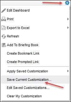
Select the Use as default option and your Filters will be applied automatically when you run the page. You can save many customizations, and switch between them using the Apply Saved Customization option in the menu.
So far, we have mainly used simple presentation of columns that are available in the Subject Area. We introduced the formula editing feature when we used the UPPER() function, and there are large number of functions available which can create a calculated result in a column. There is also a method available to calculate row totals.
Let's look at some typical calculations:
SUM: You can sum any numerical column, from any of the folders, although you would normally operate on measure columns.
A typical SUM calculation would look as follows:
SUM("Base Facts"."Revenue" )
You can also set a level to aggregate by, for example a Year or a brand:
SUM("Base Facts"."Revenue" by "Time"."Per Name Year")
A typical use for the above calculation would be to create a Percentage column:
("Base Facts"."Revenue" / SUM("Base Facts"."Revenue" by "Time"."Per Name Year"))*100.0
Now we will create an analysis to demonstrate the function:
- Create a new analysis using the Samples Sales Subject Area.
- Add
Per Name YearandBrand. - Add the
Revenuefive times. - Edit the formula on the second
Revenuecolumn, and change it toSUM("Base Facts"."Revenue" by "Time"."Per Name Year"). - Change the heading to
Revenue By Year. - Edit the formula on the third
Revenue, and change it toSUM("Base Facts"."Revenue"). - Edit the formula on the fourth
Revenue, and change it to( "Base Facts"."Revenue" / SUM("Base Facts"."Revenue" by "Time"."Per Name Year")) *100.0. - Change the heading to
% of Year. - Change the Data Format to Percentage.
- Edit the formula on the fifth
Revenue, and change it to( "Base Facts"."Revenue" / SUM("Base Facts"."Revenue" by "Time"."Per Name Year")) *100.0. - Change the heading to
% of Year. - Change the Data Format to Percentage.
- View the results.
- Edit the Table View.
- Set the Totals for the
Yearcolumn and for the Columns (both After). - Save it as
Analysis Ten:
You can see that the Revenue by Year total is repeated for each row of the Year, but the Sum of Revenue is repeated for every row.
You can also use the Aggregate Function to get a measure column total, for example "Base Facts"."Revenue"/Aggregate("Base Facts"."Revenue" BY)*100.0 would also provide the overall percentage.
TimestampDiff: A function that work with dates and times, it calculates the difference between two dates, and presents the result in Years, Months, Weeks, Days, Hours, Minutes or Seconds.
The format is as follows:
TimestampDiff(interval, date 1, date 2), where interval is one of the following:
SQL_TSI_SECOND,SQL_TSI_MINUTE,SQL_TSI_HOUR,SQL_TSI_DAY,SQL_TSI_WEEK,SQL_TSI_MONTH,SQL_TSI_QUARTER,SQL_TSI_YEAR.
We often use the function to Filter data for relative dates, for example, display the Total of Sales for the last two months.
TIMESTAMPADD:TIMESTAMPADDis similar to theTimeStampDifffunction, but it returns a date. You add or subtract an interval (For example, Week) to a date. The same list of intervals is used. The format is as follows:
TIMESTAMPADD(interval, number of intervals, date 1)
If the number of intervals is negative, then you are subtracting from date 1. The example is as follows:
TIMESTAMPADD(SQL_TSI_DAY, -1, date '2010-12-30')
This will return the day before 30th December 2010.
Let's create an analysis using the timeStampDiff function:
- Create a new analysis using the Samples Sales Subject Area.
- Add
Calendar Datetwice andRevenue. - Edit the formula on the second date column, and change it to
TIMESTAMPDIFF(SQL_TSI_WEEK, "Time"."Calendar Date", date '2010-12-30') - Change the Heading to
Week. - Add a filer on the
Weekcolumn, set it toless than 6. - View the results.
- Add a Line chart.
- Set it to be a curved line (use the icon on the toolbar).
- Set the horizontal as the
Weekcolumn. - Save it as
Analysis Eleven: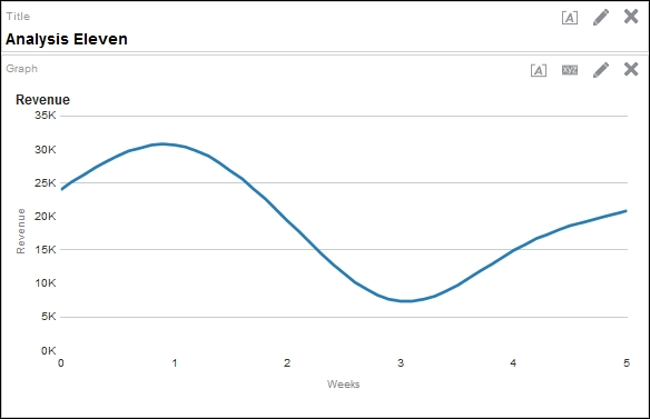
This example shows the trend of sales over 6 rolling weeks from December 30, 2010.
At this point, it is also worth mentioning the special functions of CURRENT_DATE(), CURRENT_TIME(), CURRENT_TIME(), and NOW(). Current date will return a date that relates to the server, without any time components. Current time will only return the time on the server, without any date element. Current_Timepstamp will return both the date and time. Now is exactly the same as current time-stamp.
These functions can be useful in creating a reference point for your other functions. For example, you may want to see the sales for the last three days, in which case you would use the function TIMESTAMPDIFF(SQL_TSI_DAY, "Time"."Calendar Date", CURRENT_DATE) and set a Filter on this column for less than four.
RCOUNT: This useful function provides the user with a row count column in the results. UseRCOUNT(1)to have a simple row count for each row of the results. You can also use a group by clause in the functions, for example,RCOUNT(1 BY Per name Year)will reset the counter to one each time theYearchanges.
This function can be useful to just display a small sample of the results, by having a Filter on the RCOUNT(1):
TopN: This is a combination of a Filter and a function at the same time. It determines the order of a measure, by its value from highest to lowest, and then Filters your recordset for the top N. For example, you can see a list of the top 10 months byRevenueusing:TOPN("Base Facts"."Revenue",10). If you just want to see how a number ranks overall, then set the Filter number to be larger than the expected number of total result rows.BottomNis similar toTopNbut ranks from smallest to largest.
NTile:NTile(number,scale)arranges numbers on a scale are presents where the row lies on the scale. For example, if you had a list of month numbers and used a scale of 6, that is,NTILE(Month Number, 6), then January and February will be ntile 1, March and April will be 2, May and June will be 3, and so on.
- Calculated rows: So far, we have looked at some example functions that operate on a column value, in a single row. With OBIEE, we can also sum rows together, and not just using table properties. We can create Groups which bring data together.
Let's demonstrate this using Analysis Ten as a starting point:
- Edit
Analysis Ten. - Save As
Analysis Twelve. - In the Criteria view, click on the Selection step icon (looks like a couple of feet!).
- Click on New Step in the Brand section.
- Select New Group from the sub menu:
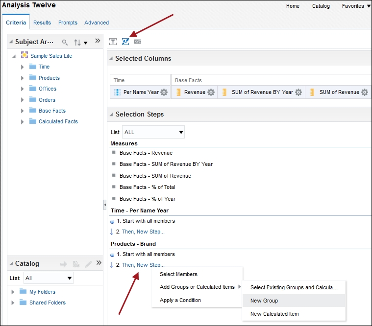
- Give the gsroup a name,
Biz and Home. - Select the Brands, BizTech and HomeView.
- Click OK.
- Click Save.
- View the Results tab.
You will now see a new row added to the table view, called Biz and Home, which shows the totals for those two brands only.
One of the cool new features in OBIEE is the ability to create a column and save it for use elsewhere. This feature enables a column to be created once and used in multiple analyses. Better still, any updates to the column can be made in one place and all analyses will reflect the changes.
Let take a quick look at Saved columns:
- Create a new analysis.
- Add the
Officecolumn. - Edit the formula, set it to be
LEFT("Offices"."Office", 1). - Click on the Bins tab.
- Click on Add Bin.
- Set the Operator to Less than.
- Enter
Hin the Value box. - Click OK.
- Enter and Name, use
A-G. - Add another bin for less than R.
- Add another Bin for Equal to or less than Z.
- Click OK.
- Now save the column by clicking on the Column Properties Wheel and select the bottom option, Save Column As...
- Choose a name for the saved object, use
Office_Group. - Change the location to the
Bookfolder. You will get a warning message about the location, you can safely ignore the message.
So, we now have a column created, and you can edit it as a stand-alone object. Navigate in the catalog to the Book folder and you will see the column you just created. You can right-click on it and you get two edit options, the formula or the Properties.
Now we will use the column:
- Create a new analysis.
- In the Catalog panel, locate the
Bookfolder and click on theOffice_Groupobject. - Click on the right-facing arrow to add the column to our analysis.
- Add the
Revenuecolumn. - Save as
Analysis Thirteen.