
Switching to Full-Screen
,Switching to full-screen implies hiding the system tray and the application bar in its entirety. The early official Windows Phone architecture documents mention a supposed FullScreen property. Yet, in the final version of the SDK, no such property existed. No matter, because going full-screen involves simply hiding the system tray and the application bar. This is made rather easy by using the data binding capabilities of the custom AppBar class. Fortunately the system tray’s visibility is specified using a Boolean attached property called SystemTray.IsVisible. As a consequence, in the view, we are able to data bind this property to a viewmodel property, like so:
shell:SystemTray.IsVisible="{Binding SystemTrayVisible}"
A menu item is used to execute a viewmodel command called FullScreenCommand, which sets the viewmodel’s SystemTrayVisible and ApplicationBarVisible properties to false, effectively hiding both items (see Figure 8.4).
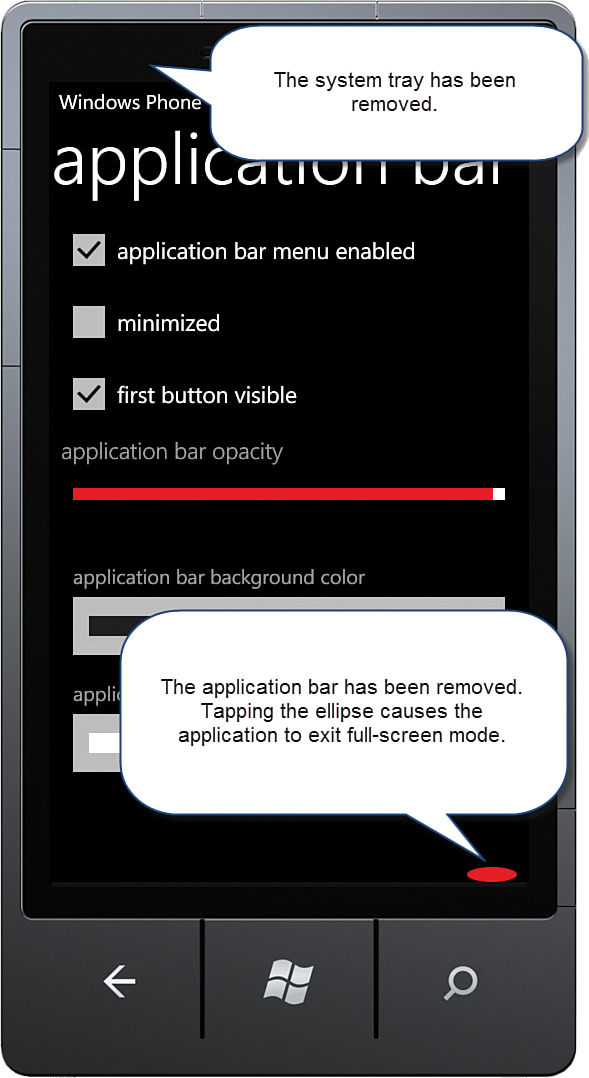
A simple Ellipse element is provided to allow the user to return from full-screen mode. The ellipse markup makes use of the custom commanding infrastructure.
The Ellipse class does not provide a Tap event, and so a nondefault event MouseLeftButtonUp is specified using the Commanding.Event attached property, as shown:
<Ellipse dv:Commanding.Command="{Binding FullScreenCommand}"
dv:Commanding.CommandParameter="false"
dv:Commanding.Event="MouseLeftButtonUp"
Visibility="{Binding ApplicationBarVisible,
Converter={StaticResource BooleanToVisibilityConverter},
ConverterParameter=Collapsed}"
Fill="{StaticResource PhoneAccentBrush}"
Width="50"
Height="15"
HorizontalAlignment="Right"
VerticalAlignment="Bottom" />
The custom BooleanToVisibilityConverter is used to hide or show the ellipse depending on the value of the viewmodel’s ApplicationBarVisible property.
Modifying the Application Bar’s Foreground and Background Colors
Two Windows Phone Toolkit ListPicker controls are populated with a collection of colors, allowing you to try out variations of the application bar’s foreground (text and icon) color and background color. Selecting a color from either ListPicker changes the corresponding viewmodel Color property, which changes the appearance of the application bar.
For more information on the Windows Phone Toolkit ListPicker control, see Chapter 9, “Enriching the User Experience with the Windows Phone Toolkit Controls.”
A custom IValueConverter is used to convert to and from a Color value and a SolidColorBrush, allowing color bands to be rendered in the ListPicker (see Listing 8.3).
LISTING 8.3. ColorToBrushConverter Class
public class ColorToBrushConverter : IValueConverter
{
public object Convert(
object value, Type targetType, object parameter, CultureInfo culture)
{
if (value == null)
{
return null;
}
return new SolidColorBrush((Color)value);
}
public object ConvertBack(
object value, Type targetType, object parameter, CultureInfo culture)
{
if (value == null)
{
return null;
}
return ((SolidColorBrush)value).Color;
}
}
Each ListPicker is populated via a binding to the Colors property of the viewmodel. A DataTemplate defined as a page resource named ColorPickerItemTemplate determines how each Color is rendered within the ListPicker:
<phone:PhoneApplicationPage.Resources>
<ValueConverters:ColorToBrushConverter x:Key="ColorToBrushConverter" />
<l:ApplicationBarModeToBooleanConverter
x:Key="ApplicationBarModeToBooleanConverter" />
<DataTemplate x:Name="ColorPickerItemTemplate">
<Rectangle
Fill="{Binding .,
Converter={StaticResource ColorToBrushConverter}}"
Width="400" Height="20" Margin="0,10,0,10" />
</DataTemplate>
</phone:PhoneApplicationPage.Resources>
When the user selects a color, a property is updated in the viewmodel via the SelectedItem property of the ListPicker, as shown:
<toolkit:ListPicker Header="application bar background color"
ItemsSource="{Binding Colors}"
SelectedItem="{Binding BackgroundColor, Mode=TwoWay}"
ItemTemplate="{StaticResource ColorPickerItemTemplate}"
FullModeItemTemplate="{StaticResource ColorPickerItemTemplate}" />