2.2 Basic Statistical Descriptions of Data
For data preprocessing to be successful, it is essential to have an overall picture of your data. Basic statistical descriptions can be used to identify properties of the data and highlight which data values should be treated as noise or outliers.
This section discusses three areas of basic statistical descriptions. We start with measures of central tendency (Section 2.2.1), which measure the location of the middle or center of a data distribution. Intuitively speaking, given an attribute, where do most of its values fall? In particular, we discuss the mean, median, mode, and midrange.
In addition to assessing the central tendency of our data set, we also would like to have an idea of the dispersion of the data. That is, how are the data spread out? The most common data dispersion measures are the range, quartiles, and interquartile range; the five-number summary and boxplots; and the variance and standard deviation of the data. These measures are useful for identifying outliers and are described in Section 2.2.2.
Finally, we can use many graphic displays of basic statistical descriptions to visually inspect our data (Section 2.2.3). Most statistical or graphical data presentation software packages include bar charts, pie charts, and line graphs. Other popular displays of data summaries and distributions include quantile plots, quantile–quantile plots, histograms, and scatter plots.
2.2.1 Measuring the Central Tendency: Mean, Median, and Mode
In this section, we look at various ways to measure the central tendency of data. Suppose that we have some attribute X, like salary, which has been recorded for a set of objects. Let ![]() be the set of N observed values or observations for X. Here, these values may also be referred to as the data set (for X). If we were to plot the observations for salary, where would most of the values fall? This gives us an idea of the central tendency of the data. Measures of central tendency include the mean, median, mode, and midrange.
be the set of N observed values or observations for X. Here, these values may also be referred to as the data set (for X). If we were to plot the observations for salary, where would most of the values fall? This gives us an idea of the central tendency of the data. Measures of central tendency include the mean, median, mode, and midrange.
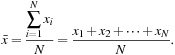
The most common and effective numeric measure of the “center” of a set of data is the (arithmetic) mean. Let ![]() be a set of N values or observations, such as for some numeric attribute X, like salary. The mean of this set of values is
be a set of N values or observations, such as for some numeric attribute X, like salary. The mean of this set of values is
 (2.1)
(2.1)
This corresponds to the built-in aggregate function, average (avg() in SQL), provided in relational database systems.
Example 2.6
Mean
Suppose we have the following values for salary (in thousands of dollars), shown in increasing order: 30, 36, 47, 50, 52, 52, 56, 60, 63, 70, 70, 110. Using Eq. (2.1), we have
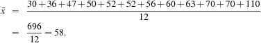
Thus, the mean salary is $58,000.
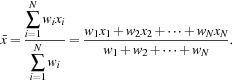
Sometimes, each value xi in a set may be associated with a weight wi for ![]() . The weights reflect the significance, importance, or occurrence frequency attached to their respective values. In this case, we can compute
. The weights reflect the significance, importance, or occurrence frequency attached to their respective values. In this case, we can compute
 (2.2)
(2.2)
This is called the weighted arithmetic mean or the weighted average.
Although the mean is the singlemost useful quantity for describing a data set, it is not always the best way of measuring the center of the data. A major problem with the mean is its sensitivity to extreme (e.g., outlier) values. Even a small number of extreme values can corrupt the mean. For example, the mean salary at a company may be substantially pushed up by that of a few highly paid managers. Similarly, the mean score of a class in an exam could be pulled down quite a bit by a few very low scores. To offset the effect caused by a small number of extreme values, we can instead use the trimmed mean, which is the mean obtained after chopping off values at the high and low extremes. For example, we can sort the values observed for salary and remove the top and bottom 2% before computing the mean. We should avoid trimming too large a portion (such as 20%) at both ends, as this can result in the loss of valuable information.
For skewed (asymmetric) data, a better measure of the center of data is the median, which is the middle value in a set of ordered data values. It is the value that separates the higher half of a data set from the lower half.
In probability and statistics, the median generally applies to numeric data; however, we may extend the concept to ordinal data. Suppose that a given data set of N values for an attribute X is sorted in increasing order. If N is odd, then the median is the middle value of the ordered set. If N is even, then the median is not unique; it is the two middlemost values and any value in between. If X is a numeric attribute in this case, by convention, the median is taken as the average of the two middlemost values.
Example 2.7
Median
Let’s find the median of the data from Example 2.6. The data are already sorted in increasing order. There is an even number of observations (i.e., 12); therefore, the median is not unique. It can be any value within the two middlemost values of 52 and 56 (that is, within the sixth and seventh values in the list). By convention, we assign the average of the two middlemost values as the median; that is, ![]() . Thus, the median is $54,000.
. Thus, the median is $54,000.
Suppose that we had only the first 11 values in the list. Given an odd number of values, the median is the middlemost value. This is the sixth value in this list, which has a value of $52,000.
The median is expensive to compute when we have a large number of observations. For numeric attributes, however, we can easily approximate the value. Assume that data are grouped in intervals according to their xi data values and that the frequency (i.e., number of data values) of each interval is known. For example, employees may be grouped according to their annual salary in intervals such as $10–20,000, $20–30,000, and so on. Let the interval that contains the median frequency be the median interval. We can approximate the median of the entire data set (e.g., the median salary) by interpolation using the formula
![]() (2.3)
(2.3)
where L1 is the lower boundary of the median interval, N is the number of values in the entire data set, ![]() is the sum of the frequencies of all of the intervals that are lower than the median interval, freqmedian is the frequency of the median interval, and width is the width of the median interval.
is the sum of the frequencies of all of the intervals that are lower than the median interval, freqmedian is the frequency of the median interval, and width is the width of the median interval.
The mode is another measure of central tendency. The mode for a set of data is the value that occurs most frequently in the set. Therefore, it can be determined for qualitative and quantitative attributes. It is possible for the greatest frequency to correspond to several different values, which results in more than one mode. Data sets with one, two, or three modes are respectively called unimodal, bimodal, and trimodal. In general, a data set with two or more modes is multimodal. At the other extreme, if each data value occurs only once, then there is no mode.
For unimodal numeric data that are moderately skewed (asymmetrical), we have the following empirical relation:
![]() (2.4)
(2.4)
This implies that the mode for unimodal frequency curves that are moderately skewed can easily be approximated if the mean and median values are known.
The midrange can also be used to assess the central tendency of a numeric data set. It is the average of the largest and smallest values in the set. This measure is easy to compute using the SQL aggregate functions, max() and min().
In a unimodal frequency curve with perfect symmetric data distribution, the mean, median, and mode are all at the same center value, as shown in Figure 2.1(a).
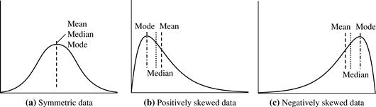
Data in most real applications are not symmetric. They may instead be either positively skewed, where the mode occurs at a value that is smaller than the median (Figure 2.1b), or negatively skewed, where the mode occurs at a value greater than the median (Figure 2.1c).
2.2.2 Measuring the Dispersion of Data: Range, Quartiles, Variance, Standard Deviation, and Interquartile Range
We now look at measures to assess the dispersion or spread of numeric data. The measures include range, quantiles, quartiles, percentiles, and the interquartile range. The five-number summary, which can be displayed as a boxplot, is useful in identifying outliers. Variance and standard deviation also indicate the spread of a data distribution.
Range, Quartiles, and Interquartile Range
To start off, let’s study the range, quantiles, quartiles, percentiles, and the interquartile range as measures of data dispersion.
Let ![]() be a set of observations for some numeric attribute, X. The range of the set is the difference between the largest (max()) and smallest (min()) values.
be a set of observations for some numeric attribute, X. The range of the set is the difference between the largest (max()) and smallest (min()) values.
Suppose that the data for attribute X are sorted in increasing numeric order. Imagine that we can pick certain data points so as to split the data distribution into equal-size consecutive sets, as in Figure 2.2. These data points are called quantiles. Quantiles are points taken at regular intervals of a data distribution, dividing it into essentially equal-size consecutive sets. (We say “essentially” because there may not be data values of X that divide the data into exactly equal-sized subsets. For readability, we will refer to them as equal.) The kth q-quantile for a given data distribution is the value x such that at most k/q of the data values are less than x and at most (q − k)/q of the data values are more than x, where k is an integer such that 0 < k < q. There are q − 1 q-quantiles.
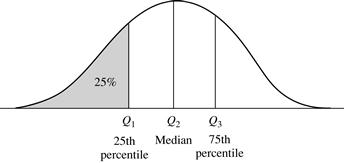
Figure 2.2 A plot of the data distribution for some attribute X. The quantiles plotted are quartiles. The three quartiles divide the distribution into four equal-size consecutive subsets. The second quartile corresponds to the median.
The 2-quantile is the data point dividing the lower and upper halves of the data distribution. It corresponds to the median. The 4-quantiles are the three data points that split the data distribution into four equal parts; each part represents one-fourth of the data distribution. They are more commonly referred to as quartiles. The 100-quantiles are more commonly referred to as percentiles; they divide the data distribution into 100 equal-sized consecutive sets. The median, quartiles, and percentiles are the most widely used forms of quantiles.
The quartiles give an indication of a distribution’s center, spread, and shape. The first quartile, denoted by Q1, is the 25th percentile. It cuts off the lowest 25% of the data. The third quartile, denoted by Q3, is the 75th percentile—it cuts off the lowest 75% (or highest 25%) of the data. The second quartile is the 50th percentile. As the median, it gives the center of the data distribution.
The distance between the first and third quartiles is a simple measure of spread that gives the range covered by the middle half of the data. This distance is called the interquartile range (IQR) and is defined as
![]() (2.5)
(2.5)
Five-Number Summary, Boxplots, and Outliers
No single numeric measure of spread (e.g., IQR) is very useful for describing skewed distributions. Have a look at the symmetric and skewed data distributions of Figure 2.1. In the symmetric distribution, the median (and other measures of central tendency) splits the data into equal-size halves. This does not occur for skewed distributions. Therefore, it is more informative to also provide the two quartiles Q1 and Q3, along with the median. A common rule of thumb for identifying suspected outliers is to single out values falling at least 1.5 × IQR above the third quartile or below the first quartile.
Because Q1, the median, and Q3 together contain no information about the endpoints (e.g., tails) of the data, a fuller summary of the shape of a distribution can be obtained by providing the lowest and highest data values as well. This is known as the five-number summary. The five-number summary of a distribution consists of the median (Q2), the quartiles Q1 and Q3, and the smallest and largest individual observations, written in the order of Minimum, Q1, Median, Q3, Maximum.
Boxplots are a popular way of visualizing a distribution. A boxplot incorporates the five-number summary as follows:
■ Typically, the ends of the box are at the quartiles so that the box length is the interquartile range.
■ The median is marked by a line within the box.
■ Two lines (called whiskers) outside the box extend to the smallest (Minimum) and largest (Maximum) observations.
When dealing with a moderate number of observations, it is worthwhile to plot potential outliers individually. To do this in a boxplot, the whiskers are extended to the extreme low and high observations only if these values are less than 1.5 × IQR beyond the quartiles. Otherwise, the whiskers terminate at the most extreme observations occurring within 1.5 × IQR of the quartiles. The remaining cases are plotted individually. Boxplots can be used in the comparisons of several sets of compatible data.
Example 2.11
Boxplot
Figure 2.3 shows boxplots for unit price data for items sold at four branches of AllElectronics during a given time period. For branch 1, we see that the median price of items sold is $80, Q1 is $60, and Q3 is $100. Notice that two outlying observations for this branch were plotted individually, as their values of 175 and 202 are more than 1.5 times the IQR here of 40.
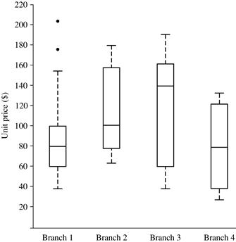
Boxplots can be computed in O(n log n) time. Approximate boxplots can be computed in linear or sublinear time depending on the quality guarantee required.
Variance and Standard Deviation
Variance and standard deviation are measures of data dispersion. They indicate how spread out a data distribution is. A low standard deviation means that the data observations tend to be very close to the mean, while a high standard deviation indicates that the data are spread out over a large range of values.
The variance of N observations, ![]() , for a numeric attribute X is
, for a numeric attribute X is
![]() (2.6)
(2.6)
where ![]() is the mean value of the observations, as defined in Eq. (2.1). The standard deviation, σ, of the observations is the square root of the variance, σ2.
is the mean value of the observations, as defined in Eq. (2.1). The standard deviation, σ, of the observations is the square root of the variance, σ2.
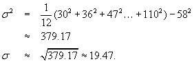
Example 2.12
Variance and standard deviation
In Example 2.6, we found ![]() using Eq. (2.1) for the mean. To determine the variance and standard deviation of the data from that example, we set N = 12 and use Eq. (2.6) to obtain
using Eq. (2.1) for the mean. To determine the variance and standard deviation of the data from that example, we set N = 12 and use Eq. (2.6) to obtain
The basic properties of the standard deviation, σ, as a measure of spread are as follows:
■ σ measures spread about the mean and should be considered only when the mean is chosen as the measure of center.
■ σ = 0 only when there is no spread, that is, when all observations have the same value. Otherwise, σ > 0.
Importantly, an observation is unlikely to be more than several standard deviations away from the mean. Mathematically, using Chebyshev’s inequality, it can be shown that at least ![]() of the observations are no more than k standard deviations from the mean. Therefore, the standard deviation is a good indicator of the spread of a data set.
of the observations are no more than k standard deviations from the mean. Therefore, the standard deviation is a good indicator of the spread of a data set.
The computation of the variance and standard deviation is scalable in large databases.
2.2.3 Graphic Displays of Basic Statistical Descriptions of Data
In this section, we study graphic displays of basic statistical descriptions. These include quantile plots, quantile–quantile plots, histograms, and scatter plots. Such graphs are helpful for the visual inspection of data, which is useful for data preprocessing. The first three of these show univariate distributions (i.e., data for one attribute), while scatter plots show bivariate distributions (i.e., involving two attributes).
Quantile Plot
In this and the following subsections, we cover common graphic displays of data distributions. A quantile plot is a simple and effective way to have a first look at a univariate data distribution. First, it displays all of the data for the given attribute (allowing the user to assess both the overall behavior and unusual occurrences). Second, it plots quantile information (see Section 2.2.2). Let xi, for i = 1 to N, be the data sorted in increasing order so that x1 is the smallest observation and xN is the largest for some ordinal or numeric attribute X. Each observation, xi, is paired with a percentage, fi, which indicates that approximately fi × 100% of the data are below the value, xi. We say “approximately” because there may not be a value with exactly a fraction, fi, of the data below xi. Note that the 0.25 corresponds to quartile Q1, the 0.50 is the median, and the 0.75 is Q3.
Let
![]() (2.7)
(2.7)
These numbers increase in equal steps of 1/N, ranging from ![]() (which is slightly above 0) to
(which is slightly above 0) to ![]() (which is slightly below 1). On a quantile plot, xi is graphed against fi. This allows us to compare different distributions based on their quantiles. For example, given the quantile plots of sales data for two different time periods, we can compare their Q1, median, Q3, and other fi values at a glance.
(which is slightly below 1). On a quantile plot, xi is graphed against fi. This allows us to compare different distributions based on their quantiles. For example, given the quantile plots of sales data for two different time periods, we can compare their Q1, median, Q3, and other fi values at a glance.
Example 2.13
Quantile plot
Figure 2.4 shows a quantile plot for the unit price data of Table 2.1.
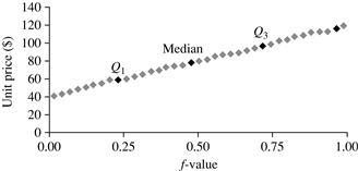
Figure 2.4 A quantile plot for the unit price data of Table 2.1.
Quantile–Quantile Plot
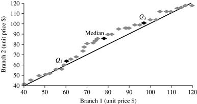
A quantile–quantile plot, or q-q plot, graphs the quantiles of one univariate distribution against the corresponding quantiles of another. It is a powerful visualization tool in that it allows the user to view whether there is a shift in going from one distribution to another.
Suppose that we have two sets of observations for the attribute or variable unit price, taken from two different branch locations. Let ![]() be the data from the first branch, and
be the data from the first branch, and ![]() be the data from the second, where each data set is sorted in increasing order. If M = N (i.e., the number of points in each set is the same), then we simply plot yi against xi, where yi and xi are both (i − 0.5)/N quantiles of their respective data sets. If M < N (i.e., the second branch has fewer observations than the first), there can be only M points on the q-q plot. Here, yi is the (i − 0.5)/M quantile of the y data, which is plotted against the (i − 0.5)/M quantile of the x data. This computation typically involves interpolation.
be the data from the second, where each data set is sorted in increasing order. If M = N (i.e., the number of points in each set is the same), then we simply plot yi against xi, where yi and xi are both (i − 0.5)/N quantiles of their respective data sets. If M < N (i.e., the second branch has fewer observations than the first), there can be only M points on the q-q plot. Here, yi is the (i − 0.5)/M quantile of the y data, which is plotted against the (i − 0.5)/M quantile of the x data. This computation typically involves interpolation.
Example 2.14
Quantile–quantile plot
Figure 2.5 shows a quantile–quantile plot for unit price data of items sold at two branches of AllElectronics during a given time period. Each point corresponds to the same quantile for each data set and shows the unit price of items sold at branch 1 versus branch 2 for that quantile. (To aid in comparison, the straight line represents the case where, for each given quantile, the unit price at each branch is the same. The darker points correspond to the data for Q1, the median, and Q3, respectively.)
We see, for example, that at Q1, the unit price of items sold at branch 1 was slightly less than that at branch 2. In other words, 25% of items sold at branch 1 were less than or equal to $60, while 25% of items sold at branch 2 were less than or equal to $64. At the 50th percentile (marked by the median, which is also Q2), we see that 50% of items sold at branch 1 were less than $78, while 50% of items at branch 2 were less than $85. In general, we note that there is a shift in the distribution of branch 1 with respect to branch 2 in that the unit prices of items sold at branch 1 tend to be lower than those at branch 2.
Histograms
Histograms (or frequency histograms) are at least a century old and are widely used. “Histos” means pole or mast, and “gram” means chart, so a histogram is a chart of poles. Plotting histograms is a graphical method for summarizing the distribution of a given attribute, X. If X is nominal, such as automobile_model or item_type, then a pole or vertical bar is drawn for each known value of X. The height of the bar indicates the frequency (i.e., count) of that X value. The resulting graph is more commonly known as a bar chart.
If X is numeric, the term histogram is preferred. The range of values for X is partitioned into disjoint consecutive subranges. The subranges, referred to as buckets or bins, are disjoint subsets of the data distribution for X. The range of a bucket is known as the width. Typically, the buckets are of equal width. For example, a price attribute with a value range of $1 to $200 (rounded up to the nearest dollar) can be partitioned into subranges 1 to 20, 21 to 40, 41 to 60, and so on. For each subrange, a bar is drawn with a height that represents the total count of items observed within the subrange. Histograms and partitioning rules are further discussed in Chapter 3 on data reduction.
Example 2.15
Histogram
Figure 2.6 shows a histogram for the data set of Table 2.1, where buckets (or bins) are defined by equal-width ranges representing $20 increments and the frequency is the count of items sold.
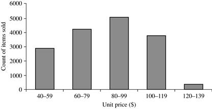
Figure 2.6 A histogram for the Table 2.1 data set.
Although histograms are widely used, they may not be as effective as the quantile plot, q-q plot, and boxplot methods in comparing groups of univariate observations.
Scatter Plots and Data Correlation
A scatter plot is one of the most effective graphical methods for determining if there appears to be a relationship, pattern, or trend between two numeric attributes. To construct a scatter plot, each pair of values is treated as a pair of coordinates in an algebraic sense and plotted as points in the plane. Figure 2.7 shows a scatter plot for the set of data in Table 2.1.
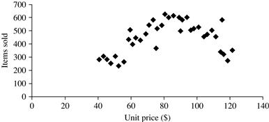
Figure 2.7 A scatter plot for the Table 2.1 data set.
The scatter plot is a useful method for providing a first look at bivariate data to see clusters of points and outliers, or to explore the possibility of correlation relationships. Two attributes, X, and Y, are correlated if one attribute implies the other. Correlations can be positive, negative, or null (uncorrelated). Figure 2.8 shows examples of positive and negative correlations between two attributes. If the plotted points pattern slopes from lower left to upper right, this means that the values of X increase as the values of Y increase, suggesting a positive correlation (Figure 2.8a). If the pattern of plotted points slopes from upper left to lower right, the values of X increase as the values of Y decrease, suggesting a negative correlation (Figure 2.8b). A line of best fit can be drawn to study the correlation between the variables. Statistical tests for correlation are given in Chapter 3 on data integration (Eq. (3.3)). Figure 2.9 shows three cases for which there is no correlation relationship between the two attributes in each of the given data sets. Section 2.3.2 shows how scatter plots can be extended to n attributes, resulting in a scatter-plot matrix.
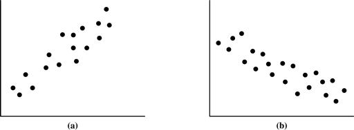
Figure 2.8 Scatter plots can be used to find (a) positive or (b) negative correlations between attributes.
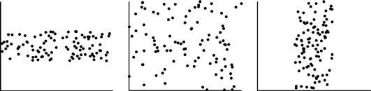
Figure 2.9 Three cases where there is no observed correlation between the two plotted attributes in each of the data sets.
In conclusion, basic data descriptions (e.g., measures of central tendency and measures of dispersion) and graphic statistical displays (e.g., quantile plots, histograms, and scatter plots) provide valuable insight into the overall behavior of your data. By helping to identify noise and outliers, they are especially useful for data cleaning.