3.6 Examples
One immediate application of 3D ROC analysis is hyperspectral imaging where the strength/concentration of a detected signal is specified by the abundance fraction of a particular target which is actually a real value and plays the central role in data analysis. By varying the value of threshold τ in (3.25) the resulting different abundance fractions can be generated and different performances can be produced.
3.6.1 Hyperspextral Imaging
Two examples, hyperspectral target detection and linear hyperspectral mixture analysis, are presented in this section for illustration.
3.6.1.1 Hyperspectral Target Detection
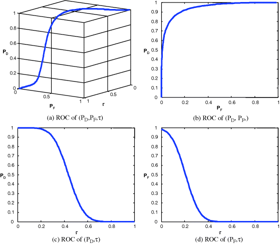
In this section, the CEM specified by (2.33) in Section 2.2.3 of Chapter 2 will be used for target detection for the HYDICE scene in Figure 1.15 and panel signatures in Figure 1.16 will be used for desired target signature, t. Since we are only interested in panel detection, pixels other than panel pixels will be considered as background pixels. In this case, there are five panel classes identified as target classes, of which one class for each of five panel signatures and one background class which accounts for all nontarget pixels. Figure 3.7 shows the detection results for all the five panel signatures with each of the five panel signatures in Figure 1.16 used as the desired target signature t for detection. As shown in Figure 3.7, all the panels in five rows are detected very well and effectively.
Figure 3.7 Detection of 15 panels by CEM.

The results in Figure 3.7 provide only qualitative assessment by visual inspection and not quantitative analysis. Since the detector specified by (2.33) actually estimates the abundance fraction of the desired target signal t rather than detects the target signal t itself, we can tabulate the detection results according to the ground truth in Figure 1.13(b) and use 3D ROC analysis for performance evaluation. By virtue of (3.24) we can derive a normalized CEM by
Analogous to (3.25) we can also use (3.41) to define a hard-decision making detector as
By varying the threshold ![]() we can produce a 3D ROC curve plotted in Figure 3.8(a) along with their corresponding three 2D ROC curves in Figures 3.8(b) and 3.8(d) detecting of each of the five panel signatures.
we can produce a 3D ROC curve plotted in Figure 3.8(a) along with their corresponding three 2D ROC curves in Figures 3.8(b) and 3.8(d) detecting of each of the five panel signatures.
Figure 3.8 3D ROC curves of five-panel signature detection.

As shown in Figure 3.8(b), the 2D ROC curve of (PD, PF) is nearly close to the one which indicated that CEM performed extremely well in detecting 15 panel pixels. As also shown in Figure 3.8(c), the 2D ROC curve of (PD,τ) implies that the CEM detected abundance fractions to reflect why detection rate is so high. On the other hand, the 2D ROC curve of (PF,τ) in Figure 3.8(d) shows that PF is very high when τ is set to very small values less than 0.15, but PF dropped down to nearly zero when τ is greater than 1.3. Based on the 2D ROC curves in Figures 3.8(c) and 3.8(d), the best τ would be around 0.2. Such information is not provided by the 2D ROC curve of (PD, PF) in Figure 3.8(b). Table 3.1 also tabulates their AUCs, Az, for 2D ROC curve of (PD, PF).
Table 3.1 Az calculated panels detected in five rows in Figure 3.8(b).

3.6.1.2 Linear Hyperspectral Mixture Analysis
Linear hyperspectral mixture analysis is one of fundamental data processing techniques widely used in hyperspectral imaging. One of known and popular LSMA techniques is the orthogonal subspace projection (OSP) developed in Section 2.3.2.1. It is originally developed by Harsanyi and Chang (1994) to estimate abundance fractions of each of image endmembers assumed to be present in the data to perform mixed pixel classification. Since OSP is an abundance-unconstrained estimator it may not accurately estimate the true abundance fractions of each of image endmembers used to form the linear mixture model (2.75), two abundance-constrained least-squares-based LSU techniques are further used for comparison. One is a partially abundance-constrained least-squares LSMA, called the non-negativity abundance-constrained least-squares (NCLS) method (Chang 2003a, Chapter 3), and fully abundance-constrained least-squares (FCLS) methods (Chang 2003a, Chapter 10) are also used for experiments.
Obviously, from the scene in Figure 1.13(a) there are more than 15 panels. Because there is no ground truth of signatures provided other than 15 panels in the scene, we use the virtual dimensionality (VD) in Chapter 5 originally developed in Chang (2003a, Chapter 17) to estimate a total number of spectrally distinct signatures assumed to be present in this scene, which is 9. Based on this information and visual inspection, we identify five areas marked in Figure 3.9 to produce four other signatures, grass, tree road plus an interferer in addition to five panel signatures in Figure 1.14.
Figure 3.9 Finding background and interferer signatures.
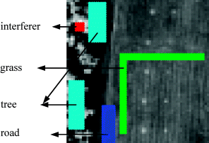
In order to effectively perform the LSMSA, the SDIN model specified by (3.36) was used as the signature matrix M with the desired panel signatures denoted by S = [p1 p2 p3 p4 p5] designated as the signal matrix and I = [interferer grass tree road] as the interference matrix. In this particular example, we can formed a background signature matrix B made up of grass, tree, road which were considered as part of the interference matrix I. With this interpretation the SBN in (3.35) became a special case of the SDIN. It should be noted that since the interferer on the left upper corner shows strong signal presence by its gray intensity, it is chosen as an unwanted signal source.
The linear spectral unmixing was then performed to unmix 15 panel pixels using p1, p2, p3, p4, p5 for mixed pixel classification where d = one specific panel signature to be used for classification and U made up of all the other four panel signatures. Three mixed pixel classifiers LSOSP (Tu et al., 1997), NCLS, and FCLS that were then used to unmix 15 panel pixels in Figure 1.13 where two orthogonal subspace projectors, ![]() and
and ![]() , defined by (2.78) were used for the SBN and SDIN models, respectively, to reject all unwanted signatures prior to detection of d by a matched filter. It should be noted that LSOSP was used instead of OSP because LSOSP provides better abundance fraction estimation than OSP does as shown in Tu et al. (1997) and Chang et al. (1998). Figures 3.10 and 3.11 show classification of the 15 panels with the 19 panel pixels unmixed by LSOSP, NCLS and FCLS using SBN and SDIN models, respectively, where as expected, the 15-panel (19 panel pixels) classification results using the SDIN model performed better than that produced by using the SBN model.
, defined by (2.78) were used for the SBN and SDIN models, respectively, to reject all unwanted signatures prior to detection of d by a matched filter. It should be noted that LSOSP was used instead of OSP because LSOSP provides better abundance fraction estimation than OSP does as shown in Tu et al. (1997) and Chang et al. (1998). Figures 3.10 and 3.11 show classification of the 15 panels with the 19 panel pixels unmixed by LSOSP, NCLS and FCLS using SBN and SDIN models, respectively, where as expected, the 15-panel (19 panel pixels) classification results using the SDIN model performed better than that produced by using the SBN model.
Figure 3.10 Classification of 19 panel pixels produced by LSOSP, NCLS, and FCLS using the SBN model.
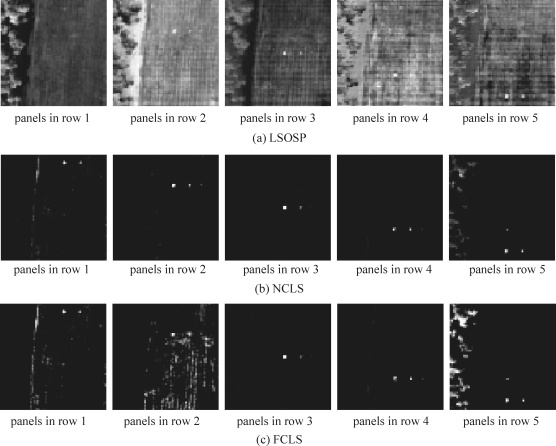
Figure 3.11 Classification of 19 panel pixels produced by LSOSP, NCLS, and FCLS using the SDIN model.

Since the unmixed results in Figures 3.10 and 3.11 are abundance fraction maps, they cannot be directly used for hard-decision-based classification to perform 3D ROC analysis. In this case, we followed the same treatment as we derived (3.41) and (3.42) for CEM by defining a normalized LSMA as
and a hard-decision-making detector as
where the superscript “LSMA” in (3.43) and (3.44) is used to indicate any specific LSMA technique that will be converted to hard decisions. In this case, hard-decision-making LSOSP, NCLS, and FCLS detectors can be defined via (3.43) and (3.44).
By varying τ in the range of [0,1] in (3.43) and (3.44) we produced 3D ROC curves of (![]() ,
,![]() ,τ) for performance evaluation. Figures 3.12(a) and 3.13(a) show 3D ROC curves of 15-panel-pixel detection results in Figures 3.10 and 3.11 using the SBN and SDIN, respectively, where the same threshold τ was used in (3.44). Along with the 3D ROC curves their corresponding 2D ROC curves are also plotted in Figures 3.12(b)–(d) and 3.13(b)–(d) for comparison and their AUCs for the 2D ROC curve of (PD, PF), Az are also tabulated in Table 3.2.
,τ) for performance evaluation. Figures 3.12(a) and 3.13(a) show 3D ROC curves of 15-panel-pixel detection results in Figures 3.10 and 3.11 using the SBN and SDIN, respectively, where the same threshold τ was used in (3.44). Along with the 3D ROC curves their corresponding 2D ROC curves are also plotted in Figures 3.12(b)–(d) and 3.13(b)–(d) for comparison and their AUCs for the 2D ROC curve of (PD, PF), Az are also tabulated in Table 3.2.
Table 3.2 Az calculated for LSOSP, NCLS, and FCLS for SBN and SDIN models in Figures 3.12(b) and 3.13(b).
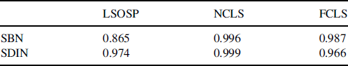
Figure 3.12 3D and 2D ROC curves of LSOSP, NCLS, and FCLS for the SBN model.
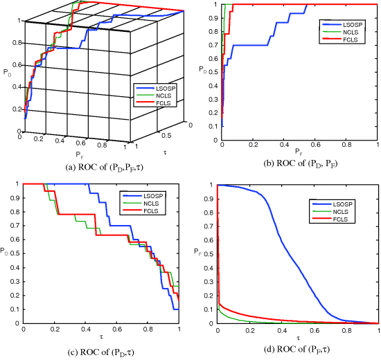
Figure 3.13 3D and 2D ROC curves of LSOSP, NCLS, and FCLS for the SDIN model.
From the results in Figures 3.13, 3.14, and Table 3.2 NCLS clearly outperformed LSOSP and FCLS for both SBN and SDIN models in terms of 15-panel (19-panel pixels) mean detection.
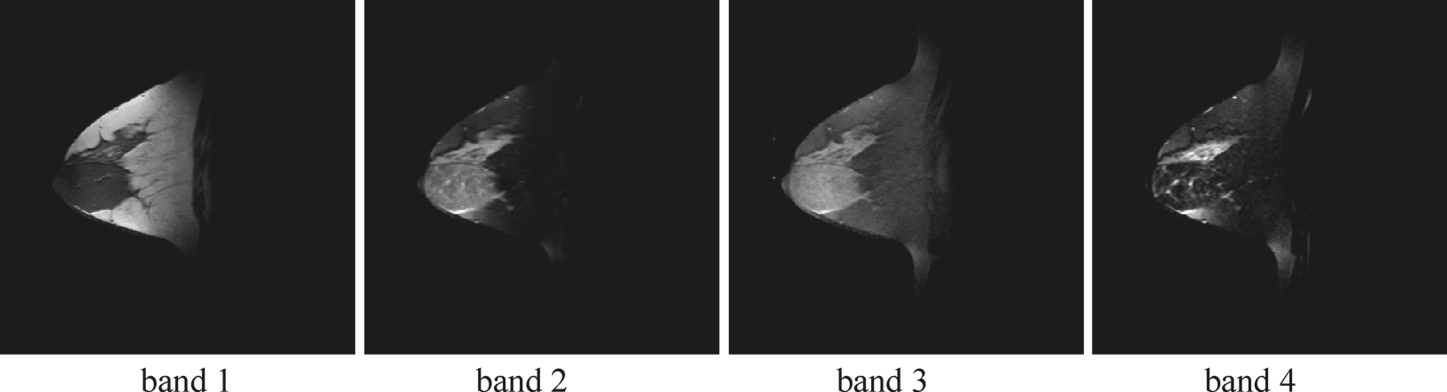
Figure 3.14 Four breast MR images.
To further make a comparison between joint detection of multiple signals, S = [p1 p2 p3 p4 p5], using the same threshold τS and single-signal detection of five individual panel signatures, p1, p2, p3, p4, p5, using five separate and independent thresholds τ1, τ2, τ3, τ4, τ5, tabulated in Table 3.3, their AUCs, Az, were calculated where it can be clearly seen that independent and separate single signal detection of multiple signals always performed better than joint detection of multiple signals. This is because the latter used different independent thresholds, τ1, τ2, τ3, τ4, τ5, to detect five distinct panel signatures, while the former must use the same threshold τ for all the five panel signatures.
Table 3.3 Az calculated for 19-panel pixels in five rows.

As also shown in Figures 3.12(c)–(d) and 3.13(c)–(d), it suggested that an effective detector such as NCLS should have smaller areas under the 2D ROC curves of (![]() ,τ) and (
,τ) and (![]() ,τ). In particular, these figures also provide information about what a good threshold to be compromised between PD and PF is where τ is around 0.18 for the SBN model and 0.1 for the SDIN model. Additionally, Figures 3.12(d) and 3.13(d) also show that how effective NCLS was in terms of PF versus the threshold τ where such information could not be provided by the traditional 2D ROC curve of (PD, PF).
,τ). In particular, these figures also provide information about what a good threshold to be compromised between PD and PF is where τ is around 0.18 for the SBN model and 0.1 for the SDIN model. Additionally, Figures 3.12(d) and 3.13(d) also show that how effective NCLS was in terms of PF versus the threshold τ where such information could not be provided by the traditional 2D ROC curve of (PD, PF).
3.6.2 Magnetic Resonance (MR) Breast Imaging
This section presents another application of 3D ROC analysis in real breast MR image experiments. We define two specific terminologies commonly used in medical imaging community, sensitivity
which is exactly the same as the detection rate in detection theory, and specificity
(3.46) ![]()
which does not exist in detection theory because it is the case of noise detection where detecting noise does not make sense in detection theory. However, it does make sense in medical imaging because it represents “negative” in diagnosis which implies a normal case.
3.6.2.1 Breast Tumor Detection
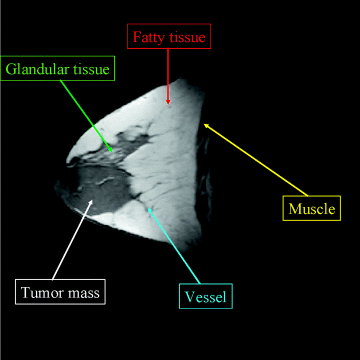
Four multispectral MR breast images shown in Figure 3.14 were used for the experiments. Each image has the same size of ![]() pixel vectors with five breast tissues of interest, fatty, glandular, muscle, tumor mass, and vessel, specified in Figure 3.15.
pixel vectors with five breast tissues of interest, fatty, glandular, muscle, tumor mass, and vessel, specified in Figure 3.15.
Figure 3.15 Five breast tissues of interest.
Specifically, band 1 is the flash 2D spectral image acquired by TR/TE = 352 ms/4.7 ms; band 2 is a T1-weighted 2D spectral image acquired by TR/TE = 832 ms/20 ms; band 3 is a T2-weighted 2D spectral image acquired by TR/TE = 3000 ms/105 ms; and band 4 is photon-density (PD)-weighted 2D spectral image acquired by TR/TE = 3000 ms/15 ms. The slice thickness is 3 mm and sagittal sections are taken by the Siemens 1.5-T system. By stacking these four MR breast images as an image cube, the CEM specified by (2.33) was used to detect these five breast tissues. Since three signatures from Figure 3.15, fatty, tumor, and muscle, are of our major interest, these tissues were then used as the desired tissues by CEM for target detection. The detection results for each of these three breast tissues (fatty, glandular, and tumor mass) are shown in Figure 3.16, where the breast tumor mass is clearly extracted in Figure 3.16(a).
Figure 3.16 Detection results of three breast tissues by CEM.

Since the detection images in Figure 3.16 are actually abundance fraction maps, the detection rate for each of the three tissues must be determined by the threshold τ specified in (3.42). As a result, a 3D ROC curve along with three 2D ROC curves were generated for fatty, tumor, and glandular, respectively. Because the tumor mass is of primary interest, only its 3D ROC curves along with three 2D ROC curves are plotted in Figure 3.17 with Az = 0.8764 where the PD and PF are TP and FP, respectively.
Figure 3.17 3D ROC curve and three 2D ROC curves for tumor mass.

To further illustrate the need for 3D ROC analysis, Figure 3.18 shows various results of detecting each of the three tissues in Figure 3.16 using four threshold values, τ = 0.2, 0.4, 0.6, 0.8.
Figure 3.18 Detection results for each of the three tissues determined by the threshold τ specified by (53).

As shown in Figure 3.18, the detection performance varied and was largely determined by the threshold τ, which in turn determined the pair of 2D ROC curves of (TP,FP) in Figure 3.17(b)–(d). Under such a circumstance, only the 3D ROC curve could provide adequate analysis for medical diagnosis.
3.6.2.2 Brain Tissue Classification
The synthetic images to be used for experiments in this section were the axial T1, T2, and proton density MR brain images (with 5-mm section thickness, 0% noise, and 0% intensity nonuniformity) resulting from the MR imaging simulator of McGill University, Montreal, Canada (available at _www.bic.mni.mcgill.ca/brainweb/). The image volume provided separate volumes of tissue classes, such as CSF, GM, WM, bone, fat, and background. The use of these web MR brain images allows researchers to reproduce our experiments for verification. Figure 3.19 shows three MR brain images with specifications provided in www.bic.mni.mcgill.ca/brainweb/ where the first image is acquired by Modality = PD, Protocol = ICBM, Phantom_name = normal, Slice_thickness = 5 mm, Noise = 0%, INU (intensity nonuniformity) = 0%, the second image by Modality = T1, Protocol = ICBM, Phantom_name = normal, Slice_thickness = 5 mm, Noise = 0%, INU = 0% and the third image by Modality = T2, Protocol = ICBM, Phantom_name = normal, Slice_thickness = 5 mm, Noise = 0%, INU = 0%.
Figure 3.19 Three MR brain images.
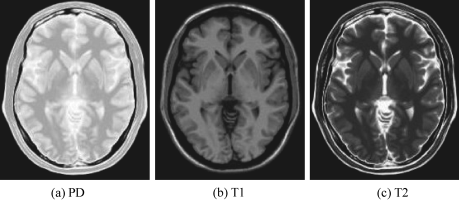
Figure 3.20 provides the ground truth, which is also available in the website www.bic.mni.mcgill.ca/brainweb/ for brain tissue substances in the images in Figure 3.19 that will be used to verify the results obtained for our experiments.
Figure 3.20 Ground truth of brain tissue substances for images in Figure 3.19.

Since only GM, WM, and CSF are major tissues of interest in brain image classification, all other brain tissues in Figure 3.20 are considered as unwanted signatures for suppression. In this case, the SDIN model (3.36) was specified by S = [CSF GM WM] as the signal matrix and I = [B fat muscle skin skull glial connective] as the interference matrix which included all brain tissues in Figure 3.20 other than CSF, GM, and WM where the background signature B was included as part of the interference matrix I. With this interpretation the SBN in (3.45) was considered as a special case of the SDIN. Also, it has been shown in Figures 3.10 and 3.11 that the SBN model was not as good as the SDIB model. In this case, only the SDIN model was considered to be used for LSMA. An LSMA technique is then performed via (3.44) to unmix CSF, GM, and WM where d = one specific brain tissue to be classified and U made up of the other two brain tissues. Similar to the application of hyperspectral image classification presented in Section 3.6.1.2, LSOSP, NCLS, and FCLS were used to unmix the CSF, GFM, and WM where an orthogonal subspace projector ![]() was used to reject all unwanted signatures prior to detection of d by a matched filter. Figure 3.21 shows classification results unmixed by LSOSP, NCLS, and FCLS where the results produced by NCLS seemed to be the best by visual assessment.
was used to reject all unwanted signatures prior to detection of d by a matched filter. Figure 3.21 shows classification results unmixed by LSOSP, NCLS, and FCLS where the results produced by NCLS seemed to be the best by visual assessment.
Figure 3.21 Classification of CSF, GM, and WM produced by (a) LSOSP, (b) NCLS, and (c) FCLS methods.

To conduct a quantitative study, we further used 3D ROC analysis for performance evaluation. The mean classification rates of CSF, GM, and WM were calculated based on (3.39) and (3.40) and used to plot their corresponding 3D ROC curves along with three 2D ROC curves in Figure 3.22, where NCLS clearly performed better than the other two methods.
Figure 3.22 3D ROC of LSOSP, NCLS, and FCLS.

Table 3.4 also tabulates their AUCs, Az, calculated for the 2D ROC curves in Figure 3.22(b) produced by LSOSP, NCLS, and FCLS in Figure 3.21; the best classification rate was actually NCLS which yielded Az = 0.916500 compared to LSOSP and NCLS which produced Az = 0.847063 and 0.805803, respectively.
Table 3.4 Az obtained for LSOSP, NCLS, and FCLS.

Interestingly, FCLS in Figure 3.21(c) did not perform better than LSOSP as it did for hyperspectral linear unmixing in Figures 3.10(c) and 3.11(c). This is mainly because FCLS was designed to quantify rather than classify brain tissues. Furthermore, for NCLS, the best threshold τ seemed to be around 0.4 according to the three 2D ROC curves in Figures 3.22(b) and 3.22(d). These experiments further provided evidence of usefulness of 3D ROC analysis.
3.6.3 Chemical/Biological Agent Detection
This section describes a third application of 3D ROC analysis in chemical/biological agent detection. After 9/11 the threat from chemical and biological warfare (CBW) agents has become reality, especially contamination and pollution in water supplies during water point selection, production, storage, and distribution to consumers. To address such a need the U.S. Army Joint Service Agent Water Monitor (JSAWM) program is particularly interested in developing a hardware-designed device, named JSAWM HHA (hand-held assay) (Chang, 2006; Liu et al., 2005), based on lateral flow immunoassay technology to determine threat levels of the CBW agents of the incidents. Two tickets with/without an agent signal shown in Figures 3.23(a) and 3.23(b) are developed by the ANP Inc. for HHA and can be read either by human eyes or by an optical scanner. The detection of water ticket samples shown in Figure 3.23(c) was carried out by the software developed at the University of Maryland, Baltimore County (UMBC). According to the ground truth provided by the ANP, Table 3.5 tabulates the ticket samples of four signals with various concentrations that were provided by the ANP, Inc.
Figure 3.23 An example of tickets with/without agent signals.

Table 3.5 Ticket samples of four signals with various concentrations used for experiments.

These ticket samples were further used for experiments. To generate ROC curves for this particular application for HHA tickets, we calculated the PD and the PF of each agent signal mj (signal j) for ![]() in the HHA ticket image, where the mj was given by different combinations of agent signals such as vaccinia, coxiella, ricin, or bot tow. Setting a concentration threshold for each agent signal to be detected was an important task in chemical and biological applications, where the presence of a threat usually depends on whether its concentration or abundance is above a certain tolerance threshold. If the concentration is greater than the threshold, we claim that the agent signal is detected. Otherwise, we consider that no agent signal is detected.
in the HHA ticket image, where the mj was given by different combinations of agent signals such as vaccinia, coxiella, ricin, or bot tow. Setting a concentration threshold for each agent signal to be detected was an important task in chemical and biological applications, where the presence of a threat usually depends on whether its concentration or abundance is above a certain tolerance threshold. If the concentration is greater than the threshold, we claim that the agent signal is detected. Otherwise, we consider that no agent signal is detected.
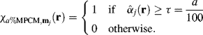
Since Figure 3.23 shows detected abundance fractions produced by the designed image detection algorithms, it requires the threshold τ to perform target detection. Let a% be the abundance percentage used as the desired cutoff threshold value. Now for each target signature mj we use (3.24) to normalize its detected abundance fraction ![]() in Figure 3.23 for each single ticket sample r to
in Figure 3.23 for each single ticket sample r to ![]() by defining
by defining
As a result, the values of ![]() always lie in the range of [0,1]. With a% as a thresholding criterion we can define an abundance percentage mixed-to-pure pixel converter (APMPCV) with a%-threshold, referred to as a%MPCV,
always lie in the range of [0,1]. With a% as a thresholding criterion we can define an abundance percentage mixed-to-pure pixel converter (APMPCV) with a%-threshold, referred to as a%MPCV, ![]() (Chang, 2003a, Chapter 9) as follows:
(Chang, 2003a, Chapter 9) as follows:
If the detected abundance fraction of a target signature, mj, ![]() exceeds
exceeds ![]() within the sample r, then the r will be assigned to this particular target. So, a “1” produced by (3.48) indicates that the sample r is classified as the desired target signature mj; otherwise, it is detected as the absence of the target signature.
within the sample r, then the r will be assigned to this particular target. So, a “1” produced by (3.48) indicates that the sample r is classified as the desired target signature mj; otherwise, it is detected as the absence of the target signature.
Using (3.47) and (3.48) and threshold ![]() with a% ranging from 0% to 100% we can produce 3D ROC curves of (
with a% ranging from 0% to 100% we can produce 3D ROC curves of (![]() ,
,![]() ,τ) for each of four signals shown in Figures 3.24–3.27 along with their AUCs, Az, tabulated in Table 3.6.
,τ) for each of four signals shown in Figures 3.24–3.27 along with their AUCs, Az, tabulated in Table 3.6.
Figure 3.24 3D and 2D ROC curves produced by signal 1.

Figure 3.25 3D and 2D ROC curves produced by signal 2.
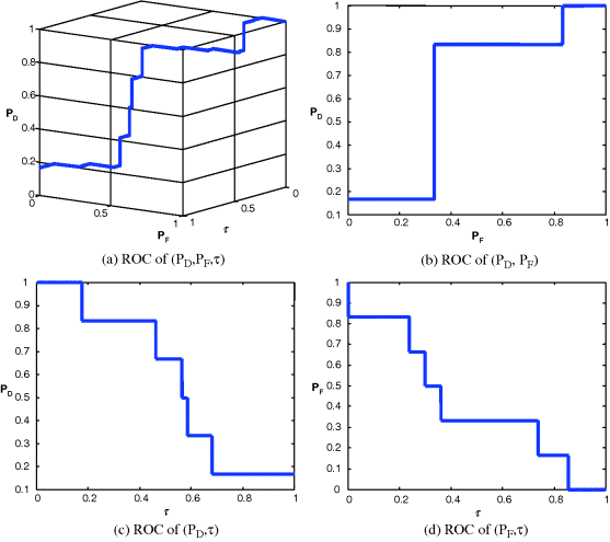
Figure 3.26 3D and 2D ROC curves produced by signal 3.
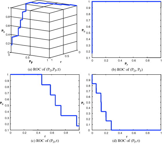
Figure 3.27 3D and 2D ROC curves produced by signal 4.
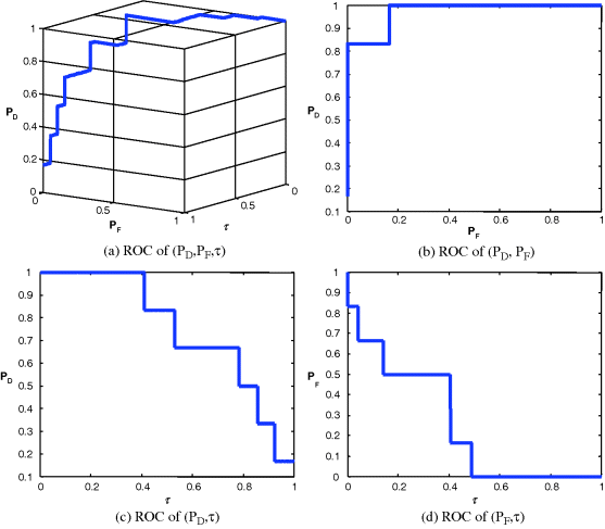
Table 3.6 Az calculated for four signals Figures 3.24(b)–3.27(b).

Since Table 3.6 was calculated based on Az under the 2D ROC curve of (![]() ,
,![]() ) which did not include concentration as a parameter for performance evaluation, in this case, the 2D ROC curves of (
) which did not include concentration as a parameter for performance evaluation, in this case, the 2D ROC curves of (![]() ,τ) and (
,τ) and (![]() ,τ) must be factored in analysis of signal sensitivity to tickets. This phenomenon can be explained by the 2D ROC curves of (
,τ) must be factored in analysis of signal sensitivity to tickets. This phenomenon can be explained by the 2D ROC curves of (![]() ,τ) in Figures 3.24(d), 3.25(d), 3.26(d), and 3.27(d) which provided additional information. That is exactly the reason why we need to introduce a 3D ROC curve to include concentration as a parameter for performance evaluation.
,τ) in Figures 3.24(d), 3.25(d), 3.26(d), and 3.27(d) which provided additional information. That is exactly the reason why we need to introduce a 3D ROC curve to include concentration as a parameter for performance evaluation.
It should be noted that Figures 3.24–3.27 and Table 3.6 were obtained by real ticket samples. As an alternative, we could also use the statistics obtained from the real ticket samples in Table 3.5 to generate Gaussian-fitted 3D and 2D ROC curves. Figures 3.28–3.31 show the Gaussian fitted 3D and 2D ROC curves of Figures 3.24–3.27 along with their corresponding AUCs, Az, tabulated in Table 3.7.
Figure 3.28 Gaussian-fitted 3D and 2D ROC curves produced by signal 1.
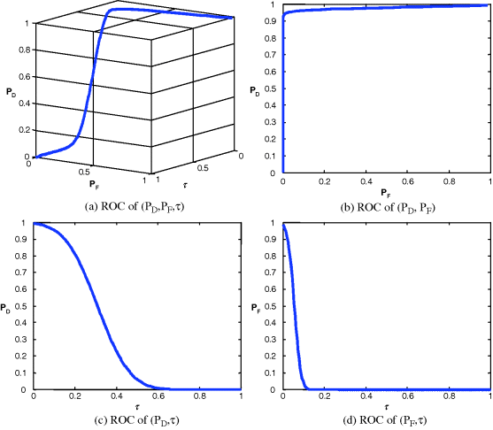
Figure 3.29 Gaussian-fitted 3D and 2D ROC curves produced by signal 2.
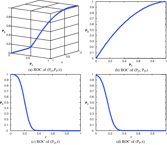
Figure 3.30 Gaussian fitted 3D and 2D ROC curves produced by signal 3.

Figure 3.31 Gaussian fitted 3D and 2D ROC curves produced by signal 4.
Like Table 3.6, the best performance based on Az in Table 3.7 was still produced by signal 1 and the worst came from signal 2. If we further compare the results in Table 3.6 against those in Table 3.5 the errors obtained from the ROC generated by real data and those generated by Gaussian-fitted data described in Sections 3.5.2 and 3.5.3 were within the range of 0.04, which indicated the appropriateness of Gaussian-fitted data in this particular application.
Table 3.7 Az obtained for four signals from Figures 3.28(b)–3.31(b).

3.6.4 Biometric Recognition
In the three applications described earlier, the threshold τ is considered as an independent parameter and PD and PF are treated as dependent parameters as functions of τ. As a matter of fact, according to (2.6) or (3.5), τ is actually determined by the costs cij defined by
and prior probabilities πj which are unknown and cannot be specified in any means beforehand in these applications. However, in some applications the costs may be specified by particular needs. One such application is the evaluation of a biometric recognition system which is generally conducted based on the costs used by the system (Du and Chang, 2007, 2008). To reflect the role that the costs play in the threshold τ, a 3D ROC curve may be better plotted based on three parameters, PD, PF, and costs via (2.7), (2.9)–(2.10) instead of PD, PF, and τ via (3.49), (3.2)–(3.3). More specifically, PD is replaced by false rejection rate (FRR) which is actually the missed probability PM defined by (3.27) to reflect how a biometric system is sensitive to false rejection rate rather than detection rate. If we further assume that πj for two hypotheses are equally likely, this implies that two systems evaluated under each hypothesis have equal chance to be used for the application. As a result, the averaged risk r(δ) defined by (2.4) and the cost specified by (3.49) become
respectively. Since we generally assume that there is no cost for TN and TP in which case c00 = c11 = 0, (60) can be further reduced to
which is reduced to a cost function of PD and PF specified by (3.2) and (3.3), respectively. As shown in Du and Chang (2007, 2008), a 3D ROC curve, referred to as the 3D cost curve of (FRR, PF, cost), can then be plotted by the three parameters, FRR = 1 − PD, PF, and cost specified by (3.52) instead of the threshold τ. Consequently, in addition to the three 2D ROC curves of (PD, PF), (PD,τ), (PF,τ) that are already introduced in the 3D ROC analysis, there are three more additional 2D ROC curves of (PD, cost), (PF, cost), and (τ, cost) that can be further derived by introducing (3.50) as a cost via (3.51) parameter. Furthermore, upon evaluating a biometric recognition system, users may care more about relationships among Security, Convenience, τ, and cost. Under such circumstances, various 3D ROC curves, called 3D combinational curves in Du and Chang (2007, 2008), can be plotted based on these four parameters of interest, FER = 1 − PM, PF, τ, and cost along with their corresponding 2D combinational ROC curves by defining the system security by 1−PF = PTN via (3.13) and the system convenience by 1 − FRR = PD. For example, in the context of Security, Convenience, τ, and cost, a 3D combinational performance ROC curve and a 3D combinational performance cost curve can be specified by a 3D ROC curve of (Convenience, Security, τ) and a 3D ROC curve of (Convenience, Security, cost), respectively, along with their six corresponding 2D combinational ROC curves of (Convenience, Security), (Security, τ), (Convenience, τ), and (Security, cost), (Convenience, cost), and (cost, τ). For example, a 2D combinational ROC curve of (Convenience, Security) = (PD, PTN) represents a compromise of a biometric system between security and convenience. Since the utility of 3D ROC analysis in the evaluation of biometric recognition systems has been investigated and explored in great detail in Du and Chang (2008) and extensive experimental results are also conducted therein, no experiments are included here to avoid duplication.