
Most of the Splunk commands result in an output that is in a tabular format and displayed in the Statistical tab on Splunk Web. Now, you will learn about all the feature customizations and formatting that can be done on the tabular output.
The important point to note here is that the Table output is available on the Statistical tab and not on the Visualization tab. The tabular output is basically a simple table displaying the output of a search query. The tabular output can be obtained by either using statistical and charting functions, such as stats, charts, timecharts, or various other reporting and trending commands.
The following is the list of formatting and customization options available directly from the Splunk Web console in the Format option of the tabular output:
- Wrap result: Whether the result should be wrapped can be enabled or disabled from here.
- Row numbers: This option can enable the row number in the result.
- Drilldown: The tabular output can be enabled to drilldown either on a cell level or row level from this option. If drilldown is not required, it can be disabled as well.
- Data overlay: The heat map or data overlay can be enabled from the format option of the tabular output.
Let's see how to create a tabular output and format options with the help of the following example:
index=* | top sourcetype
The preceding search query will search all the indexes of Splunk and return the count and percentage (top) on the basis of sourcetype.
The output of the preceding search query is as follows:
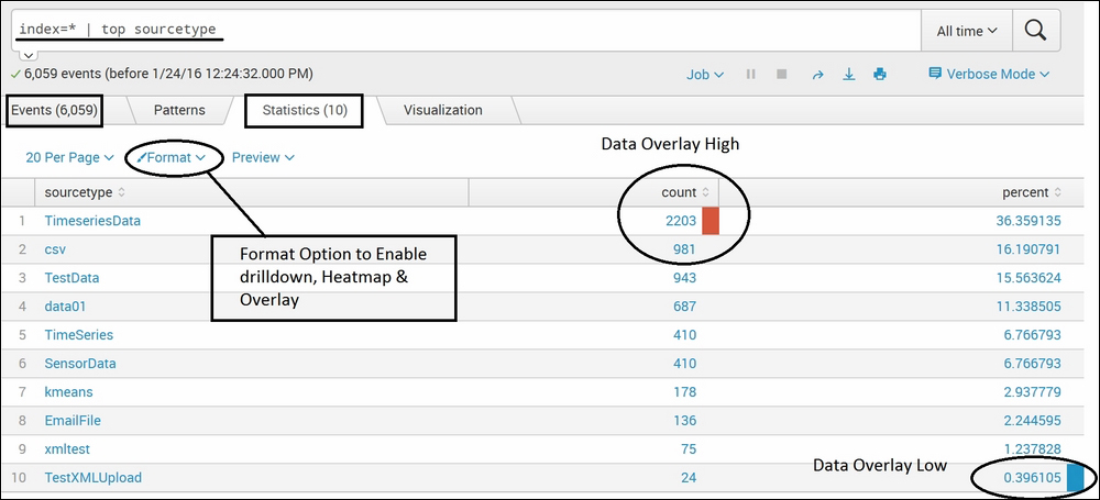
In the preceding example, we enabled row numbers, row drilldown, and low and high data overlay. Similarly, depending on the requirement necessary, formatting and customization options can be enabled and disabled.
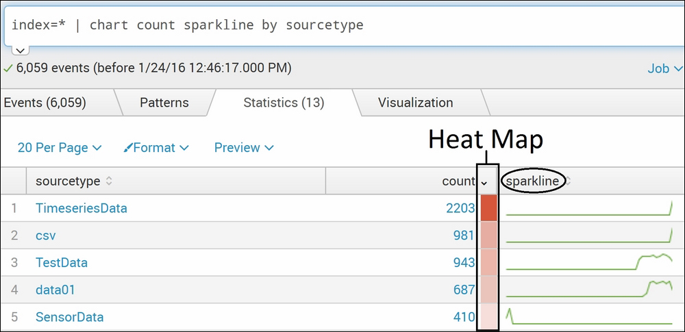
Now, since you've learned how to enable various formatting and customization options, we will see how to show Sparkline in a table output. For Sparkline, we will make use of the chart command, as shown in the following example query:
index=* | chart count sparkline by sourcetype
The output of the preceding search query will result in the count of all sourcetype in all the indexes of Splunk. Sparkline along with the chart command is used here to enable Sparkline in the given output. The output has Heat Map enabled from the Format option, and hence the count column can be seen with Heat Map as shown in the following screenshot:
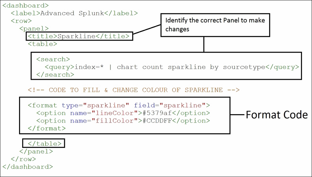
This is the basic Sparkline; we can also create customized Sparklines by modifying XML. The steps on how to access the XML code is already shown in the Prerequisites – configuration settings section of this chapter. Now, you will learn how to modify the code for customized visualizations.
In the preceding section, we looked at Sparkline. Now, we will see a variant of Sparkline wherein we can change colors and fill colors in Sparkline. Let's see how to do this with the help of an example.
The following code needs to be added in XML to change the fill in the Sparkline and to change the color of the Sparkline:
<format type="sparkline" field="sparkline">

  <option name="lineColor">#5379af</option>
  <option name="fillColor">#CCDDFF</option>
</format>
In the preceding code, field should be the name of the field holding the Sparkline. As shown in the preceding example's screenshot, Sparkline is available under the field name Sparkline. The linecolor and fillcolor option is provided with the HTML format's color code to be applied on the Sparkline.
The preceding code needs to be added to the respective panel of the dashboard, which can be identified using <title> or search query in case the dashboard has many panels. The code needs to be added just before the end of </table>, as shown in the following screenshot:
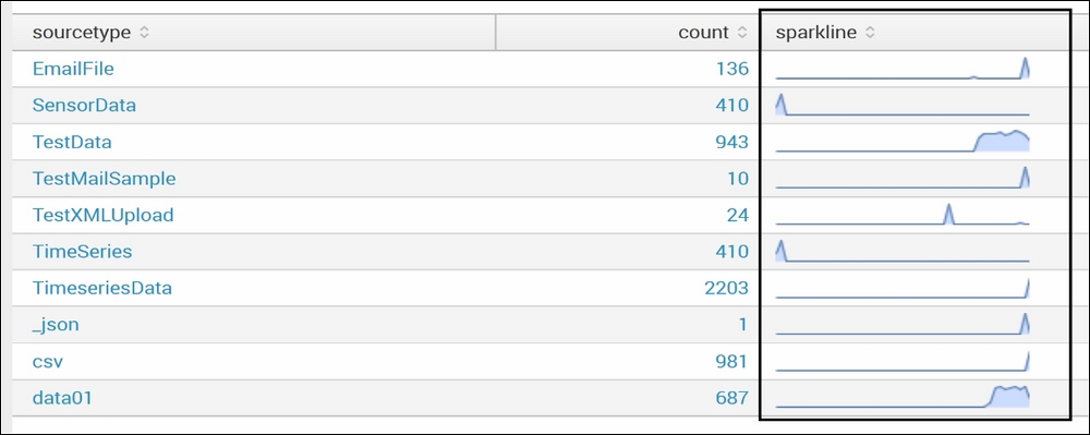
The output of the preceding change in the code is as follows. The color has been changed and Sparkline is filled with the given color. The following output can be compared to the example in the earlier section of Sparkline and the difference can be seen:
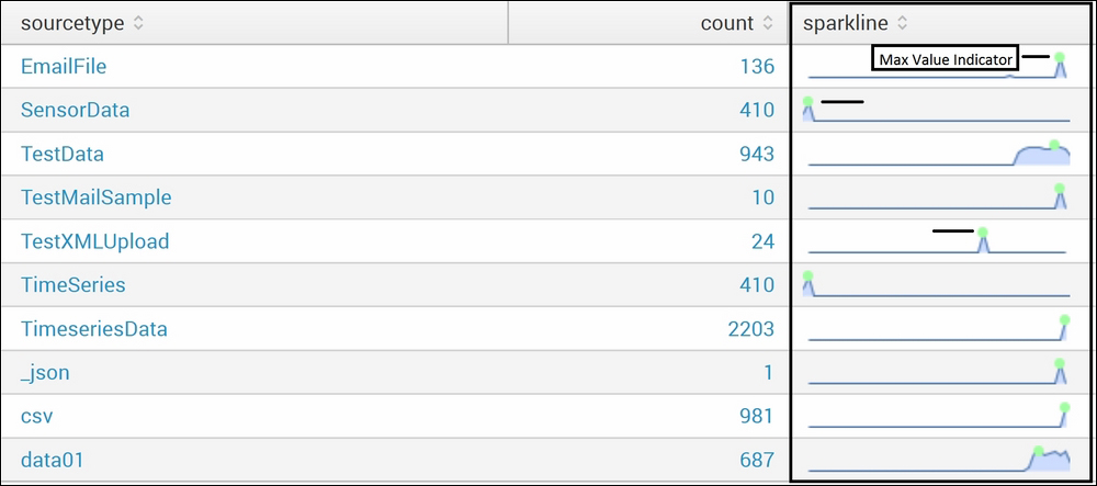
In this section, we will have a look at a Sparkline that has a maximum value indicator. This can help us easily spot the maximum value with the help of the maximum value indicator using Sparkline.
The following code will add a max value indicator to Sparkline:
<format type="sparkline" field="sparkline">
<option name="lineColor">#5379af</option>
<option name="fillColor">#CCDDFF</option>

<!-- Max Value Indicator -->
<option name="maxSpotColor">#A2FFA2</option>
<option name="spotRadius">3</option>

</format>
The output of the preceding code is as follows:
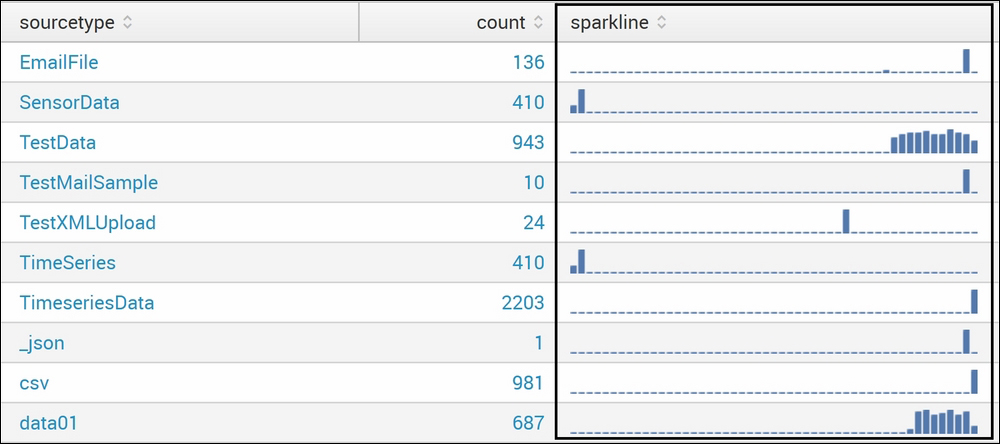
XML can be customized to change wave-styled Sparkline into bar-styled Sparkline using the following code:
<format type="sparkline" field="sparkline">
  <option name="type">bar</option>
  <option name="barColor">#5379AF</option>
</format>
The output of the preceding code is as follows:
Along with bar-style Sparkline, a color map can be used by adding the following code:
<option name="colorMap">
  <option name="2000:">#5379AF</option>
  <option name=":1999">#9ac23c</option>
</option
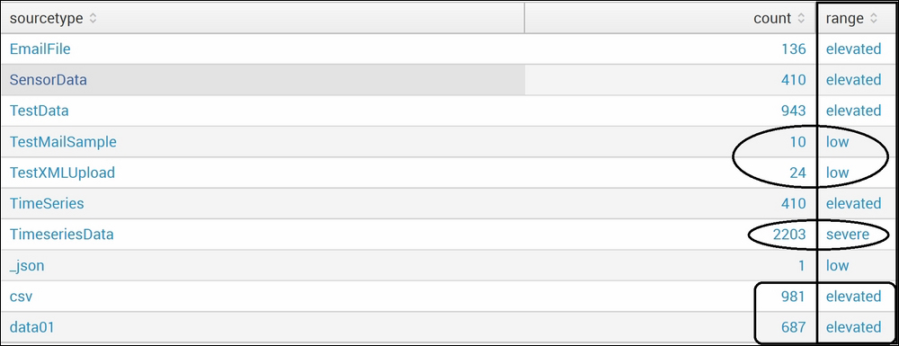
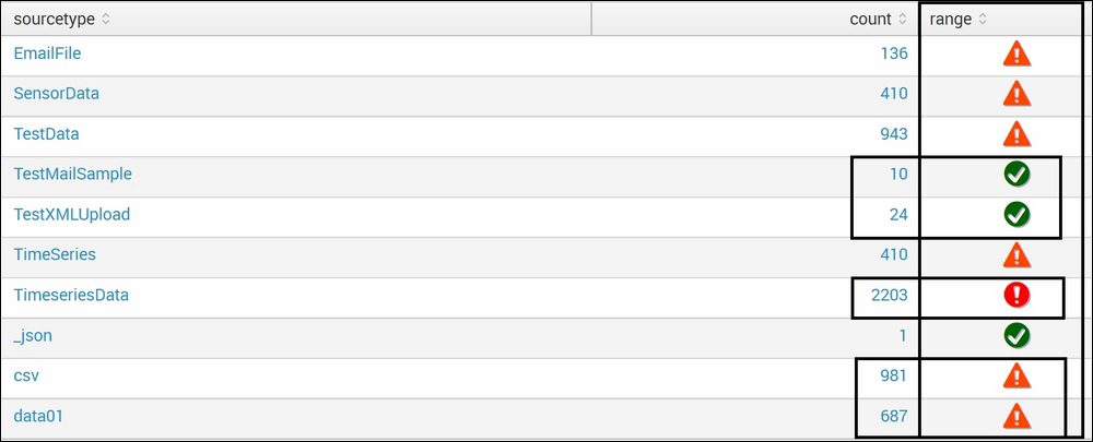
The table element provides us with the functionality of showing icons on the basis of the range of the values of the fields. Let's take an example to better understand the use of an icon set in a tabular output. Suppose the output of a search query results in a few values, and the user is interested in categorizing those values in a range where if the value is between 0-100, then it can be tagged as good, if it is in the range of 100-200, then moderate/average, and if it is above 200, then it is severe. Then, the rangemap command can be used to categorize the values in the output in the required categories. To make the categorization more visual, icons can be added, for example, the good ones are marked with a green tick mark, the moderate ones with an orange triangle, and the severe ones with a red circle. Similarly, depending on the need and categorization, different icons can be used to visualize data in a more reader-friendly style.
Splunk provides users with the functionality of adding custom CSS (Cascading Style Sheet) and JS (JavaScript) to add such customizations in the output result. Now, we will see how we can get such customization in a table element.
The following is the search query used to explain how an icon set is added to a table element:
index=* | chart count by sourcetype | rangemap field=count low=0-100 elevated=101-1000 default=severe
In the preceding search query, the rangemap command will categorize the specified value (count) to the field parameter on the basis of conditions (low=0-100, elevated=101-1000, and default as severe).
The output of the preceding search query will be as follows:
Now, we will add custom CSS and JS so that instead of range values (elevated, low, and severe), respective icons are shown in the table.
The CSS and JS files need to be added to the static folder for the respective apps' file location, that is, $SPLUNK_HOMEetcapps<app_name>appserverstatic, where app_name is the name of the app in which the panel/dashboard is created. In our example, the panel is created in the search app's dashboard, so the path to create custom CSS and JS files in our case will be $SPLUNK_HOMEetcappssearchappserverstatic.
The name of the JS and CSS files can be anything as per the user's needs. In our example, the names of the JS file is icons.js and the CSS file is icons.css. The names of the JS and CSS files need to be noted and remembered, as they are to be referenced in the XML file. The JavaScript file defines what needs to be done on which fields, and the CSS file holds formatting options such as color, font, size, and so on.
The code of the icons.js JavaScript file is as follows:
require ([
  'underscore',
  'jquery',
  'splunkjs/mvc',
  'splunkjs/mvc/tableview',
  'splunkjs/mvc/simplexml/ready!'
], function (_, $, mvc, TableView) {
  // Translations from rangemap results to CSS class
  var ICONS = {
    severe: 'alert-circle',
    elevated: 'alert',
    low: 'check-circle'
  };
  var RangeMapIconRenderer = TableView.BaseCellRenderer.extend({
    canRender: function(cell) {
      // Only use the cell renderer for the range field
      return cell.field === 'range';
    },
    render: function ($td, cell) {
      var icon = 'question';
      // Fetch the icon for the value
      if (ICONS.hasOwnProperty(cell.value)) {
        icon = ICONS[cell.value];
      }
      // Create the icon element and add it to the table cell
      $td.addClass('icon').html(_.template('<i class="icon-<%-icon%> <%- range %>" title="<%- range %>"></i>', {
      icon: icon,
      range: cell.value
    }));
  }
});
mvc.Components.get('testtable').getVisualization(function(tableView){
  // Register custom cell renderer, the table will re-render automatically
  tableView.addCellRenderer(new RangeMapIconRenderer());
  });
});
In the preceding JavaScript code, the important things to be noted are the sections that are highlighted. These sections are explained in detail in the following bullets:
- In the top section, icons are defined, that is, the conditions for which icon should be shown in case of a respective category.
- In the middle section, the field name on which the value is to be replaced by icons is to be specified. In the preceding code, the field name is
range. - In the last section of the code, we need to set the table ID on which this visualization is to be applied. There can be many tables in a dashboard or in an app, but we may require to apply this visualization in only one table, so we need to specify the table ID. In our case, the table ID is
testtable. This value is to be noted as it is to be used in the later section.
The code of the icons.css CSS file is as follows:
td.icon {
  text-align: center;
}
td.icon i {
  font-size: 25px;
}
td.icon .severe {
  color: red;
}
td.icon .elevated {
  color: orangered;
}
td.icon .low {
  color: #006400;
}
The preceding CSS file defines the color for each of the icons and alignments. Now, since the JS and CSS files are in place, the following changes are required in the XML of the dashboard holding the table in which the icons are to be displayed.
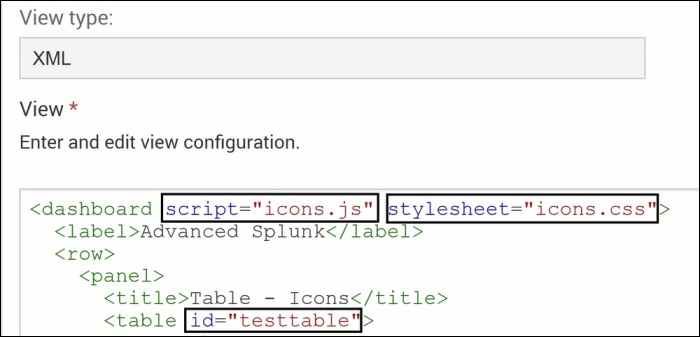
The name of the CSS and JS file is included in the <dashboard> tag of the XML file, and the table in which the range values are to be replaced with an icon is set as the same table ID that we have set in the preceding JS file. In our case, the table ID is testtable. The following screenshot shows how the CSS and JS files are included along with the table ID to map the icons in place of range values:
Once the preceding settings are done, click on Save and restart Splunk to make the changes effective. Once Splunk is restarted, the range field will have icons in place of values, as shown in the following screenshot:
Similarly, depending on the need, different levels of customization are possible in the table element output. A row/cell of the table can be highlighted on the basis of field values, data bars can be added in the table output, and so on.