
You have already learned what chart overlay is and how to create it in a previous chapter (Chapter 6, Visualization). Now, we will see how to create custom chart overlay using a D3 extension. Basically, it is an advanced and more customized visualization option of chart overlay.
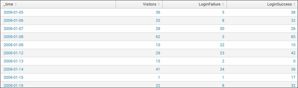
Let's look at the tabular dataset that we will use to create custom chart overlay. Later, you will learn how to implement it in the Splunk dashboard.
The following screenshot is the subset of the total dataset that we will use to visualize custom chart overlay:
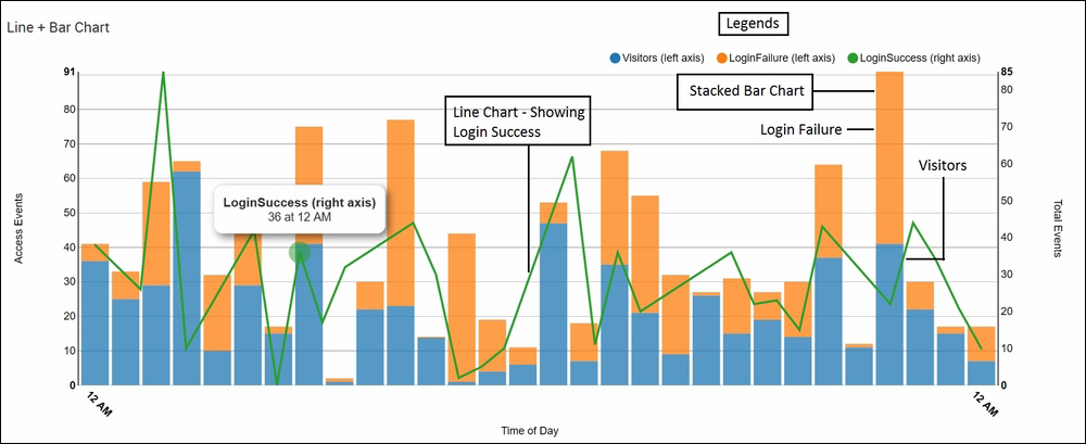
The preceding dataset that has login failure, login success, and number of visitors along with time from a web server will look like the following screenshot when implemented for D3 custom chart overlay. Hovering the mouse over the chart shows the required relevant information. It also shows that behaviors can be customized from the JavaScript code of custom chart overlay:
The following are the steps to be taken in the Splunk dashboard to create a custom chart overlay visualization using D3 extension similar to one show in the preceding graph:
- To implement custom chart overlay, a JS
(Custom_Chart.js,d3chartview.js) and CSS (custom_chart.css) file will be required, and they can be obtained from the Splunk app, Splunk 6.X dashboard examples, which we already used in our previous visualizations. - The required JS and CSS files are located at
$SPLUNK_HOMEetcappssimple_xml_examplesappserverstatic. - The JS and CSS files from the preceding directory can be used without any modification. In the case of any customization, the respective JS file needs to be modified.
- The dashboard in which the chart overlay visualization is to be implemented is modified as follows:
<dashboard script="custom_chart.js, autodiscover.js" stylesheet="custom_chart.css">
- The following code needs to be added in the XML of the dashboard to implement custom chart overlay in Splunk:
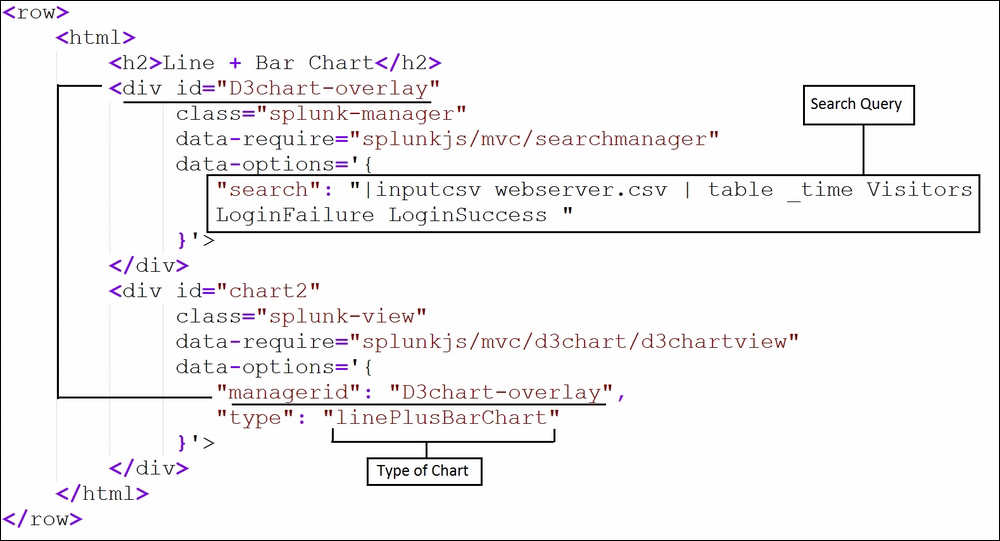
- The respective search query needs to be replaced with the required query, and the type of chart can also be defined in the
typeparameter in the preceding code. - Click on Save, and the required custom chart overlay visualization will be available in the panel of the Splunk dashboard.