
The Splunk visualization list has two types of visualizations to show geographical data on maps. Maps visualization can be used from the visualization list to show data on the geographical world map. In its version 6.3, Splunk introduced powerful choropleth visualization to show more metrics and much more customized data mapping on maps to get insight from the data belonging to the geospatial domain. Choropleth visualization can be used to spot the pattern to sense the complete insight on the data.
Splunk used standard definition to describe the boundaries of colored polygons on choropleth maps visualization. Splunk 6.3 has included countries' maps updated with the latest boundaries and information and 50 states of the United States by default. That doesn't mean that the visualization will be limited to only these two boundaries, but it supports widely used the KMZ format of polygon definition of maps' boundaries and data.
Splunk's choropleth visualization supports one of the greatest features: point in polygon lookup. It allows us to map any longitude/latitude combination to any of the polygons in the visualization. This feature, along with choropleth visualization, can also be used in other charts such as bar chart, line chart, and many more.
Let's now learn what all kind of insights and customization can be made on choropleth visualization and how to implement it in the Splunk dashboard.
The geom Splunk command is used to add a geom fieldname to each event defining geographical data for polygon geometry in the JSON format, which can be used to create choropleth map visualizations.
The syntax for chloropleth visualization is as follows:
…
 | geom
        Featurecollection
        FeatureIdField=Field_name
The description for the parameters discussed earlier is as follows:
Featurecollection: Splunk supports two feature collections out of the box:geo_countriesandgeo_us_states. If any other geographical lookups are required for the given data, then KMZ files for the respective locations can be installed and used.FeatureIdField: This parameter can be specified with thefield_nameof the field containing the geographical parameter to be used to generate choropleth map visualization.
The following search query will use the geo_countries feature collection with featureIdField as country to create the geom field for all the events of data containing the JSON format polygon geometry of the countries listed in the country field:
| inputlookup geo_attr_countries | geom geo_countries featureIdField=country
The output of the preceding search query will look like the following screenshot:

The choropleth visualization of the preceding search query will be as follows, showing the countries of the world on the map. It uses various color combinations and the legends describing the colors corresponding to the geographical location:

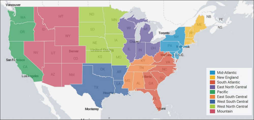
As you have already learned, Splunk 6.3 comes inbuilt with geographical information of the United States (geo_us_states). The following search query will plot the data specific to the geographic location of the United States. Similarly, other location KMZ file can be installed, and depending on the requirement, required locations visualization can be made available:
| inputlookup states_pop_density.csv | geom geo_us_states featureIdField=state
The visualization of the preceding search query will look similar to the one shown in the following image, with the states plotted on the United States (US) map. The following screenshot displays 50 states of the United States (US) in the choropleth visualization:
The formatting option on the Splunk dashboard can be used to further customize the choropleth visualization for features such as drilldown, color combination, minimum and maximum zoom level, and so on.
One of the important customizations in terms of color that is available in Splunk is Color Modes. Depending on the scenario and requirement, the following color modes can be used to make the visualization more informative and useful:
- Sequential: One color and its different shades are used in the map to display the information. This type of color mode is used to show information such as sale of product and traffic to a web portal. Basically, this color mode is beneficial in scenarios where the data is in distribution of variables and can be defined in ranges.
- Categorical: This color mode uses different colors for different categories. All the places whose data belongs to the same category will be in the same color. An example of this kind of color mode in visualization can be used by banks/financial institutions to show the transactions across different locations as safe (green), moderate (orange), and unsafe (red) color.
- Divergent: This color mode uses two colors and their different shades, converging to a white neutral point. This kind of color mode can be used to show how much a variable is below or above the neutral point.