
The Splunk single value visualization is used to represent information or the result of the Splunk command, which is basically a single value that can be a number/statistics/single information on which an inference can be made. Like a single value, visualization can be used to represent a number of errors, number of visitors, number of fraud detected, number of failures, last error occurred, top users, number of invalid accounts, time of last failure, and so on.
Splunk 6.3 has enhanced single value visualization with various functional customizations such as adding trend indicators, Sparkline, labels, and other aesthetic customizations by adding custom CSS. You will now learn how to create single value visualization on the Splunk Web console.
The following is the list of customizations and formatting that can be done on a single value:
- Single value: This is the basic one that is by default with no customization and formatting. It will just display the number or text returned by the search query in the Visualization tab, as shown in the following screenshot:

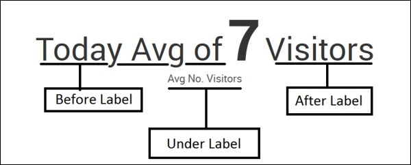
- Single value (label): Using the Format option in the Visualization tab, there are three types of labels that can be applied to describe a single value. As in the following figure, Before Label (Today Avg of), After Label (Visitor), and Under Label (Avg No. Visitors) are applied to describe that the single value is depicting the average number of visitors. Similarly, the respective label can be used to describe a single value in order to make it understandable to the readers:
- Single value (Sparkline and Trend indicator): If the Splunk
searchcommand has atimechartcommand, then Sparkline and Trend can be enabled from the Format option. Sparkline and Trend can be formatted using the Color option and conditional coloring can also be done on the basis of the value using the Format option. The below image shows the single value with Sparkline and Trend indication: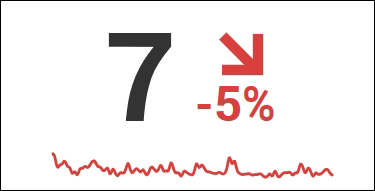
For example, the visitor information data from a test web server is used to showcase how a single value can be used. The following search query on Splunk will return the average number of visitors visiting the web server, and since the timechart command is used, trend and Sparkline can also be enabled. Now, this information can be displayed using a single value; you just need to choose it from the list of visualizations, as shown at the start of the chapter.
Our search query is as follows:
||inputcsv webserver.csv | eval _time=strptime (date, "%e-%b-%y") |timechart avg(Visitors) span=7d
This query will produce the following output:

So, single value visualization can be used to depict required information along with trend and Sparkline. Splunk 6.3 gives all the formatting and customization right from the Splunk web console Format option itself. Conditional coloring, that is, the color of the value will change depending on the range in which the value lies or on the basis of the trend. The precision and thousand separators can be enabled and configured from the Format option.