
You already learned how to create and customize basic visualizations in the previous chapter. Now, in this chapter, we will go through advanced visualizations that can be implemented in Splunk. You will learn how to implement advanced visualizations such as Sunburst, custom decoration, calendar heatmap, and force directed graphs. Many of these visualizations were introduced in the latest version of Splunk 6.3. These advanced visualizations can even be used by a non-technical audience to generate useful insight and derive business decisions.
In this chapter, we will cover the following topics:
- Sunburst sequence
- Geospatial visualization
- Punchcard visualization
- Calendar heatmap
- Sankey diagram
- Parallel coordinates
- Force directed graph
- Custom chart overlay
- Custom decorations
Splunk supports various advanced visualizations, and now, you will learn how sunburst visualization can be implemented in Splunk dashboards and what type of data can be best visualized in a sunburst sequence.
A sunburst sequence chart is sometimes also known as a ring chart. A multilevel pie chart is a chart that can be used to display a hierarchical type of data and its overall distribution in a circular pie chart like visualization. It is a multi-circle chart in which each ring represents a level of hierarchy with the innermost circle as the top level of hierarchy. A sunburst chart having multiple levels depicts how inner and outer rings are related, and a sunburst sequence without hierarchical data looks like a doughnut chart. The sunburst sequence chart is one of the most effective visualizations to show how one ring is distributed/broken into its contributing constituents.
Let's see how we can implement a sunburst sequence in the Splunk dashboard. The data used in this example has a manufacturer (mobile device manufacturer), OS (mobile device OS), and an OS version, as shown in the following screenshot:

Basically, the data has a list of mobile OSes, their manufacturers, and their respective OS versions. Now, we will create a sunburst sequence on this data. The sunburst sequence will look like the following diagram:
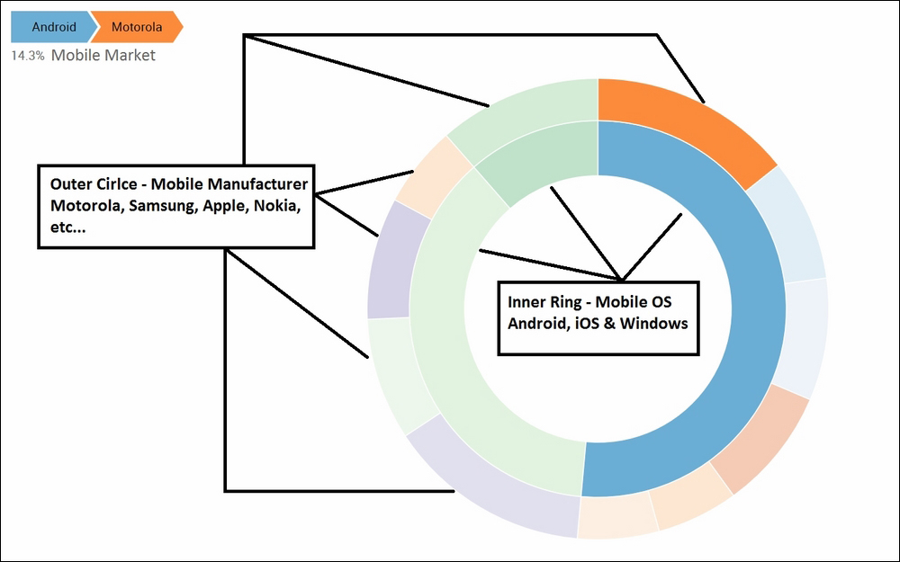
The innermost circle of the sunburst sequence shows the distribution of total mobile OSes, and the next circle (outer circle) shows mobile manufacturers for respective mobile OSes. As shown in the preceding screenshot, the innermost circle is Android. When you hover the mouse over the outer circle, you can see that out of the total mobile market, 14.3 percent is taken over by Motorola. Similarly, hovering respectively on the inner and outer circles will show the market segment on the basis of mobile OSes (inner circle) and on the basis of manufacturers (outer circle).
Some of the insights that can be derived from the above sunburst sequence are as follows:
- 51.4 percent, 11.4 percent, and 37.1 percent of the total mobile market is by Android, iOS, and Windows OS, respectively
- Out of the total Android OS phones, Samsung constitutes only 5.71 percent
So, sunburst can be used for various kinds of data to get such useful insights. Let's now learn how to create sunburst sequence visualization on the Splunk dashboard.
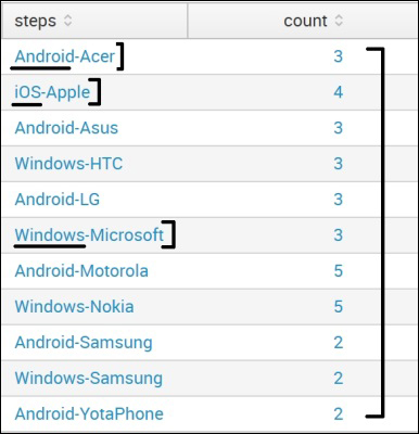
We require two fields to create asunburst sequence: steps and count. Practically, field names can be anything as per the defined user, but the content format should be as required. The steps field should have various fields of data separated by "-" (without quotes). In our example, the search query to create the steps and count fields is as follows:
|inputcsv phonedata.csv |stats dc(Version) as count by Manufacturer, OS| eval steps=OS+"-"+Manufacturer |table steps count | outputcsv MobileData.csv
The preceding search query creates a steps field, which has the OS and manufacturer separated by - and a distinct count on the basis of the version. The output of the preceding search query will appear as shown in the following screenshot.
In the steps field, the first value will be the inner circle, then the next value after – will be the second circle, and so on. Depending on the number of – available, the respective number of circular rings depicting the data will be available in the Sunburst chart:
The preceding search query outputs the result into a MobileData.csv CSV file, which we will use in the search query of the Sunburst sequence. It is not necessary to output the result into the CSV file and then use it in sunburst. This search query can be used in the Sunburst itself, resulting in the same output:
- First, download the sequences-sunburst or Custom Visualizations Splunk app from the Splunk app store, which requires important JS and CSS files for Sunburst. There is a slight variation in the JS and CSS files for either of the apps, but the steps and procedure remain the same. We are using the sequences-sunburst app as a reference in the following example.
- Then, copy the
componentsdirectory from the downloaded app'sstaticfolder to the respective app'sstaticdirectory in which the sunburst sequence is to be implemented.For instance, in our example, all
filesfrom the$SPLUNK_HOMEetcappssequences-sunburstappserverstaticsequences_sunburstdirectory are copied to thecomponentsdirectory of the search app located at$SPLUNK_HOMEetcappssearchappserverstatic.The dashboard in which sunburst is to be added is modified to include
autodiscover.js, which you have also done in various visualizations learned in previous chapter:<dashboard script="autodiscover.js"> - The following code needs to be added in a panel of the dashboard where Sunburst is required. For understanding and readability purposes, I have replaced
andquot;from thedata-optionstag: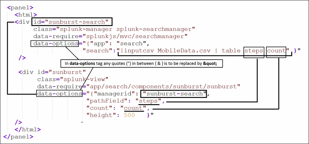
- In the code inside the screenshot,
div idandmanageridshould be the same. Thedata-requirefield in the section should be given a proper path of thecomponentsfolder discussed previously. - The search query with the proper fieldname should be provided in the
pathFieldandcountparameters of the code in the preceding screenshot. - Once all the changes are done, the dashboard can be saved, and sunburst visualization will be visible.
Thus, now, we know how we can implement sunburst sequence visualization on your data on Splunk to generate insights from the data.