
Punchcard visualization is another advanced visualization. It can be used to show insight from the data, and using those insights, informed business decisions can be made. Punchcard charts are used to visualize data by hour/day/week at the same time. A punchcard chart can be used to analyze the power consumption of a location over the week, sales on an e-commerce portal by hour of the day, and so on.
Let's see how punchcard visualization can be implemented on the Splunk dashboard.
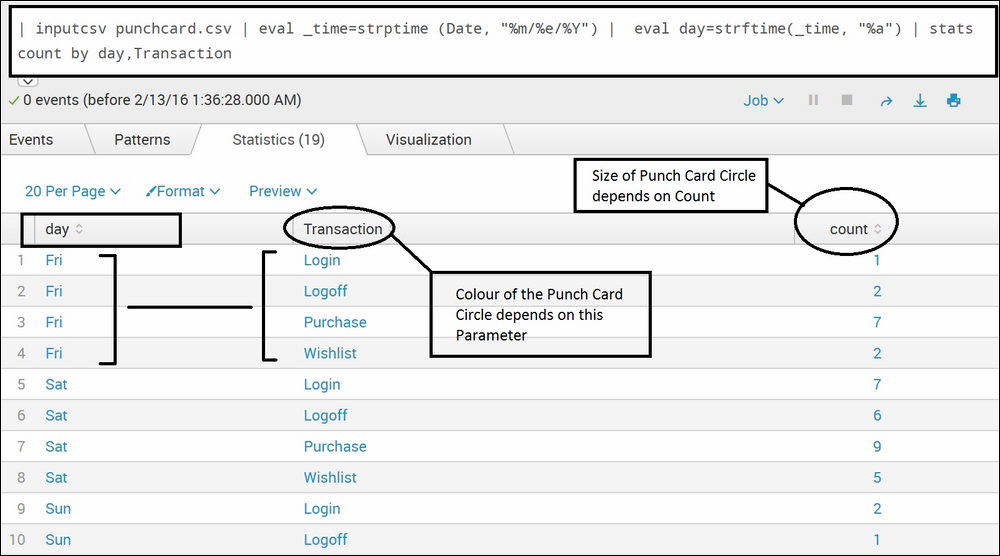
Here is the search query to be run to get the output that will be required for punchcard visualization:
| inputcsv punchcard.csv | eval _time=strptime (Date, "%m/%e/%Y") | eval day=strftime (_time, "%a") | stats count by day, Transaction
The output of the preceding search query in the statistical form will be displayed as shown in the following screenshot:
The preceding tabular data, when shown in punchcard visualization, will appear as shown in the following diagram. The size of the circles is proportional to the count (occurrence) of the respective transaction over the distribution of days of the week. The different colors of the circles correspond to different transactions as listed on the right-hand side of the punchcard card visualization in the following diagram:
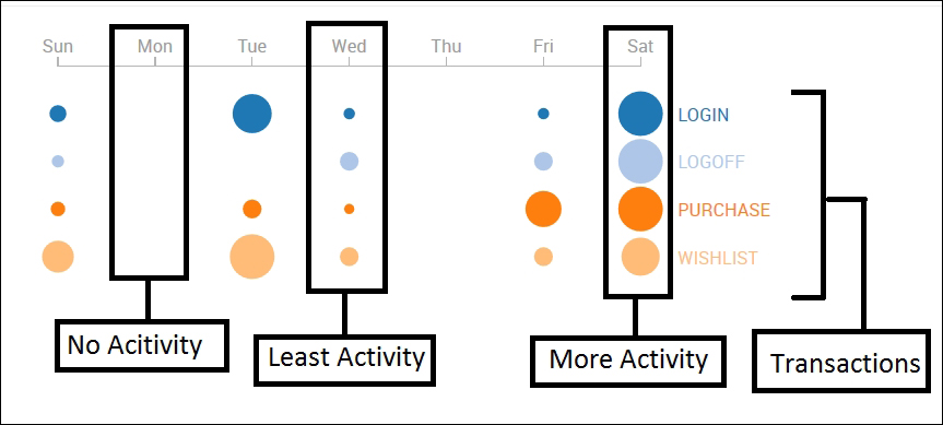
In the preceding punchcard visualization diagram, hovering the mouse on a circle will display the count value for each of the events of the hovered transaction. This functionality is coded in the punchcard.js file and can be customized per user requirement.
Here are the steps to be taken in the Splunk dashboard to create a punchcard visualization similar to the previous diagram:
- To implement punchcard visualization, JS and CSS files will be required, and they can be obtained by downloading the Splunk 6.X dashboard examples Splunk app from the Splunk app store.
- Then, copy the
punchcarddirectory from the downloaded app'sstaticfolder to the respective app'sstaticdirectory, where punchcard visualization is to be implemented. Explained in the following are some scenarios:- For instance, in our example, all files from the
$SPLUNK_HOMEetcapps simple_xml_examplesappserverstaticcomponentspunchcarddirectory are copied to thepunchcarddirectory of the search app located at$SPLUNK_HOMEetcappssearchappserverstaticcomponents. - The JS and CSS files from the preceding directory can be used as they are without any modification. If the user wants any customization with respect to color aesthetics (CSS) and functionality (JS), they can be modified.
- For instance, in our example, all files from the
- The dashboard in which the punchcard visualization is to be shown is modified to include
autodiscover.js, similar to what we have done in Sunburst sequence section in the previous section of this chapter. The dashboard script should look like the following:<dashboard script="autodiscover.js">
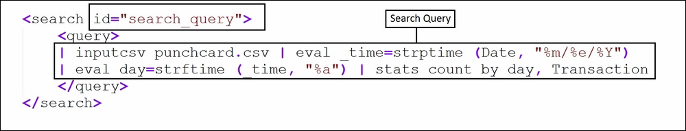
- The preceding search query that we used to create statistical output needs to be defined in the XML code of the dashboard with ID as follows:
- The following HTML code needs to be added in the
<panel>section of the XML code of the dashboard to get the punchcard visualization. Theidused in the preceding search query should be the same in themanageridsection of the following code:
- Modify the respective fields highlighted in the preceding screenshot with the required information and click on Save. Punchcard visualization is ready to be visible on the dashboard of Splunk.