
39
EXPERIMENTAL DESIGN FOR PHARMACEUTICAL DEVELOPMENT
Gregory S. Steeno
Worldwide Research and Development, Pfizer, Inc., Groton, CT, USA
39.1 INTRODUCTION
In the pharmaceutical industry and in today's regulatory environment, process understanding, in terms of characterization or optimization, is critical in developing and manufacturing new medicines that ensure patient safety and drug efficacy. Experimentation is the key component in building that knowledge base, whether those activities are physical experiments or trials run in silico. And this understanding comes from relating variation in observed response(s) back to changes, both intended and observational, in factors. If the factor changes are deliberate, then the scientist is testing hypotheses of factor effects and qualifying or quantifying their impact. What can be often neglected, however, is how important the quality of the experimental plan is and how that connects to making inferences from those data. This chapter focuses on both of these aspects: the experimental design and the data modeling.
For engineers characterizing a chemical reaction, experimental inputs span catalyst load, reaction concentration, jacket temperature, reagent amount, and other factors that are continuous in nature, as well as types of solvents, bases, catalysts, and other factors that are discrete in nature. These are examples of controllable factors and are represented as x1, x2, …, xp. Additional elements that can influence reaction outputs, such as analysts, instruments, lab humidity, etc., are examples of uncontrollable factors and are represented as z1, z2, …, zq. Figure 39.1, as shown by Montgomery [1], depicts a general process where both factor types impact the output.
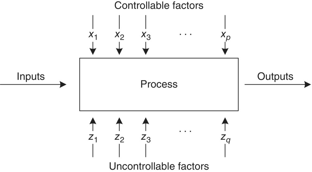
FIGURE 39.1 General process diagram.
The set of trials to develop relationships between factors and outputs, and the structure of how those trials are executed, is the experimental design. What follows are strategies for sound statistical design and analysis.
As a motivating example, consider a process where the output is yield (grams) and is expected to be a function of two controllable factors, reaction time (minutes) and reaction temperature (°C). That is, yield = f(time, temperature). As a first step in understanding and optimizing this process, experiments were executed by fixing time at 30 minutes and observing yield across a range of reaction temperatures. Figure 39.2 shows the data, and it is concluded that 35 °C is a reasonable choice as an optimal temperature. For the second step, experiments were executed by now fixing temperature at 35 °C and observing yield across a range of reaction times. Figure 39.3 shows the data, and it is concluded that the optimal time is about 40 minutes. The combined information from the totality of experiments produces an optimal setting of (temperature, time) = (35 °C, 40 minutes) with a predicted yield around 70 g.

FIGURE 39.2 Scatterplot of yield against temperature with empirical fit.
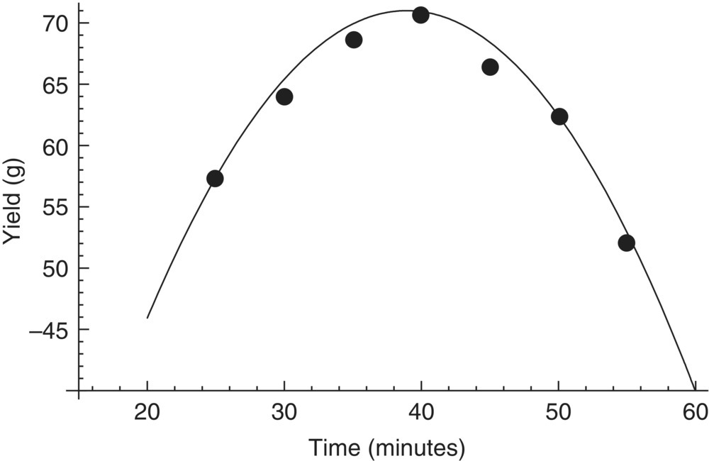
FIGURE 39.3 Scatterplot of yield versus time with empirical fit.
This experiment was conducted using a one‐factor‐at‐a‐time (OFAAT) approach. And while easy to implement and instinctively sensible, there are a few shortcomings when compared with a statistically designed experiment. In general, OFAAT studies (i) are not as precise in estimating individual factor effects; (ii) cannot estimate multivariate factor effects, such as linear × linear interactions; and (iii) as a by‐product are not as efficient at locating an optimum. Figure 39.4 illustrates the experimental path (●⋅⋅⋅⋅⋅●), the chosen optimum (XX), and the actual underlying relationship between time and temperature on yield. Since the joint relationship between time and temperature was not fully investigated, the true optimum around (temp, time) ≈ (60 °C, 60 minutes) was missed.
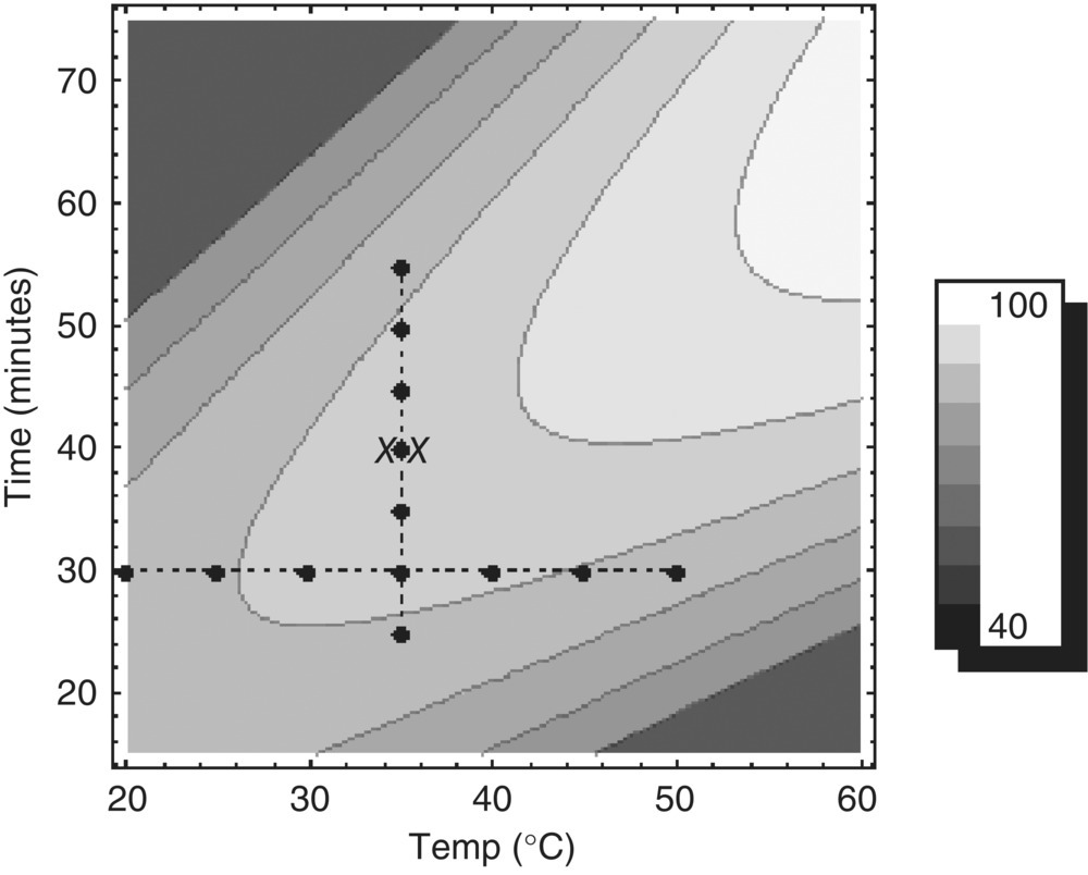
FIGURE 39.4 Contour plot of underlying mechanistic relationship of temperature and time on yield, along with experimental path (●⋅⋅⋅⋅⋅●) and chosen optimum (XX).
This example illustrates that even with only two variables, the underlying mechanistic relationship between the factors and response(s) can be complex enough to easily misjudge. This is especially true of many pharmaceutical processes where functional relationships are dynamic and nonlinear. Due to this complexity, experiments that produce the most complete information in the least amount of resources (time, material, cost) are vital. This is a major aspect of statistical experimental design, which is an efficient method for changing process inputs in a systematic and multivariate way. The integration of experimental design and model building is generally known as response surface methodology, first introduced by Box and Wilson [2]. The data resulting from such a structured experimental plan coupled with regression analysis easily lend to deeper understanding of where process sensitivities exist, as well as how to improve process performance in terms of speed, quality, or optimality.
The experimental design and analysis procedure is straightforward and intuitive but is described below for completeness to ensure that all information is collected and effectively used:
- Formulate a research plan with purpose and scope.
- Brainstorm explanatory factors denoted X1, X2, X3, …, that could impact the response(s). Discuss ranges and omit factors that have little scientific value.
- Determine the responses to be measured, denoted Y1, Y2, Y3, …, and consider resource implications.
- Select an appropriate experimental design in conjunction with purpose and scope. Consider the randomization sequence. Hypothesize process models.
- Execute the experiment. Measurement systems should be accurate and precise. The randomization sequence is key to balancing effects of random influences and propagation of error.
- Appropriately analyze the data.
- Draw inference and formulate next steps.
The statistical experimental designs discussed in this chapter are used to help estimate approximating response functions for chemical process modeling. To begin, the functional relationship between the response, y, and input variables, ξ1, ξ2, …, ξk, is expressed as
which is unknown and potentially intricate. The inputs, ξ1, ξ2, …, ξk, are called the natural variables, as they represent the actual values and units of each input factor. The ε term represents the variability not explicitly accounted for in the model, which could include the analytical component, the lab environment, and other natural sources of noise. For mathematical convenience, the natural variables are centered and scaled so that coded variables, x1, x2, …, xk, have mean zero and standard deviation one. This does not change the response function, but it is now expressed as
If the experimental region is small enough, f(⋅) can be empirically estimated by lower‐order polynomials. The motivation comes from Taylor's theorem that asserts any sufficiently smooth function can locally be approximated by polynomials. In particular, first‐order and second‐order polynomials are heavily utilized in response modeling from designed experiments.
A first‐order polynomial is referred to as a main effects model, due to containing only the primary factors in the model. A two‐factor main effects model is expressed as
where
- β1 and β2 are coefficients for each factor.
- β0 is the overall intercept.
This function represents a plane through the (x1, x2) space. As an example, consider an estimated model:
Figure 39.5 shows a 3D view of that planar response function, also called a surface plot. Figure 39.6 represents the 2D analogue called a contour plot. The contour plots are often easier to read and interpret since the response function height is projected down onto the (x1, x2) space. If there is an interaction between the factors, it is easily added to the model as follows:
This is called a first‐order model with interaction. To continue with the example, let the estimated model be
The additional term −5x1x2 introduces curvature in the response function, which is displayed on the surface plot in Figure 39.7 and the corresponding contour plot in Figure 39.8. Occasionally, the curvature in the true underlying response function is strong enough that a first‐order plus interaction model is inadequate for prediction. In this case, a second‐order (quadratic) model would be useful to approximate f(⋅) and takes the form
To finish the example, let the estimated model be
Figure 39.9 shows a parabolic relationship between y and x1, x2, while Figure 39.10 displays the typical elliptical contours generated by this model.
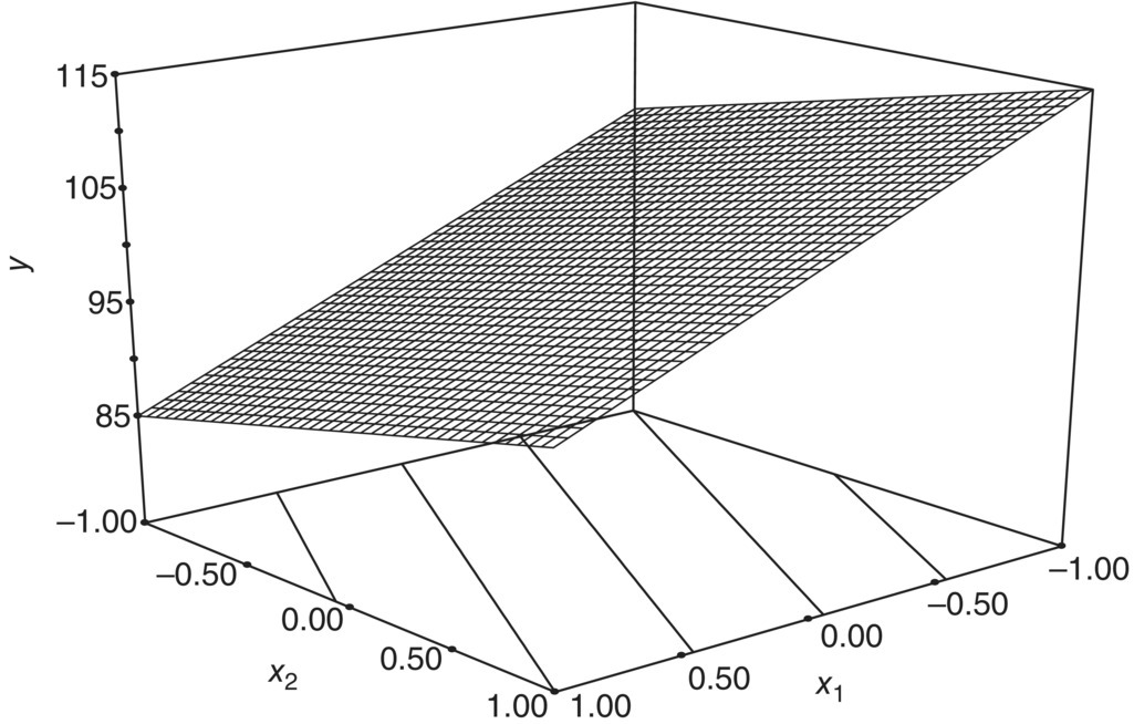
FIGURE 39.5 Surface plot of 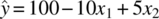 .
.

FIGURE 39.6 Contour plot of  .
.
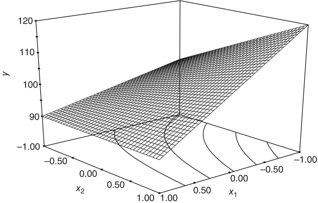
FIGURE 39.7 Surface plot of  .
.
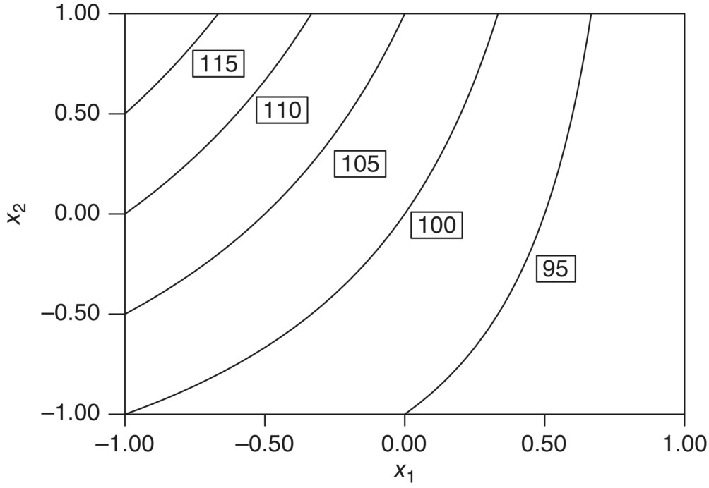
FIGURE 39.8 Contour plot of  .
.

FIGURE 39.9 Surface plot of  .
.
FIGURE 39.10 Contour plot of  .
.
There is an iterative, sequential nature to understanding and optimizing the performance of chemical processes. If the goal is to first identify the most important factors for further study, a screening design may be carried out. This is sometimes referred to as phase zero of the study. Once this is complete, the next objective is to determine if the optimum lies within current experimental region or if the factors need adjustment to locate a more desirable one, say, by using methods of steepest ascent/descent. This is referred to as phase one of the study, also known as region seeking. Finally, once in the region of desirable response is established, the goal becomes to precisely model that area and establish optimal factor settings. In this case, higher‐order models are employed to capture likely curvature about the optimum point.
39.2 THE TWO‐LEVEL FACTORIAL DESIGN
Factorial designs are experimental plans that consist of all possible combinations of factor settings. As an example, a factorial design with three different catalysts, two different solvents, and four different temperatures produces a design with 3 × 2 × 4 = 24 unique experimental conditions. The advantage of these designs is that all joint effects of factors can be investigated. The disadvantage is that these designs become prohibitively large and impractical when factors contain more than just a few levels or the number of factors under investigation is large.
The simplest and most widely used factorial designs for industrial experiments are those that contain two levels per factor, called 2k factorial designs, where k is the number of factors under investigation. The two levels for each factor are usually chosen to span a practical range to investigate. These designs can be augmented into fuller designs and are very effective in terms of time, resource, and interpretability. The class of 2k factorial designs can be used as building blocks in process modeling by:
- Screening the most important variables from a set of many.
- Fitting a first‐order equation used for steepest ascent/descent.
- Identifying synergistic/antagonistic multifactor effects.
- Forming a base for an optimization design, such as a central composite.
Factors can either be continuous in nature or discrete. For the rest of the chapter, it is assumed that the factors are continuous. This allows for predictive model building and regression analysis that includes the linear and interaction terms and subsequently the quadratic/second‐order terms.
To illustrate a two‐level factorial design, consider the previous case where there are k = 2 factors, temperature (factor A) and time (factor B), each having an initial range under investigation. In coded units, the low level of the range for each factor is scaled to −1, and the high level of the range is scaled to +1. The 22 experimental design with all four treatment combinations is shown in Table 39.1 and graphically depicted via (○) in Figure 39.11. Notice that each treatment condition occurs at a vertex of the experimental space. For notation, the four treatment combinations are usually represented by lowercase letters. Specifically, a represents the combination of factor levels with A at the high level and B at the low level, b represents A at the low level and B at the high level, and ab represents both factors being run at the high level. By convention, (1) is used to denote A and B, each run at the low level.
TABLE 39.1 Example 22 Experimental Design with n = 2 Replicates per Design Point
| Design | Response | ||||
| Treatment | Temperature (A) | Time (B) | Temp × Time (AB) | Rep 1 | Rep 2 |
| (1) | −1 | −1 | 1 | y11 | y12 |
| a | 1 | −1 | −1 | y21 | y22 |
| b | −1 | 1 | −1 | y31 | y32 |
| ab | 1 | 1 | 1 | y41 | y42 |
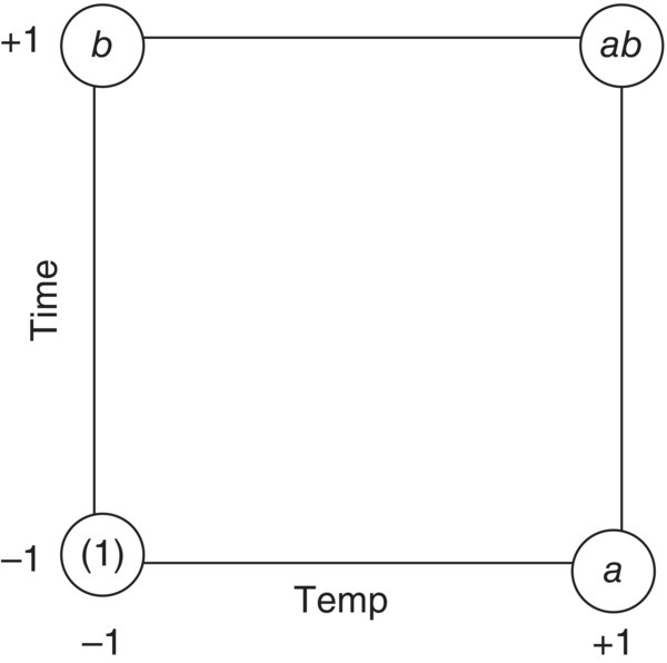
FIGURE 39.11 Factor space of 22 experimental design.
Two‐level designs are used to estimate two types of effects, main effects and interaction effects, and these are estimated by a single degree of freedom contrast that partitions the design points into two groups: the low level (−1) and the high level (+1). The contrast coefficients are shown in Table 39.1 for each of the main factors of temperature and time, as well as the temperature × time interaction obtained through pairwise multiplication of the main factor contrast coefficients.
A main effect of a factor is defined as the average change in response over the range of that factor and is calculated from the average difference between data collected at the high level (+1) and data collected at the low level (−1). For the 22 design above and using the contrast coefficients in Table 39.1, the temperature (A) main effect is estimated as
where
- (1), a, b, and ab are the respective sum total of responses across the n replicates at each design point (n = 2 in Table 39.1).
Geometrically this is a comparison of data on average from the right side to the left side of the experimental space in Figure 39.11. If the estimated effect is positive, the interpretation is that the response increases as the factor level increases. Similarly, the time (B) main effect is estimated as
which is a comparison of data on average from the top side to the bottom side in Figure 39.11.
An interaction between factors implies that the individual factor effects are not additive and that the effect of one factor depends on the level of another factor(s). As with the main effects, the interaction is estimated by partitioning the data into two groups and comparing the average difference. The contrast coefficients in Table 39.1 show that the temperature × time (AB) interaction effect is estimated as
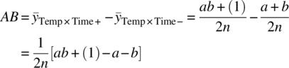
which is a comparison on average of data on the right diagonal against the left diagonal in Figure 39.11.
The sum of squares for each effect is mathematically related to their corresponding contrast. Specifically, the sum of squares for an effect is calculated by the squared contrast divided by the total number of observations in that contrast. For the example above, the sums of squares for temperature, time, and the temperature × time interaction are
In 2k designs, the contrasts are orthogonal and thus additive. The total sum of squares, SST, is the usual sum of squared deviations of each observation from the overall mean of the data set. Because the contrasts are orthogonal, the error sum of squares, denoted SSE, can be calculated as the difference between the total sum of squares, SST, and the sums of squares of all effects. For the 22 example, SSE = SST − SSTemp − SSTime − SSTemp×Time. With this information, the analysis of variance (ANOVA) table is constructed, as shown in Table 39.2.
TABLE 39.2 ANOVA Table for Completely Randomized 22 Design with n Replicates per Design Point
| Source | SS | DF | MS | F | p‐Value |
| Temp | SSTemp | 1 | MSTemp | MSTemp/MSE | pTemp |
| Time | SSTime | 1 | MSTime | MSTime/MSE | pTime |
| Temp × Time | SSTemp×Time | 1 | MSTemp×Time | MSTemp×Time/MSE | pTemp×Time |
| Error | SSE | 4(n − 1) | MSE | ||
| Total | SST | 4n − 1 |
The ANOVA table contains all numerical information in determining which factor effects are important in modeling the response. The hypothesis test on individual factor effects is conducted through the F‐ratio of MSFactor against MSError. If this ratio of “signal” against “noise” is large, this implies that the factor explains some of the observed variation in response across the design region and should be included in the process model. If the ratio is not large, then the inference is that the factor is unimportant and should be deleted from the model. All statistical evidence of model inclusion comes via the p‐value. Large F‐ratios imply low p‐values, and a common cutoff for model inclusion of a factor is p ≤ 0.05, although this should be appropriately tailored with experimental objectives, such as factor screening where the critical p‐value is normally bit higher.
It is important to identify all influential factors for modeling variation in response back to change in factor level. An underspecified model, one that does not contain all the important variables, could lead to bias in regression coefficients and bias in prediction. One approach to mitigate this issue is to not model edit but rather incorporate all factor terms in the process model, including those that contribute very little or nothing of value in predicting. However, an overspecified model, one that contains insignificant terms, produces results that lead to higher variances in coefficients and in prediction. Thus a proper model will be a compromise of the two. This can be completed manually, say, by investigating the full model ANOVA and then deleting insignificant effects one at a time, all while updating the ANOVA after every step. Yet for models that could contain many effects, this exercise becomes cumbersome. There are several variable selection procedures that can aid in helping identify smaller‐sized candidate models. The most common algorithms used in standard software packages entail either sequentially bringing in significant factors to build the model up (called forward selection), sequentially eliminating regressors from a full model (called backward elimination), or a hybrid of the two (called stepwise regression). The procedures typically involve defining a critical p‐value for factor inclusion/exclusion in the model‐building process. Once a term enters or leaves, factor significance is recalculated, and the process is repeated for the next step. The engineer should use these tools not as a panacea to the model‐building process, but rather as an exercise to see how various models perform. For more information on the process and issues of model selection, the reader is instructed to see Myers [3].
Once the significant factors are selected, the estimated regression coefficients in the linear predictive model are functionally derived from the factor's effect size. To estimate the regression coefficient βi for factor i, its effect is divided by two. The rationale is that by definition the regression coefficient represents the change in y per unit change in x. Since each factor effect is calculated as a change in response over a span of two coded units (−1 to 1), division by two is needed to obtain the per‐unit basis. Finally, the model intercept, β0, is calculated as the grand average of all the data.
TABLE 39.3 23 Reaction Conversion Experimental Design, Model, and Data
| Design | |||||||||
| Catalyst | Ligand | Temp | Data Conversion | ||||||
| Treatment | A | B | C | AB | AC | BC | ABC | Rep 1 | Rep 2 |
| (1) | −1 | −1 | −1 | 1 | 1 | 1 | −1 | 63.8 | 64.1 |
| a | 1 | −1 | −1 | −1 | −1 | 1 | 1 | 76.4 | 74.9 |
| b | −1 | 1 | −1 | −1 | 1 | −1 | 1 | 66.5 | 63.7 |
| ab | 1 | 1 | −1 | 1 | −1 | −1 | −1 | 76 | 76.3 |
| c | −1 | −1 | 1 | 1 | −1 | −1 | 1 | 78.7 | 77.7 |
| ac | 1 | −1 | 1 | −1 | 1 | −1 | −1 | 77.6 | 80.4 |
| bc | −1 | 1 | 1 | −1 | −1 | 1 | −1 | 78 | 81.3 |
| abc | 1 | 1 | 1 | 1 | 1 | 1 | 1 | 79 | 77.2 |

FIGURE 39.12 23 reaction conversion experimental space and corresponding data.
TABLE 39.4 Reaction Conversion Experiment ANOVA Table with Full Model
| Source | SS | DF | MS | F | p‐Value |
| A‐catalyst | 121.00 | 1 | 121.00 | 58.24 | <0.0001 |
| B‐ligand | 1.21 | 1 | 1.21 | 0.58 | 0.4673 |
| C‐temp | 290.70 | 1 | 290.70 | 139.93 | <0.0001 |
| AB | 2.25 | 1 | 2.25 | 1.08 | 0.3284 |
| AC | 138.06 | 1 | 138.06 | 66.46 | <0.0001 |
| BC | 0.30 | 1 | 0.30 | 0.15 | 0.7127 |
| ABC | 0.72 | 1 | 0.72 | 0.35 | 0.5717 |
| Error | 16.62 | 8 | 2.08 | ||
| Total | 570.87 | 15 |
TABLE 39.5 Reaction Conversion Experiment ANOVA Table After Model Editing
| Source | SS | DF | MS | F | p‐value |
| A‐catalyst | 121.00 | 1 | 121.00 | 68.80 | <0.0001 |
| C‐temp | 290.70 | 1 | 290.70 | 165.29 | <0.0001 |
| AC | 138.06 | 1 | 138.06 | 78.50 | <0.0001 |
| Error | 21.10 | 12 | 1.76 | ||
| Total | 570.87 | 15 |

FIGURE 39.13 Normal probability plot of residuals from reaction conversion model.
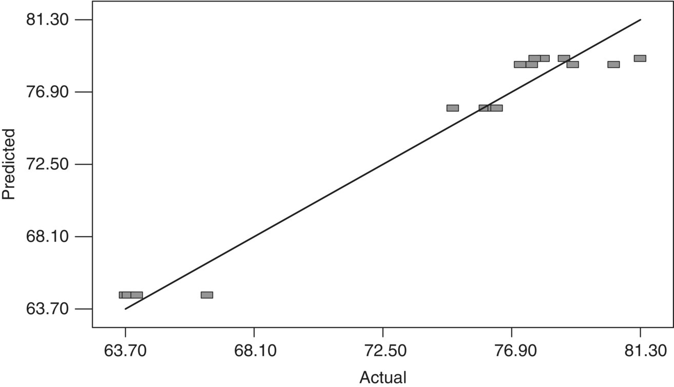
FIGURE 39.14 Predicted vs. actual plot using reaction conversion example.

FIGURE 39.15 Interaction plot of catalyst and temperature on reaction conversion.

FIGURE 39.16 Contour plot of predicted reaction conversion across catalyst and temperature levels.
39.3 BLOCKING
There are situations that call for the design to be run in groups or clusters of experiments. This often occurs when the number of factors is large, in which case the design would be broken down into smaller blocks of more homogeneous experimental units. These are referred to as incomplete blocks, as not all treatment combinations occur in these smaller sets. This situation also occurs with equipment setup or limitations, where groups of experiments are executed in “batches” at the same time. As one example, consider a replicated 22 design that investigates temperature and solvent concentration on reaction completion. The equipment chosen for the experiment is a conventional process chemistry workstation that has four independent reactors. A natural and appropriate way to execute this design is to run each replicate of the 22 design on the workstation with random assignment of the reactor vessels to each treatment combination. By doing this, any block‐to‐block variability is accounted for and does not influence the analysis on factor effects. As another example, consider a 23 design using the four‐reactor workstation that investigates temperature, solvent concentration, and catalyst loading on reaction completion. To execute this study, the design needs to be split into two groups of four, since it is not possible to execute all experiments in one block.
Both of these examples result in observations within the same group to be more homogeneous than those in another group. For situations where the experiment is subdivided, appropriate blocking can help in optimally constructing a design based on the assumption or knowledge that certain (higher‐order) interactions are negligible. This design technique is called confounding or aliasing, where information on treatment effects is indistinguishable from information on block effects. The number of blocks for the two‐level design is usually a multiple of two, implying designs are run in blocks of two, four, eight, etc.
To illustrate, consider the previous 23 design with temperature (A), solvent concentration (B), and catalyst loading (C) as the factors, with the design executed in two blocks of four on the workstation. The design and full model with associated contrast coefficients are shown in Table 39.6.
TABLE 39.6 23 Design Full Model Contrast Coefficients
| Treatment | A | B | C | AB | AC | BC | ABC |
| (1) | −1 | −1 | −1 | 1 | 1 | 1 | −1 |
| a | 1 | −1 | −1 | −1 | −1 | 1 | 1 |
| b | −1 | 1 | −1 | −1 | 1 | −1 | 1 |
| ab | 1 | 1 | −1 | 1 | −1 | −1 | −1 |
| c | −1 | −1 | 1 | 1 | −1 | −1 | 1 |
| ac | 1 | −1 | 1 | −1 | 1 | −1 | −1 |
| bc | −1 | 1 | 1 | −1 | −1 | 1 | −1 |
| abc | 1 | 1 | 1 | 1 | 1 | 1 | 1 |
One candidate design partition into two blocks of four is to group all combinations where ABC is at the low level (−1) into one block and all combinations where ABC is at the high level (+1) into the other block. Schematically, each block would appear as in Figure 39.17.

FIGURE 39.17 Schematic of 23 factorial divided into two blocks of size four.
Recall the contrast to estimate the effect of A (temperature) is written as
Any block effect between experiments conducted in Block 1 and those conducted in Block 2 is canceled out in this contrast, as the overall effect of A is actually a pooled sum of the simple within‐block effects of A. That is, let A1 be the comparison of A at the high level versus A at the low level within Block 1 and A2 be the corresponding comparison within Block 2. The overall effect of A is calculated as
This holds for all other effects except the ABC effect, where its corresponding contrast from Table 39.6 is
By design, the difference in those treatment combinations corresponds exactly to the design partition into Blocks 1 and 2. That is, the effect of ABC is not estimable; it is confounded with blocks. Assuming the ABC effect is negligible, this is an optimally constructed design, as the ABC effect was intentionally confounded to preserve inferences on lower‐order effects in the presence of any block‐to‐block variation.
The last example showed that for a design partitioned into two blocks, one effect (ABC) is chosen to be confounded with the block effect. Another way of stating this is that the block effect and the ABC effect share a degree of freedom in the analysis. For the case of four blocks that use three degrees of freedom in the analysis, the general procedure is to independently select two effects to be confounded with blocks, and then a third confounded effect is determined by the generalized interaction. This will be described in a more detail with fractional factorial designs. For more information on constructing blocks in 2k designs, see Myers and Montgomery [6].
39.4 FRACTIONAL FACTORIALS
Consider an unreplicated 26 design that contains 64 unique treatment combinations of the 6 factors and therefore 63 degrees of freedom for effects. Of those 63 degrees of freedom, only 6 are used for main effects (factors A, B, …, F) and 15 for two‐factor interactions (AB, AC, …, EF). Assuming the sparsity‐of‐effects principle holds, only a subset of the total degrees of freedom are used for the vital few effects that should adequately model the process. This discrepancy gets bigger as k gets larger, making full factorial designs an inefficient choice for experimentation. As with blocking, it is possible to optimally construct designs based on the assumption or knowledge that higher‐order interactions are negligible, which are smaller in size yet preserve critical information about likely effects of interest. These are called fractional factorial designs, and they are widely utilized for any study involving, say, five or more factors. In particular, these are highly effective plans for factor screening, the exercise to whittle down to only the crucial process factors to be subsequently studied in greater detail. As with the full factorial designs, the fractional factorials are balanced, and the estimated effects are orthogonal. Two‐level fractional factorial designs are denoted 2k−p, where k still represents the number factors in the study and p represents fraction level. A 2k−1 design is called a one‐half fraction of the 2k, a 2k−2 design is called a one‐quarter fraction of the 2k, and so on. A 2k−p design is a study in k factors, but executed with 2k−p unique treatment combinations.
Consider the 23 design, but due to limited resources, only four of the eight treatment combinations can be studied. The candidate design is a one‐half fraction of a 23 factorial, denoted 23−1. The primary questions in design construction are similar to those encountered in blocking and center on exactly how the four treatment combinations should be chosen and what information is contained in those experiments. Under the sparsity‐of‐effects principle, the ABC effect is negligible. Thus one choice of design is to choose those treatment combinations that are all positive in the ABC contrast coefficients. Equivalently one could choose the set that are all negative in ABC. Table 39.7 shows the experimental design for those coefficients positive in ABC.
TABLE 39.7 One‐Half Fraction of the 23 Full Factorial Design
| Treatment | A | B | C | AB | AC | BC | ABC |
| a | 1 | −1 | −1 | −1 | −1 | 1 | 1 |
| b | −1 | 1 | −1 | −1 | 1 | −1 | 1 |
| c | −1 | −1 | 1 | 1 | −1 | −1 | 1 |
| abc | 1 | 1 | 1 | 1 | 1 | 1 | 1 |
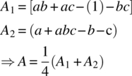
It should be clear to the reader from the contrast coefficients in Table 39.7 that (i) all information for the ABC term is sacrificed in creating this design and (ii) the contrast coefficients that estimate one effect exactly match those for another. For instance, the contrast to estimate the A effect simultaneously estimates the BC effect. That is,
As previously discussed with the blocks, the effect of A is said to be confounded (aliased) with BC. Similarly, the B effect is confounded with the AC effect, and the C effect is confounded with the AB effect. There is no way to individually estimate those effects, only their linear combinations. This pooling of effect information is a by‐product of fractional factorial designs.
In the previous example, the ABC term was assumed the least important effect and used as the basis for constructing the 23−1 experimental design. Formally, ABC is called the design generator and is algebraically expressed in the relation
This is known as the defining relation, where I stands for identity, and implies that the ABC effect is confounded with the overall mean. Knowing this relationship helps determine details about the alias structure. This is accomplished by multiplying each side of the defining relation by an effect of interest and deleting any letter raised to the power 2 (i.e. via modulo 2 arithmetic). Any effect multiplied by I gives the effect back. Below demonstrates how to determine which effects are confounded with the main effect of A:
The interpretation is that the estimated A effect is confounded with the BC effect (A = BC), which was previously observed via the contrast coefficients in Table 39.7. Likewise it is trivial to show B = AC and C = AB.
The defining relation for the chosen fraction above is more descriptively expressed as I = +ABC, since all contrast coefficients were positive in ABC. This is called the principle fraction and will always contain the treatment combination with all levels at their high setting. Alternatively, the complementary fraction could have been selected such that the defining relation would be expressed as I = −ABC. As a consequence, the linear contrasts would estimate A − BC, B − AC, and C − AB. Irrespective of sign, both fractions are statistically equivalent as main effects are confounded with two‐factor interactions, although there may be a practical difference between the two.
Appropriately, one‐half fraction designs are always constructed with the highest‐order interaction in the defining relation. For instance, a 25−1 experiment uses I = ABCDE to create the fraction and to investigate the alias structure, as this interaction is assumed the least likely effect to significantly explaining response variation. However, the one‐half fraction may still be too large to feasibly execute, and therefore fractions of higher degrees should be considered. The quarter‐fraction design, denoted 2k−2, is the next highest degree fraction from the half‐factorials and comprises a fourth of the original 2k factorial runs. These designs require two defining relations, call them I = E1 and I = E2, where the first designates the half fraction based on the “+” or “−” sign on the E1 interaction and the second divides it further into a quarter fraction based on the “+” or “−” sign on the E2 interaction. Note that all four possible fractions using ±E1 and ±E2 are statistically equivalent, with the principle fraction corresponding to choosing I = +E1 and I = +E2 in the defining relation. In addition, the generalized interaction E3 = E1⋅E2 using modulo 2 arithmetic is also included. Thus to investigate the alias structure for a 2k−2 fractional factorial design, the complete defining relation is written as I = E1 = E2 = E3. These interactions need to be chosen carefully to obtain a reasonable alias structure.
As an example, consider the 26−2 design for factors A through F, and let E1 = ABCE and E2 = BCDF. The generalized interaction, E3, is computed by multiplying the two interactions together and deleting any letter with a power of 2. Thus
and hence the complete defining relation is expressed as
It is easy to show for this design that main effects are confounded with three‐factor interactions and higher (e.g. A = BCE = ABCDF = DEF) and that two‐factor interactions are confounded with two‐factor interactions and higher (AB = CE = ACDF = BDEF). Again, individual effects are not estimable, only the linear combinations.
To succinctly describe the alias structure of fractional factorials, design resolution is introduced. The resolution of a fractional factorial design is characterized by the length of the shortest effect (often referred to as the shortest word) in the defining relation and is represented by a Roman numeral subscript. The one‐half fraction of a 25 factorial with defining relation I = ABCDE is called a resolution V design and is formally denoted ![]() . Similarly, the one‐quarter fraction of a 26 factorial with defining relation I = ABCE = BCDF = ADEF is a resolution IV design and is denoted
. Similarly, the one‐quarter fraction of a 26 factorial with defining relation I = ABCE = BCDF = ADEF is a resolution IV design and is denoted ![]() . The design resolutions of greatest interest are described below.
. The design resolutions of greatest interest are described below.
- Resolution III: There exist main effects aliased with two‐factor interactions. These designs are primarily used for screening many factors to identify which are the most influential in process modeling.
- Resolution IV: Main effects are confounded with three‐factor interactions, and two‐factor interactions are confounded with each other. Assuming the sparsity‐of‐effects principle, main effects are said to be estimated free and clear, since three‐factor interactions and higher are considered negligible.
- Resolution V: Main effects are confounded with four‐factor interaction, and two‐factor interactions are confounded with three‐factor interactions. Assuming the sparsity‐of‐effects principle, main effects and two‐factor interactions are said to be estimated free and clear, since three‐factor interactions and higher are considered negligible.
39.5 DESIGN PROJECTION
One of the major benefits to using the two‐level factorials and fractional factorials is to take advantage of the design projection property. This states that factorial and fractional factorial designs can be projected into stronger designs in a subset of the significant factors. In the case of unreplicated full factorials, those designs project into full factorials with replicates. For example, by disregarding one insignificant factor from a 24 full factorial, the design becomes a full 24−1 = 23 factorial with 21 replicates at each point. In the case of fractional factorial designs of resolution R, those designs project into full factorials in any of the R − 1 factors, conceivably with replicates. It may be possible to project to a fuller design with more parameters than the R − 1 rule dictates, but this is not guaranteed.
As a specific example, consider the ![]() fractional factorial design with defining relation I = +ABC that investigates catalyst equivalents (A), ligand equivalents (B), and solvent volume (C). The four treatment combinations are depicted on the cube in the middle of Figure 39.18. As this is a resolution III design, it projects into a full factorial in any two of the three factors, also displayed in Figure 39.18. The projection property of two‐level designs is very important, simply due to its usefulness in obtaining full modeling information on a subset of factors and its implicit use in sequential experimentation.
fractional factorial design with defining relation I = +ABC that investigates catalyst equivalents (A), ligand equivalents (B), and solvent volume (C). The four treatment combinations are depicted on the cube in the middle of Figure 39.18. As this is a resolution III design, it projects into a full factorial in any two of the three factors, also displayed in Figure 39.18. The projection property of two‐level designs is very important, simply due to its usefulness in obtaining full modeling information on a subset of factors and its implicit use in sequential experimentation.

FIGURE 39.18 Illustration of projecting a 23 fraction onto a full 22 factorial in a subspace of the experimental region.
39.6 STEEPEST ASCENT
The content so far has focused on employing experimental designs with the sole purpose of identifying magnitude of effects plus two‐parameter synergies. Often though, the process models are used for optimization or improvement. The combination of experimental design, model building, and sequential experimentation used in searching for a region of improved response is called the method of steepest ascent (or steepest descent if explicitly minimizing). The goal is to effectively and efficiently move from one region in the factor space to another. Model simplicity and design economy are very important. The general algorithm consists of:
- Fitting a first‐order (main effects) model with an efficient two‐level design.
- Computing the path of steepest ascent (descent), where there is an expected maximum increase (decrease) in response.
- Conduct experiments along the path. Eventually response improvement will slow or start to decline.
- Carry out another factorial/fractional design.
- Recompute new path, or augment into optimization design.
Constructing the path of steepest ascent is straightforward. Consider all points that are a fixed distance from the design region center (i.e. radius r) with the desire to seek the parameter combination that maximizes the response. Mathematically, one uses the method of Lagrange multipliers to find where the maximum response lies, constrained to the radius r. Intuitively, the path of steepest ascent is proportional to the size and sign of the coefficients for the first‐order model in coded units. For example, let fitted equation be 2 + 3x1 − 1.5x2. As shown in Figure 39.19, the path of steepest ascent will have x1 moving in a positive direction and x2 in a negative direction. More specifically, the path is such that for every 3.0 units of increase in x1, there will correspondingly be 1.5 units of decrease in x2. For steepest decent, the path is chosen using the opposite sign of the coefficients.
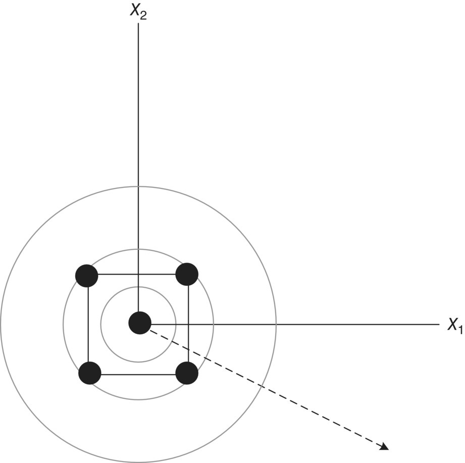
FIGURE 39.19 Path of steepest ascent for the model  .
.
The success of the steepest ascent method rests on whether the region where the path is constructed is main effect driven. Steepest ascent should still be successful in the presence of curvature (interaction or quadratic), as long as it is small relative to size of the main effects. If curvature is large, then this exercise is self‐defeating. In addition, the success of the path is dependent on the overall process model. Models that are poor and have high uncertainty lead to paths with high uncertainty. Finally, modifying the steepest ascent path with linear constraints is both mathematically and practically easy to incorporate. For more information on process improvement with steepest ascent, see Myers and Montgomery.
39.7 CENTER RUNS
One of the model assumptions in using a two‐level design is linearity across the experimental region. If the region is small enough, this is a fair assumption. If the region spans a somewhat bolder space and/or the region contains the optimal process condition, then it would not be surprising if nonlinearity exists. Unfortunately, two‐level designs by themselves cannot even detect any curvilinear relationship across the design region, much less model it. A cost‐effective strategy to initially identify curvature and also have an independent estimate of variance is to add center runs to the experimental design. This second point is critical as in practice most 2k designs are unreplicated. Using the standard ±1 scaling of factor levels, center runs are replicated nc times at the design point xi = 0, i = 1, 2, …, k. Note that adding center runs produces no impact on the usual effect estimates in the 2k design. The pure error variance is estimated with nc − 1 degrees of freedom, and the test for nonlinearity is via a single degree of freedom contrast that compares the average response at the center to the average response from the factorial points. If nonlinearity is nonexistent across the design region, these averages should be comparable. Specifically, let ![]() be the average of the nc center points, and let
be the average of the nc center points, and let ![]() be the average of the nf factorial points. The formal hypothesis test of nonlinearity is conducted by comparing the sum of squares for curvature
be the average of the nf factorial points. The formal hypothesis test of nonlinearity is conducted by comparing the sum of squares for curvature
against the mean squared error. This test does not give any information on which factors contribute the sources of curvature, only whether curvature exists or not. If ![]() is large, then curvature is present across the design region. The implication is that the linear model with main effects and interactions is inadequate for prediction and additional design points or a more advanced design is necessary to identify which specific factors are contributing to the nonlinearity in order to accurately predict across the experimental region.
is large, then curvature is present across the design region. The implication is that the linear model with main effects and interactions is inadequate for prediction and additional design points or a more advanced design is necessary to identify which specific factors are contributing to the nonlinearity in order to accurately predict across the experimental region.
39.8 RESPONSE SURFACE DESIGNS
Previous discussion has centered on fitting first‐order and first‐order plus interaction models. However, a higher‐order model is necessary when in the neighborhood of optimal response. In this case, second‐order models are very good approximations to the true underlying functional relationship when curvature exists. These take the form

To estimate the second‐order model, each factor must have at least three levels. Implicitly there has to be as many unique design points as model terms. Many efficient designs are available that accommodate the above model. The most common is the central composite design (CCD) (Box and Wilson). The k‐factor CCD is comprised of three components: a full 2k factorial or resolution V fraction, center runs, and 2⋅k axial points. One compelling feature of CCD is that the axial points are a natural augmentation to the standard 2k or ![]() plus center run designs.
plus center run designs.
As the name suggests, the axial points lie on the axes of each factor in the experimental space. In coded units they are set at a distance ±α from the center of the design region. The axial value, α, can take on any value, which speaks to the flexibility of these designs. In practice they are usually taken at either α = 1 for a face‐centered design, ![]() for a spherical design, or α = f1/4 for a rotatable design, where f is the size of factorial or fractional used in the CCD. Table 39.8 shows an example of a two‐factor CCD, and Figure 39.20 displays the experimental region.
for a spherical design, or α = f1/4 for a rotatable design, where f is the size of factorial or fractional used in the CCD. Table 39.8 shows an example of a two‐factor CCD, and Figure 39.20 displays the experimental region.
TABLE 39.8 General Two‐Factor Central Composite Design
| X1 | X2 | |
| −1 | −1 | |
| 1 | −1 | } Factorial runs |
| −1 | 1 | |
| 1 | 1 | |
| 0 | 0 | } Center runs (≥1) |
| −α | 0 | } Axial runs |
| α | 0 | |
| 0 | −α | |
| 0 | α |

FIGURE 39.20 Illustration of general two‐factor central composite design.
Referring to Figure 39.20, if the axial value is set at α = 1, then all of the experimental conditions except the center runs lie on the surface of the cube. Similarly, if the axial value is set at ![]() , all of the experimental conditions except the center runs lie on the surface of a sphere. For rotatable designs, the precision on the model prediction is a function of only the distance from the design center and the error variance, σ2. This is illustrated through the two‐factor CCD in Table 39.8. The number of factorial points is nf = 4, which yields
, all of the experimental conditions except the center runs lie on the surface of a sphere. For rotatable designs, the precision on the model prediction is a function of only the distance from the design center and the error variance, σ2. This is illustrated through the two‐factor CCD in Table 39.8. The number of factorial points is nf = 4, which yields ![]() as the axial value for rotatability. Assuming the design contains nc = 3 center runs, Figure 39.21 displays how the scaled standard error of prediction varies across the design region. First, the prediction error increases toward the boundary of the design region, a behavior typically seen with confidence bands about a simple linear regression fit. Second, as the design is rotatable, the standard error of prediction is constant on spheres of radius r. Consider two model predictions in Figure 39.21,
as the axial value for rotatability. Assuming the design contains nc = 3 center runs, Figure 39.21 displays how the scaled standard error of prediction varies across the design region. First, the prediction error increases toward the boundary of the design region, a behavior typically seen with confidence bands about a simple linear regression fit. Second, as the design is rotatable, the standard error of prediction is constant on spheres of radius r. Consider two model predictions in Figure 39.21, ![]() and
and ![]() , that are at different coordinates in the experimental region. While the model‐based predictions should be different, the precision of
, that are at different coordinates in the experimental region. While the model‐based predictions should be different, the precision of ![]() and
and ![]() is the same as both are equidistant from the center of the design region.
is the same as both are equidistant from the center of the design region.
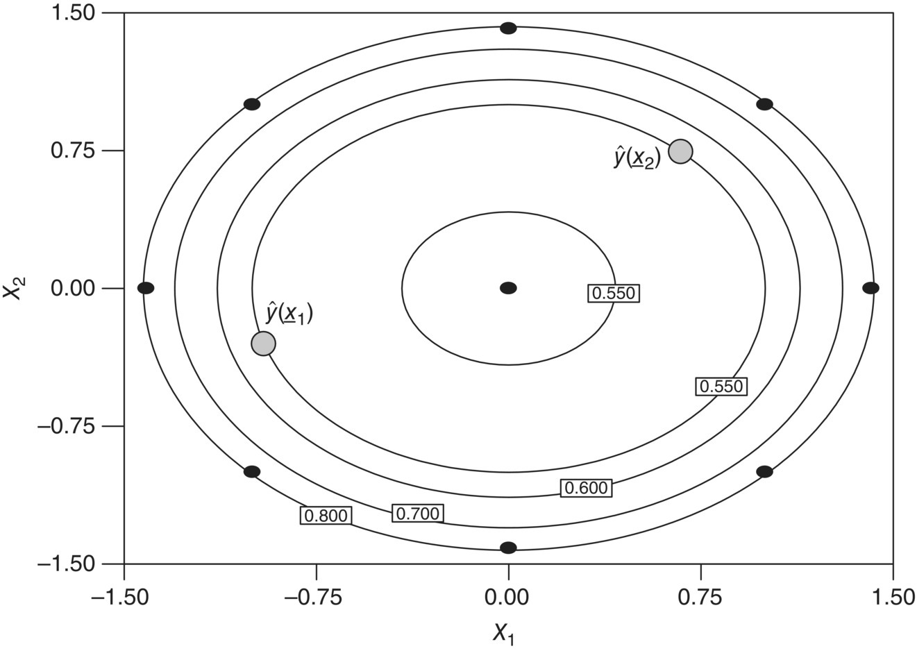
FIGURE 39.21 Illustration of rotatability using the standard error of prediction across factor space.
An alternative to the class of CCD are the Box–Behnken [7] designs (BBD). These experimental plans are very efficient in fitting second‐order models, are nearly rotatable, and have a potentially practical advantage of experimenting with three equally spaced levels over the experimental region. These designs are constructed by incorporating 22 or 23 factorial arrays in a balanced incomplete block fashion, with the other factors set at their center value. Table 39.9 shows an example of a three‐factor BBD, and Figure 39.22 displays the design in graphical form. The BBDs are spherical designs, and there are no factorial “corner points” or face points. For the k = 3 design shown in Figure 39.22, all conditions except the center runs are at ![]() distance from the center. This should not deter the engineer from using this design, especially if predicting at the corners is not of interest, potentially due to cost, impracticality, feasibility, or other issues.
distance from the center. This should not deter the engineer from using this design, especially if predicting at the corners is not of interest, potentially due to cost, impracticality, feasibility, or other issues.
TABLE 39.9 Three‐Factor Box–Behnken Design
| X1 | X2 | X3 |
| −1 | −1 | 0 |
| 1 | −1 | 0 |
| −1 | 1 | 0 |
| 1 | 1 | 0 |
| −1 | 0 | −1 |
| 1 | 0 | −1 |
| −1 | 0 | 1 |
| 1 | 0 | 1 |
| 0 | −1 | −1 |
| 0 | 1 | −1 |
| 0 | −1 | 1 |
| 0 | 1 | 1 |
| 0 | 0 | 0 |

FIGURE 39.22 Illustration of three‐factor Box–Behnken design.
39.9 COMPUTER‐GENERATED DESIGNS
Classical experimental designs such as those discussed so far may not be appropriate for a practical situation due to one or more constraints. These could include:
- Sample size limitations due to time, budget, or material, which may yield a nonstandard number of runs, say, 11 or 13.
- Nonviable factor settings, therefore impacting the experimental region geometry. Examples include solubility limitations, safety concerns, and small‐scale mixing sensitivities.
- Desired factor levels are nonstandard, say, 4 or 6.
- Factors are both qualitative and quantitative.
- Proposed model may be more complicated than first‐ or second‐order polynomial, either higher in order or nonlinear.
For such cases, experimental designs should be tailored to accommodate any constraints yet still preserve properties that the more classical designs typically possess, such as those based on model precision and prediction precision. The design construction is accomplished with computer assistance and falls under the class of computer‐generated designs. The computer is a vital tool to construct appropriate designs that meet certain objectives, but unfortunately can be viewed as a black box and misused because of gaps in understanding exactly what the computer algorithms are doing.
Computer‐generated designs, and the area of optimal design theory, can be attributed to Kiefer [8, 9] and Kiefer and Wolfowitz [10]. The general algorithm consists of the engineer providing an objective function that reflects the design property of interest, a hypothesized model, the sample size for the study, and other design elements potentially corresponding to blocks, center runs, and lack of fit. The algorithm then uses a fine grid of candidate experimental conditions and searches for the design that optimizes the objective function.
There are several objective functions that speak to design properties of interest and are referred to as alphabetic optimality criteria. As background to the objective functions, consider the linear model
where
-
 is the (N × 1) vector of observations.
 - X is the (N × p) model matrix.
-
 is the (p × 1) vector of model coefficients.
 -
 is the (N × 1) vector of errors assumed to be independent and normally distributed with mean zero and variance σ2.
The ordinary least squares estimate of model coefficients is
and the covariance matrix of those estimates is given by
In addition, the variance of a predicted mean response, ![]() , at coordinates
, at coordinates ![]() is given by
is given by
It should be apparent to the reader from Eqs. (39.1) and (39.2) the importance of good experimental design on the model and prediction precision, as demonstrated through the (X′X)−1 matrix embedded in both of those quantities.
The most common optimality criterion is D‐optimality, which minimizes the joint confidence region on the regression model coefficients. A‐optimality is a similar and common criterion that minimizes the average size of a confidence interval on the regression coefficients. Both D‐ and A‐optimality use functions of Eq. (39.1) to obtain the appropriate design and are defined by the scaled moment matrix, M, expressed as
for completely randomized designs. The scaling takes away any dependence on σ2, a constant independent of the design, and the sample size, N, which allows for comparisons across designs of different size. The algorithm finds that set of design points that maximizes the determinant of M for D‐optimality and minimizes the trace of M−1 for A‐optimality.
Two other criteria are G‐optimality and IV‐optimality, which use functions of the prediction variance in Eq. (39.2) to obtain a candidate design. A G‐optimal design minimizes the maximum size of a confidence interval on a prediction over the entire experimental region, whereas IV‐optimality minimizes the average size of a confidence interval on a prediction over the entire experimental region. Similar to the scaling done with the D‐criterion above, these criteria are defined by the scaled prediction variance given by ![]() .
.
Research and software application in the area of optimal design theory has grown immensely over the recent past. Clearly the flexibility is appealing and at times invaluable. It allows the engineer to generate an experimental design for any sample size, number of factors (both discrete and continuous), type of model (linear or nonlinear), and randomization restrictions. Here are some additional notes and cautions regarding computer‐generated designs:
- They are model‐dependent optimal. Occasionally, the engineer will propose a mechanistic model that represents the true relationship between y and
 . Often though, empirical models are proposed and inevitably edited after collecting data. The edited designs are suboptimal with respect to the criterion, and process modeling performance could deteriorate. There are strategies and graphical tools available to help generate and assess model robustness, such as those proposed by Heredia‐Langner [11].
 - The optimal design for one criterion is usually robust/near optimal across other criteria [12]. This is not overly surprising due to the importance of the (X′X)−1 matrix. However, this is not guaranteed as it is possible to generate a D‐optimal design that has poor prediction variance.
- Slight variations in algorithms and software packages could lead to generated designs that are statistically equivalent but different experimentally. As a matter of good scientific practice, the engineer needs to scrutinize the design for merit and practicality.
- Two‐level designs for main effects only and main effects plus two‐factor interaction models are all A‐, D‐, G‐, and IV‐optimal.
- Classical CCD and BBD for second‐order models are near optimal. That is, they are highly efficient relative to the most optimal designs.
39.10 MULTIPLE RESPONSES
Up until now any discussion involving effect identification and regression analysis has focused on a single response, and the process model for that response can be used to hone in on a region of desirability in the factor space, as defined by the engineer. However, rarely in practice are experiments conducted when only a single response is collected. With chemical reaction trials, natural outputs could include various impurity levels, completion time, and yield, just to name a few. Standard analysis practice would involve (i) modeling each of those outcomes separately, (ii) defining their respective region of acceptable response over the factor space, and (iii) identifying the intersection of individual regions where all responses are deemed acceptable. Some software packages include this feature of overlaying contour plots, which is an effective approach in locating an optimal process operating region. However, when the number of responses and/or factors gets somewhat large, this exercise can become quite cumbersome. In addition, it is not surprising to have competing responses, meaning the optimal region for one response is suboptimal for other responses. This commonly occurs with crystallization processes, where maximum impurity purge is often at the sacrifice of higher yield, due to similar solubility properties of the chemical species. The question then becomes how to effectively merge process model information to identify conditions that are optimally balanced across multiple criteria.
The idea of desirability functions introduced by Derringer and Suich [13] addresses this problem. This is a formula scaled between [0, 1] inclusively, where the researchers own priorities and requirements are built into the optimization procedure. To illustrate, consider minimizing the total impurity level (%) from a chemical reaction and assume that any reaction that produces less than 0.5% is highly desirable. On the other hand, assume a reaction with more than 3% is unacceptable. The desirability function, d, for that response is expressed as
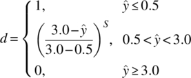
Model predictions less than 0.5% get the highest desirability score of one, whereas model predictions higher than 3% get the lowest desirability score of zero. For cases in between those levels, there exists a gradient of desirability scores that are a function of both the model prediction and a weight, S. This weight is chosen by the engineer, and it determines the severity of not achieving the most desirable goal, which in this case is 0.5% or less. Figure 39.23 gives a visual of how that desirability function behaves for various values of S.

FIGURE 39.23 Example total impurity desirability function across various weights of S.
For a given factor setting, each of the m responses has its own desirability score. That is, response i gets desirability, di, i = 1, 2, …, m. To obtain the overall desirability across m responses at any experimental condition, the overall desirability score, D, is calculated as the geometric mean of each individual di, expressed as D = {d1 ⋅ d2 ⋅ , …, ⋅ dm}1/m. This overall score is easily modified when responses vary in importance. For example, impurity responses that affect drug product quality (and therefore affect the patient) are considered more important versus, say, yield that affects a sponsor's bottom line. The final objective is to locate parameter conditions that make D largest. This is normally accomplished via response surface modeling of D across experimental space and/or numerical techniques. Many software packages include this functionality as part of optimization. Note that any identified conditions should be confirmed for acceptability.
TABLE 39.10 Three‐Factor CCD Design to Optimize Total Impurities and Yield
| Design | Data | |||
| Catalyst | Concentration | Temperature | Total Impurities | Yield |
| −1 | 1 | −1 | 23.54 | 33.95 |
| −1 | −1 | −1 | 10.57 | 15.27 |
| 0 | 0 | 0 | 12.20 | 35.10 |
| 1 | 1 | −1 | 19.74 | 15.43 |
| −1 | 1 | 1 | 5.20 | 18.68 |
| 1 | −1 | −1 | 8.61 | 2.50 |
| 0 | 0 | 0 | 11.10 | 37.20 |
| 1 | −1 | 1 | 0.79 | 24.00 |
| 0 | 0 | 1 | 8.63 | 33.40 |
| −1 | −1 | 1 | 2.59 | 8.30 |
| 0 | 0 | 0 | 10.10 | 42.20 |
| 1 | 0 | 0 | 11.96 | 32.16 |
| 1 | 1 | 1 | 4.40 | 42.10 |
| 0 | −1 | 0 | 5.47 | 31.90 |
| 0 | 0 | −1 | 15.98 | 21.60 |
| 0 | 1 | 0 | 17.07 | 47.80 |
| −1 | 0 | 0 | 12.82 | 31.17 |

FIGURE 39.24 Illustration of three‐factor face‐centered CCD design.
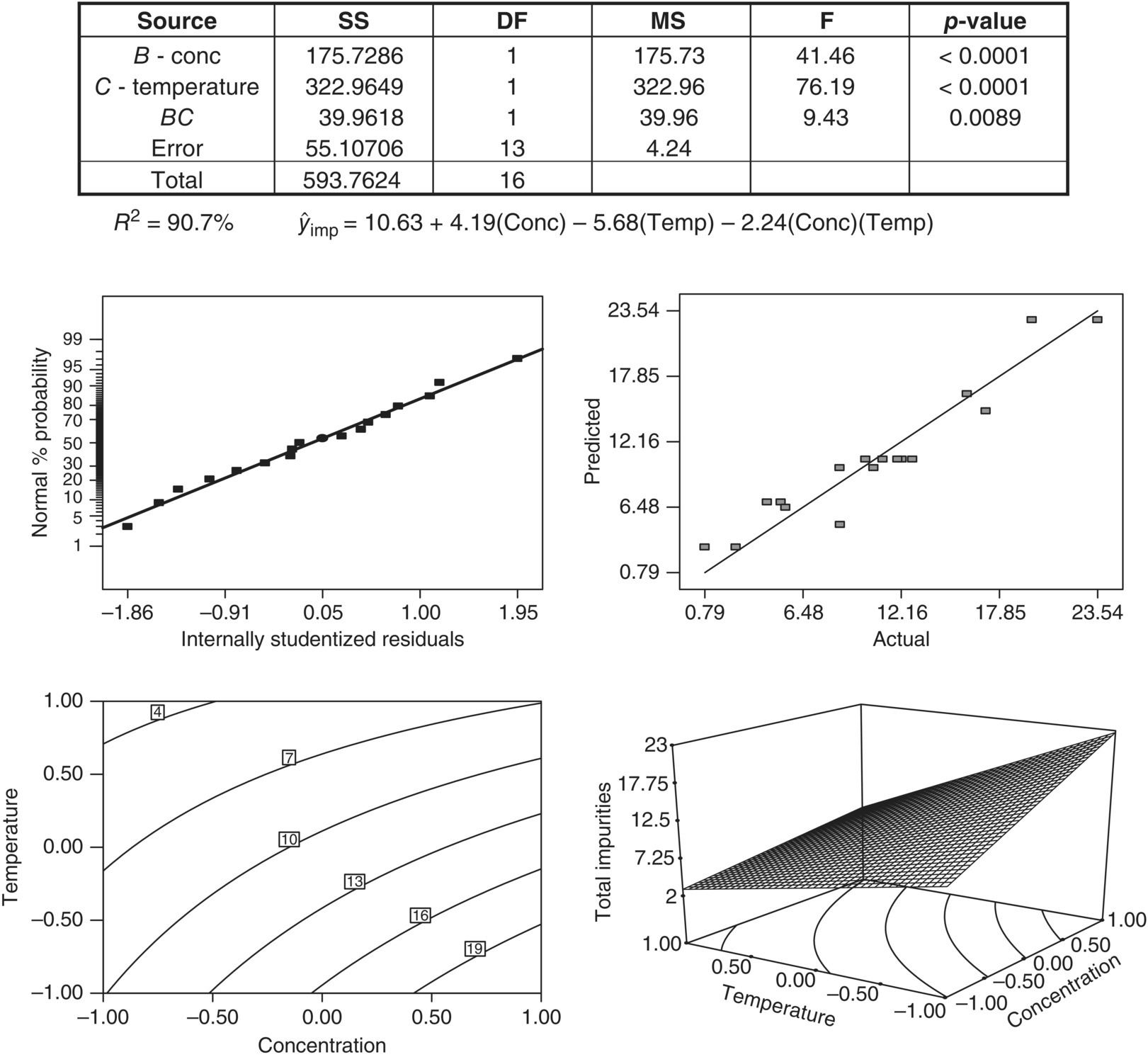
FIGURE 39.25 Summary of total impurity modeling.

FIGURE 39.26 Summary of yield modeling.
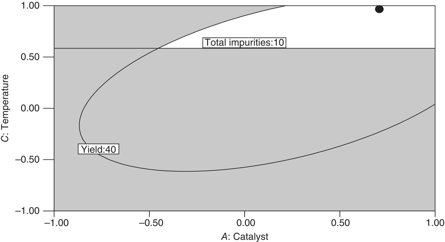
FIGURE 39.27 Overlay plot of catalyst–temperature combinations that meet specified performance criteria for total impurities and yield, with candidate optimal setting (●).
39.11 ADVANCED TOPICS
39.11.1 Industrial Split‐Plot Designs
One assumption made throughout the chapter is that all experimental designs have complete randomization of the treatment combinations, which are generally called completely randomized designs. However, for experiments run at larger scale and/or with equipment limitations, complete randomization of the experiments is arduous to execute. This happens with factors that are difficult to independently change for each design run or impractical when certain factors can and should be held constant for some duration of the experiment due to resource or budget constraints. Temperature and pressure are examples that immediately come to mind of hard‐to‐change factors. When this situation occurs, part of the design is executed in “batch mode.” That is, certain treatment combinations are fixed across a sequence of experiments, without resetting the actual treatment combination. This type of execution results in nested sources of variation and is called a split‐plot design. These designs were originally developed for agronomic experiments, but its applicability easily spans all fields of science, even as the agricultural naming conventions have endured.
The basic split‐plot experiment can be viewed as two experiments that are superimposed on each other. The first corresponds to a randomization of hard‐to‐change factors to experimental units called whole plots, while the second corresponds to a separate randomization of the easy‐to‐change factors within each whole plot, called subplots. This is different than completely randomized designs, which have unrestricted randomization factor combinations across all experimental units. The blocking of the hard‐to‐change factors along with the two separate randomization sequences creates a correlation structure among data collected within the same whole plot. Inferentially, the associated ANOVA needs to reflect that the experiment was executed in a split‐plot fashion. If the data were analyzed as if the experiments were completely randomized, then it is possible to erroneously conclude significance of hard‐to‐change effects when they are not, while conclude insignificance of easy‐to‐change effects when they are. A good discussion on classical split‐plot designs can be found in Hinkelmann and Kempthorne [14], as well as in Box and Jones [15] regarding response surface methodology.
In the recent past considerable attention has been given to constructing and evaluating optimal split‐plot designs, especially with the computational horsepower of today's computers. Topics span from algorithms for D‐optimal split‐plot designs [16, 17] to comparing the performance between classical response surface designs in a split‐plot structure [18] to graphical techniques for comparing competing split‐plot designs [19]. This is an important area of research as many, if not most, industrial experiments are conducted in a split‐plot fashion, whether deliberately planned or not. For those cases when it is planned, more software tools are becoming widely available so that the split‐plot experiment are both powered sufficiently and analyzed appropriately.
39.11.2 Nonstandard Conditions
Model diagnostics and the analysis of residuals are a crucial part of any model‐building exercise and are standard with any software package with a regression component. The information can numerically or visually identify any conditions from the standard assumption of normal and independent residuals with mean zero and common variance σ2. Examples of nonstandard conditions are heterogeneous variance, data transformations, outliers, and non‐normal errors.
In practice, the assumption of homogeneous variance is most likely violated. For many scientific applications, it is natural that variability increases with either response or regressor. From a theoretical perspective, this is simple to accommodate as the ordinary least squares estimate of regression coefficients, ![]() , is slightly altered to a weighted least squares estimate, where the weights are the inverse of the variances. The implication is that residuals with large variances (small weights) should not count as much in the model fit as those with small variances (large weights). For a given matrix of weights, W, the expression for the weighted least squares estimate of β is given by
, is slightly altered to a weighted least squares estimate, where the weights are the inverse of the variances. The implication is that residuals with large variances (small weights) should not count as much in the model fit as those with small variances (large weights). For a given matrix of weights, W, the expression for the weighted least squares estimate of β is given by
The immediate practical issue is how to obtain the weights. One approach is to collect multiple data at each experimental condition and use the corresponding estimate of variance. However, this is problematic if the sample variances are based on a small number of data and therefore potentially unreliable as a solution. A loose rule of thumb is that any estimated weights should be based on no less than a sample of nine [20]. Less than that can result in very poor performance of the weighted least squares solution, and ignoring the weights would be the better course of action.
One effective approach concerning the issue of increasing variance relative to increasing response is through a response transformation. The most common data transformation is the log transformation (y* = ln(y) or y* = log10(y)), where the mechanism of change in y across ![]() is exponential. Other less common transformations include the square root (
is exponential. Other less common transformations include the square root (![]() ) and reciprocal (y* = y−1). All of these examples fall under the class of power transformations, where y* = yλ. The Box–Cox method [21] is one particular and powerful technique that aids in properly transforming y into y* and takes the form
) and reciprocal (y* = y−1). All of these examples fall under the class of power transformations, where y* = yλ. The Box–Cox method [21] is one particular and powerful technique that aids in properly transforming y into y* and takes the form
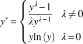
where
-
 is the geometric mean of the original data.
The assignment of ln(y) when λ = 0 comes from the limit of (yλ − 1)/λ as λ approaches zero, which allows for continuity in λ. The use of ![]() rescales the response to the same units so that the error sum of squares can be comparable across different values of λ. As mentioned, common power transformation values of λ are −1, 0, 0.5, and 1, the last corresponding to no response transformation. In practice, after an appropriate model is fit to the data, an estimate of λ that minimizes the error sum of squares is estimated. If this value is significantly different than 1.0, a transformation on the data is recommended to produce a better fit, with potentially a different model. Most software packages that contain the Box–Cox procedure as part of model diagnostics provide a confidence interval on λ that simultaneously tests the hypothesis of no response transformation needed and puts a bound on a recommended one.
rescales the response to the same units so that the error sum of squares can be comparable across different values of λ. As mentioned, common power transformation values of λ are −1, 0, 0.5, and 1, the last corresponding to no response transformation. In practice, after an appropriate model is fit to the data, an estimate of λ that minimizes the error sum of squares is estimated. If this value is significantly different than 1.0, a transformation on the data is recommended to produce a better fit, with potentially a different model. Most software packages that contain the Box–Cox procedure as part of model diagnostics provide a confidence interval on λ that simultaneously tests the hypothesis of no response transformation needed and puts a bound on a recommended one.
39.11.3 Designs for Nonlinear Models
Except for a brief mention in the section on computer‐generated designs, all the discussion and examples in this chapter have only considered models that are linear in their parameters, which are then (successfully) used to approximate underlying nonlinear behavior over a small region. By definition, a linear model is one where the partial derivatives with respect to each model parameter are only a function of the factor/regressor. A simple example is the two‐factor interaction model
It is trivial to show that ∂y/∂βi, (i = 0, 1, 2, and 12), does not depend on βi. Conversely, a nonlinear model is defined as one where at least one of the partial derivatives is a function of a model parameter. An example of a nonlinear model would be
where
- both ∂y/∂β0 and ∂y/∂β1 are still functions of the unknown β‐parameters.
Of course, chemical engineers are fully aware that the majority of kinetic models are nonlinear and not even closed form but expressed as differentials.
As opposed to linear models, in most cases classical experimental designs are not appropriate or optimal for nonlinear models. (The notable exception is in some applications of generalized linear models, as discussed by Myers et al [22].) Thus practitioners typically rely on computer‐generated designs that are optimal in some respect, such as by D‐ or G‐optimality criteria previously described. However, this is problematic and circular in terms of design construction, since the optimal design for a nonlinear model is a function of the unknown parameters. To circumvent that issue, initial parameter estimates are used that are often the results of previous studies and/or scientific knowledge. These designs are called locally optimal, and Box and Lucas [23] discuss locally D‐optimal designs for nonlinear models. Intuitively, if the initial model parameter estimates are poor, then the locally optimal design will suffer in performance. One avenue that gets away from parameter point estimates is to use Bayesian approach to experimental design [24], where the scientist would postulate a prior distribution on the parameters plus specify a utility function, which is similar in spirit to the objective functions discussed in classical alphabetic optimal criteria. In any event, optimal designs for nonlinear models are inherently sequential, which may be an obstacle in adoption. In addition, commonly available technology has not caught up to the contemporary thinking in this field, adding another very tangible barrier. Nevertheless, independent of model type, it should be apparent that the process model fit is only as good as the design behind the data.
REFERENCES
- 1. Montgomery, D.C. (2005). Design and Analysis of Experiments, 6e. New York: Wiley.
- 2. Box, G.E.P. and Wilson, K.B. (1951). On the experimental attainment of optimum conditions. Journal of the Royal Statistical Society, Series B 13: 1–45.
- 3. Myers, R.H. (1990)). Classical and Modern Regression with Applications, 2e. Belmont, CA: Duxbury Press.
- 4. Design Expert version 7.1.6 (2007). Stat‐Ease, Inc., Minneapolis, MN.
- 5. Daniel, C. (1959). Use of half‐normal plots in interpreting factorial two‐level experiments. Technometrics 1: 311–342.
- 6. Myers, R.H. and Montgomery, D.C. (2002). Response Surface Methodology: Process and Product Optimization Using Designed Experiments, 2e. New York: Wiley.
- 7. Box, G.E.P. and Behnken, D.W. (1960). Some new three‐level designs for the study of quantitative variables. Technometrics 2: 455–475.
- 8. Kiefer, J. (1959). Optimum experimental designs. Journal of the Royal Statistical Society, Series B 21: 272–304.
- 9. Kiefer, J. (1961). Optimum designs in regression problems. Annals of Mathematical Statistics 32: 298–325.
- 10. Kiefer, J. and Wolfowitz, J. (1959). Optimum designs in regression problems. Annals of Mathematical Statistics 30: 271–294.
- 11. Heredia‐Langner, A., Montgomery, D.C., Carlyle, W.M., and Borror, C.M. (2004). Model robust designs: a genetic algorithm approach. Journal of Quality Technology 36: 263–279.
- 12. Cornell, J.A. (2002). Experiments with Mixtures: Designs, Models, and the Analysis of Mixture Data, 3e. New York: Wiley.
- 13. Derringer, G. and Suich, R. (1980). Simultaneous optimization of several response variables. Journal of Quality Technology 12: 214–219.
- 14. Hinkelmann, K. and Kempthorne, O. (1994). Design and Analysis of Experiments Volume I: Introduction to Experimental Design. New York: Wiley.
- 15. Box, G.E.P. and Jones, S. (1992). Split‐plot designs for robust product experimentation. Journal of Applied Statistics 19: 3–26.
- 16. Goos, P. and Vandebroek, M. (2001). Optimal split plot designs. Journal of Quality Technology 33: 436–450.
- 17. Goos, P. and Vandebroek, M. (2003). D‐Optimal split plot designs with given numbers and sizes of whole plots. Technometrics 45: 235–245.
- 18. Letsinger, J.D., Myers, R.H., and Lentner, M. (1996). Response surface methods for bi‐randomization structure. Journal of Quality Technology 28: 381–397.
- 19. Liang, L., Anderson‐Cook, C.M., Robinson, T.J., and Myers, R.H. (2006). Three dimensional variance dispersion graphs for split‐plot designs. Journal of Computational and Graphical Statistics 15: 757–778.
- 20. Deaton, M.L., Reynolds, M.R. Jr., and Myers, R.H. (1983). Estimation and hypothesis testing in regression in the presence of nonhomogeneous error variances. Communications in Statistics, B 12 (1): 45–66.
- 21. Box, G.E.P. and Cox, D.R. (1964). An analysis of transformations (with discussion). Journal of the Royal Statistical Society, Series B 26: 211–246.
- 22. Myers, R.H., Montgomery, D.C., and Vining, G.G. (2002). Generalized Linear Models With Applications in Engineering and the Sciences. New York: Wiley.
- 23. Box, G.E.P. and Lucas, H.L. (1959). Design of experiments in non‐linear situations. Biometrika 46: 77–90.
- 24. Chaloner, K. and Verdinelli, I. (1995). Bayesian experimental design: a review. Statistical Science 10: 273–304.