
EMULATING THE WINDOWS 95 EXPLORER WITH THE LISTVIEW CONTROL
The ListView control allows you to create a dialog that looks similar to the views found in the Windows 95 Explorer. With this control, you can add a view that's different from the everyday laundry list of items.
The following sections show how to fill the ListView control programmatically. But first, some more explanation about the control and its properties is needed.
Looking at the Different Views of the ListView Control
The following views can be found:
Large Icons. This view displays large icons with the label underneath (refer to Figure 14.7). Only the specified label is displayed.
Small Icons. Items are lined up across the screen with small icons displayed beside the labels. Only the specified label is displayed.
List. Items are listed down the screen with small icons displayed beside the labels. Only the specified label is displayed.
Report. Items are listed down the screen with small icons displayed beside the labels (refer to Figure 14.8). Other item details are also displayed.
Although the names of the first three view choices correspond with Explorer's view names, the Report view matches up with the Detail view in Explorer.
Seeing the Major Groupings of the ListView Control Properties
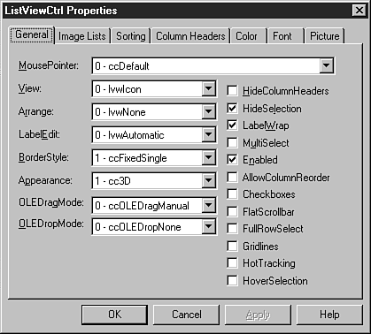
The ListView control has properties not only for the main control, but also for each possible column. Figure 14.9 shows the ListView control's property sheet. Table 14.2 describes each page on the ListView control property sheet.
Figure 14.9. The General properties for the ListView control affect the control's overall appearance.
| Page | Description |
|---|---|
| General | This page contains properties that affect the overall display of the ListView control (refer to Figure 14.9). |
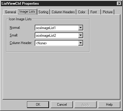
| Image Lists | Specify two ImageList controls on this page: one for the normal icon size and one for the small icon size. |
| Sorting | This page contains three properties. The first one specifies whether you want to sort a column of the ListView control. The second allows you to set which column you want to use for sorting (O – for the label text, > 0 for the other columns). The last property specifies whether to sort ascending or descending. |
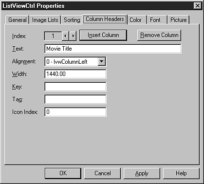
| Column Headers | This page adds the individual columns. With it you can specify the text, alignment, and width. Other properties pertaining to columns also are specified here. |
| Color | Specify colors for the standard Windows 95 settings on this page. |
| Font | Select the fonts for the text displayed. |
| Picture | Set a custom mouse cursor on this page. |
Setting Up a ListView Control Manually
To set up a ListView control manually, follow these steps:
1. |
Create two ImageLists as described earlier in the section “Adding Images to the ImageList Control at Runtime”—one for normal icons and one for small icons. The ImageLists have only one picture apiece. |
2. |
Specify the two ImageList controls in the appropriate property on the Image Lists page, Normal and Small (see Figure 14.10). Figure 14.10. The Image Lists page lets you set up which ImageLists to use in the ListView control.
|
3. |
On the Column Headers page, create the columns you want to include in your view list. Figure 14.11 shows the filled-out page for the column heading Movie Title. Figure 14.11. You can set up column headings for the ListView control in Design view.
|
Note
The Width value for columns is set in twips, the unit of measure when assigning values to screen measurements from VBA. A twip is 1,440th of an inch.
Although you can set up the ListView control's columns and images at design time, the actual data that's displayed must be loaded in code by using VBA. Unlike Access controls such as combo boxes and list boxes, the ListView control isn't data-bound.
Creating and Filling a ListView Control Using VBA
It's actually easier to see how a ListView control is created by using code instead of following steps through the property sheet. In the following example, you see how to load ImageList controls, create column headings for the ListView control, and lastly fill the control with the desired data. Listing 14.4 shows the code that's run in the OnLoad event for the WindowsCommonControlsListView form.
Listing 14.4. Chap14.mdb: Filling a ListView Control
The code in Listing 14.4 performs these steps:
1. |
It declares two object variables: objDummy and ocxListV (objDummy isn't actually used for anything in this code). |
2. |
It sets ocxListV as a reference to the ListView control on the form. |
3. |
The code then uses the Add method of the ListImages collection for two ImageList controls and loads the two different icon sizes. |
Note
This section of the code is covered earlier in the section “Adding Images to the ImageList Control at Runtime,” where the ListImages collection is examined more closely.
4. |
It assigns the two ListImage controls to the Icon (referred to as Normal in the UI) and SmallIcon (Small) properties of the ListView control. (This is the same as step 2 shown in the preceding section.) |
5. | |
6. |
It opens the recordset that's supplying the actual data. |
7. |
It loads the data into the ListItems collection via the Add method. The SubItems collection off the ListItem object is loaded with the other information that's to be displayed—in this case, the TitleNo and Rating columns. |
With this code, you can start displaying data with the ListView control. You can also create different views for flexibility.