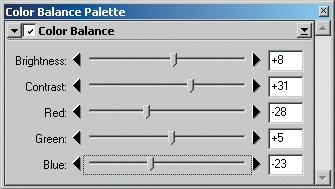
In the Color Balance palette, there are sliders to control brightness and contrast separately as well as the color channels red, green, and blue. These are global settings. To tweak a specific tonal range, use Curves; adjustments to tonal range cannot be done with Color Balance. Brightness and contrast apply to all color channels of the image.
Optimizing the image with Color Balance is quick and easy, but it only allows for relatively rough corrections. For that reason, experienced users prefer the more complicated tuning with Curves. This feature allows much finer color balance and contrast correction.
Brightness changes the brightness of the entire image. For example, if many details are overexposed, the overall brightness can be reduced. It is not possible to make a specific tonal range darker or brighter. DEE and comparable functions are available for that purpose.
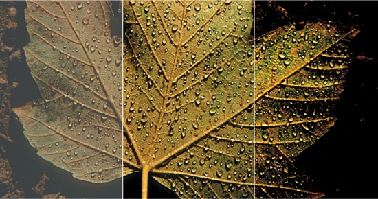
Contrast describes the brightness difference between bright and dark portions of the image. If the contrast is too low, the image looks flat. If the contrast is too high, details get lost and the color distribution in general looks hard and unnatural. Below, the example with the maple leaf is a collage of three partial images. In the middle the contrast is ideal, on the left it is too low, and on the right it is too high.