
Decreasing Contrast and Detail
Any part of the curve that's flatter (more horizontal) than the original line indicates an area where the contrast has been reduced (shades of gray become more similar). Look at the gradient directly below these areas to determine which shades of the image were changed. The flatter the line becomes, the less contrast you'll see in that area of the image. When you lower the amount of contrast in an image, it becomes harder to see detail. This can be useful if you want detail to be less visible. If the curve becomes completely horizontal in an area, you've lost all detail there (Figures 6.41 to 6.43). Remember, it's a bar chart—the same height means the same brightness.
Figure 6.41. Original image. (©2005 Andy Katz)

Figure 6.42. Curves used to reduce apparent detail in woodwork.

Figure 6.43. Result of applying Curves to reduce apparent detail.

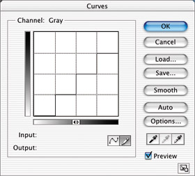
Let's Analyze a Classic Tip
Have you ever heard the tip, “Make an S curve”? Well, let's explore exactly what an S curve does (Figure 6.44).
Figure 6.44. A classic S curve.

Remember, to find out what a curve is doing to your image, you should compare the curve with the original line. Look at the areas of the curve that are steeper than the original line—in this case, the middle of the curve. The shades represented by these steeper areas will appear to have more detail. Whenever you pull detail out of one part of an image, you'll also lose detail in another part. Therefore, look at either end of the curve, at the areas of the curve that are flatter than the original line (more horizontal). These areas appear to have less detail. Thus, an S curve attempts to exaggerate detail in the middle grays of the image. However, it also gives you less detail in the highlights and shadows.
Checking Ink Ranges
Look at Figure 6.45 and concentrate on the gradient at the left side of the Curves dialog box. This gradient indicates how dark an area will become if you move the curve to a particular height. Pick a shade of gray from that gradient (such as 90%); then look directly to the right of it to determine if you'll have any areas that shade of gray. Pick another shade and do the same thing. If the curve starts in the lower-left corner and ends in the upper-right corner, each one of the shades should be used somewhere in the image. However, there might be a few shades that are used in more than one area of the curve.
Figure 6.45. After this adjustment, the image won't contain any areas darker than 90% or brighter than 18%.

Inverting Your Image
Think of a stock-market chart that indicates what's happening to the market over a month's time. If you're like most investors, whenever the market's going up, you're happy. However, you're always carefully watching that chart to see if the market starts to dip. If it does, that's when you start to panic. You can think of curves in the same way. As long as the curve is rising, you're fine; however, if the curve starts to fall, you should expect unusual results. Look at Figure 6.46, and try to figure out what's happening in the area that's going downhill. The dark areas of the image (around 75%) became bright, and the bright areas (around 25%) became dark. That means you've inverted that part of the image. You'll usually want to minimize or avoid this situation unless you're going for a special effect (Figures 6.47 and 6.48).
Figure 6.46. Areas between 25% and 75% have been inverted.

Figure 6.47. Original image. (©2005 PhotoSpin, www.photospin.com)

Figure 6.48. Result of applying the curve shown in Figure 6.51 and fading it using Luminosity mode.


Freeform Curves
To change the curve, you're not limited to adding and moving points. Another way to define a curve is to click the pencil icon at the bottom of the Curves dialog box and draw a freeform shape (Figure 6.49). However, the shape you draw has to resemble a line moving from left to right. Go ahead, just try to draw a circle. You can't do it. That's because the Curves dialog box is just like a bar chart, and you can't have two bars for a single shade. Just for giggles, draw a really wild-looking line across the grid area, and then look at your image. Drawing your own line with the Pencil tool is usually better for special effects than for simple image adjustments.
Figure 6.49. A curve created with the Pencil tool.

Let's take a quick look at some of the things you can do when working with a freeform curve:
Smoothing: After creating a curve with the Pencil tool, you can click the Smooth button to smooth out the shape you drew (Figure 6.50). Go ahead and click it multiple times to keep smoothing the curve.
Figure 6.50. A freeform curve after Smooth is applied.

Converting to points: To convert any line drawn with the Pencil tool into a normal curve, click the curve icon (Figure 6.51).
Figure 6.51. The result of converting a freeform curve into a normal curve.

Drawing straight lines: You can also draw straight lines with the Pencil tool (Figure 6.52). Just Shift-click across the graph area, and Photoshop will connect the dots to create a straight line.
Figure 6.52. Straight lines drawn by Shift-clicking with the Pencil tool.

Posterizing: By drawing a stair-step shape with the Pencil tool, you can accomplish the same effect as if you had used the Posterize command (Figure 6.53).
Figure 6.53. Drawing stair-steps is the same as choosing Image > Adjust > Posterize.
To try this out, open the image called chrome.jpg from the CD, and then play around with the Pencil tool in the Curves dialog box. Try making a huge M or W, and experiment with different shapes. You should be able to transform the 3D type into some cool-looking chrome text if you experiment long enough (Figures 6.54 to 6.56).
Figure 6.54. Freeform curve used to create chrome effect.

Figure 6.55. Image from the CD.

Figure 6.56. Result of applying the curve in Figure 6.54.
