Use Gray to Fix Color?!?
 | Just because I mention RGB mode throughout this chapter doesn't mean that the techniques don't work just as well in CMYK mode. It's just that the initial concept I show you really needs to be performed in RGB mode. So, even though you'll end up dealing with RGB settings at the beginning, Photoshop can translate them into CMYK numbers once you start performing the steps listed under the “Professional Color Correction” section of this chapter. If you just look at the CMYK area of the color picker, you'll see what you'd end up with in CMYK mode. |
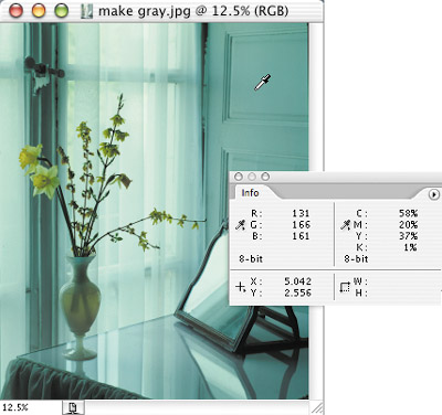
For the time being I want you to wipe out any thoughts of color. And, no, I'm not crazy. This approach really works, so stick with me. Do you remember how to make gray in the idealized RGB mode that we talked about in the “Color Management” chapter? Equal amounts of red, green, and blue, right? With that in mind, let's open an image and see if we can find an area that should be gray. Then we can look in the Info palette to see if it really is gray in Photoshop—all without having to trust your monitor or your eyes! On the CD, open the image that's called make gray.jpg. The door on the right should be a shade of gray. If the RGB numbers in the Info palette aren't equal—no matter what it looks like on your monitor—it's not gray. If it's not gray, then it must be contaminated with color (Figure 8.1). But could that color be contaminating more than the gray area? Most likely. Then why not use the door as an area to measure what's wrong with the entire image so we have the information we need to fix it? Let's give it a try.
Figure 8.1. If the RGB numbers are not equal, then that area is not gray. (©2005 Andy Katz)
Using the example image, you'll see that the RGB numbers are not equal, telling us that there is indeed color lurking somewhere in that gray. How could those contaminating colors get in there? Here are a few potential culprits: indoor, artificial lighting (you know how “off” that can be); the temperature of the chemicals used to develop the film being too hot or too cool; inappropriate filters used in a photographic enlarger when your prints are being made; and aging bulbs in a scanner that might shift the colors during the scanning process. We're going to use the Curves dialog box to make our adjustment. But don't worry, you don't have to remember everything from Chapter 6, “Understanding Curves” to do this. For what we're trying to accomplish, here's what you need to know:
Command- or Ctrl-clicking on your image will add a point.
The Input number indicates what you are changing.
The Output number determines what you'll end up with in the area you are changing.

And don't worry, even if you skipped the chapter on Curves, you'll still be able to quickly color correct your images. At this stage, we're only going to manually adjust a curve. After that, I'll show you a much faster and easier method, so just stick with me knowing that it will end up being really easy.
Start by putting your cursor on the gray door. Now glance over at the Info palette and write down the RGB numbers (131R, 166G, and 161B in my case). To make that door area a real gray, we'll need to make those RGB numbers equal. But we don't want to change the brightness of the door. To make sure that doesn't happen, grab a calculator and add the three RGB numbers together to find out the total amount of light that is making up the door (131 + 166 + 161 = 458, for example). We don't want to change the brightness of the door, so we'll want to keep the total amount of light used the same as what we started with, but using equal amounts of red, green, and blue. To figure out the exact numbers to use, just divide the total brightness of the door (458 in my case) by three (458 ÷ 3 = 152.6667), and then round off the result so you don't have any decimals (153 in my case). Now that we know what we're starting with (from the Info palette) and what we want to end up with (from the calculator), we can adjust our image.
If you choose Image > Adjustments > Curves and then Command-click on your image while the menu at the top of the dialog box is set to RGB, you'll end up changing red, green, and blue in equal amounts, which would just change the brightness of the image (which is what we did in the Curves chapter). But for our purposes, we want to work on the individual colors separately. To have Photoshop add a point to each of the red, green, and blue curves, hold Shift-Command (Mac) or Shift-Ctrl (Windows) and click on the gray door. If you want to see what happened, choose one of the colors that show up under the Channel pop-up menu at the top of the Curves dialog box. You should find a new point on each of those curves. The position of each one of those points is based on the numbers that showed up in the Info palette. All you need to do is switch between the red, green, and blue curves and change the output numbers for each one so that they match the numbers you came up with when you used a calculator to average the RGB numbers (153 in my case) in the Info palette (Figure 8.2). After you've done that, you can take a peek at your image to see what you've done (Figure 8.3). The door should be gray. If it's not, and you're quite sure you followed the steps correctly, your monitor is way out of whack and may need calibration (see Chapter 7, for details on how to do that).
Figure 8.2. The Output number you enter for each curve will move the point to the correct position.

Figure 8.3. when you're done, the area should be gray. The left numbers indicate what was originally in the image; the right numbers indicate the result of our adjustment.

But now, look back at the three curves we applied to this image (Figures 8.4 to 8.6). We measured what was wrong with the image in the gray areas, but our adjustment changed the entire image. That's logical enough, because whatever is wrong with the gray areas is also affecting the rest of the image. But when you look at those curves, does it look like we really changed the full length of the curve? Almost—but not quite. We didn't change the brightest and darkest areas. So, we really haven't accomplished our color correction, and we won't until we've taken some more steps. But from this exercise, we saw that our concept of measuring and adjusting gray works. Now let's see how we can make this process faster and easier, and then we'll move on to adjusting the brightest and darkest areas.
Figure 8.4. The red curve.

Figure 8.5. The green curve.

Figure 8.6. The blue curve.

It might feel quite low tech to be scribbling a bunch of numbers on a sheet of paper and using a calculator when we have a multi-thousand-dollar computer in front of us. The folks at Adobe realized that, and gave us a tool that will do 99% of the work for us, so let's see what they came up with. Choose File > Revert to return that door and flowers image back to its original state, and then choose Image > Adjustments > Curves. Click on the middle eyedropper in the lower right of the dialog box, and then move your cursor out onto the image and click on that gray door again. With a single click, it should change to gray. Photoshop is using the same concept we used when we wrote down the RGB numbers and averaged them; it's just doing it in a fraction of a second and there is no paper involved. In fact, those eyedroppers will help us even more if we adjust the full range of shades from the brightest to the darkest. Let's see how it works.