The Adjust Tab
The Adjust tab should be your mandatory first stop in the Camera Raw dialog box. I use it for every image I ever open with Camera Raw (Figure 9.9); all the other settings under the other tabs can be considered optional. The Adjust tab is where we can change the overall color feeling of the image, adjust the brightness and contrast, and make sure we retain as much detail as possible. I like to start with the White Balance settings.
Figure 9.9. The settings found under the Adjust tab control the overall color appearance and tonality of an image.

White Balance
This setting allows you to shift the overall color of your image, making it feel warm, cool, or neutral. There are three ways to set the white balance of your image: the pop-up menu, the sliders, or the Eyedropper tool.
You might find yourself using the White Balance pop-up menu because it's simple and easy. That's where you'll find presets for different types of lighting conditions (Daylight, Cloudy, Tungsten, Fluorescent). If you know which type of light an image was shot under, then choose that preset so Photoshop will correct for that particular light source. If you're not sure what the lighting conditions were when the image was shot, then just click through them and watch your image change until you find the one that makes the colors in your image look their best (Figures 9.10 and 9.11). Or, if you're in a big hurry, just set the menu to Auto and Photoshop will use the setting that it thinks is appropriate for the lighting conditions of your image. All this pop-up menu is doing is moving the Temperature and Tint sliders to preset positions. But before you start fiddling with those sliders, I'd recommend beginning with the pop-up menu because that will easily get you to a good starting point, which you can then fine-tune with the sliders.
Figure 9.10. Result of using the Daylight White Balance setting on an image captured under daylight lighting conditions. (©2005 Ben Willmore)

Figure 9.11. Result of using Tungsten White Balance on an image captured under daylight conditions.

Moving the Temperature slider toward the left will shift the colors in your image toward blue; sliding it to the right will shift them toward yellow. The Tint slider will shift the color in your image toward green or magenta. The combination of these two sliders will allow you to shift the image toward just about any color. For instance, if you move both the Temperature and Tint sliders toward the right, you'll be simultaneously shifting the image toward yellow and magenta. Those two colors combined produce red, so that's the color your image will shift toward. Moving them in the opposite direction would shift things toward both blue and green, which will send the colors toward cyan.
If you want your image to look completely neutral (not warm or cool), you might consider using the Eyedropper tool that is located in the upper left of the Camera Raw dialog box. With that tool active, you can click on your image and Photoshop will figure out the proper Temperature and Tint settings that would be needed to remove all the color from the area you clicked on. All you have to do is find an area that shouldn't contain color and then click on it (Figures 9.12 and 9.13). Just look for anything that appears to be a shade of gray in the image. It could be someone's gray sweatshirt, a wall that's painted white, a button on someone's shirt, or anything else that shouldn't contain a trace of color. Then, if you feel the image is just too sterile looking, you're welcome to adjust the Temperature and Tint sliders to make the image a little warmer (toward yellow and magenta) or cooler (toward green and blue).
Figure 9.12. Image opened with random Temperature and Tint settings. (©2005 Ben Willmore)
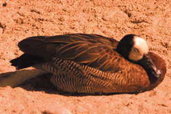
Figure 9.13. Image opened by clicking with the Eyedropper tool on an area that should not contain color.

It doesn't really matter which of the three methods you use (pop-up menu, sliders, or Eyedropper) because in the end, all of them are just manipulating the Temperature and Tint sliders to produce the final result. Your personal interpretation of what you'd like your image to look like will dictate what you end up with.

Exposure Slider
The Exposure slider will control the brightness of the brightest area of your image. It's a lot like the upper-right slider in the Levels dialog box (we talked about that one back in Chapter 5). As you move the Exposure slider farther to the right, more areas of your image become pure white. Because of that, you have to be very careful; otherwise, you'll end up trashing the detail in the brightest part of your image.
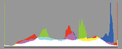
There are four ways to tell if you're losing detail. The least reliable of them is to simply watch your image to see if any areas are becoming solid white or black. You often can't tell the difference between a very bright area and one that has become solid white. An alternative is to watch the histogram while adjusting the Exposure slider (Figure 9.14). If a spike appears on the right end of the histogram, you're starting to lose highlight detail. Behind the scenes, your images is made out of red, green and blue light (also known as channels). If the spike is in color, you're losing detail in one or two of the three colors that make up your image, but still have detail left in the highlights. If the spike is white on the other hand, your highlights are becoming solid white and have no detail. A spike only matters if it shows up on the absolute right end of the histogram. A spike in the middle or near the end does not indicate a loss of detail. (To learn more about histograms, check out Chapter 5, “Optimizing Grayscale Images,” and Chapter 6, “Understanding Curves.”) The problem with this approach is that light sources and reflections of those sources on shiny objects (like glass, water or metal) look better when they don't contain detail and the histogram can't distinguish between those areas and other important parts of your image.
Figure 9.14. Camera Raw's histogram.
Photoshop CS2 offers a new method for determining if you're losing detail when adjusting the Exposure slider. Turning on the Highlights checkbox that appears above the image will cause areas that are losing highlight detail to turn red in the Camera Raw dialog box (Figure 9.15 and 9.16). That makes it much easier to know when and where you're starting to lose detail. The only snag is that the red overlay does not differentiate between losing detail in just one or two of the three colors that make up your image (in which case you still have some detail remaining), and losing detail in all three colors, which produces solid white. To get the most informative and useful indication of lost detail, hold down the Option key (Mac) or Alt key (Windows) while you move the Exposure slider. That will cause Photoshop to change the way it displays your image (Figure 9.17). In this view, areas that show up as solid white have lost all detail and will end up solid white when the image is opened in Photoshop. Areas that show up in color indicate where you're losing detail in one or two of the colors that make up your image, but the areas have not become solid white yet. Finally, areas that appear solid black have detail in all three of the colors that make up your image and are therefore not at risk.
Figure 9.15. This image contains very saturated colors, which will often cause detail to be lost in one or two of the colors that make up the image.

Figure 9.16. Using the Highlights checkbox indicated that a large area was losing detail, even though only a small area had become solid white.
Figure 9.17. Holding the Option/Alt key when dragging the Exposure slider indicated that only a small area was becoming solid white.

 | In Photoshop CS2, Adobe added Auto checkboxes to many of the sliders found under the Adjust tab in Camera Raw. They attempt to automatically adjust the brightness and contrast of the image to produce a result that looks less flat than what was obtained with the default settings in CS. Some people love what the Auto checkboxes do to their images, while others hate it. You can toggle all the checkboxes on or off by typing Command-U (Mac)or Ctrl-U (Windows). If you're like me and would like the checkboxes to be off by default, do the following: Choose Camera Raw Defaults from the Settings pop-up menu in the upper right of the Camera Raw dialog box, turn off all the Auto checkboxes, and then choose Set New Camera Raw Defaults from the pop-up menu that appears to the right of the Settings pop-up menu. |
My approach to adjusting this slider is to move it toward the right (with Option/Alt held down) until I see the first hints of white showing up (Figure 9.18). Then I'll back off a tiny amount and think of that as the farthest I'd want to move it (Figure 9.19) (unless the area that's becoming white is a light source or reflection of the light source, in which case forcing it to white might actually improve the look of the image). Then I'll look at the colored areas that are showing up, and if there are areas that contain critical detail, I'll continue to move the slider back toward the left until I see only small areas of color. I don't mind having large areas of color if I want my image to look really saturated, because you have to max out at least one of the colors that make up your image (red, green, and blue) in order to get a truly saturated color. Once I've found the general range that I like, I'll let go of the Option/Alt key and see how this setting is affecting the brightest areas of my image, and then fine-tune it if necessary. The vast majority of the time I end up leaving it at the position that was just shy of seeing solid white when I had the Option/Alt key held down.
Figure 9.18. Hold Option/Alt and drag the Exposure slider until you see the first hints of white.

Figure 9.19. Back off on the Exposure setting until you don't see any white.

The Exposure setting is only used to control how bright the absolute brightest areas of your image should be. I don't suggest you try to control the overall brightness of your image with this slider. There are better ways to do that, which we'll get to in a few moments. Right now, let's think about the darker areas of your image.
Shadows Slider
The Shadows slider controls how dark the absolute darkest areas of your image will be. It's very similar to the upper-left slider in the Levels dialog box (which we talked about in Chapter 5). It works just like the Exposure slider in that you can hold Option or Alt to see which areas are becoming solid black (they will look black), which areas are starting to have less detail (colored areas), and which areas haven't lost any detail (they will look white). You also have a Shadows checkbox available that will make areas that are losing detail appear in blue in Camera Raw. Unlike the Highlights checkbox, the Shadows checkbox will only indicate where an area has become solid black. It won't show up on areas that are losing detail in just one or two of the colors that make up the image. I still prefer to use the Option/Alt key method because I often want to know where I'm losing detail in just one or two colors in the image. I usually hold Option/Alt and move the Shadows slider until I see the first hints of pure black showing up and then back off just slightly so I don't trash the detail anywhere (Figure 9.20).
Figure 9.20. When moving the Shadows slider, try not to force any areas to black.

If you decide not to use the Shadows checkbox feature when moving the Shadows slider, be sure to keep an eye on the histogram at the top of the dialog box. Again, acting just like the Exposure slider, but working with shadows instead of bright areas, a spike on the far left of the histogram is an indication that you might be losing detail in the shadows of your image. If the spike is white instead of a color, then you're starting to get some solid black areas in your image.
Brightness Slider
Now that we've determined how bright the brightest areas should be and how dark the darkest areas should be, it's time to adjust the brightness levels that fall between black and white.
The Brightness slider is very similar to the middle slider in the Levels dialog box because it attempts to adjust the overall brightness of your image without screwing up the brightest or darkest areas. Move the slider to the left if your image needs to be darker (Figures 9.21 and 9.22), or move it to the right to brighten the image (Figure 9.23). If you're planning to make radical changes in brightness, I recommend that you use curves (see Chapter 6) after you've opened the image in Photoshop. You'll simply have a lot more control over the process that way, but it won't hurt if you make a slight tweak using the Brightness slider.
Figure 9.21. Image opened using default Brightness setting of 50. (©2005 Ben Willmore)
Figure 9.22. Result of moving the Brightness slider all the way to the left to darken the image.

Figure 9.23. Result of moving the Brightness slider all the way to the right to brighten the image.

Contrast Slider
I consider the Contrast slider to be optional. Most of the time, I'd rather adjust the contrast of my images using curves because they provide much more control than I'd ever get by moving a generic Contrast slider. But, when I'm in a hurry, I often limit my adjustments to what's available in the Camera Raw dialog box. For instance, when I do a photo shoot, I often want to email my girlfriend just to show her a few of the shots I took. That's when I don't want to spend too much time adjusting individual images, so I'll settle for the generic Contrast adjustment instead of spending the time it would take to fine-tune it with curves (Figures 9.24 through 9.26).
Figure 9.24. Image opened with –40 contrast setting. (©2005 Ben Willmore)

Figure 9.25. Image opened with default contrast setting of +25.

Figure 9.26. Image opened with +70 contrast setting.

Saturation Slider
I think of the Saturation slider as optional. The truth is, you'll have much more control over your image if you adjust it in Photoshop with the Hue/Saturation dialog box. But, if you're in a hurry, or if you're recording an action that will be applied to a large number of similar images, then you might decide to use this slider instead of taking the time to do it as two steps. If you have more time, you can test the waters with this slider, and make the actual adjustments with the Hue/Saturation dialog box afterward (Figures 9.27 through 9.29).
Figure 9.27. Image opened with –50 Saturation setting. (©2005 Ben Willmore)

Figure 9.28. Image opened with 0 Saturation setting.

Figure 9.29. Image opened with +50 Saturation setting.

If you want a better idea of how the White Balance setting is affecting the colors of your image, you can temporarily pump up the saturation of your image with this slider. Then, once you like the overall color of the image, bring the Saturation slider back to zero.
Don't feel bad if you decide to use the Contrast or Saturation sliders. There's nothing wrong with them. You'll just have much more control if you use curves to adjust the contrast and Hue/Saturation to adjust the saturation. So, if you ever get frustrated with these two somewhat crude controls, be sure to check out Chapter 6, “Understanding Curves” and Chapter 10, “Color Manipulation.”
Now let's move on and explore the settings found under the other tabs that appear on the right side of the Camera Raw dialog box. Those are the ones that I consider to be optional because not every image will benefit from those features, and you can often get more control if you use similar settings after your image is opened in Photoshop.