How Color Works
In figuring out color management, I read all about how our eyes work and that's when I learned that we could see only three colors of light—red, green, and blue. Every-thing we see is a combination of those colors. That's right, when you look at a rainbow, all your eyes see are red, green, and blue (Figures 7.1 and 7.2). When we see all three of those colors in a balanced amount (equal amounts of red, green, and blue), we see white light. The more light there is, the brighter it is; the less light there is, the darker it is. We often call a low level of white light gray, so that's what I'll call a balanced amount of red, green, and blue. When they aren't balanced, we see color. Photoshop works the same way.
Figure 7.1. The color wheel.

Figure 7.2. The RGB components of the color wheel.

Go ahead and launch Photoshop, click on your foreground color, and pick any color you'd like. Now glance over at the RGB numbers that appear in the right side of that dialog box—they show you how that foreground color can be made out of a combination of red, green, and blue (Figure 7.3). That's also how your computer screen works (Figure 7.4). Each pixel that makes up your screen is made out of three tiny bars of color right next to each other—again RGB. A digital camera works on the same principle; it just measures how much RGB light travels through the lens. So, it really is an RGB world out there. But things change just a tiny bit when you print things.
Figure 7.3. Photoshop's Color Picker.
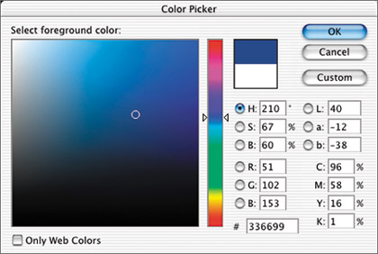
Figure 7.4. A magnified view of your screen.

Remember that white light is made from a balanced amount of red, green, and blue light. So, for red ink to look red when you shine white light at a sheet of paper, it has to let only red light reflect off it and into your eyes; otherwise, it wouldn't look red (Figure 7.5). That means that red ink absorbs green and blue in order to just let the red light bounce off the sheet of paper. So if that's the case, then blue ink must absorb everything but blue, and green light must absorb everything but green. So, when you combine any two of those inks (let's say red ink printed on top of green ink), all you'd get is black because the inks end up absorbing all three colors of light (Figure 7.6). That presents a problem that is easily solved. When we print, we don't need red, green, and blue inks; instead, we need three inks that control how much RGB bounces off a sheet of paper. We need one ink that controls how much red light enters our eye, another to control green light, and a third to control blue.
Figure 7.5. Red ink absorbs green and blue light.

Figure 7.6. Red and green ink create black.

So, let's figure out what we need. Take a look at Figure 7.7. It represents three flashlights, one with a red filter, one with green, and one with blue. Now, check out the area where the blue and green flashlights overlap, but the red one does not; you should see cyan. That means that cyan ink simply absorbs red light, while allowing the other two colors of light to bounce off the sheet of paper. If you analyze Figure 7.7 further, you might be able to figure out that magenta ink absorbs green light and yellow ink absorbs blue light. That's why the Info palette is arranged the way it is (Figure 7.8). One side looks at light and the other looks at ink. If you're wondering about the K in CMYK, it stands for key, which is really just a term used for black ink. It's used because a lot of people in the printing industry call cyan blue and they didn't want to confuse anyone by calling black B (and B is already used in RGB), so they came up with K instead to confuse the rest of us. Since black ink can't shift the color of anything, we'll talk about it later in this chapter. I know we haven't really gotten into color management yet, but this information is completely relevant to what we need to accomplish in this chapter. Now that we've got a basic idea of how color is reproduced, let's take a look at why your screen doesn't match your desktop printer and why your printer delivers a different result than your next-door neighbor's—in essence, why we need to bother with color management.
Figure 7.7. Three overlapping flashlight beams.

Figure 7.8. The Info palette.
