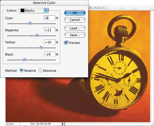
Selective Color
Auto Color isn't the only way to force colors into the brightest, darkest, and neutral gray areas of an image. If you choose Image > Adjustments > Selective Color, you can select which general colors you'd like to change from the Colors pop-up menu and then shift them toward a primary color (Figure 10.57). Moving the sliders toward the right will shift the selected color toward the color listed to the left of the slider. Moving the slider toward the left will shift it away from the color listed and toward its exact opposite. So, even though this dialog box only lists cyan, magenta, yellow, and black, you can still shift things toward red, green, and blue by moving the sliders toward the left. If the Relative radio button is turned on, then you'll change areas relative to what they started at. That means that if you have 50% cyan and you move the Cyan slider to 10%, you'll end up with 55% cyan because 10% of 50% is 5%. If, on the other hand, you use the Absolute setting, you'll simply add the exact amount that you dial in. That means that if you have 50% cyan and you move the Cyan slider to 10%, you'll end up with 60% cyan because it added the exact amount of cyan that you dialed in.
Figure 10.57. With Selective Color you can push certain colors toward any of the primary colors.

One nice aspect of Selective Color is that you can shift the color of the blacks in your image. All you have to do is choose Blacks from the Colors pop-up menu, move the Black slider toward the left to lighten the area, and then move whichever color sliders you'd like to use toward the right to push color into those areas (Figures 10.58 to 10.59). Or, if you're working in CMYK mode, you can make the black areas of your image richer by moving the Cyan slider toward the right. This adjustment is commonly used when creating large areas of black in an image that will be printed on a commercial printing press. I often like to have at least 40% cyan in those areas.
Figure 10.58. The original image. (© 2005 Stockbyte, www.stockbyte.com)

Figure 10.59. Using Selective Color you can shift the color of black areas.
You can also use Selective Color to brighten the highlights in your image by choosing Whites from the Colors menu and then moving the Cyan, Magenta, and Yellow sliders toward the left (Figures 10.60 to 10.62). This change can be useful for metallic objects where the brightest areas need to be pure white in order to make the object appear to be highly polished and therefore shiny.
Figure 10.60. The original image. (©2005 Stockbyte, www.stockbyte.com)

Figure 10.61. After adjusting the Whites, the highlights are much brighter, making the object look more polished.

Figure 10.62. The Selective Color adjustment used to brighten the highlights.
