
Those of you who are familiar with HTML will probably have a good understanding of using a repeating image for a background to reduce memory usage. Unity uses the same idea to create a graphic for the user interface, which will save a lot of memory and size for our game. In this section, we will take a look at the GUI Skin, which is the main key to creating a custom skin in Unity.
We will begin by creating the new project in Unity. Let's start:
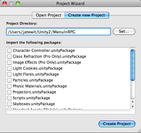
- First, create a new project and name it MenuInRPG, similar to what we did in the first chapter. Click on the Create Project button, as shown in the following screenshot:
- Next, import the assets package by going to Assets | Import Package | Custom Package...); choose the
Chapter2.unityPackage, which we just downloaded, and then click on the Import button in the pop-up window link, as shown in the following screenshot: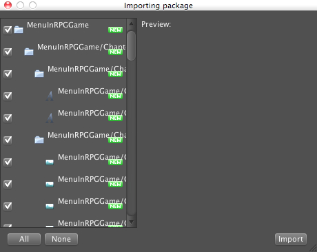
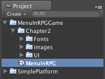
- Wait until it's done, and you will see the MenuInRPGGame and SimplePlatform folders in the Window view. Next, click on the arrow in front of the MenuInRPGGame folder to bring up the drop-down and you will see the Chapter2 folder and the MenuInRPG scene, as shown in the following screenshot:
- Next, double-click on the MenuInRPG scene, as shown in the preceding screenshot, to open the scene that we will work on in this chapter.
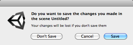
- When you double-click on the MenuInRPG scene, Unity will display a pop-up asking whether we want to save the current scene or not. As we want to use the MenuInRPG scene, just click on the Don't save button to open up the MenuInRPG scene, as shown in the following screenshot:
- Then, go to
Chapter2/UIfolder and click on thearrowDHover.pngto bring up its Inspector view. In the Inspector view, make sure that GUI is selected in the Texture Type properties, and Truecolor is selected in Format. Then, we will click on the Apply button, as shown in the following screenshot:
- At last, we will edit the layers' name by going to the Layer Inspector and set the User Layer 8 to Background and User Layer 9 to Level.
Now, we are ready to create the GUI Skin:
- Let's create a new GUI oing to Assets | Create | GUI Skin, and we will see New GUISkin in our project window. Name the GUI Skin as MenuSkin. Then, we click on our MenuSkin and go to its Inspector. We will see something similar to the following screenshot:
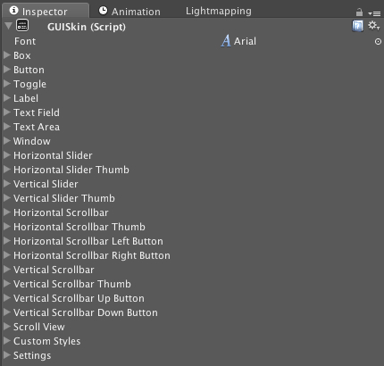
- You will see many properties, but don't be afraid, because this is the main key to creating a custom graphics for our UI. Font is the base font for the GUI Skin. From Box to Scroll View, each property is a GUIStyle, which we will be able to use for creating our custom UI. The Custom Styles property is the array of GUIStyle that we can set up for the extra style. Settings are the setup for the entire GUI.
- Next, we will set up the new font style for our menu UI; go to Font line in this Inspector view, click the circle icon, and select the font Federation Kalin.
- Now you have set up the base font for our GUI Skin. Next, click on the arrow in front of the Box line to bring up a drop-down. We will see all the properties. We can see more information and learn more about these properties on the Unity website: http://unity3d.com/support/documentation/Components/class-GUISkin.html.
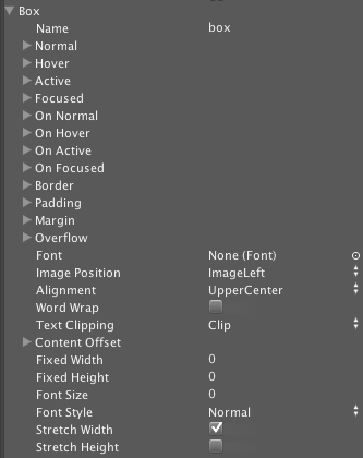
- Name is basically the name of this style, which the box is the default style of the GUI.Box. Next, we will start by setting our custom UI to this GUI Skin; click on the arrow in front of Normal to bring up the drop-down, and you will see two parameters Background and Text Color.
- Click on the circle icon at the right of the Background line to bring up the Select Texture2D window and choose the
boxNormal.pngtexture, or you can drag theboxNormal.pngtexture from ourChapter2/UIfolder and drop it to the Background space.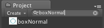
- Then under the Text Color line, we leave the color as the default color—because we will not have any text shown in this style—and repeat the previous step with On Normal by using the
boxNormal.pngtexture. - Next, click on the arrow in front of Hover under the Background. Choose
boxActive.pngtexture, and repeat this step for Active and On Active. - Then, go to each property in the Box style and set the following:
- Border: Left: 14, Right: 14, Top: 14, Bottom: 14
- Padding: Left: 6, Right: 6, Top: 6, Bottom: 6
For the other properties in this style, we will leave them as default.
- Next, we go to the following properties in GUISkin inspector and set them as follows:
- Label
- Normal | Text Color: R: 27, G: 95, B: 104, A: 255
- Window
- Normal | Background:
myWindow.png - On Normal | Background:
myWindow.png - Border: Left: 27, Right: 27, Top: 55, Bottom: 96
- Padding: Left: 30, Right: 30, Top: 60, Bottom: 30
- Normal | Background:
- Horizontal Scrollbar
- Normal | Background:
horScrollBar.png - Border: Left: 4, Right: 4, Top: 4, Bottom: 4
- Normal | Background:
- Horizontal Scrollbar Thumb
- Normal | Background:
horScrollBarThumbNormal.png
- Normal | Background:
- Hover | Background:
horScrollBarThumbHover.png- Border: Left: 4, Right: 4, Top: 4, Bottom: 4
- Horizontal Scrollbar Left Button
- Normal | Background:
arrowLNormal.png - Hover | Background:
arrowLHover.png - Fixed Width: 14
- Fixed Height: 15
- Normal | Background:
- Horizontal Scrollbar Right Button
- Normal | Background:
arrowRNormal.png - Hover | Background:
arrowRHover.png - Fixed Width: 14
- Fixed Height: 15
- Normal | Background:
- Vertical Scrollbar
- Normal | Background:
verScrollBar.png - Border: Left: 4, Right: 4, Top: 4, Bottom: 4
- Padding: Left: 0, Right: 0, Top: 0, Bottom: 0
- Normal | Background:
- Vertical Scrollbar Thumb
- Normal | Background:
verScrollBarThumbNormal.png - Hover | Background:
verScrollBarThumbHover.png - Border: Left: 4, Right: 4, Top: 4, Bottom: 4
- Normal | Background:
- Vertical Scrollbar Up Button
- Normal | Background:
arrowUNormal.png - Hover | Background:
arrowUHover.png - Fixed Width: 16
- Fixed Height: 14
- Normal | Background:
- Vertical Scrollbar Down Button
- Normal | Background:
arrowDNormal.png - Hover | Background:
arrowDHover.png - Fixed Width: 16
- Fixed Height: 14
- Normal | Background:
We have finished the setup of the default style.
- Label
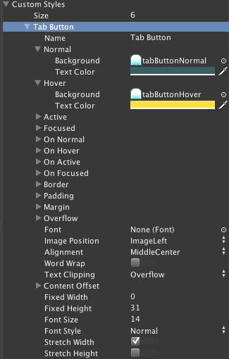
- Now we will go to the Custom Styles property and create our custom GUIStyle to use for this menu; go to Custom Styles and under Size change the number to 6. Then, we will see Element 0 to Element 5.
- Next, we go to the first element or Element 0; under Name type Tab Button, and we will see Element 0 change to Tab Button. Set it as follows:
- Tab Button (or Element 0)
- Name: Tab Button
- Normal
- Background:
tabButtonNormal.png - Text Color: R: 27, G: 62, B: 67, A: 255
- Background:
- Hover
- Background:
tabButtonHover.png - Text Color: R: 211, G: 166, B: 9, A: 255
- Background:
- Active
- Background:
tabButtonActive.png - Text Color: R: 27, G: 62, B: 67, A: 255
- Background:
- On Normal:
- Background:
tabButtonActive.png - Text Color: R: 27, G: 62, B: 67, A: 255
- Background:
- Border: Left: 12, Right: 12, Top: 12, Bottom: 4
- Padding: Left: 6, Right: 6, Top: 6, Bottom: 4
- Alignment: Middle Center
- Fixed Height: 31
- Font Size: 14
- Tab Button (or Element 0)
- We have finished our first style, but we still have five left, so let's carry on:
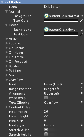
- Exit Button (or Element 1)
- Name: Exit Button
- Normal | Background:
buttonCloseNormal.png - Hover | Background:
buttonCloseHover.png - Fixed Width: 26
- Fixed Height: 22
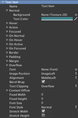
- Text Item (or Element 2)
- Name: Text Item
- Normal | Text Color: R: 27, G: 95, B: 104, A: 255
- Alignment: Middle Left
- Word Wrap: Check
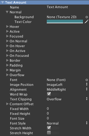
- Text Amount (or Element 3)
- Name: Text Amount
- Normal | Text Color: R: 27, G: 95, B: 104, A: 255
- Alignment: Middle Right
- Word Wrap: Check
- Selected Item (or Element 4)
- Name: Selected Item
- Normal | Text Color: R: 27, G: 95, B: 104, A: 255
- Hover
- Background:
itemSelectNormal.png - Text Color: R: 27, G: 95, B: 104, A: 255
- Background:
- Active
- Background:
itemSelectNormal.png - Text Color: R: 27, G: 95, B: 104, A: 255
- Background:
- On Normal
- Background:
itemSelectActive.png - Text Color: R: 27, G: 95, B: 104, A: 255
- Border: Left: 6, Right: 6, Top: 6, Bottom: 6
- Padding: Left: 4, Right: 4, Top: 4, Bottom: 4
- Margin: Left: 2, Right: 2, Top: 2, Bottom: 2
- Alignment: Middle Center
- Word Wrap: Check
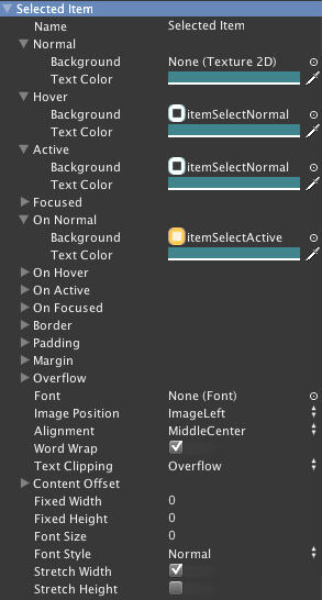
- Background:
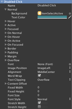
- Disabled Click (or Element 5)
- Name: Disabled Click
- Normal
- Background:
itemSelectActive.png - Text Color: R: 27, G: 95, B: 104, A: 255
- Background:
- Border: Left: 6, Right: 6, Top: 6, Bottom: 6
- Padding: Left: 4, Right: 4, Top: 4, Bottom: 4
- Margin: Left: 2, Right: 2, Top: 2, Bottom: 2
- Alignment: Middle Center
- Word Wrap: Check
- Exit Button (or Element 1)
And we have now finished this step.
Basically, what we have done here is create the GUISkin asset as the skin for our menu. First, we tell the GUI that we will use the font name Federation Kalin as our main font for this GUI Skin by setting up the Font in the first line in this skin inspector. Then, we changed all the default skin textures to use our UI graphics from our UI folder by setting all the necessary properties and parameters in Box, Label, Window, Horizontal Scrollbar, Horizontal Scrollbar Thumb, Horizontal Scrollbar Left Button, Horizontal Scrollbar Right Button, Vertical Scrollbar, Vertical Scrollbar Thumb, Vertical Scrollbar Up Button, Vertical Scrollbar Down Button style. Then, we created six Custom Styles, Tab Button, Exit Button, Text Item, Text Amount, Selected Item, and Disabled Click, which will be used in our script in the next section.
In this section, we applied UI graphics to GUISkin. You might have a question here—how does it work? Here, we will go through the basic concept of how to create a custom UI in Photoshop and get the right texture to use in our GUISkin.
First, let's take a look at the myWindow.png in our Chapter2/UI folder. We will see the capsule shape. You might be curious—how are we going to create a window graphics with this capsule shape? Well, the trick is the properties Border on which we set the parameters Left, Right, Top, and Bottom. As we already mentioned, use the repeating image in the background of the HTML code.
Here is how the Unity GUIStyle works. Take a look at the following figure:
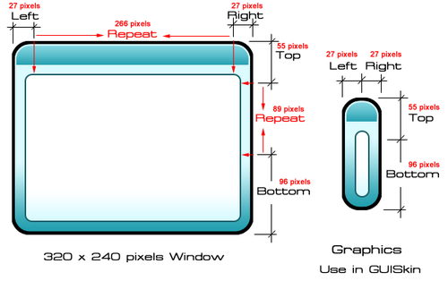
First, we set the parameters for the Border. These parameters will offset the pixels of the current UI graphics from 0 to the number that we assigned. For example, if we want to draw a rectangular window, which is 320 pixels in width and 240 pixels in height, and we set the Left Border to 27, Right to 27, Top to 55, and Bottom to 96, this will tell Unity GUIStyle to always draw the graphics from pixel 0 to pixel 27 on the left side with the same scale as the source texture. What will happen from pixel 28? Basically, it will repeat pixel 27 until it hits the right Border, which is also set to 27 pixels from the right. So, this means that we tell the GUIStyle to draw graphics from the source texture from pixel 0 to pixel 27, and repeat the texture from pixel 28 to pixel 293, then switch back and draw pixel 294 to pixel 320 from the source texture, which is the offset of 27 pixels from the right. This also applies to the top and bottom Borders, as we can see on the left side of the preceding figure.
From this concept, we can save a lot of memory because instead of using a 320 x 240 pixel image, we just use 54 x 151 pixels. However, in some cases we don't want any repeating pixels for our UI such as fixed button graphics—for example, our Exit Button style—or any fixed texture, and so on, as we can see in the following figure:

We can just set the Fixed Width and Fixed Height properties in GUIStyle to match our image size. For instance, we have our exit button image, which is 26 pixels wide and 22 pixels high. We just set the Fixed Width to 26 and Fixed Height to 22. We can also set only Fixed Width or Fixed Height in GUIStyle—as we already did in our Custom Styles
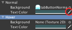
Tab Button—as we can see in the following figure:
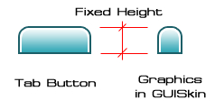
We set the Fixed Height to 31, and we leave the Fixed Width at 0, which means that the height of the style will always be 31 pixels but the width can vary from zero to infinity.