
D
esigners
Page:100
(RAY)
08-13937 Job:08-13923 Title:RP-1000 Ideas x 100 Graghic Designers
#175 Dtp:160(P) Page:101
098-103_13937.indd 101098-103_13937.indd 101 8/25/09 7:29:32 PM8/25/09 7:29:32 PM
Text
Forest 101
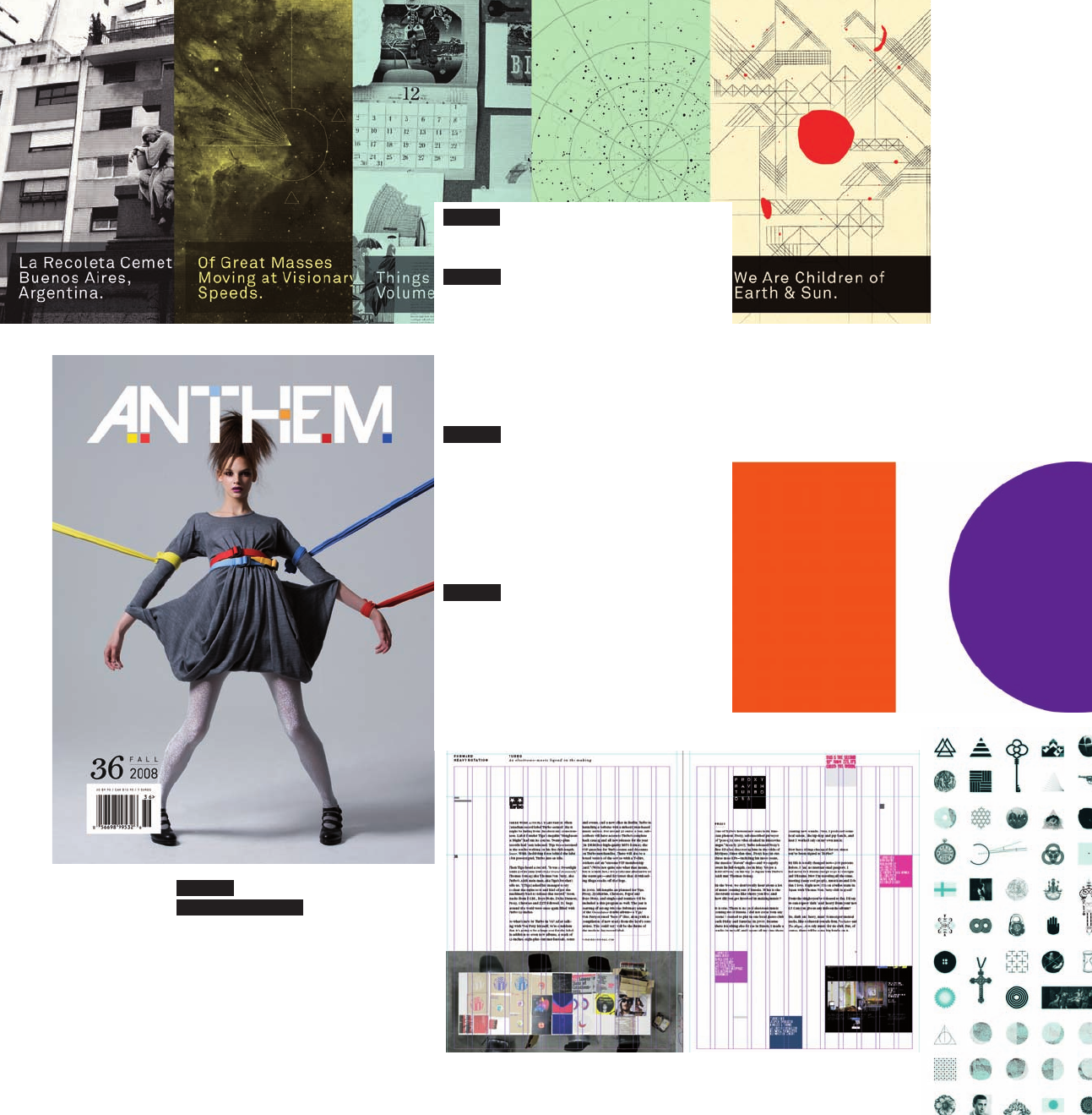
Joel Speasmaker is the
founder of Forest, a
multi-purpose design
studio located in Los
Angeles, California,
working in the areas
of graphic design, art
direction, publishing,
branding, web design
and development,
illustration, and various
curatorial projects. He
previously published
The
Drama
magazine, and
now acts as art director
for
Anthem
magazine,
comics section editor for
Swindle
magazine, and
conducts interviews for
Faesthetic
magazine.
He’s been lucky enough
to show in galleries such
as Subliminal Projects,
Little Bird, Lump, Okay
Mountain, Thanky, Quirk,
and others. He’s been
featured in books by
Victionary, maomao
Publications, and
Jeremyville, as well as
Flaunt
,
XLR8R
,
Dazed &
Confused
,
Entertainment
Weekly
,
Art Prostitute
,
Clark
,
Giant Robot
, and
Mule
magazines.
Forest
www.thisisforest.com
D
esigners
Page:100
(RAY)
08-13937 Job:08-13923 Title:RP-1000 Ideas x 100 Graghic Designers
#175 Dtp:160(P) Page:101
098-103_13937.indd 101098-103_13937.indd 101 8/26/09 8:15:43 AM8/26/09 8:15:43 AM
(RAY)
08-13937 Job:08-13923 Title:RP-1000 Ideas x 100 Graghic Designers
#175 Dtp:160(P) Page:102
098-103_13937.indd 102098-103_13937.indd 102 8/25/09 7:29:33 PM8/25/09 7:29:33 PM
Text
102 1,000 Ideas by 100 Graphic Designers
271 IDEAS ARE ALREADY INSIDE OF
US. It just takes the appropriate
project to bring them out and give
them shape. Ideas come from our
life experiences—through traveling,
through interactions with the people
we meet, through the books we
read, through the music we listen
to, through the best and worst of
times. There are so many sources of
inspiration in even the most seemingly
mundane activities.
272 Start with many ideas until
you narrow it down to one.
273 A
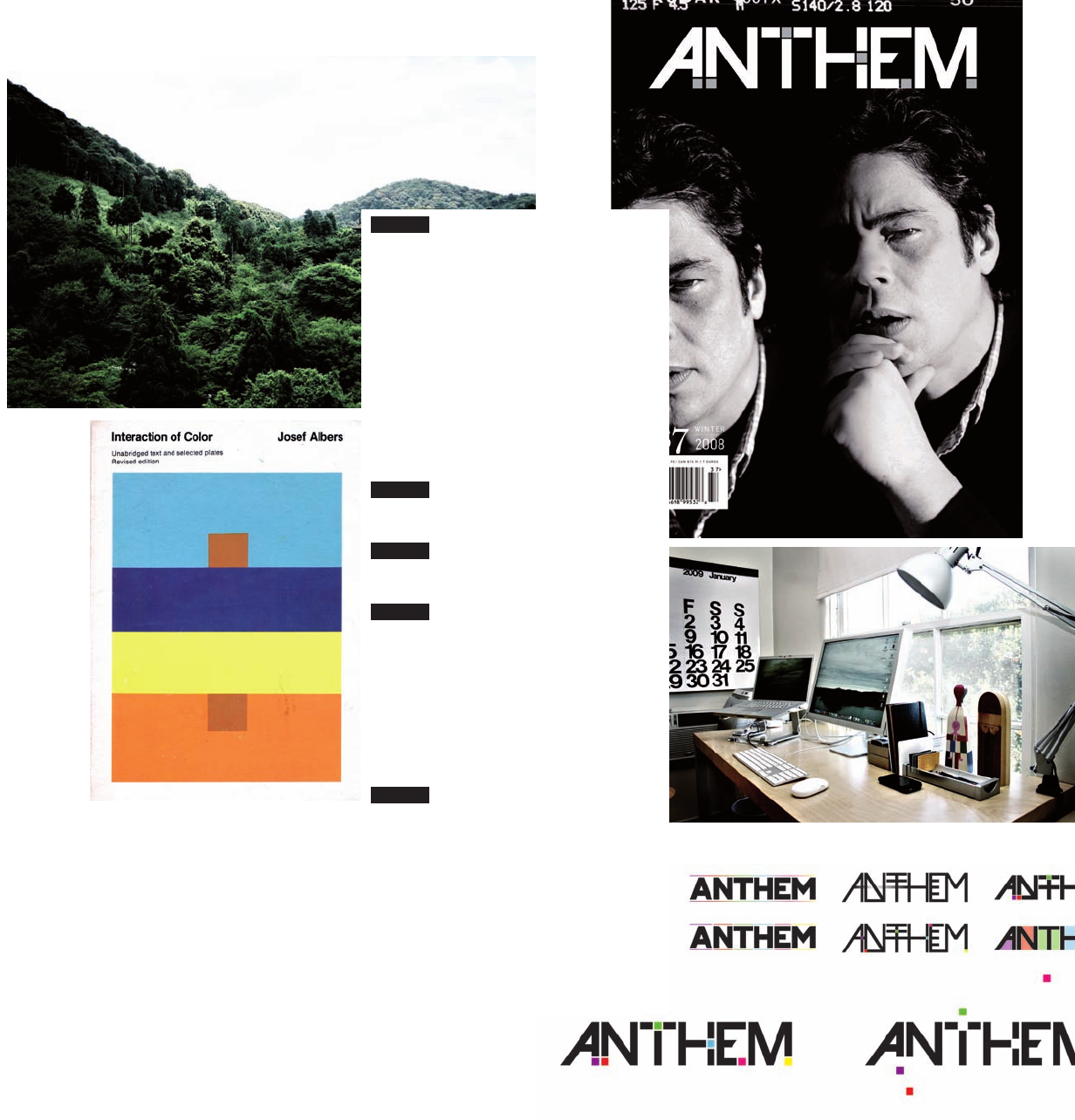
N UNMISSABLE BOOK.
Interaction of Color
by Josef Albers.
274 T
RAVEL. Traveling is one of the
most important activities to me, not
only as a source of ideas but simply
as a way to formulate a philosophy
of living. All aspects of your life can
only benefi t by exposure to new and
previously unseen and unknown
things.
275 Y
OUR SPACE DEFINES YOUR
WORK. Keep your workspace perfectly
orderly, surrounded by books and
organization.
(RAY)
08-13937 Job:08-13923 Title:RP-1000 Ideas x 100 Graghic Designers
#175 Dtp:160(P) Page:102
098-103_13937.indd 102098-103_13937.indd 102 8/26/09 8:15:43 AM8/26/09 8:15:43 AM
D
esigners
Page:102
(RAY)
08-13937 Job:08-13923 Title:RP-1000 Ideas x 100 Graghic Designers
#175 Dtp:160(P) Page:103
098-103_13937.indd 103098-103_13937.indd 103 8/25/09 7:29:44 PM8/25/09 7:29:44 PM
Text
276 Do as many personal projects
as possible. Client work will follow.
277 F
OLLOW GRIDS (MOST OF THE
TIME). Grids are very important,
whether you are working for print
or web. Even when specifi cally not
following a grid I think it is important
to consider its infl uence in that
decision.
278 R
ESEARCH CONSTANTLY. I am
interested and can appreciate most
everything I come in contact with,
whether it be a work of art, an object,
a tool, an idea, a period of history,
etc. Because of this, doing specifi c
research for a job is enjoyable.
279 S
IMPLE SOLUTIONS. I’m always
drawn to the simplest solution,
utilizing shape and color to facilitate a
meaning for the viewer.
280
If in doubt, print!
Forest 103
D
esigners
Page:102
(RAY)
08-13937 Job:08-13923 Title:RP-1000 Ideas x 100 Graghic Designers
#175 Dtp:160(P) Page:103
098-103_13937.indd 103098-103_13937.indd 103 8/26/09 8:15:43 AM8/26/09 8:15:43 AM
(RAY)
08-13937 Job:08-13923 Title:RP-1000 Ideas x 100 Graghic Designers
#175 Dtp:160(P) Page:104
104-109_13937.indd 104104-109_13937.indd 104 8/26/09 8:29:16 AM8/26/09 8:29:16 AM
Text
281 IMPORTANT THINGS ARE
IMPORTANT. This tautology manifests
my dualist design paradigm. As I see
it, every design has two levels or
dimensions: the top-level, consisting
of tangible design elements (they may
be images, typography, etc.), and
the base structure, consisting of the
concept, the thought, the decisions
of what to show and how to present
that. Although the base structure may
be exposed only through the layer of
concrete entities, the labor of design
should be focused on the invisible.
Do not nudge around the elements of
your layout; it is inconsequential if an
image or typography piece lies here
or there. Instead, concentrate on
what is important.
282 S
KETCH BLOCKS. A friend of
mine who is a gifted storyteller once
told me a colorful tale of Kaj Franck’s
sketching habits. The renowned
designer used only small cards about
6-inches (15-cm) high for sketching.
These so called taco cards were a
cheap byproduct of the Tervakoski
cardboard factory. The cards were
coated on one side and uncoated on
the other, making them an excellent
platform for both felt pen and pencil
drawing. I also use small cards
for sketching, and recommend it to
everyone.
283 THE OUTCOME OF OUR WORK
USUALLY RESPONDS VISUALLY TO ITS
CHARACTER. Nevertheless, or perhaps
therefore, an excellent premise for
designing is a non-visual one; instead
of attempting to visualize a brief you
can approach it through moving,
touching and sensing, thinking with
the help of other means of perception
than eyesight. That can be inspiring.
284 E
VERY DESIGNER HAS HIS OWN
RELATION TO BACKGROUND MUSIC WHEN
WORKING. When I’m designing I
listen to music, but when a project
proceeds to production phase, and
the work gets a more technical
character I often listen to discussion
programs with only little music on the
radio, or audio books.
285 B
RUTALIZE TYPOGRAPHY. Some
years ago I visited a lecture by
Alex Trüb and Valentin Hindermann
where I came across their work
for Schauspielhaus Zürich. Their
aggressively condensed
Futura
was something that clashed with
almost every typographic principle I
cherished at the time. This dramatic
encounter was the starting shot for
the conscious and intentional decay
of my typographic taste. Typographic
decadence is recommended for
anyone!
104 1,000 Ideas by 100 Graphic Designers
(RAY)
08-13937 Job:08-13923 Title:RP-1000 Ideas x 100 Graghic Designers
#175 Dtp:160(P) Page:104
104-109_13937.indd 104104-109_13937.indd 104 8/26/09 8:29:01 AM8/26/09 8:29:01 AM
D
esigners
Page:104
(RAY)
08-13937 Job:08-13923 Title:RP-1000 Ideas x 100 Graghic Designers
#175 Dtp:160(P) Page:105
104-109_13937.indd 105104-109_13937.indd 105 8/26/09 8:29:21 AM8/26/09 8:29:21 AM
Text
286
Confl ict of form and content is always
interesting. The deeper the gap
between the sublime content and the
vulgar form is (or vice versa), the
better! When typesetting the Bible,
do it with Balloon Extra Bold.
287 AT THE PRESS. Pen and the
Mac are our common tools, and so is
the offset press. Therefore at least
basic knowledge of the limits and
possibilities of the printing process
should be a part of every designer’s
technical expertise. Go to the printer
and follow the process whenever
possible.
288 L
ANDSCAPES. I struggled for
a long time with a modernist fi xation
for non-representative layouts. In my
opinion, all elements of design should
only represent themselves; images
should only be images and type
especially should never represent
anything else but letterforms. I’m
now free of this neurotic approach
of every layout as a single image,
a landscape where everything is
possible; type can be as an image,
or an image can be typography. Set
yourself free!
289 T
ESTING. Include at least
one technical, typographic, or any
other sort of test in every project
you do. Visiting the area of the
unknown makes a design often more
challenging to the viewer, and your
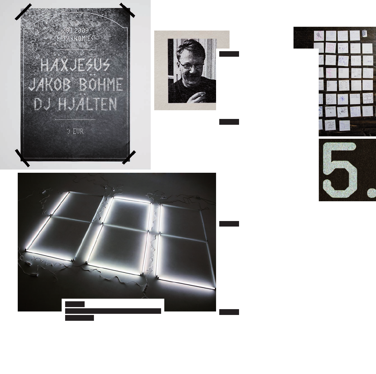
knowledge expands quickly. Three
of four of the tests won’t succeed,
but who cares? We are not surgeons
or pilots, no one dies if you make
a mistake, and often no one even
notices.
290 Never show the client a
sketch you don’t want to take further;
the client will certainly choose it.
Fräckr 105
D
esigners
Page:104
(RAY)
08-13937 Job:08-13923 Title:RP-1000 Ideas x 100 Graghic Designers
#175 Dtp:160(P) Page:105
104-109_13937.indd 105104-109_13937.indd 105 8/26/09 8:29:01 AM8/26/09 8:29:01 AM
..................Content has been hidden....................
You can't read the all page of ebook, please click here login for view all page.