
(RAY)
08-13937 Job:08-13923 Title:RP-1000 Ideas x 100 Graghic Designers
#175 Dtp:160(P) Page:215
215-217_13937.indd 215215-217_13937.indd 215 8/26/09 1:54:01 PM8/26/09 1:54:01 PM
Text
Nathalie Pollet has been
a graphic designer since
1992. After finishing her
studies, she started a
career as a freelance
designer for record
companies and concert
halls in Brussels.
She co-founded the
Designlab studio in 1998
where she was creative
director and studio
manager for 11 years.
Most of her clients come
from the cultural sector
in Belgium and France:
Bureau d’architecture
V+ (Bruxelles),
CIVA—Centre
International pour la
Ville, l’Architecture et
le Paysage (Bruxelles),
Lille3000 (Lille). Projects
are mainly in the
areas of identities for
museums and festivals,
communication for
cultural centers, art
galleries, exhibits, dance
companies, art and
architecture magazines,
and lately signage. In
the beginning of 2009,
she started a new studio
named Pam&Jenny: new
name, same spirit, lighter
structure.
Pam&Jenny
www.pametjenny.be
Pam&Jenny 215
(RAY)
08-13937 Job:08-13923 Title:RP-1000 Ideas x 100 Graghic Designers
#175 Dtp:160(P) Page:215
215-217_13937.indd 215215-217_13937.indd 215 8/26/09 1:53:42 PM8/26/09 1:53:42 PM

(RAY)
08-13937 Job:08-13923 Title:RP-1000 Ideas x 100 Graghic Designers
#175 Dtp:160(P) Page:216
215-217_13937.indd 216215-217_13937.indd 216 8/26/09 1:54:01 PM8/26/09 1:54:01 PM
Text
651 Let the idea come to you.
652 Your working space must be
like a white page.
653 Ideas are everywhere.
654 Let your clients trust you
blindly.
655 Be serious, be friendly.
(RAY)
08-13937 Job:08-13923 Title:RP-1000 Ideas x 100 Graghic Designers
#175 Dtp:160(P) Page:216
215-217_13937.indd 216215-217_13937.indd 216 8/26/09 1:53:42 PM8/26/09 1:53:42 PM

D
esigners
Page:216
(RAY)
08-13937 Job:08-13923 Title:RP-1000 Ideas x 100 Graghic Designers
#175 Dtp:160(P) Page:217
215-217_13937.indd 217215-217_13937.indd 217 8/26/09 1:54:07 PM8/26/09 1:54:07 PM
Text
660
Don’t trust a badly-dressed designer.
656 White and black. Timeless
color combination.
657 Every detail counts.
658 Organize your timelines. Or,
work late.
659 Always try something else.
Pam&Jenny 217
D
esigners
Page:216
(RAY)
08-13937 Job:08-13923 Title:RP-1000 Ideas x 100 Graghic Designers
#175 Dtp:160(P) Page:217
215-217_13937.indd 217215-217_13937.indd 217 8/26/09 1:53:42 PM8/26/09 1:53:42 PM

(RAY)
08-13937 Job:08-13923 Title:RP-1000 Ideas x 100 Graghic Designers
#175 Dtp:160(P) Page:218
218-220_13937.indd Sec1:218218-220_13937.indd Sec1:218 8/26/09 2:07:04 PM8/26/09 2:07:04 PM
Text
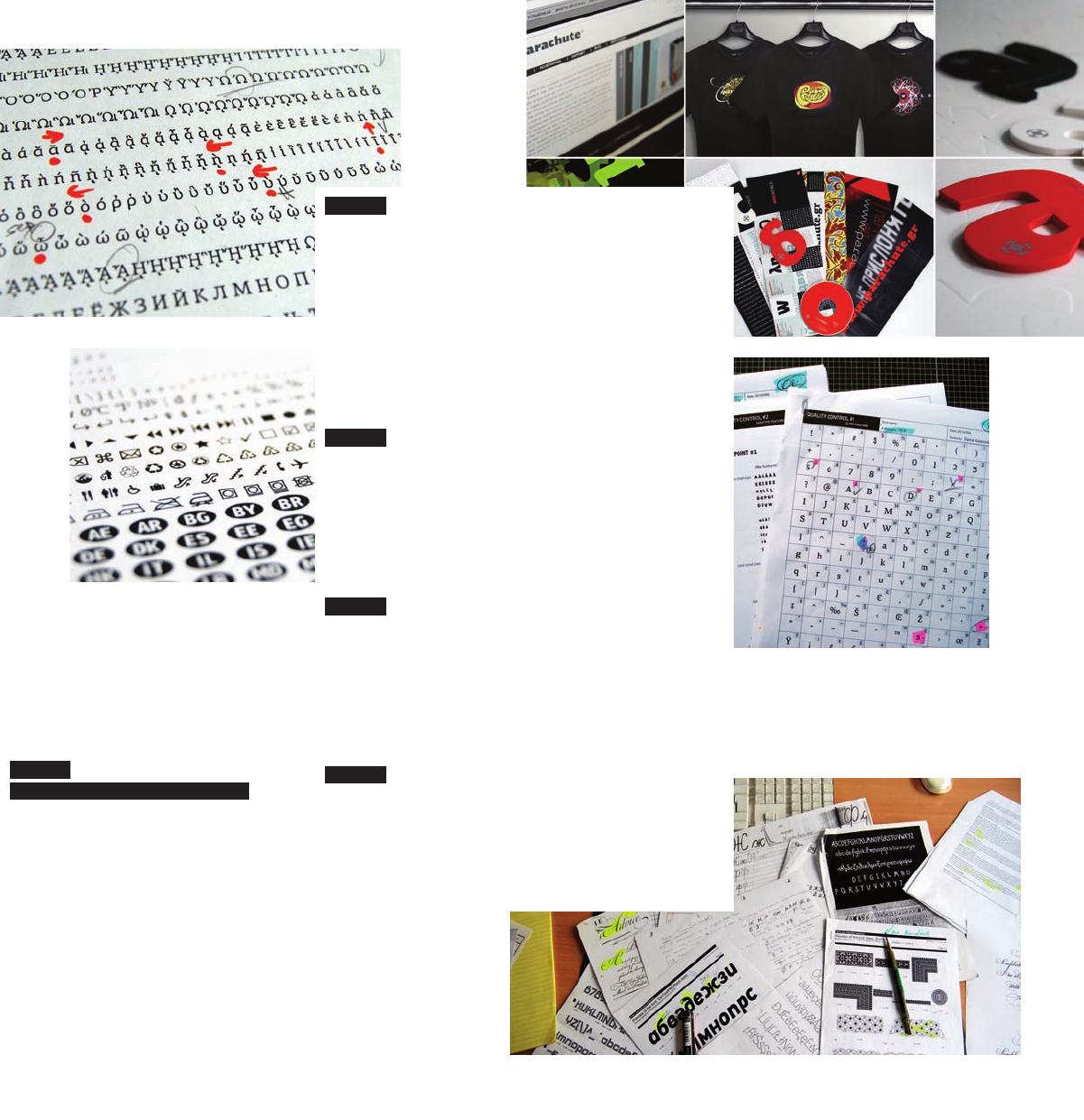
661 RESPECT THE ORIGIN OF THE IDEA. I mostly
work on commercial typefaces, so ideas and
decisions taken are market-driven. This means I
have to watch out for trends coming from selected
directions such as music, fashion, visual arts,
technology. A new design refl ects these trends
as well as the surrounding environment i.e. the
various structural shapes such as architectural
buildings, industrial objects, and even just plain
natural structures. The idea behind Centro
Pro (an award winning font that Parachute®
designed) was to combine modern square forms
with traditional shapes in such a way as not
to distract legibility. The serifs would have to
refl ect the simplicity of a contemporary building.
Furthermore, extreme care was taken so that
the pronounced triangular cuts were properly
connected and balanced with round forms to avoid
creating a strange-looking typeface. Finally, it was
decided to support all European scripts—Latin,
Greek, and Cyrillic—in order to satisfy a growing
demand among pan-European companies and
institutions for such typefaces.
662 R
ESEARCH THOROUGHLY. It always helps to
look back to what the masters of the trade have
done. Some characteristics of Centro Pro serif
were modeled after W.A. Dwiggins’s experiments
with type. The angular slanted serifs of Centro
Pro, in letters like “n,” “p,” “r,” etc., while they
foster a distinct identity at display sizes, they
tend to look like curves at small sizes. Other
characteristics such as the abrupt cut at the
joints were infl uenced by Galfra, a typeface
designed in 1975 by Ladislas Mandel for the
Italian phone directory. These cuts add certain
fl air to Centro Pro serif especially at display sizes,
but they are functional as well, since at small
sizes, while they disappear into rounded curves,
they compensate for over-inking.
663 DRAFTING THE IDEA. In most cases the
idea is drafted initially on a piece of paper, a
rough sketch of several characters with as many
characteristics as I can fi t on paper. Then I create
a second, more elaborate sketch of three basic
characters such as “a,” “n,” and “o.” These are
the three letters I always design fi rst since they
contain many of the characteristics as I need as
a guide for the design of other characters. Then
everything is fi nalized in FontLab. There are also
a few instances (particularly for text typefaces,
which follow certain rules and consist of well-
defi ned forms) that a design may start right on
the computer by playing around with one of my
older designs.
664 B
OOKS. Of all, there are four books on
typography which I consider a total must, as
each one complements the other:
American
Metal Typefaces of the 20th Century
by Mac
McGrew,
Elements of Typographic Style
by Robert
Bringhurst,
Letters of Credit
by Walter Tracy,
Writing & Illuminating & Lettering
by Edward
Johnston.
665 P
AY ATTENTION TO DETAIL. This is one of your
characteristics that set you apart from the crowd.
Things like spacing or kerning of characters as
well as the proper position or shape of accents,
are very important for a demanding customer.
In Centro Pro, the main concern right from
the beginning was not only the shape of the
characters but the rhythm of text as well. If
letters are not properly spaced, the text will be
hard to read. First, the basic spacing (sidebearing
adjustment) for capitals “H” and “O” as well as
lowercase “n” and “o” was set. Then, for every
new character created, the sidebearings were
adjusted based on the similarities of its straight
or round strokes to the letters used as reference.
Proper positioning of accents was also double-
checked and adjusted.
218 1,000 Ideas by 100 Graphic Designers
(RAY)
08-13937 Job:08-13923 Title:RP-1000 Ideas x 100 Graghic Designers
#175 Dtp:160(P) Page:218
218-220_13937.indd Sec1:218218-220_13937.indd Sec1:218 8/26/09 2:06:51 PM8/26/09 2:06:51 PM
D
esigners
Page:218
(RAY)
08-13937 Job:08-13923 Title:RP-1000 Ideas x 100 Graghic Designers
#175 Dtp:160(P) Page:219
218-220_13937.indd Sec1:219218-220_13937.indd Sec1:219 8/26/09 2:07:07 PM8/26/09 2:07:07 PM
Text
666
A
LWAYS DELIVER WHAT YOU PROMISE.
Minimize problems by passing your
design through extensive quality
control. The Centro Pro series
supports more than 100 languages
and each font contains an enormous
number of glyphs. This situation may
easily get out of hand as some glyphs
could be placed mistakenly in the
wrong position. In order to overcome
such problems, we devised a quality
control method—i.e. two sets of
tables which we use to check the
proper position of glyphs as well as
OT features.
667 GIVE MORE THAN EXPECTED. Add extra value to
your product without raising the price. Every font
in the Centro Pro series was completed with 270
copyright-free symbols, some of which have been
proposed by several international organizations
for packaging, public areas, environment,
transportation, computers, and fabric care. These
are quite useful and handy to designers involved
with branding, packaging, and products with
international appeal.
668 P
ROMOTE YOUR WORK. Your work is not
worth much unless you promote it. The promotion
plan for Centro Pro included, among other
things, an extensive presentation in Parachute’s
website, printed material, clothing, typographic
screensavers, as well as an exclusive collection of
popular coasters.
669 W
ORK SCHEDULE. Don’t work on the same
project more than a few days in a row. I have the
tendency to get stuck in minor details trying to
perfect things, so I fi nd it more productive to just
drop it, work for a while on a different project,
and later come back with a clear head to fi nd the
solution.
670 D
EFY RULES. This is a motto that always
reminds me of what I want to do and not
necessarily what I do.
D
esigners
Page:218
(RAY)
08-13937 Job:08-13923 Title:RP-1000 Ideas x 100 Graghic Designers
#175 Dtp:160(P) Page:219
218-220_13937.indd Sec1:219218-220_13937.indd Sec1:219 8/26/09 2:06:51 PM8/26/09 2:06:51 PM
..................Content has been hidden....................
You can't read the all page of ebook, please click here login for view all page.