In the previous recipe, we added a new list to a user dashboard. This recipe will review the different settings that are available for displaying a list on a dashboard.
Carry out the following steps in order to complete this recipe:
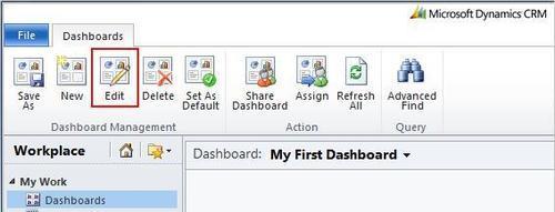
- Select the Dashboards link from the Workplace area.
- Select the same personal dashboard we created in the first recipe (Creating a user dashboard).
- From the Dashboards menu in the Dynamics CRM 2011 ribbon, click on the Edit button, as highlighted in the following screenshot:
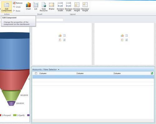
- The dashboard editor screen will open, and your dashboard will be in the edit mode. Select the My Active Accounts list component and click on the Edit Component button in the ribbon toolbar, as shown in the following screenshot:
- The List or Chart Properties dialog will appear. This dialog is different from the Component Designer window that you saw when we added a list to this dashboard earlier in the Adding a list to your dashboard recipe. The following screenshot and sections will explain the different settings in detail:
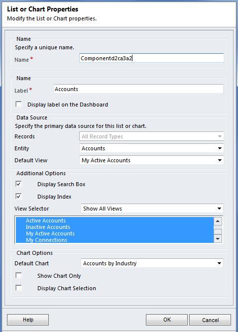
There are many different properties available when editing a dashboard component. The following sections will go into each of these items in more detail.
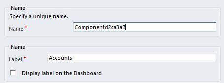
The Name field contains a unique ID that is used to identify each chart component. The ID value is for internal use by the dashboard to support features, such as drilldowns and full-screen zooms. The system will suggest an auto-generated value, but you can override this with a valid value as well. The Label field can be used to display a title for the list when used on a dashboard. In order to show the label, provide a descriptive value and select the Display label on the Dashboard checkbox, as shown in the following screenshot:
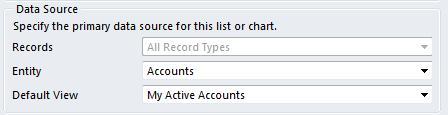
The data that is shown in the list is based on the settings identified in the Data Source section of the List or Chart Properties window. Any two of the three fields in this section can be configured. These fields are explained as follows:
- Records: This field will be set to All Record Types. The value does not need to be changed when working with a list component on a dashboard.
- Entity: This field lets you change the entity type for this list component. Changing this value affects the list of available views in the Default View field. In our example, the Entity field is set to Accounts, as shown in the following screenshot, which means the list will show account data.
- Default View: This field lists the available data views for the entity type that was selected in the Entity field. The selected view will provide the data and column layouts shown in the list component on the dashboard.
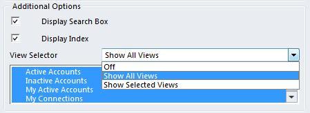
The Additional Options section has settings that control how the user can interact with or adjust the list component once it is on the dashboard.
The Display Search Box option controls whether the user can interact with a search box for this list component's data records.
Checking the Display Index option will display an alphabetical index (#, A-Z) that lets the user jump to records starting with the selected index character.
The View Selector drop-down determines if the end user can change the view currently being shown in the list component. If the option is Off, then the user cannot select a different view. The other two options are Show All Views and Show Selected Views, which lets you control the access, as shown in the following screenshot:
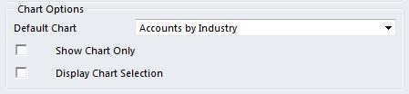
The Chart Options section specifies the default chart that should be displayed along with this list component. The Default Chart field provides a list of related charts that you can select from. The list of charts is dependent on the value of the Entity field located in the Data Source section of this window.
The Show Chart Only option lets you replace the list component with chart visualizations, basically the same effect as adding a chart by itself.
The Display Chart Selection option allows the user to change the chart being displayed alongside the list during runtime. If the user changes the chart selection, those changes will not be saved with the dashboard. Every time the dashboard is visited, the list component will show the original Default Chart as its companion: