Dynamics CRM 2011 offers flexible ways to visualize the CRM data using charts. One of the great charting features is the ability to easily create stacked comparison charts using the Chart Designer dialog.
This recipe assumes that the reader understands the basics of creating a chart. The techniques described here follow the creation of a System chart, but are the same when creating a User chart.
Carry out the following steps in order to complete this recipe:
- Start by creating a new System chart based on the CRM Case entity. For information on how to create a chart you can refer to the Creating a system chart recipe or Creating a user chart recipe.
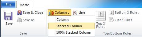
- In the Chart Designer dialog, click on the Column icon in the Charts area of the toolbar and select Stacked Column, as shown in the following screenshot:
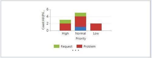
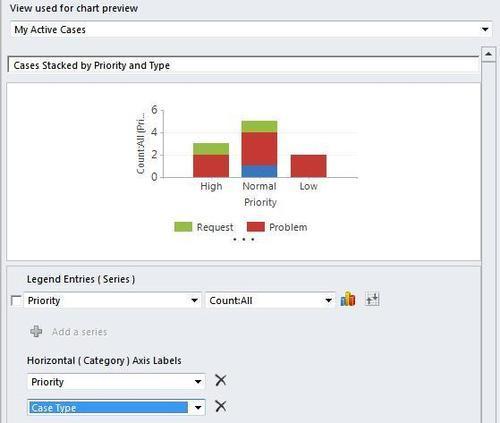
- Select My Active Cases as the view used for chart preview. Provide a name for this new chart, such as Cases Stacked by Priority and Type.
- In the Legend Entries (Series) section, select Priority as the series field, and Count:All as the aggregate function.
- For the Horizontal (Category) Axis Labels section, select the Priority field again.
- Next, click on the Add a category link. This will create the extra axis needed to complete the stacked comparison:
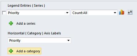
- In the new category axis drop-down, select the Case Type field. The chart preview will now render and show you a stacked column chart:
- Click the Save & Close toolbar button to save the new chart.
There are many different chart features available. The following section will provide more information about the stacked chart options.
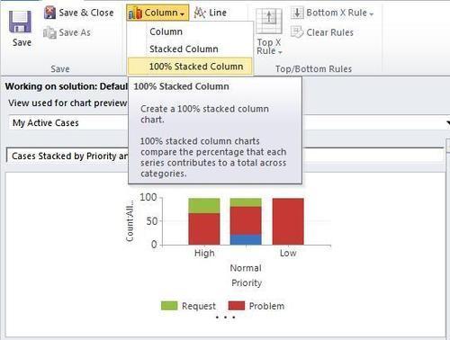
In the previous recipe, we created a Stacked Column chart based on the Case entity. The Series axis was a counting of all the Cases by Priority, and they each had a different total count value. For some charting implementations, the individual count isn't the focus, but instead the stacking breakdown is more important. So, to show this type of chart, we would use the 100% Stacked Column option. This will render a chart where the all the values of the series (Y axis) are scaled in percentages versus numeric counts: