
Building on the lessons learned earlier in the chapter, this recipe will show the reader how to change the colors used in the chart, along with setting up a 3D appearance. By default, Dynamics CRM automatically decides which colors to use for the chart; however, certain colors can mean different things depending on the audience. You may even wish to use a corporate color palette so that all charts look similar. By setting custom palettes and colors the developer has control over this option.
This recipe assumes that you are working with the chart created earlier in the Exporting a chart recipe. This chapter also assumes that the reader has access to an XML editor such as Microsoft Visual Studio.
Carry out the following steps in order to complete this recipe:
- Locate the exported Chart XML file (either System chart or user chart) that was created in the earlier recipe. Open the XML file in the editor of your choice.
- In the Chart XML, locate the
<Chart>element located under the<presentationdescription>element. - Add the following two properties to the Chart element. This will override the default colors using a different shades of blue for the series.
Property
Value
PaletteNonePaletteCustomColors55, 118, 193- The following code demonstrates this:
<Chart Palette="None" PaletteCustomColors="55,118,193">
- If you want to, you can also turn off the gradient color feature, which is usually turned on by default. In order to turn it off, locate the
<Series>element inside the<Chart>element and adjust the following property value:
Property
Value
BackGradientStyleNone - The following code demonstrates this:
- In order to add the 3D affect to the chart, you need to add the
<Area3DStyle>element before the</ChartArea>element's closing tag, shown as follows:<Area3DStyle Enable3D="True" LightStyle="Simplistic" />
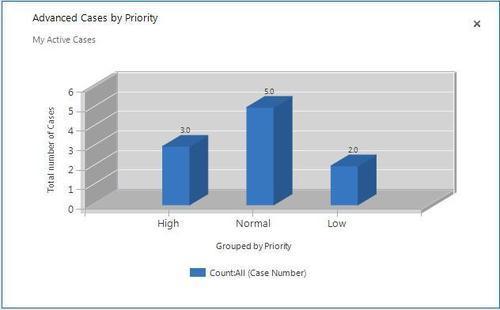
- Save the changes and import the chart back into Dynamics CRM. The final chart should look similar to the following screenshot:
The example for controlling the color in this recipe showed how to set the base color when dealing with one data series only. If you have a chart that uses multiple data series then you can specify more than one color to use. There is also the option of using a predefined pallet as a property setting.
In order to specify more than one color using the PalletCustomColors property, simply list the different color options separated by a semicolon character. This code snippet specifies three different color options. The color options and the series work in parallel, meaning that the first series in the chart will get the first color listed, and so on:
PaletteCustomColors="55,118,193; 197,56,52; 149,189,66"
The MSDN documentation also specifies a set of predefined color pallets under the CharColorPalette Enumeration. These are noted in the following URL:
|
Pallet Name |
Description |
|---|---|
|
Bright |
Bright colors |
|
Grayscale |
Shades of black and white |
|
Excel |
Uses MS Excel-style colors |
|
Pastel |
Pastel colors |
|
Berry |
Blues and purples |
|
Fire |
Red, orange, and yellow colors |
The MS Chart .NET 3.5 help file lists some of the properties available for customizing the 3D display settings of a chart. The following are some examples:
|
Property |
Description |
Options |
|---|---|---|
|
|
Controls the lighting type |
None, Realistic, Simplistic |
|
|
Integer value that represents the percent of perspective |
Range between 0-100. Default is 0. |
|
|
Integer value that controls the depth of data points |
Range between 0-1000 percent. Default is 100. |