Charts are an excellent way to view data as they allow users to graphically represent data. Charts can display multiple data series, and then compare or contrast the results. Occasionally, viewing large sets of graphical data can become difficult as there might be too many data points to read at the same time. In order to help users make sense of the data, the Dynamics CRM 2011 charts include the tooltips feature.
Carry out the following steps in order to complete this recipe:
- Select the Dashboards link from the Workplace area.
- Select the Microsoft Dynamics CRM Overview dashboard.
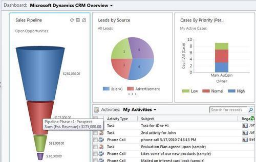
- By using the Sales Pipeline chart (which shows all the user's open opportunity records, grouped by sales stage), place your mouse cursor over one of the segments of the funnel.
- This will bring up a tooltip that provides information on that segment. In the following screenshot, you can see the tooltip being shown for the red segment. The information informs the user that they have $175,000.00 worth of opportunities in the Prospect phase of the pipeline:
- The tooltip will remain for a few seconds, and then it will disappear. To see information about the other segments in this chart, simply move the mouse cursor over those segments.
Tooltips for a chart component in Dynamics CRM 2011 identify the different data series that were used to build the chart. In the Sales Pipeline chart example, we can see that this chart summarizes Opportunity Estimated Revenue data (money values), and then groups the results by the Pipeline Phase field (four different types in this example).
Tooltips are of course not limited to just the funnel type chart (used in this example); they are present in all the chart types offered in Dynamics CRM 2011.
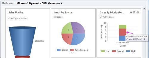
When working with a stacked bar chart, as in the Cases By Priority (Per Owner) chart in the dashboard shown in the following screenshot, the tooltips are also stacked. Compared to a normal bar chart where there will be a single tooltip for the entire bar, a stacked bar chart will contain a different tooltip for each segment of the stack.
- Using the Cases By Priority (Per Owner) chart, move your mouse cursor over the first segment in the single stacked bar. You will see a tooltip showing information related to that single segment of the total bar value:
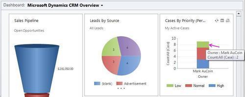
- Next, move your mouse cursor down to another segment in the stack. You will notice that the tooltip changes to reflect data related to that segment of the chart: