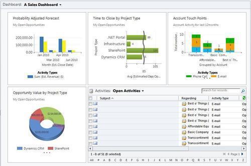
The appendix for this book includes two dashboards that use some advanced ChartXML and FetchXML to build charts that you don't find out-of-the-box with Dynamics CRM. Hopefully, they will be useful and provide you with ideas of your own to extend the charting and dashboard experience. The two dashboards that we will be looking at are:
- Sales Dashboard
- Service Dashboard
Instead of showing the standard out-of-the-box charts on a sales dashboard, this chapter will show some new custom-built charts using the techniques mentioned in Chapter 9, Advanced Chart XML. The list control on the dashboard is just a simple view of the user's Open Activities records, as shown in the following screenshot:
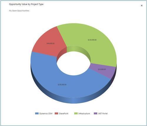
The Probability Adjusted Forecast visualization uses a multi-series column chart to report on open Opportunity records. As shown in the following screenshot, the first series (in blue) is the Estimated Revenue Value. The second series (in yellow) is a custom field added to the Opportunity entity named Probability Adjusted Value. Since FetchXML is not able to generate calculated fields, (such as the Probability Adjusted Value), a workflow was built that is triggered when the Estimated Revenue Value or Probability fields change, and recalculates the Probability Adjusted Value. Some of the Opportunity charts that come standard with Dynamics CRM allow you to compare Estimated vs. Actual revenue values. However, this is an example of how a multi-series chart can compare other values as well, including custom fields:

The Time to Close by Project Type visualization is a bar chart that groups Opportunities by a custom Project Type option set and calculates the average Estimated Days Open field. The custom Estimated Days Open field is the difference between the Created Date and Estimated Close Date values. The idea was to show the average of how long each of these project types takes to close. The chart uses the optional ScaleBreakStyle element in the Chart XML to better present the data by avoiding large gaps when there are big differences in the data. This element goes into the AxisY element in the Chart XML:
<ScaleBreakStyle Enabled="True" BreakLineStyle="Wave" Spacing="2" CollapsibleSpaceThreshold="50" />
There are some interesting parameters available to help customize this option. In this example a Wave style was used with a threshold of 50, which means if there is a difference in bar values greater than 50%, show a scale break that looks like a wave. This is shown in the following screenshot:

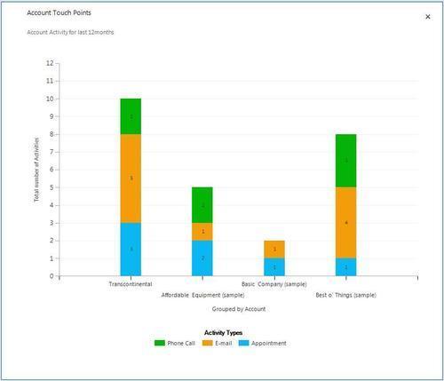
The Account Touch Points visualization uses a stacked bar chart, similar to the chart shown in Chapter 8, Creating a Chart to show how many Activities have been tracked against the salesperson's accounts over the last 12 months. The Y Axis counts the total number of Activities, where the X axis groups by account and then stacks by Activity type (filtered on phone calls, e-mails and appointments), as shown in the following screenshot: