This recipe will explain the steps required to create your first user dashboard.
Carry out the following steps in order to complete this recipe:
- Select the Dashboards link from the Workplace area. The default dashboard will be displayed.
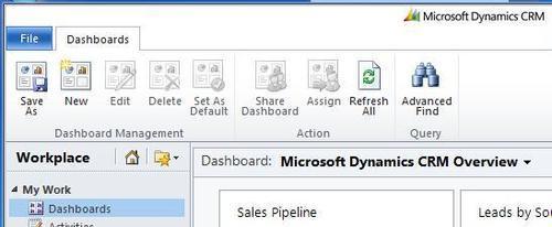
- The Dashboards ribbon should also be displayed along the top of the screen. Click on the New button to start the process, as shown in the following screenshot:
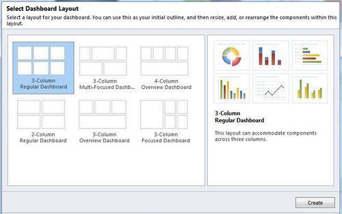
- The Select Dashboard Layout dialog will appear. It contains a listing of the six default layouts available when creating a new dashboard. For this recipe, select the 3-Column Regular Dashboard layout, and then click on the Create button, as shown in the following screenshot:
- The dashboard designer screen will now appear. Provide the required Name value for your new dashboard and hit the Save and Close button.
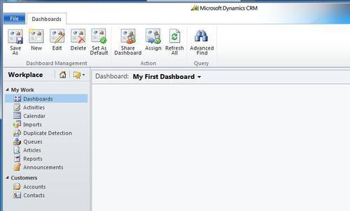
- Once the dashboard editor window has closed, you will be back at the Dashboards section in Dynamics CRM 2011, and you will see your new (albeit empty) dashboard. In this example, it was named My First Dashboard, as shown in the following screenshot:
- Referring back to the Dashboards ribbon again, click on the Edit button to open the dashboard editor window for your new dashboard.
Rather than creating physical files for each dashboard, the dashboard editor stores an XML record containing the layout of the dashboard within the Dynamics CRM database. This record is retrieved by the system and rendered when a user requests a dashboard to be displayed.
Let's explore the six different layouts.
When you click on the New button from the Dashboards ribbon, a Select Dashboard Layout screen appears that contains the six default layouts to help you get started. This section shows examples of how to use these layouts and explains how each of the layout types might be used.
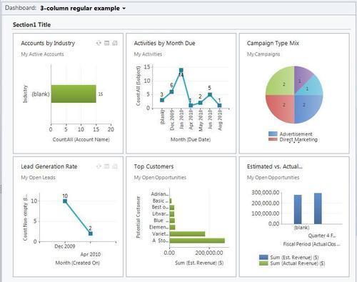
This layout provides placeholders for six components. That is, two rows of three columns in a grid format. There is one section container on this dashboard, so that you can provide a subtitle if needed. The following screenshot shows an example:
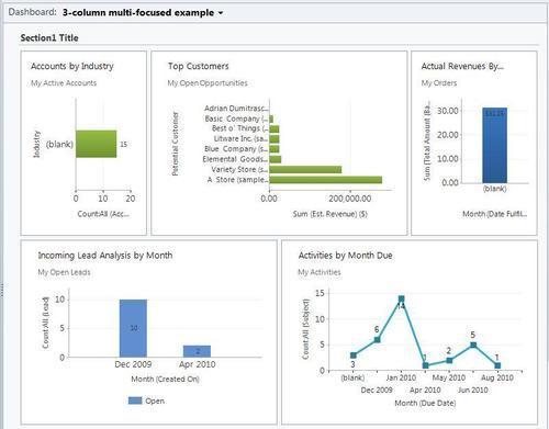
This layout provides space for five components. The component placeholders are of different sizes, and have been designed that way to draw the attention (focus) of the user to a couple of components when first viewed. There is one section container on this dashboard, so that you can provide a subtitle if needed. The following screenshot shows an example:
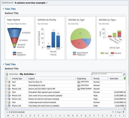
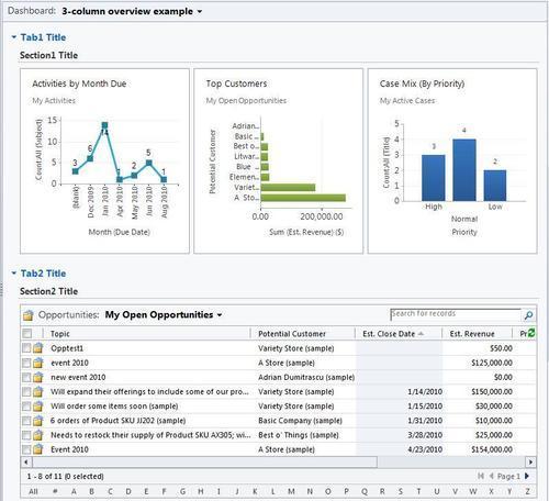
This layout has two rows by default. The first row has four columns, which can be used to display charts and other components. The second row has one wide column, which is suitable for showing a list control, a wide chart, or an IFrame component. There are two collapsible tabs, each with one section container so that you can provide a subtitle if needed. The following screenshot shows an example:
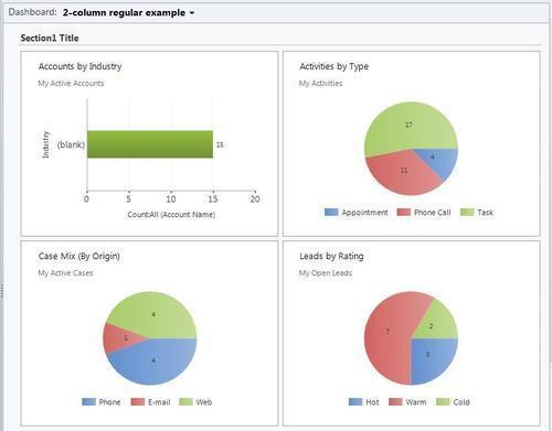
This layout provides placeholders for four components. That is, two rows of two columns in a grid format. There is one section container on this dashboard, so that you can provide a subtitle if needed. The following screenshot shows an example:
This layout has two rows by default. The first row has three columns and can be used to display any smaller components. The second row has one large column, which is suitable for showing wide list controls, charts, and IFrames. There are two collapsible tabs, each with one section container so that you can provide a subtitle if needed. The following screenshot shows an example:
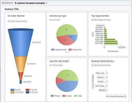
This layout contains three main columns to display components; however, the first column can be used to draw focus to a specific component that might require more vertical space. There is one section container on this dashboard, so that you can provide a subtitle if needed. The following screenshot shows an example: