
Multifactor Fixed Income Risk Models and Their Applications
In this entry24, we discuss risk modeling construction and applications to fixed income portfolios. Although they share a similar framework, multifactor models in fixed income use different building blocks and provide a different analysis of the risk of a portfolio.
When analyzing their holdings, portfolio managers constantly monitor their exposures, typically net of a benchmark: What is the portfolio net duration? How risky is the overweight to credit? How does it relate to the exposure to mortgages? What is the exposure to specific issuers? Even when portfolio holdings and exposures are well known, portfolio managers increasingly rely on quantitative techniques to translate this information into a common risk language. Risk models can present a coherent view of the portfolio, its exposures, and how they correlate to each other. They can quantify the risk of each exposure and its contribution to the overall risk of the portfolio.
Fixed income securities are exposed to many different types of risk. Multifactor risk models in this area capture these risks by first identifying common sources along different dimensions, the systematic risk factors. All risk not captured by systematic factors is considered idiosyncratic or security-specific. Typically, fixed income systematic risk factors are divided into two sets: those that influence securities across asset classes (e.g., yield curve risk) and those specific to a particular asset class (e.g., prepayment risk in securitized products).
There are many ways to define systematic risk factors. For instance, they can be defined purely by statistical methods, observed in the markets, or estimated from asset returns. In fixed income, the standard approach is to use pricing models to calculate the analytics that are the natural candidates for risk factor loadings (also called sensitivities). In this setting, the risk factors are estimated from cross-sectional asset returns. This is the approach taken in the Barclays Global Risk Model,1 which is the model used for illustration throughout this entry.
In this risk model, the forecasted risk of the portfolio is driven by both a systematic and an idiosyncratic (also called specific, nonsystematic, and concentration) component. The forecasted systematic risk is a function of the mismatch between the portfolio and the benchmark in the exposures to the risk factors, such as yield curve or spreads. The exposures are aggregated from security-level analytics. The systematic risk is also a function of the volatility of the risk factors, as well as the correlations between them. In this setting, the correlation of returns across securities is driven by the correlation of systematic risk factors these securities load on. As the model uses security-level returns and analytics to estimate the factors, we can recover the idiosyncratic return for each security. This is the return net of all systematic factors. The model uses these idiosyncratic returns to estimate rich specifications for the idiosyncratic risk.
APPROACHES USED TO ANALYZE RISK
In what follows, we turn to the analysis of the risk of a particular portfolio, going through the different approaches typically used. Specifically, consider a portfolio manager that is benchmarked against the Barclays US. Aggregate Index. Moreover, suppose she believes interest rates are coming down—so she wants to be long duration—and that she wants some extra yield in her portfolio—meaning investing in bonds with relatively higher spreads. Finally, let us assume that she is mandated to keep the difference between the returns of the portfolio and the benchmark at around 15 basis points, on a monthly basis. Therefore, she has to track a benchmark, but is allowed to deviate from it up to a point in order to express views that hopefully lead to superior returns. A portfolio manager with such a mandate is called an enhanced indexer. The amount of deviation allowed is called the risk budget (15 basis points in our example) and can be quantified using a risk model. The risk model produces an estimate of the volatility of the difference of the portfolio and benchmark returns, called tracking error volatility (TEV). (In this entry, we refer to TEV, risk, and the standard deviation of the portfolio net returns interchangeably.) The portfolio manager should keep the TEV at a level equal to or less than her risk budget. For illustration, we construct a portfolio with 50 securities that is consistent with the portfolio manager’s views and risk budget and analyze it throughout this entry.
Market Structure and Exposure Contributions
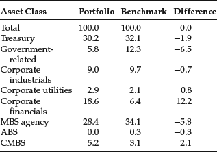
The first level of analysis that any portfolio manager usually performs is to compare the portfolio holdings in terms of market value with the holdings from the benchmark. For instance, Table 1 shows that the composition of the portfolio has several important mismatches when compared with the benchmark. The portfolio is underweighted in Treasuries and government-related securities by 8.4%. This is compensated with an overweight of 12.3% in corporates, especially in the financials sector. Other mismatches include an underweight in mortgage-backed securities (MBS) (−5.8%) and an overweight in commercial mortgage-backed securities (CMBS) (+2.1%).
Table 1 Market Weights for Portfolio and Benchmark
Interestingly, for an equity manager, this kind of information—for example, applied to the different industries or sectors of the portfolio—would be of paramount importance to the analysis of the risk of her portfolio. For a fixed income portfolio, this is not the case. Although important, this analysis tells us very little about the true active exposures of a fixed income portfolio. What if the Treasuries in the portfolio have significantly longer duration than those in the benchmark—would we be really “short” in this asset class? What if the spreads from financials in the portfolio are much smaller than those in the benchmark—is the weight mismatch that important?
To answer this kind of questions, we turn to another typical dimension of analysis—the exposure of the portfolio to major sources of risk. An example of such a risk exposure is the duration of the portfolio. Other exposures typically monitored are the spread duration, convexity, spread level, and vega (if the portfolio has many securities with optionality, such as mortgages or callable bonds).
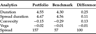
Table 2 shows these analytics at the aggregate level for our portfolio, benchmark, and the difference between the two. In particular, we can see that the portfolio is long duration (+0.25 years), consistent with the forecast the manager has regarding yield curve moves. In terms of spread duration, the mismatch is somewhat smaller. We can also see that the portfolio has significantly lower negative convexity than the benchmark (−0.15 versus −0.29), probably coming from the smaller weight MBS securities have in the portfolio. The portfolio has also a higher negative vega, but the number is reasonably small for both universes. Finally, the portfolio has significantly higher spreads (100 basis points) than the benchmark. This mismatch is consistent with the manager’s goal of having a higher yield in her portfolio, when compared with the benchmark.
Table 2 Aggregate Analytics
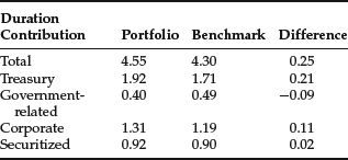
The analysis in the Tables 1 and 2 can be combined to deliver a more detailed picture of where the different exposures are coming from. Table 3 shows that analysis for the duration of the portfolio. This exhibit shows that the majority of the mismatch in duration contribution (market-weighted duration exposures) comes from the Treasury component of our portfolio (+0.21). Interestingly, even though we are short in Treasuries, we are actually long in duration for that asset class. This means that our Treasury portfolio will be negatively impacted, when compared with the benchmark, by an increase in interest rates. Because we are short in Treasuries, this result must mean that our Treasury portfolio is longer in duration than the Treasury component of the benchmark. Conversely, we have a relatively small contribution to excess duration coming from our very large overexposure to corporates. This means that on average the corporate bonds in the portfolio are significantly shorter in duration than those in the benchmark.
Table 3 Duration Contribution per Asset Class
Adding Volatility and Correlations into the Analysis
The analysis above gives us some basic understanding of our exposures to different kinds of risk. However, it is still hard to understand how we can compare the level of risk across these different exposures. What is more risky, the long duration exposure of 0.25 years, or the extra spread of 100 basis points? How can we quantify how serious is the vega mismatch on my portfolio? Specifically, the risk of the portfolio is a function of the exposures to the risk factors, but also of how volatile (how “risky”) each of the factors is. So to enhance the analysis we bring volatilities into the picture. Table 4 shows the outcome of this addition to our example. In particular, it displays the risk of the different exposures of the portfolio in isolation (that is, if the only active imbalances were those from that particular set of risk factors).
Table 4 Isolated Risk per Category
| Risk Factors Categories | Risk |
| Curve | 8.5 |
| Volatility | 1.7 |
| Spread government-related | 3.0 |
| Spread corporate | 5.1 |
| Spread securitized | 3.0 |
For example, in Table 4 one can see that if the only active weight in the portfolio were the mismatch in the yield curve exposures, the risk of the portfolio would be 8.5 basis points per month. By adding volatilities into the analysis, we can now quantify that the mismatch of +0.25 years in duration “costs” the portfolio 8.5 basis points per month of extra volatility, when taken in isolation.2 Similarly, if the only mismatch were the exposure to corporate spreads, the risk of the portfolio would be 5.1 basis points. Interestingly, we also see that both government-related and securitized sectors have nontrivial risk, despite having smaller imbalances in terms of market weights. By bringing volatilities into the analysis, we can now compare and quantify the impact of each of the imbalances in the portfolio.
For future reference, consider the volatility of the portfolio if all these sources of risk were independent (e.g., correlations were zero). That number would be 10.9 basis points per month.3 Of course, this scenario is unrealistic, as these sources of risk are not independent. Also, this analysis does not allow us to understand the interplay between the different imbalances. For instance, we know that the isolated risk associated with the curve is 8.5. But this value can be achieved both by being long or short duration. So the isolated number does not allow us to understand the impact of the curve imbalance to the total risk of the portfolio. The net impact certainly depends on the sign of the imbalance. For instance, if the long exposure in curve is diversified away by a long exposure in credit (due, for instance, to negative correlation between rates and credit spreads), a symmetric (short) curve exposure would add to the risk of the long exposure in credit. The risk is clearly smaller in the first case.
To alleviate these shortcomings, we bring correlations into the picture. They allow us to understand the net impact of the different exposures to the portfolio’s total risk and to detect potential sources of diversification among the imbalances in the portfolio. Table 5 reports the contribution of each of the risk factor groups to the total risk, once all correlations are taken into account. The total risk (9.3 bps/month) is smaller than the zero-correlation risk calculated before (10.9 bps/month) due to generally negative correlations between the curve and the spread factors. The exhibit also allows us to isolate the main sources of risk as being curve (5.9 bps/month) and credit spreads (2.4 bps/month), in line with the evidence from the earlier analysis. In particular, the risk of the government-related and securitized spreads is significantly smaller once correlations are taken into account.
Table 5 Correlated Risk per Category
| Risk Factors Categories | Risk |
| Total | 9.3 |
| Curve | 5.9 |
| Volatility | 0.1 |
| Spread government-related | 0.1 |
| Spread corporate | 2.4 |
| Spread securitized | 0.7 |
The difference in analysis between the isolated and correlated risks reported in Tables 4 and 5 deserves a bit more discussion. For simplicity, assume there are only two sources of risk in the portfolio—yield curve (Y) and spreads (S). The total systematic variance of the portfolio (P) can be illustrated as follows:
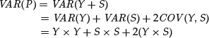
where we use the product (×) to represent variances and covariances. Another way to represent this summation is using the following matrix:
![]()
The sum of the four elements in the matrix is the variance of the portfolio. The isolated risk (in standard deviation units) reported in Table 4 is the square root of the diagonal terms. So the isolated risk due to spreads is represented as
![]()
It would be a function of the exposure to all spread factors, the volatilities of all these factors, and the correlations among them.
The correlated risk reported in Table 5 is
![]()
that is, we sum all elements in the row of interest (row 1 for Y, row 2 for S) from the matrix above, and normalize it by the standard deviation of the portfolio. This statistic (1) takes into account correlations and (2) ensures that the correlated risks of all factors add up to the total risk of the portfolio ![]() .4
.4
The generic analysis we just performed constitutes the first step into the description of the risk associated with a portfolio. The analysis refers to categories of risk factors (such as “curve” or “spreads”). However, a factor-based risk model allows for a significantly deeper analysis of the imbalances the portfolio may have. Each of the risk categories referred to above can be described with a rich set of detailed risk factors. Typically in a fixed income factor model, each asset class has a specific set of risk factors, in addition to the potential set of factors common to all (e.g., curve factors). These asset-specific risk factors are designed to capture the particular sources of risk the asset class is exposed to. In the following section, we go through a risk report built in such a way, emphasizing risk factors that are common or particular to the different asset classes. Along the way, we demonstrate how the report offers insights from both a risk management and a portfolio construction perspective.
A Detailed Risk Report
In this section, we continue the analysis of the portfolio introduced previously, a 50-bond portfolio benchmarked against the Barclays US Aggregate Index. The report package we present was generated using POINT®, Barclays cross-asset portfolio analysis and construction system, and gives a very detailed picture of the risk embedded in the portfolio. The package is divided into four types of reports: summary reports, factor exposure reports, issue/issuer level reports, and scenario analysis reports. Some of the information we reviewed earlier can be thought of as summary reports.
Summary Report
Table 6 illustrates a typical risk summary statistics report. It shows that the portfolio has 50 positions, but from only 27 issuers. This number implies limited ability to diversify idiosyncratic risk, as we will see below. The report confirms that the portfolio is long duration (OAD of 4.55 years versus 4.30 years for the benchmark) and has higher yield (yield to worst of 3.71% versus 2.83% for the benchmark) and coupon (4.73% versus 4.46% for the benchmark).
Table 6 Summary Statistics Report
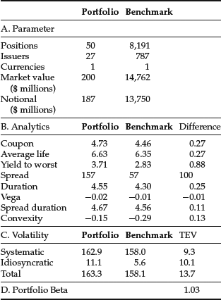
The table also reports that the total volatility of the portfolio (163.3 bps/month) is higher than that of the benchmark (158.1 bps/month). This is not surprising: longer duration, higher spread and less diversification all tend to increase the volatility of a portfolio. Because of its higher volatility, we refer to the portfolio as riskier than the benchmark. Looking into the different components of the portfolio’s total volatility, the table reports that the idiosyncratic volatility of the portfolio is significantly smaller than that of the systematic (11.1 bps/month versus 162.9 bps/month, respectively). This is also expected from a portfolio of investment-grade bonds. Given the fact that by construction the systematic and idiosyncratic components of risk are independent, we can calculate the total volatility of the portfolio as
![]()
There are two interesting observations regarding this number: first, the total volatility is smaller than the sum of the volatilities of the two components. This is the diversification benefit that comes from combining independent sources of risk. Second, the total volatility is very close to the systematic one. This may suggest that the idiosyncratic risk is irrelevant. That is an erroneous and dangerous conclusion. In particular, when managing against a benchmark, the focus should be on the net exposures and risk, not on their absolute counterparts. In Table 6 the total TEV is reported as 13.7 bps/month. This means that the model forecasts the portfolio return to be typically no more than 14 bps/month higher or lower than the return of the benchmark. This number is in line with the risk budget of our manager. The exhibit also reports idiosyncratic TEV of 10.1 bps/month, which is greater than the systematic TEV (9.3). When measured against the benchmark, our major source of risk is idiosyncratic, contrary to the conclusion one could draw by looking only at the portfolio’s volatility. The TEV of our portfolio is also bigger than the difference between the volatilities of the portfolio and benchmark. Again, this is not surprising: The volatility depends on the absolute exposures, while the TEV measures imbalances between these absolute exposures from the portfolio and the benchmark. For the TEV what matters most is the correlation between these absolute exposures. Depending on this correlation, the TEV may be smaller or bigger than the difference in volatilities.
Table 7 Factor Partition—Risk Analysis
Finally, the report estimates the portfolio to have a beta of 1.03 to the benchmark. This statistic measures the co-movement between the portfolio and the benchmark. We can read it as follows: The model forecasts that a movement of 10 bps in the benchmark leads to a movement of 10.3 bps in the portfolio in the same direction. Note that a beta of less than one does not mean that the portfolio is less risky than the benchmark. In the limit, if the portfolio and benchmark are uncorrelated, the portfolio beta is zero but obviously that does not mean that the portfolio has zero risk. Finally, one can compute many different “betas” for the portfolio or subcomponents of it.5 A simple and widely used one is the “duration beta,” given by the ratio of the portfolio duration to that of the benchmark. In our case this ratio is 4.55/4.30 = 1.06. This implies that the portfolio has a return from yield curve movements around 1.06 times larger than that of the benchmark. This beta is larger than the portfolio beta (1.03), meaning that net exposures to other factors (e.g., spreads) “hedge” the portfolio’s curve risk.
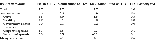
This first summary report (Table 6) allows us to get a glimpse into the risk of the portfolio. However, we want to know in more detail what the source of this risk is. To do that, we turn to the next two summary reports. In the first, risk is partitioned across different groups of risk factors. In the second, the partition is across groups of securities/asset classes.
Table 7 shows four different statistics associated with each set of risk factors. The first two were somewhat explored in Tables 4 and 5.6 The exhibit reports in the first column the isolated TEV, that is, the risk associated with that particular set of risk factors only. We see that in an isolated analysis, the systematic and idiosyncratic risks are balanced, at 9.3 and 10.1 respectively. The report also shows the isolated risk associated with the major components of systematic risk. As discussed before, all components of systematic risk have nontrivial isolated risk, but only curve and credit spreads are significant when we look into the contributions to TEV. If we look across factors, the major contributors are idiosyncratic risk, curve, and credit spreads. Other systematic exposures are relatively small.
Table 8 Security Partition—Risk Analysis I
Another look into the correlation comes when we analyze the liquidation effect reported in the table. This number represents the change in TEV when we completely hedge that particular group of risk factors. For instance, if we hedge the curve component of our portfolio, our TEV drops by 1.5 bps/month, from 13.7 to 12.2. One may think that the drop is rather small, given the magnitude of isolated risk the curve represents. However, if we hedge the curve, we also eliminate the beneficial effect the negative correlation between curve and spreads have on the overall risk of the portfolio. Therefore, we have a more limited impact when hedging the curve risk. In fact, for this portfolio we see that hedging any particular set of risk factors has a limited effect in the overall risk.
The TEV elasticity reported in the last column gives another perspective into how the TEV in the portfolio changes when we change the risk loadings. Specifically, it tells us what the percentage change in TEV would be if we changed our exposure to that particular set of factors by 1%. We can see that if we reduce our exposure to corporate spreads by 1%, our TEV would decrease by 0.1%.
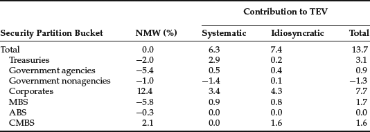
We perform a similar analysis in Table 8, but applied to a security partition. That is, instead of looking at individual sources of risk (e.g., curve) across all securities, we now aggregate all sources of risk within a security and report analytics for different groups of these securities (e.g., subportfolios). In particular, Table 8 reports the results by asset class. We can see that the majority of risk (7.7 bps/month) is coming from the corporate component of the portfolio.7 Corporates are also the primary contributors to the portfolio’s systematic and idiosyncratic components of risk. This is not surprising, given the portfolio’s large net market weight (NMW) to this sector. There are two other important sources of risk. The first is the Treasuries subportfolio, with 3.1 bps/month of risk. This risk comes mainly from the mismatch in duration. The second comes from the idiosyncratic risk of the CMBS component of the portfolio. Even though the NMW and systematic risk are not significant for this asset class, the relatively small number of (risky) CMBS positions in the portfolio causes it to have significant idiosyncratic risk (three securities in the portfolio versus 1,735 in the index). Since the portfolio manager is trying to replicate a very large benchmark with only 50 positions, she has to be very confident in the issuers selected. This report highlights the significant name risk the portfolio is exposed to.
Table 9 Security Partition—Risk Analysis II
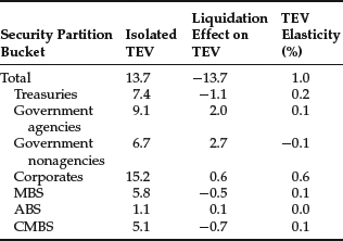
Table 9 completes the analysis, reporting other important risk statistics about the different asset classes within the portfolio. These statistics mimic the analysis done in terms of risk factor partitions in Table 7, so we will not repeat their definitions. We focus on the numbers. In particular, the isolated TEV from the corporate sector is 15.2 bps/month, higher than the total risk of the portfolio. This means that the exposures to the other asset classes, on average, hedge our credit portfolio. The exhibit also reports that the agencies isolated risk is very large. This is due to the large negative net exposure (−5.4%) we have to this asset class. But the risk is fully hedged by the other exposures of the portfolio (e.g., long exposure to credit or long duration on Treasuries), so overall the risk contribution of this asset class is small, as previously discussed. We can even take the analysis a bit further: Table 9 shows us through the liquidation effect that if we eliminate the imbalance the portfolio has on agencies, we actually would increase the total risk of the portfolio by 2.0 bps/month. In short, we would be eliminating the hedge this asset class provides to the global portfolio, therefore increasing its risk. The exposures to this asset class were clearly built to counteract other exposures in the portfolio. Finally, Table 9 also reports the TEV elasticity of the different components of the portfolio. This number represents the percentage change in TEV if the NMW to that subportfolio changes by 1%, so we need to read the numbers with an opposite sign if the NMW is negative. In particular, if we increase the weight of the agency portfolio in absolute value (making it “more short”) by 1%, we would actually increase the TEV by 0.1%. This result shows that the position in agencies provides hedging “on average,” but marginally it is already increasing the risk of the portfolio. In other words, the hedging went beyond its optimal value.
This set of summary reports gives us a very clear picture of the major sources of risk and how they relate to each other. In what follows, we focus on the more detailed analysis of the individual systematic sources of risk.
Factor Exposure Reports
At the heart of a multifactor risk model is the definition of the set of systematic factors that drive risk across the portfolio. As described above, there are different types of risk a fixed income portfolio is exposed to. In what follows, we focus on the three major types: curve, credit, and prepayment risk. Specifically in what regards the latter two, we use the credit and MBS component of the portfolio, respectively, to illustrate how to measure risks along these dimensions. Moreover, to keep the example simple, we show only a partial view of all relevant factors for these sources of risk. Later in this section we refer briefly to other sources of risk a fixed income portfolio may be exposed to.
Curve Risk
As the previous analysis shows (e.g., Table 7), curve is the major source of risk in our portfolio. This kind of risk is embedded in virtually all fixed income securities (exceptions are, for instance, floaters and distressed securities), therefore mismatches are very penalizing.
When analyzing curve risk, we should use the curve of reference we are interested in. Depending on the portfolio and circumstances, this is typically the government or swap curve.8 In calm periods, the behavior of the swap curve tends to match that of the government curve. However, during liquidity crises (e.g., the Russian crisis in 1998 or the credit crisis in 2008), they can diverge significantly. To capture these different behaviors adequately, we analyze curve risk using the following decomposition: For government products, the curve risk is assessed using the government curve. For all other products in our portfolio (that usually trade off the swap curve), this risk is measured using both the Treasury curve and swap spreads (i.e., the spreads between the swap and the government curve). Other decompositions are also possible.
The risk associated with each of these curves can be described by the exposure the portfolio has to different points along the curve and how volatile and correlated the movement in these points of the curve are. A additional convexity term is sometimes used to capture the non-linear components of curve risk. For a typical portfolio, a good description of the curve can be achieved by looking at a relatively small number of points along the curve (called key rates), for example, 6-month, 2-year, 5-year, 10-year, 20-year, and 30-year. An alternative set of factors used to capture yield curve risk can be defined using statistical analysis of the historical realizations of the various yield curve points. The statistical method used most often is called principal component analysis (PCA). This method defines factors that are statistically independent of each other. Typically three or four such factors are sufficient to explain the risk associated with changes of yields across the yield curve. PCA analysis has several shortcomings and must be used with caution. Using a larger set of economic factors, such as the key rate points described above, is more intuitive and captures the risk of specialized portfolios better. In our analysis, we follow the key rates approach.
Table 10 details the risk in our portfolio associated with the US Treasury curve. It starts by describing all risk factors our portfolio or benchmark load on. As discussed above, we identify the six key rate (KR) points in the curve plus the convexity term as the risk factors associated with US Treasury risk. They are described in the first column of panel A in the exhibit. They measure the risk associated with moves in that particular point in the curve. Exposure to these risk factors is measured by the key rate durations (KRD) for each of the six points. The description of the loading is in the second column of the exhibit, while its value for the portfolio, benchmark, and the difference is displayed in the next columns. Key rate durations are also called partial durations, as they add up to approximately the duration of the portfolio. Their loadings are constructed by aggregating partial durations across (virtually) all the securities. For instance, for our portfolio, the sum of the key rate durations is 0.14 + 0.86 + 1.30 + 0.77 + 1.02 + 0.47 = 4.56, very close to the total duration of our portfolio.
Table 10 Treasury Curve Risk
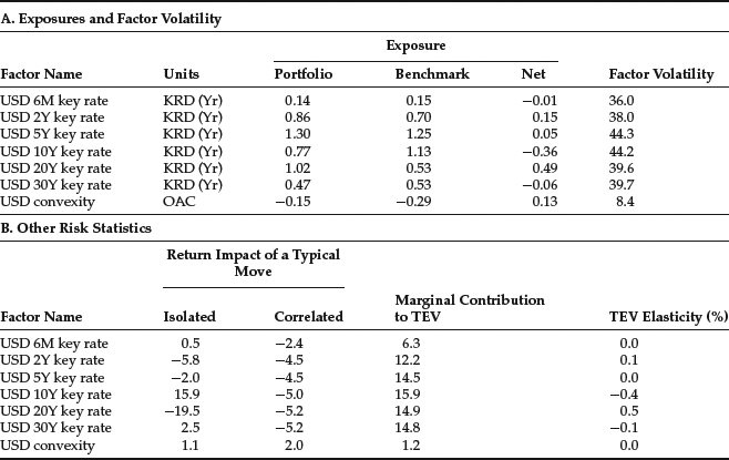
Looking at the table, we see significant mismatches in the duration profiles between our portfolio and its benchmark, namely at the 10-year and 20-year points on the curve. Specifically, we are short 0.41 years at the 10-year point and long 0.53 years at the 20-year point. How serious is this mismatch? Looking at the factor volatility column, it can be seen that these points on the curve have been very volatile at around 40 bps/month. If we interpret this volatility as a typical move, the first two columns of panel B show us the potential impact of such a movement in the return of our portfolio, net of benchmark. For instance, a typical move up (+44.2 bps/month) in the 10-year point of the Treasury curve, when considered in isolation, will deliver a positive net return of 15.9 bp.9 In isolation, the positive impact is expected because we are short that point of the curve. More interesting may be the correlated number on the exhibit. It states the return impact but in a correlated fashion. In the scenario under analysis, a movement in the 10-year point will almost certainly involve a movement of the neighboring points in the curve. So, contrary to the positive isolated effect documented above, the correlated impact of a change up in the 10-year point is actually negative, at −5.0 bps. This result is in line with the overall positive duration exposure the portfolio has: General (correlated) movements up in the curve have negative impact in the portfolio’s performance.10 Finally, and broadly speaking, the (negative of the) ratio of the correlated impact to the factor volatility gives us the model-implied partial empirical duration of the portfolio. For instance, if we focus on the 10-year point, we get −(−5.0/44.2) = 0.11. This smaller empirical duration is typical in portfolios with spread exposure. The spread exposure tends to empirically hedge some of the curve exposure, given the negative correlation between these two sources of risk. Finally, the exhibit shows the risk associated with convexity. We can see that the benchmark is significantly more negatively convex, so the portfolio is less responsive than the benchmark to higher order changes in the yield curve.
There are many other statistics of interest one can analyze regarding the Treasury curve risk of the portfolio. Portfolio managers frequently have questions such as: If I want to reduce the risk of my portfolio by manipulating my Treasury curve exposure, what should I change? What is the most effective move? By how much would my risk actually change? The statistics reported in the columns “Marginal Contribution to TEV” and “TEV Elasticity (%)” of panel B are typically used to answer these questions. Regarding the marginal contributions, the 10-year point has the largest value, indicating that an increase (reduction) of one unit of exposure (in this case one year of duration) to the 10-year point leads to an increase (reduction) of around 16 bps in the TEV.11 In other words, if we want to reduce risk by manipulating our exposure to the yield curve, the 10-year point seems to present the fastest track. In addition, the exhibit shows that all Treasury risk factors are associated with positive marginal contributions. This means that an increase in the exposure to any of these factors increases the risk (TEV) of the portfolio. This conclusion holds, even for factors for which we have negative exposure (e.g., the 10-year key rate). The reason behind this result is our overall long duration exposure. If we add exposure to it, regardless of the specific point where we add it, we extend our duration even further, increasing the mismatch our portfolio has in terms of duration, and so increasing its risk.12 This result holds because we take into consideration the correlations between the different points in the Treasury curve. Without correlations, the analysis would be significantly less clear. The exhibit also reports the TEV elasticity of each of the risk factors, a concept introduced earlier. The interpretation is similar to the marginal contribution, but with normalized changes (percentage changes). This normalization makes the numbers more comparable across risk factors of very different nature. It is also useful when considering leveraging the entire portfolio proportionally. In our case, if we increase the exposure to the 10-year key rate point by 10%, from −0.36 to something around −0.40 (effectively reducing our long duration exposure), our TEV would be reduced by 4% (from 13.7 to 13.2 bps/month).
Table 11 Swap Spread (SS) Risk
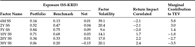
We now turn the analysis to the other component of the curve risk described above: the risk embedded into the portfolio exposure to the swap spread, that is, the spread between the swap and the Treasury curves. All securities that trade against the swap curve (e.g., all typical credit and securitized bonds) are exposed to this risk. Its analysis follows very closely that of the Treasury curve, so we only highlight the major risk characteristics of the portfolio along this dimension. Table 11 shows that in general our exposure to the swap spreads is smaller than the exposure to the Treasury curve. Remember that Treasuries do not load on this set of risk factors, so the market-weighted exposures are consequently smaller. Looking at the profile of factor volatilities, one can see that its term structure of volatilities is U-shaped, with the short end extremely volatile and the five-year point having the lowest volatility. When comparing with the Treasury curve volatility profile (see Table 10), we can see significant differences, the aftermath of a strong liquidity crisis. Regarding net exposures, the exhibit shows that our largest mismatch is at the 30-year point, where we are short by 0.15 years. Interestingly, this is not the most expensive mismatch in terms of risk: When looking at the last column, we see that we would be able to change risk the most by manipulating the short end of our exposure to the swap spread curve, namely the six-month point.
The previous tables allow us to understand our exposures to the different types of curve risk and their impact both on the return and risk of our portfolios. They also guide us regarding what changes we can introduce to modify the risk profile of the portfolio. We now turn our attention to sources of risk that are more specific to particular asset classes. In particular, we start with the analysis of credit risk.
Credit Risk
Instruments in the portfolio issued by corporations or entities that may default are said to have credit risk. The holders of these securities demand some extra yield—on top of the risk-free yield—to compensate for that risk. The extra yield is usually measured as a spread to a reference curve. For instance, for corporate bonds the reference curve is usually the swap curve. The level of credit spreads determines to a large extent the credit risk exposure associated with the portfolio.13
Table 12 Credit Spread Risk
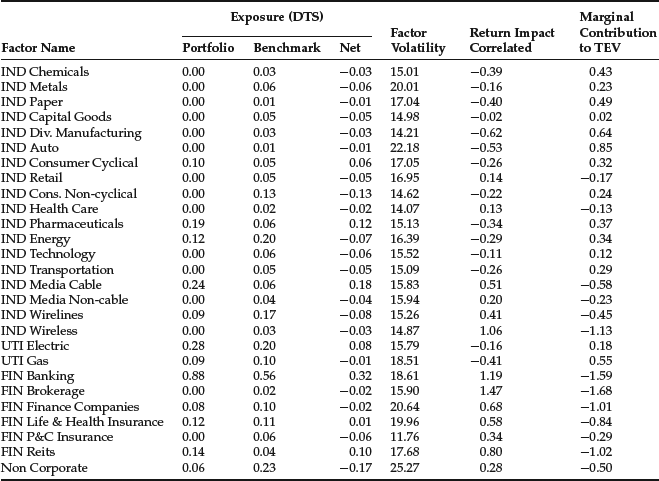
There are several characteristics of credit bonds that are naturally associated with systematic sources of credit spread risk. For instance, depending on the business cycle, particular industries may be going through especially tough times. So industry membership is a natural systematic source of risk. Similarly, bonds with different credit ratings are usually treated as having different levels of credit risk. Credit rating could be another dimension we can use to measure systematic exposure to credit risk. Given these observations, it is common to see factor models for credit risk using industry and rating as the major systematic risk factors. Recent research suggests that risk models that directly use the spreads of the bonds instead of their ratings to assess risk perform better for relatively short/medium horizons of analysis.14 Under this approach, the loading of a particular bond to a credit risk factor would be the commonly used spread duration multiplied by the bond’s spread (the loading is termed DTS = Duration Times Spread = OASD × OAS). By directly using the spread of the bond in the definition of the loading to the credit risk factors we do not need to assign specific risk factors to capture the rating or any similar quality-like effect. It will be automatically captured by the bond’s loading to the credit risk factor and will adjust as the spread of the bond changes. We use different systematic risk factors only to distinguish among credit risk coming from different industries.15
Table 13 Risk per Rating
The results of such an approach to the analysis of our portfolio are displayed in Table 12, which shows the typical industry risk factors associated with credit risk. The portfolio has net positions in 27 industries, spanning all three major sectors: Industrials (IND), Utilities (UTI) and Financials (FIN). We saw before that we have a significant net exposure to financials in terms of market weights (12.2%, see Table 1). In terms of risk exposure, Table 12 shows that the net DTS exposure to the Banking industry is 0.32, clearly the highest across all sectors.16 However, the marginal contribution to TEV that comes from that industry, although high, is comparable to other industries, namely Brokerage, for which the net exposure is close to zero. This means that these two industries are close substitutes in terms of the current portfolio holdings. Actually, what is very interesting is the fact that the marginal contribution is negative for these industries, even though we are significantly overweighting them. The analysis suggests that if we increase our risk exposure to Banking, our risk would actually decrease. This result is again driven by the strong negative correlation between spreads in financials and the yield curve. Therefore, the exposure in banking is actually helping hedge out our (more risky) long duration position. This kind of analysis is only possible when you account for the correlations across factors. It is of course also dependent on the quality of the correlation estimations the model has.
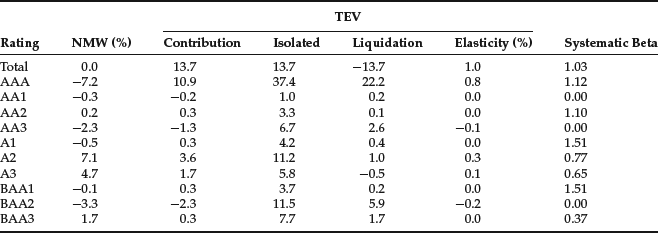
Although the risk factors used to measure risk are predetermined in a linear factor model, there is extreme flexibility in the way the risk numbers can be aggregated and reported.17 For example, as explained above, the risk model we use to generate the current risk reports does not use credit ratings as drivers of systematic credit risk. Instead, it relies on the DTS concept. However, once generated, the risk numbers can be reported using any portfolio partition. As an example, Table 13 shows the risk breakdown by rating. As reported in this table, the majority of risk is coming from our AAA exposure (10.9 bps/month), the bucket with the biggest mismatch in terms of net weight (−7.2%). This bucket includes Treasury and government-related securities, sectors that are underweighted in the portfolio leading to significant risk. This is even clearer when we look into the isolated TEV numbers. If we had mismatches only on AAAs, the risk of our portfolio would be 37.4 bps/month, instead of the actual 13.7: our other exposures (namely the one to single As) hedge the risk from AAAs. This table also reports the systematic betas associated with each of the rating subportfolios. These betas add up to the portfolio beta, when we use the portfolio weights (not NMW) as weights in the summation. Systematic betas of zero identify buckets for which the portfolio has (close to) no holdings. The table shows that a movement of 10 basis points in the benchmark leads to a 11.2 basis points return in the AAA subcomponent of the portfolio. The beta of 0.37 for the BAA3 component of the portfolio does not signal low volatility for this subportfolio. It indicates mainly low correlation with the benchmark. This is probably due to a larger component of idiosyncratic risk for this set of bonds.
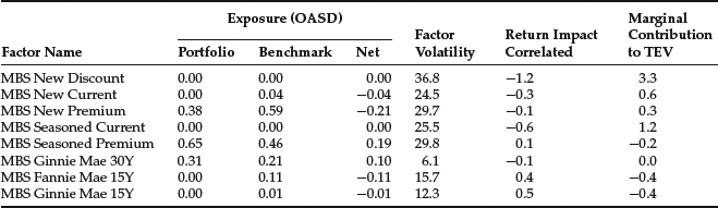
Table 14 MBS (spread) Prepayment Risk
Prepayment Risk
Securitized products are generally exposed to prepayment risk. The most common of the securitized products are the residential MBS (RMBS or simply MBS). These securities represent pools of deals that allow the borrower to prepay their debt before the maturity of the loan/deal, typically when prevailing lending rates are lower. This option means an extra risk to the holder of the security, the risk of holding cash exactly when reinvestment rates are low. Therefore, these securities have two major sources of risk: interest rates (including convexity) and prepayment risk.
Some part of the prepayment risk can be expressed as a function of interest rates via a prepayment model. This risk will be captured as part of interest-rate risk using the key rate durations and the convexity. These securities usually have negative convexity because usually prepayments increase (decrease) with decreasing (increasing) interest rates, thereby reducing price appreciation (increase price depreciation). The remaining part of prepayment risk—that is not captured by the prepayment model—must be modeled with additional systematic risk factors. Typically, the volatility of prepayment speeds (and therefore of risk) on MBS securities depends on three characteristics: program/term of the deal, if the bond is priced at discount or premium (e.g., if the coupon on the bond is bigger than the current mortgage rates) and how seasoned the bond is. This analysis suggests that the systematic risk factors in a risk model should span these three characteristics of the securities.
Table 14 shows a potential set of risk factors that capture the three characteristics discussed above. Programs identified as having different prepayment characteristics are the conventional (Fannie Mae) 30-year bonds (the base case used for the analysis), the 15-year conventional (Fannie Mae) bonds, as well as the Ginnie Mae 30- and 15-year bonds. The age of bonds is captured by factors distinguishing between new and aged deals. Finally, each bond is also classified by the price of the security—discount, current, or premium. In this example there are no seasoned discounted bonds, given the unprecedented level of mortgage rates as of June 2010. In terms of risk exposures, the exhibit shows that we are currently underweighting 15-year conventional bonds, and overweighting 30-year Ginnie Mae bonds.
Interaction between Sources of Risk
So far we analyzed the major sources of spread risk: credit and prepayment. To do this, we conveniently used two asset classes—credit and agency RMBS, respectively—where one can argue that these sources of risk appear relatively isolated. However, recent developments have made very clear that these sources of risk appear simultaneously in other major asset classes, including non-agency RMBS, home equity loans and CMBS.18 When designing a risk model for a particular asset class, one should be able to anticipate the nature of the risks the asset class exhibits currently or may encounter in the future. The design and ability to segregate between these two kinds of risk depends also on the richness of the bond indicatives and analytics available to the researcher. For this last point, it is imperative that the researcher understands well the pricing model and assumptions made to generate the analytics typically used as inputs in a risk model. This allows the user to fully understand the output of the model, as well as its applicability and shortcomings.
Other Sources of Risk
There are other sources of systematic risk we did not detail in this section. They may be important sources of risk for particular portfolios. Specific risk models can be designed to address them. We now mention some of them briefly.
Implied Volatility Risk
Many fixed income securities have embedded options (e.g., callable bonds). This means that the expected future volatility (implied volatility19) of the interest rate or other discount curves used to price the security plays a role in the value of that option. If expected volatility increases, options generally become more expensive, affecting the prices of bonds with embedded options. For example, callable bonds will become cheaper with increasing implied volatility since the bond holder is short optionality (the right of the issuer to call the bond). Therefore, the exposure of the portfolio to the implied volatility of the yield curve is also a source of risk that should be accounted for. The sensitivity of securities to changes of implied volatilities is measured by vega, which is calculated using the security pricing model. Implied volatility factors can be either calculated by the market prices of liquid fixed income options (caps, floors, and swaptions), or implied by the returns of bonds with embedded options within each asset class.
Liquidity Risk
Many fixed income securities are traded over-the-counter, in decentralized markets. Some trade infrequently, making them illiquid. It is therefore hard to establish their fair price. These bonds are said to be exposed to liquidity risk. The holder of illiquid bonds would have to pay a higher price to liquidate its position, usually meaning selling at a discount. This discount is uncertain and varies across the business cycle. For instance, the discount can be significant in a liquidity crisis, such as the one we experienced in 2008. The uncertainty about this discount means that, everything equal, a more illiquid bond will be riskier. This extra risk can be captured through liquidity risk factors. For instance, in the Treasury markets, one generally refers to the difference in volatility between an on-the-run and an off-the-run Treasury bond as liquidity risk.
Inflation Risk
Inflation-linked securities are priced based on the expectation of future inflation. Uncertainty about this variable adds to the volatility of the bond over and above the volatility from other sources of risk, such as the nominal interest rates. Expected inflation is not an observed variable in the marketplace but can be extracted from the prices on inflation-linked government bonds and inflation swaps. Expected inflation risk factors can be constructed by summarizing this information. The sensitivity of securities to expected inflation is calculated using a specialized pricing model and is usually called inflation duration.
Tax-Policy Risk
Many municipal securities are currently tax-exempt. This results in added benefit to their holders. This benefit—incor-porated in the price of the security—depends on the level of exemption allowed. Uncertainty around tax policy—tax-policy risk—adds to the risk of these securities. Once again, tax-policy risk factors cannot be observed in the marketplace and must be extracted from the prices of municipal securities. The return of municipal securities in excess of interest rates is driven partially by tax-policy expectations changes. However, it is also driven by changes in the creditworthiness of the municipal issuers as well as other factors. In this case it is difficult to separate tax-policy risk factors from other factors driving municipal bond spreads. Therefore, instead of specific tax-policy factors we usually extract factors representing the overall spread risk of municipal securities. This exercise is performed in a similar way to the credit risk model, where securities are partitioned into groups of “similar” risk by geography, bond-type (general obligation versus revenue), tax-status, and the like.20
Table 15 Issue Specific Risk
Issue-Level Reports
The previous analysis focused on the systematic sources of risk. We now turn our attention to the idiosyncratic or security-specific risk embedded in our portfolio. This risk measures the volatility the portfolio has due to news or demand–supply imbalances specific to the individual issues/issuers it holds. Therefore, the idiosyncratic risk is independent across issuers and diversifies away as the number of issues in the portfolio increases: Negative news about some issuers is canceled by positive news about others. For relatively small portfolios, the idiosyncratic risk may be a substantial component of the total risk. This can be seen in our example, as our portfolio has only 27 issuers. Table 6 shows that the idiosyncratic volatility of our portfolio is 11.1 bps/month, more than twice the idiosyncratic volatility of the benchmark (5.6 bps/month). When looking at the tracking error volatility net of benchmark, Table 6 shows that our specific risk is 10.1 bps/month and larger than the systematic component (9.3 bps/month). This means that, typically, a major component of the monthly net return is driven by events affecting only individual issues or issuers. Therefore, monitoring these individual exposures is of paramount importance.
The idiosyncratic risk of each bond is a function of two variables: its net market weight and its idiosyncratic volatility. This last parameter depends on the nature of the bond issuer. For instance, a bond from a distressed firm has much higher idiosyncratic volatility than one from a government-related agency.
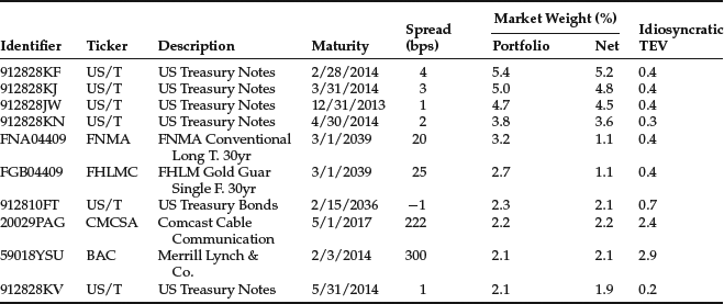
Table 15 provides a summary of the idiosyncratic risk for the top 10 positions by market weight in our portfolio. Not surprisingly, our top seven holdings are Treasuries and MBS securities, in line with the constitution of the index we are using as benchmark. Moreover, these positions have significant market weights, given that our portfolio contains only 50 positions. Even though we see large concentrations, the idiosyncratic TEV for the top holdings is small, as they are not exposed to significant name risk. The last column of the table shows that from this group the largest idiosyncratic risk comes from two corporate bonds (issued by Comcast Cable Communication “CMCSA” and Merrill Lynch “BAC”). This is not surprising, as these are the type of securities with larger event risk. Even within corporates, idiosyncratic risk can be quite diverse. In particular, it usually depends on the industry, duration, and level of distress of the issuer (usually proxied by rating, but in our model by the spread of the bond). For instance, the net position for both the CMCSA and BAC bonds is similar (2.2% and 2.1% respectively), but even though the maturity of the BAC bond is significantly shorter, its spread is higher, delivering a higher idiosyncratic risk (2.9 versus 2.4 bps/month). The fact that BAC is a firm from an industry (Financials) that experienced significant volatility in the recent past also contributes to higher idiosyncratic volatility. To manage the idiosyncratic risk in the portfolio one should pay particular attention to mismatches between the portfolio and benchmark for bonds with large spreads or long durations. These would tend to affect disproportionably the idiosyncratic risk of the portfolio.
Although important, the information in Table 15 is not enough to fully assess the idiosyncratic risk embedded in the portfolio. For instance, one could buy credit protection to BAC through a credit default swap (CDS). In this case, our exposure to this issuer may not be significant, even though, taken separately, the position reported in this exhibit is relevant. More generally, idiosyncratic risk is independent across issuers, but what happens within a particular issuer? A good risk model should have the ability to account for the fact that the idiosyncratic risk of two securities from the same issuer is correlated, as they are both subject to the same company-specific events. This is especially the case for corporates and emerging market securities. Moreover, it is important to note that the correlation between issues from the same issuer is not constant either. For an issuer in financial distress, all claims to their assets (bonds, equities, convertibles, etc.) tend to move together, in the absence of specific circumstances. This means that the idiosyncratic correlation between issues from that issuer should be high. Therefore, adding more issues from that issuer to the portfolio does not deliver additional diversification. On the other end, securities from firms that enjoy very strong financial wealth can move quite differently, driven by liquidity or other factors. In this case, one can have some diversification of idiosyncratic risk (although limited) even when adding issues from that same issuer into the portfolio.
To help us understand the net effect of all these points, we need to know the issuers that contribute the most to idiosyncratic risk. When aggregating risk from the issue (as shown in Table 15) to the issuer level, the correlations referred to above should be fully taken into account. Table 16 shows the results of this exercise for the 10 issuers with the highest idiosyncratic TEV. Our riskiest exposure comes from Johnson & Johnson (JNJ), with 3.7 bps/month of issuer risk. We can also observe that idiosyncratic TEV is not monotonic in the NMW: We have JNJ and President & Fellows of Harvard “HARVRD” with the same NMW, but the former is significantly more risky (3.7 versus 2.0 bps/month). It is possible to have important issuer risk even for names we do not have in our portfolio, if they have significant market weight in the benchmark. Finally, note that because the idiosyncratic risk across issuers is independent, we can easily calculate the cumulative risk of several issuers. For example, the total idiosyncratic risk of the first two issuers is given by
![]()
Another important interpretation from Table 16 is that these are our biggest name exposures in our portfolio. In this case, we are overweight in all of them. Therefore, we should not have negative views about any of them. If this is not the case, then we are assuming an unintended name risk. This risk should be promptly taken out of the portfolio, in favor of another issuer with similar characteristics and for which we do not have negative views about. This interactive exercise can easily be performed with a good and flexible optimizer.
Table 16 Issuer Specific Risk
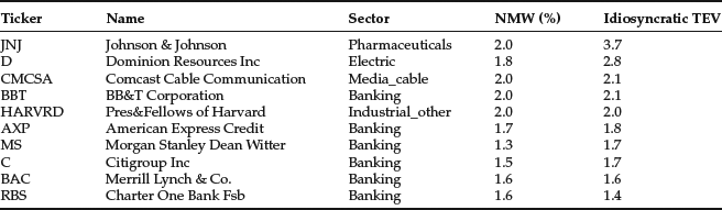
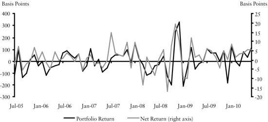
Figure 1 Historical Systematic Simulated Returns (basis points)
Scenario Analysis Report
Scenario analysis is another useful way to gain additional perspective on the portfolio’s risk. There are many ways to perform this exercise. For instance, one may want to reprice the whole portfolio under a particular interest rate or spread scenario, and look at the hypothetical return under that scenario. Alternatively, one may look at the holdings of the portfolio and see how they would have performed under particular stressed historical scenarios (e.g., the 1987 equity crash or the Asian crisis in 1997). One particular problem with this approach is the fact that, given the dynamic nature of the securities, the current portfolio did not exist with the current characteristics along all these historical episodes. A solution may be to try to price the current securities with the market variables at the time. Another solution is to represent the current portfolio as the set of loadings to all systematic risk factors in the factor risk model. We can then multiply these loadings by the historical realizations of the risk factors. The result is a set of historical systematic simulated returns. Figure 1 presents these returns for our portfolio over the last five years. As expected, the largest volatility came with the crisis of 2008, when the portfolio registered returns between −200 and +300 basis points. The largest underperformance against the benchmark appeared in September 2008, followed by the largest outperformance two months after, both at around 20 basis points.
This analysis has some limitations, especially for the portfolio under consideration, where idiosyncratic exposure is a major source of risk. This kind of risk is always very hard to pin down and obviously less relevant from an historical perspective, as the issuers in our current portfolio may have not witnessed any particular major idiosyncratic event in the past. However, these and other kinds of historical scenario analysis are very important, as they give us some indication of the magnitude of historical returns our portfolio might have encountered. They are usually the starting point for any stress testing. The researcher should always complement these with other nonhistorical scenarios relevant for the particular portfolio under analysis. One way to use the risk model to express such scenarios is discussed in the following section.
APPLICATIONS OF RISK MODELING
In this section, we illustrate several risk model applications typically employed for portfolio management. All applications make use of the fact that the risk model translates into a common, comparable set of numbers the imbalances the portfolio may have across many different dimensions. In some of the applications—risk budgeting and portfolio rebalancing—an optimizer that uses the risk model as an input is the optimal setting to perform the exercise.
Portfolio Construction and Risk Budgeting
Portfolio managers can be divided broadly into indexers (those that measure their returns relative to a benchmark index) and absolute return managers (typically hedge fund managers). In between stand the enhanced indexers we introduced previously in the entry. All are typically subject to a risk budget that prescribes how much risk they are allowed to take to achieve their objectives: Minimize transaction costs and match the index returns for the pure indexers, maximize the net return for the enhanced indexers, or maximize absolute returns for absolute return managers. In any of these cases, the manager has to merge all her views and constraints into a final portfolio. When constructing the portfolio, how can she manage the competing views, while respecting the risk budget? How can the views be combined to minimize the risk? What trade-offs can be made? Many different techniques can be used to structure portfolios in accordance with the manager’s views. In particular, risk models are widely used to perform this exercise. They perform this task in a simple and objective manner: They can measure how risky each view is and how correlated they are. The manager can then compare the risk with the expected return of each of the views and decide on the optimal allocation across her views.
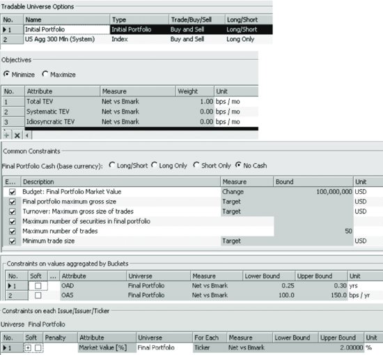
An example of a portfolio construction exercise using the risk model is the one we performed to construct the portfolio analyzed in the previous section.21 Figure 2 shows the exact problem we asked the optimizer to solve. We start the problem by defining an initial portfolio (empty in our case) and a tradable universe—the set of securities we allow the optimizer to buy or sell from. In our case, this is the Barclays US Aggregate index with issues having at least $300 million of amount outstanding (in the Tradable Universe Options pane of the POINT® Optimizer window shown in Figure 2). The selection of this universe allows us to avoid having small issues in our portfolio, potentially increasing its liquidity. Pertaining to the risk model use (in the Objectives pane of the POINT® Optimizer window), the objective function used in the problem is to minimize Total TEV. This means that we are giving leeway to the risk model to choose a portfolio from the tradeable universe that minimizes the risk relative to the benchmark, in our case the Barclays US Aggregate index. In the Common Constraints pane, additional generic constraints have been imposed: a $100 million final portfolio with a maximum number of 50 securities. In the Constraints on values aggregated by Buckets pane, we force the optimizer to tilt our portfolio to respect the portfolio manager’s views: long duration against the benchmark between 0.25 and 0.30 years and spreads between 100 and 150 bps higher than the benchmark. In the Constraints on each Issue/Issuer/Ticker pane, we impose a maximum under-/overweight of 2% per issuer, to ensure proper diversification.22 The characteristics of the portfolio resulting from this optimization problem were extensively analyzed in the previous section.
Figure 2 Portfolio Construction Optimization Setup in the POINT® Optimizer
Portfolio Rebalancing
Managers need to rebalance their portfolios regularly. For instance, as time goes by, the characteristics of the portfolio may drift away from targeted levels. This may be due to the aging of its holdings, market moves, or issuer-specific events such as downgrades or defaults. The periodic re-alignment of a portfolio to its investment guidelines is called portfolio rebalancing. Similar needs arise in many different contexts: when managers receive extra cash to invest, get small changes to their mandates, want to tilt their views, and the like. Similar to portfolio construction, a risk model is very useful in the rebalancing exercise. During rebalancing, the portfolio manager typically seeks to sell bonds currently held and replace them with others having properties more consistent with the overall portfolio goals. Such buy and sell transactions are costly, and their cost must be weighted against the benefit from moving the portfolio closer to its initial specifications. A risk model can tell the manager how much risk reduction (or increase) a particular set of transactions can achieve so that she can evaluate the risk adjustment benefits relative to the transaction cost.
Figure 3 Portfolio Rebalancing Optimization Setup in the POINT® Optimizer
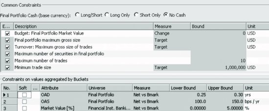
As an example, suppose our portfolio manager wants to tone down the heavy overweight she has on banking. She wants to cap that overweight to 5% and wants to do it with no more than 10 trades. Finally, assume she wants no change to the market value of the final portfolio. We can use a setup similar to that of Figure 2, but adjusting some of the constraints. Figure 3 shows two of the constraints option panes in the POINT® Optimizer window, changed to allow for the new constraints. Specifically, in the first panel, we allow for 10 trades and, in the second, included an extra constraint for the banking industry.
Table 17 shows the trading list suggested by the POINT® Optimizer. Not surprisingly, the biggest sells are of financial companies. To replace them, the optimizer—using the risk model—recommends more holdings of Treasury and corporate bonds. (We need these last to keep the net yield of the portfolio high.) Remember that we concluded that our financial holdings were highly correlated with Treasuries, so the proposed swap is not surprising.
Table 17 Proposed Trading List

Interestingly, the extra constraint imposed on the optimization problem did not materially change the risk of the portfolio. Results show that the risk actually decreased to around 13 bps/month. This is due to the extra three positions added to the portfolio that now has 53 securities. These extra securities allowed the portfolio to reduce both its systematic as well as its idiosyncratic risk.
Scenario Analysis
As described in the previous section, scenario analysis is a very popular tool both for risk management and portfolio construction. In this section, we illustrate another way to construct scenarios, this time using the covariance matrix of the risk model. In this context, users express views on the returns of particular financial variables, indexes, securities, or risk factors, and the scenario analysis tool (using the risk model) calculates their impact on the portfolio’s (net) return.
Typically in this kind of scenario analysis, the views one has are only partial views. This means we can have specific views on how particular macro variables, asset classes, or risk factors will behave; but we hardly have views on all risk factors the portfolio under analysis is exposed to. This is when risk models may be useful. At the heart of the linear factor models described in this entry is a set of risk factors and the covariance matrix between them. They are being increasingly used in the context of scenario analysis as a way to “complete” specific partial views or scenarios, delivering a full picture of the impact of the scenario in the return of the portfolio. Mechanically, what happens is the following: First, one translates the views into realizations of a subset of risk factors. Then the scenario is completed—using the risk model covariance matrix—to get the realizations of all risk factors. Finally, the portfolio’s (net) loadings to all risk factors are used to get its (net) return under that scenario (by multiplying the loadings by the factor realizations under the scenario). This construction implies a set of assumptions that should be carefully understood. For instance, we assume that we can represent or translate our views as risk factor returns. So, if we have a view about the unemployment rate, and this is not a risk factor,23 we cannot use this procedure to test our scenario. Also, to “complete” the scenario, we generally assume a stationary and normal multivariate distribution between all factors. These assumptions make this analysis less appropriate for looking at extreme events or regime shifts, for instance. But the analysis can be very useful in many circumstances.
As an example, consider using the scenario analysis to compute the model-implied empirical durations (MED) of the portfolio we analyzed in detail previously in this entry. To do this, we express our views as changes in the curve factors. In our risk model, these are represented by the six key rate factors illustrated in Table 10. In particular, to calculate the model-implied empirical duration, we are going to assume that all six decrease by 25 bps/month, broadly in line with our managers’ views.
Panel a of Table 18 shows that under this scenario, the portfolio returns 99 basis points, against the 93 of the benchmark. As expected given our longer duration, we outperform the benchmark. Due to the other exposures present in the portfolio and benchmark (e.g., spreads) and their average negative correlation with the curve factors, the duration implied by the scenario (MED) for our portfolio is only 3.96 (= 99/25) against the analytical 4.55. The scenario shows a similar decrease in the benchmark’s duration.
Table 18 Spread Analysis
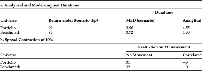
Another characteristic imposed while constructing the portfolio was a targeted higher spread. As shown in Table 2, this resulted in an OAS for the portfolio of 157 bps against the 57 of the benchmark. It would be interesting to evaluate the impact to the portfolio (net) return of a credit spread contraction of 10%. The portfolio is long spread duration (net OASD = 0.11, see Table 2), so we may expect our portfolio to outperform in this scenario. To do so, we analyze the results under two spread contraction scenarios: imposing no change in the yield curve (that is, an unchanged yield curve is part of the view) or allowing this change to be implied by the correlation matrix. (That is, the change in the yield curve is not part of the scenario. We have no views about it, but we allow it to change in a way historically consistent with our spread view.) Contrary to what one might expect, panel b of Table 18 shows that the effect in the net return is minimal under both scenarios. The higher spreads deliver no return advantage under this scenario. However, the absolute returns are quite different across the scenarios. When one allows the rates to move in a correlated fashion the net return drops close to zero: All positive return from the spread contraction is cancelled by the probable increase in the level of the curve and our long-duration exposure.
These very simple examples illustrate how one can look at reasonable scenarios to study the behavior of the portfolio or the benchmark under different environments. This scenario analysis does increase significantly the intuition the portfolio manager may have regarding the results from the risk model.
KEY POINTS
- Risk models describe the different imbalances of a portfolio using a common language. The imbalances are combined into a consistent and coherent analysis reported by the risk model.
- Risk models provide important insights regarding the different trade-offs existing in the portfolio. They provide guidance regarding how to balance them.
- Risk models in fixed income are unique in two different ways: First, the existence of good pricing models allows us to robustly calculate important analytics regarding the securities. These analytics can be used confidently as inputs into a risk model. Second, returns are not typically used directly to calibrate risk factors. Instead returns are first normalized into more invariant series (e.g., returns normalized by the duration of the bond).
- The fundamental systematic risk of all fixed income securities is interest rate and term structure risk. This is captured by factors representing risk-free rates and swap spreads of various maturities.
- Excess (of interest rates) systematic risk is captured by factors specific to each asset class. The most important components of such risk are credit risk and prepayment risk. Other risk factors that can be important are implied volatility, liquidity, inflation, and tax policy.
- Idiosyncratic risk is diversified away in large portfolios and indices but can become a very significant component of the total risk in small portfolios. The correlation of idiosyncratic risk of securities of the same issuer is nonzero and must be modeled very carefully.
- A good risk model provides detailed information about the exposures of a complex portfolio and can be a valuable tool for portfolio construction and management. It can help managers construct portfolios tracking a particular benchmark, express views subject to a given risk budget, and rebalance a portfolio while avoiding excessive transaction costs. Further, by identifying the exposures where the portfolio has the highest risk sensitivity it can help a portfolio manager reduce (or increase) risk in the most effective way.
NOTES
1. The Barclays Global Risk Model is available through POINT®, Barclays portfolio management tool. It is a multi-currency cross-asset model that covers many different asset classes across the fixed income and equity markets, including derivatives in these markets. At the heart of the model is a covariance matrix of risk factors. The model has more than 700 factors, many specific to a particular asset class. The asset class models are periodically reviewed. Structure is imposed to increase the robustness of the estimation of such large covariance matrix. The model is estimated from historical data. It is calibrated using extensive security-level historical data and is updated on a monthly basis.
2. Later in this entry, we refer to this risk number as Isolated TEV.
3. We arrive at this number by taking the square root of the sum of squares of all the numbers in the table: 10.9 = (8.52 + 1.72 + 3.02 + 5.12 + 3.02)0.5. Moreover, this number would represent the total systematic risk of the portfolio. This definition is developed later in the entry.
4. In this example, we focus only on the systematic component of risk. Later, the normalization is with respect to the total risk of the portfolio, including idiosyncratic risk.
5. For example, see Table 13 later in this entry.
6. Note that the contribution numbers are different from those from Table 5 because there we reported the contribution to systematic—not total—risk.
7. This result does not contradict the findings in Table 7, where we see that curve is the major source of risk. Remember that the curve risk can come from our corporate subportfolio.
8. Other curves that can be used are, for instance, the municipals (tax free) curve, derivatives-based curves, and the like.
9. This number is obtained by simply multiplying the net exposure by the factor volatility. The sign of the move depends on the interpretation of the factor. In the case of the yield curve movements we know that R = –KRD × ΔKR. In our example –(–0.36) × 44.2 = 15.9.
10. This reversal is clearly related to the fact that the 10-year and the 20-year points in the curve are usually highly correlated. In our case, our short position on the 10-year point is more than compensated by the positive exposure in the 20-year. Netting out, the 20-year effect (long duration) dominates when all changes are taken in a correlated fashion.
11. The marginal contribution is the derivative of the TEV with respect to the loading of each factor, so its interpretation holds only locally. Therefore, a more realistic reading may be that if we reduce the exposure to the 10-year by 0.1 years, the TEV would be reduced by around 1.6 basis points.
12. This is a rationale very similar to the one used before, where we see all correlated impacts with the same sign.
13. Spreads are also compensation for sources of risk other than credit (e.g., liquidity), but for the sake of our argument, we treat them primarily as major indicators of credit risk.
14. For details, see Ben Dor et al. (2010).
15. The general principle of a risk model is that the historical returns of assets contain information that can be used to estimate the future volatility of portfolio returns. However, good risk models must have the ability to interpret the historical asset returns in the context of the current environment. This translation is made when designing a particular risk model/factor and delivers risk factors that are as invariant as possible. This invariance makes the estimation of the factor distribution much more robust. In the particular case of the DTS, by including the spread in the loading (instead of using only the typical spread duration), we change the nature of the risk factor being estimated. The factor now represents percentage change in spreads, instead of absolute changes in spreads. The former has a significantly more invariant distribution. For more details, see Silva (2009a).
16. The DTS units used in the report are based on an OASD stated in years and an OAS in percentage points. Therefore, a bond with an OASD = 5 and an OAS = 200 basis points would have a DTS of 5 × 2 = 10. The DTS industry exposures are the weighted sum of the DTS of each of the securities in that industry, the weights being the market weight of each security.
17. For a detailed methodology on how to perform this customized analysis, Silva (2009b).
18. For a further discussion, see Gabudean (2009).
19. The volatility is called implied because it is calculated from the market prices of liquid options with the help of an option-pricing model.
20. For more discussion, see Staal (2009).
21. The example is constructed using the POINT® Optimizer. For more details, refer to Kumar (2010).
22. Another way to ensure diversification would be to include the minimization of the idiosyncratic TEV as a specific goal in the objective function.
23. Unemployment rate is not used as a factor in most short- and medium-term risk models.
24. The authors would like to thank Andy Sparks for his valuable comments.
REFERENCES
Ben Dor, A., Dynkin, L., Houweling, P., Hyman, J., van Leeuwen, E., and Penninga, O. (2010). A new measure of spread exposure in credit portfolios. Barclays Publication, February.
Gabudean, R. (2009). U.S. home equity ABS risk model. Barclays Publication, October.
Kumar, A. (2010). The POINT optimizer. Barclays Publication, June.
Silva, A. (2009a). A note on the new approach to credit in the Barclays Global Risk Model. Barclays Capital Publication, September.
Silva, A. (2009b). Risk attribution with custom-defined risk factors. Barclays Publication, August.
Staal, A. (2009). US municipal bond risk model. Barclays Publication, July.