
Basic Data Description for Financial Modeling and Analysis
In this entry, we will present the first essentials of data description. We describe all data types and levels. We explain and illustrate why one has to be careful about the permissible computations concerning each data level.1
We will restrict ourselves to univariate data, that is, data of only one dimension. For example, if you follow the daily returns of one particular stock, you obtain a one-dimensional series of observations. If you had observed two stocks, then you would have obtained a two-dimensional series of data, and so on. Moreover, the notion of frequency distributions, empirical frequency distributions, and cumulative frequency distributions is introduced. The goal of this entry is to provide the first methods necessary to begin data analysis. After reading this entry you will learn how to formalize the first impression you obtain from the data in order to retrieve the most basic structure inherent in the data. That is essential for any subsequent tasks you may undertake with the data. Above all, though, you will have to be fully aware of what you want to learn from the data. That step is maybe the most important task before getting started in investigating the data. For example, you may just want to know what the minimum return has been of your favorite stock during the last year before you decide to purchase. Or you are interested in all returns from last year to learn how this stock typically performs, that is, which returns occur more often than others, and how often. In the latter case, you definitely have to be more involved to obtain the necessary information than in the first case.
DATA TYPES
Data are gathered by several methods. In the financial industry, we have market data based on regular trades recorded by the exchanges. Theses data are directly observable. Aside from the regular trading process, there is so-called over-the-counter (OTC) business whose data are less accessible. Annual reports and quarterly reports, on the other hand, are published by companies themselves in print or electronically. These data are available also in the business and finance sections of most major business oriented print media and the Internet. The fields of marketing and the social sciences know additional forms of data collection methods. There are telephone surveys, mail questionnaires, and even experiments.
If one does research on certain financial quantities of interest, one might find the data available from either free or commercial databases. Hence, one must be concerned with the quality of the data. Unfortunately, very often databases of unrestricted access such as those available on the Internet may be of limited credibility. In contrast, there are many commercial purveyors of financial data who are generally acknowledged as providing accurate data. But, as always, quality may have its price.
Information Contained in the Data
Once the data are gathered, it is the objective of descriptive statistics to visually and computationally convert the amount of information given into quantities revealing the essentials in which we are interested. Commonly in this context, visual support is added since very often that allows for a much easier grasp of the information.
The field of descriptive statistics discerns different types of data. Very generally, there are two types: qualitative and quantitative data.
If certain attributes of an item can only be assigned to categories, these data are referred to as qualitative. For example, stocks listed on the New York Stock Exchange (NYSE) can be categorized as belonging to a specific industry sector such as “banking,” “energy,” “media and telecommunications,” and so on. That way, we assign the item stock as its attribute sector one or possibly more values from the set containing banking, energy, media and telecommunications, and so on. (Instead of attribute, we will most of the time use the term “variable.”) Another example would be the credit ratings assigned to debt obligations by commercial rating companies such as Standard & Poor’s, Moody’s, and Fitch Ratings. Except for retrieving the value of an attribute, nothing more can be done with qualitative data. One may use a numerical code to indicate the different sectors (e.g., 1 = banking, 2 = energy, and so on). However, we are not allowed to perform any computation with these figures since they are simply proxies of the underlying attribute sector.
However, if an item is assigned a quantitative variable, the value of this variable is numerical. Generally, all real numbers are eligible. Depending on the case, however, one will use discrete values only, such as integers. Stock prices or dividends, for example, are quantitative data drawing from—up to some digits—positive real numbers. Quantitative data have the feature that one can perform transformations and computations with them. One can easily think of the average price of all companies comprising some index on a certain day, while it would make absolutely no sense to do the same with qualitative data.
Data Levels and Scale
In descriptive statistics, we group data according to measurement levels. The measurement level gives an indication as to the sophistication of the analysis techniques that one can apply to the data collected. Typically, a hierarchy with five levels of measurement—nominal, ordinal, interval, ratio, and absolute—is used to group data. The latter three form the set of quantitative data. If the data are of a certain measurement level, they are said to be scaled accordingly. That is, the data are referred to as nominally scaled, and so on.
Nominally scaled data are on the bottom of the hierarchy. Despite the low level of sophistication, this type of data are commonly used. An example is the attribute sector of stocks. We already learned that, even though we can assign numbers as proxies to nominal values, these numbers have no numerical meaning whatsoever. We might just as well assign letters to the individual nominal values, for example, “B = banking,” “E = energy,” and so on.
Ordinally scaled data are one step higher in the hierarchy. We also refer to this type as “rank data,” since we can already perform a ranking within the set of values. We can make use of a relationship among the different values by treating them as quality grades. For example, we can divide the stocks listed in a particular stock index according to their market capitalization into five groups of equal size. Let “A” denominate the top 20% of the stocks. Also, let “B” denote the next 20% below, and so on, until we obtain the five groups: A, B, C, D, and E. After ordinal scaling, we can make statements such as “Group A is better than group C.” Hence, we have a natural ranking or order among the values. However, we cannot quantify the difference between them. Also, the credit rating of debt obligations is ordinarily scaled.
Until now, we can summarize that while we can test the relationship between nominal data for equality only, we can additionally determine a greater or less than relationship between ordinal data.
Data on an interval scale are given if they can be reasonably transformed by a linear equation. Suppose we are given values x. It is now feasible to express a new variable y by the relationship y = a* x + b, where the x’s are our original data. If x has a meaning, then so does y. It is obvious that data have to possess a numerical meaning and therefore be quantitative in order to be measured on an interval scale. For example, consider the temperature F given in degrees Fahrenheit. Then, the corresponding temperature in degrees Celsius, C, will result from the equation C = (F − 32)/ 1.8. Equivalently, if one is familiar with physics, the same temperature measured in degrees Kelvin, K, will result from K = C + 273.15. So, say it is 55° Fahrenheit for Americans, the same temperature will mean approximately 13° Celsius for Europeans, and they will not feel any cooler. Generally, interval data allow for the calculation of differences. For example, 70° − 60° Fahrenheit = 10° Fahrenheit may reasonably express the difference in temperature between Los Angeles and San Francisco. But be careful—the difference in temperature measured in Celsius between the two cities is not the same. How much is it?
Data measured on a ratio scale share all the properties of interval data. In addition, ratio data have a fixed or true zero point. This is not the case with interval data. Their intercept, b, can be arbitrarily changed through transformation. Since the zero point of ratio data is invariable, one can only transform the slope, a. So, for example, y = a* x is always a multiple of x. In other words, there is a relationship between y and x given by the ratio a, hence the name used to describe this type of data. One would not have this feature if one would permit some b different from zero in the transformation. Consider, for example, the stock price, E, of some European stock given in euro units. The same price in U.S. dollars, D, would be D equals E times the exchange rate between euros and U.S. dollars. But if the company’s price after bankruptcy went to zero, the price in either currency would be zero, even at different rates determined by the ratio of U.S. dollar per euro. This is a result of the invariant zero point.
Absolute data are given by quantitative data measured on a scale even stricter than for ratio data. Here, along with the zero point, the units are invariant as well. Data measured on an absolute scale occur when transformation would be mathematically feasible but lacks any interpretational implication. A common example is provided by counting numbers. Anybody would agree on the number of stocks listed in a certain stock index. There is no ambiguity as to the zero point and the count increments. If one stock is added to the index, it is immediately clear that the difference to the content of the old index is exactly one unit of stock, assuming that no stock is deleted This absolute scale is the most intuitive and needs no further discussion.
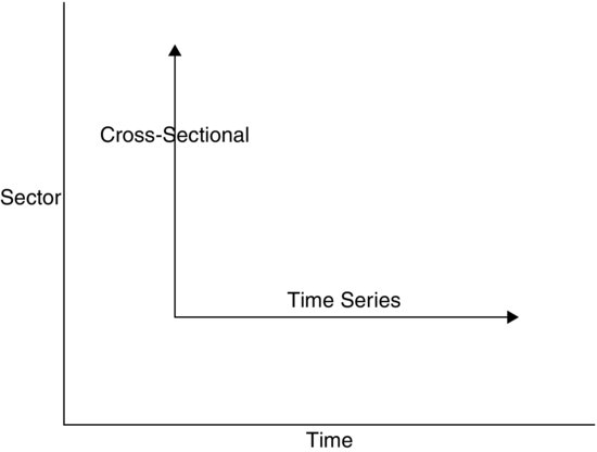
Cross-Sectional and Time Series Data
There is another way of classifying data. Imagine collecting data from one and the same quantity of interest or variable. A variable is some quantity that can assume values from a value set. For example, the variable “stock price” can technically assume any nonnegative real number of currency but only one value at a time. Each day, it assumes a certain value, which is the day’s stock price. As another example, a variable could be the dividend payments from a specific company over some period of time. In the case of dividends, the observations are made each quarter. The accumulated data then form what is called time series data. In contrast, one could pick a particular time period of interest such as the first quarter of the current year and observe the dividend payments of all companies listed in the Standard & Poor’s 500 index. By doing so, one would obtain cross-sectional data of the universe of stocks in the S&P 500 index at that particular time.
Summarizing, time series data are data related to a variable successively observed at a sequence of points in time. Cross-sectional data are values of a particular variable across some universe of items observed at a unique point in time. This is visualized in Figure 1.
Figure 1 Relationship between Cross-Sectional and Time Series Data
FREQUENCY DISTRIBUTIONS
Sorting and Counting Data
One of the most important aspects when dealing with data is that they are effectively organized and transformed in order to convey the essential information contained in them. This processing of the original data helps to display the inherent meaning in a way that is more accessible for intuition. But before advancing to the graphical presentation of the data, we will first describe the methods of structuring data.
Suppose that we are interested in a particular variable that can assume a set of either finite or infinitely many values. These values may be qualitative or quantitative by nature. In either case, the initial step when obtaining a data sample for some variable is to sort the values of each observation and then to determine the frequency distribution of the dataset. This is done simply by counting the number of observations for each possible value of the variable. Alternatively, if the variable can assume values on all or part of the real line, the frequency can be determined by counting the number of observations that fall into nonoverlapping intervals partitioning the real line.
Table 1 DJIA Components as of December 12, 2006
| Industrial Classification Benchmark | |
| Company | (ICB) Subsector |
| 3M Co. | Diversified Industrials |
| Alcoa Inc. | Aluminum |
| Altria Group Inc. | Tobacco |
| American Express Co. | Consumer Finance |
| American International Group Inc. | Full Line Insurance |
| AT&T Inc. | Fixed Line Telecommunications |
| Boeing Co. | Aerospace |
| Caterpillar Inc. | Commercial Vehicles & Trucks |
| Citigroup Inc. | Banks |
| Coca-Cola Co. | Soft Drinks |
| E.I. DuPont de Nemours & Co. | Commodity Chemicals |
| Exxon Mobil Corp. | Integrated Oil & Gas |
| General Electric Co. | Diversified Industrials |
| General Motors Corp. | Automobiles |
| Hewlett-Packard Co. | Computer Hardware |
| Home Depot Inc. | Home Improvement Retailers |
| Honeywell International Inc. | Diversified Industrials |
| Intel Corp. | Semiconductors |
| International Business Machines Corp. | Computer Services |
| Johnson & Johnson | Pharmaceuticals |
| JPMorgan Chase & Co. | Banks |
| McDonald’s Corp. | Restaurants & Bars |
| Merck & Co. Inc. | Pharmaceuticals |
| Microsoft Corp. | Software |
| Pfizer Inc. | Pharmaceuticals |
| Procter & Gamble Co. | Nondurable Household Products |
| United Technologies Corp. | Aerospace |
| Verizon Communications Inc. | Fixed Line Telecommunications |
| Wal-Mart Stores Inc. | Broadline Retailers |
| Walt Disney Co. | Broadcasting & Entertainment |
In our illustration, we will begin with qualitative data first and then move on to the quantitative aspects in the sequel. For example, suppose we want to analyze the frequency of the industry subsectors of the components listed in the Dow Jones Industrial Average (DJIA), an index comprised of 30 U.S. stocks. Table 1 displays the 30 companies in the index along with their respective industry sectors as of December 12, 2006. By counting the observed number of each possible Industry Classification Benchmark (ICB) subsector, we obtain Table 2, which shows the frequency distribution of the variable subsector. Note in the table that many subsector values appear only once. Hence, this might suggest employing a coarser set for the ICB subsector values in order to reduce the amount of information in the data to a necessary minimum.
Table 2 Frequency Distribution of the Industry Subsectors
| ICB Subsector | Frequency ai |
| Aerospace | 2 |
| Aluminum | 1 |
| Automobiles | 1 |
| Banks | 2 |
| Broadcasting & Entertainment | 1 |
| Broadline Retailers | 1 |
| Commercial Vehicles & Trucks | 1 |
| Commodity Chemicals | 1 |
| Computer Hardware | 1 |
| Computer Services | 1 |
| Consumer Finance | 1 |
| Diversified Industrials | 3 |
| Fixed Line Telecommunications | 2 |
| Full Line Insurance | 1 |
| Home Improvement Retailers | 1 |
| Integrated Oil & Gas | 1 |
| Nondurable Household Products | 1 |
| Pharmaceuticals | 3 |
| Restaurants & Bars | 1 |
| Semiconductors | 1 |
| Soft Drinks | 1 |
| Software | 1 |
| Tobacco | 1 |
Now suppose you would like to compare this to the Dow Jones Global Titans 50 Index (DJGTI). This index includes the 50 largest-capitalization and best-known blue-chip companies listed on the NYSE. The companies contained in this index are listed in Table 3 along with their respective ICB subsectors. The next step would also be to sort the data according to their values and count each hit of a value, finally listing the respective count numbers for each value. A problem arises now, however, when you want to directly compare the numbers with those obtained for the DJIA because the number of stocks contained in each index is not the same. Hence, we cannot compare the respective absolute frequencies. Instead, we have to resort to something that creates comparability of the two datasets. This is done by expressing the number of observations of a particular value as the proportion of the total number of observations in a specific dataset. That means we have to compute the relative frequency. See Table 4.
Table 3 Dow Jones Global Titans 50 Index as of December 12, 2006
| Company Name | ICB Subsector |
| Abbott Laboratories | Pharmaceuticals |
| Altria Group Inc. | Tobacco |
| American International Group Inc. | Full Line Insurance |
| Astrazeneca PLC | Pharmaceuticals |
| AT&T Inc. | Fixed Line Telecommunications |
| Bank of America Corp. | Banks |
| Barclays PLC | Banks |
| BP PLC | Integrated Oil & Gas |
| Chevron Corp. | Integrated Oil & Gas |
| Cisco Systems Inc. | Telecommunications Equipment |
| Citigroup Inc. | Banks |
| Coca-Cola Co. | Soft Drinks |
| ConocoPhillips | Integrated Oil & Gas |
| Dell Inc. | Computer Hardware |
| ENI S.p.A. | Integrated Oil & Gas |
| Exxon Mobil Corp. | Integrated Oil & Gas |
| General Electric Co. | Diversified Industrials |
| GlaxoSmithKline PLC | Pharmaceuticals |
| HBOS PLC | Banks |
| Hewlett-Packard Co. | Computer Hardware |
| HSBC Holdings PLC (UK Reg) | Banks |
| ING Groep N.V. | Life Insurance |
| Intel Corp. | Semiconductors |
| International Business Machines Corp. | Computer Services |
| Johnson & Johnson | Pharmaceuticals |
| JPMorgan Chase & Co. | Banks |
| Merck & Co. Inc. | Pharmaceuticals |
| Microsoft Corp. | Software |
| Mitsubishi UFJ Financial Group Inc. | Banks |
| Morgan Stanley | Investment Services |
| Nestle S.A. | Food Products |
| Nokia Corp. | Telecommunications Equipment |
| Novartis AG | Pharmaceuticals |
| PepsiCo Inc. | Soft Drinks |
| Pfizer Inc. | Pharmaceuticals |
| Procter & Gamble Co. | Nondurable Household Products |
| Roche Holding AG Part. Cert. | Pharmaceuticals |
| Royal Bank of Scotland Group PLC | Banks |
| Royal Dutch Shell PLC A | Integrated Oil & Gas |
| Samsung Electronics Co. Ltd. | Semiconductors |
| Siemens AG | Electronic Equipment |
| Telefonica S.A. | Fixed Line Telecommunications |
| Time Warner Inc. | Broadcasting & Entertainment |
| Total S.A. | Integrated Oil & Gas |
| Toyota Motor Corp. | Automobiles |
| UBS AG | Banks |
| Verizon Communications Inc. | Fixed Line Telecommunications |
| Vodafone Group PLC | Mobile Telecommunications |
| Wal-Mart Stores Inc. | Broadline Retailers |
| Wyeth | Pharmaceuticals |
Table 4 Comparison of Relative Frequencies of DJIA and DJGTI
| Relative Frequencies | ||
| ICB Subsector | DJIA | DJGTI |
| Aerospace | 0.067 | 0.000 |
| Aluminum | 0.033 | 0.000 |
| Automobiles | 0.033 | 0.020 |
| Banks | 0.067 | 0.180 |
| Broadcasting & Entertainment | 0.033 | 0.020 |
| Broadline Retailers | 0.033 | 0.020 |
| Commercial Vehicles & Trucks | 0.033 | 0.000 |
| Commodity Chemicals | 0.033 | 0.000 |
| Computer Hardware | 0.033 | 0.040 |
| Computer Services | 0.033 | 0.020 |
| Consumer Finance | 0.033 | 0.000 |
| Diversified Industrials | 0.100 | 0.020 |
| Electronic Equipment | 0.000 | 0.020 |
| Fixed Line Telecommunications | 0.067 | 0.060 |
| Food Products | 0.000 | 0.020 |
| Full Line Insurance | 0.033 | 0.020 |
| Home Improvement Retailers | 0.033 | 0.000 |
| Integrated Oil & Gas | 0.033 | 0.140 |
| Investment Services | 0.000 | 0.020 |
| Life Insurance | 0.000 | 0.020 |
| Mobile Telecommunications | 0.000 | 0.020 |
| Nondurable Household Products | 0.033 | 0.020 |
| Pharmaceuticals | 0.100 | 0.180 |
| Restaurants & Bars | 0.033 | 0.000 |
| Semiconductors | 0.033 | 0.040 |
| Soft Drinks | 0.033 | 0.040 |
| Software | 0.033 | 0.020 |
| Telecommunications Equipment | 0.000 | 0.040 |
| Tobacco | 0.033 | 0.020 |
Formal Presentation of Frequency
For a better formal presentation, we denote the (absolute) frequency by a and, in particular, by ai for the ith value of the variable. Formally, the relative frequency fi of the ith value is, then, defined by
![]()
where n is the total number of observations. With k being the number of the different values, the following holds:
![]()
In our illustration, let n1 = 30 be the number of total observations in the DJIA and n2 = 50 the total number of observations in the DJGTI. Table 4 shows the relative frequencies for all possible values. Notice that each index has some values that were observed with zero frequency, which still have to be listed for comparison. When we look at the DJIA, we find out that the sectors Diversified Industrials and Pharmaceuticals each account for 10% of all sectors and therefore are the sectors with the highest frequencies. Comparing these two sectors to the DJGTI, we find out that Pharmaceuticals play as important a role as a sector with an 18% share, while Diversified Industrials are of minor importance. In this index, Banks are a very important sector with 18% also. A comparison of this sort can now be carried through for all subsectors thanks to the relative frequencies.
Naturally, frequency (absolute and relative) distributions can be computed for all types of data since they do not require that the data have a numerical value.
Table 5 DJIA Stocks by Share Price in Ascending Order as of December 15, 2006
Source: www.dj.com/TheCompany/FactSheets.htm, December 15, 2006.
| Company | Share Price |
| Intel Corp. | 20.77 |
| Pfizer Inc. | 25.56 |
| General Motors Corp. | 29.77 |
| Microsoft Corp. | 30.07 |
| Alcoa Inc. | 30.76 |
| Walt Disney Co. | 34.72 |
| AT&T Inc. | 35.66 |
| Verizon Communications Inc. | 36.09 |
| General Electric Co. | 36.21 |
| Hewlett-Packard Co. | 39.91 |
| Home Depot Inc. | 39.97 |
| Honeywell International Inc. | 42.69 |
| Merck & Co. Inc. | 43.60 |
| McDonald’s Corp. | 43.69 |
| Wal-Mart Stores Inc. | 46.52 |
| JPMorgan Chase & Co. | 47.95 |
| E.I. DuPont de Nemours & Co. | 48.40 |
| Coca-Cola Co. | 49.00 |
| Citigroup Inc. | 53.11 |
| American Express Co. | 61.90 |
| United Technologies Corp. | 62.06 |
| Caterpillar Inc. | 62.12 |
| Procter & Gamble Co. | 63.35 |
| Johnson & Johnson | 66.25 |
| American International Group Inc. | 72.03 |
| Exxon Mobil Corp. | 78.73 |
| 3M Co. | 78.77 |
| Altria Group Inc. | 84.97 |
| Boeing Co. | 89.93 |
| International Business Machines Corp. | 95.36 |
EMPIRICAL CUMULATIVE FREQUENCY DISTRIBUTION
Accumulating Frequencies
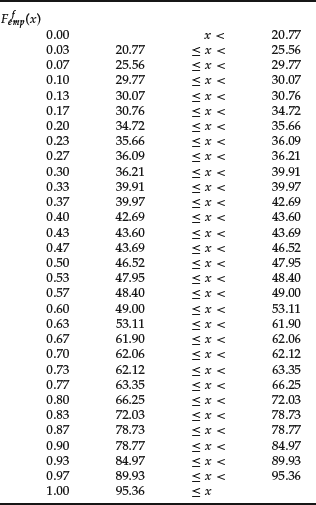
In addition to the frequency distribution, there is another quantity of interest for comparing data that is closely related to the absolute or relative frequency distribution. Suppose that one is interested in the percentage of all large-capitalization stocks in the DJIA with closing prices of at most US $50 on a specific day. One can sort the observed closing prices by their numerical values in ascending order to obtain something like the array shown in Table 5 for market prices as of December 15, 2006. Note that since each value occurs once only, we have to assign each value an absolute frequency of 1 or a relative frequency of 1/30, respectively, since there are 30 component stocks in the DJIA. We start with the lowest entry ($20.77) and advance up to the largest value still less than $50, which is $49 (Coca-Cola). Each time we observe less than or equal to $50, we add 1/30, accounting for the frequency of each company to obtain an accumulated frequency of 18/30 representing the total share of closing prices below $50. This accumulated frequency is called the “empirical cumulative frequency” at the value $50. If one computes this for all values, one obtains the empirical cumulative frequency distribution. The term “empirical” is used because the distribution is computed from observed data.
Formal Presentation of Cumulative Frequency Distributions
Formally, the empirical cumulative frequency distribution Femp is defined as
![]()
where k is the index of the largest value observed that is still less than x. In our example, k is 18. When we use relative frequencies, we obtain the empirical relative cumulative frequency distribution defined analogously to the empirical cumulative frequency distribution, this time using relative frequencies. Hence, we have
![]()
In our example, Ffemp(50) = 18/30 = 0.6 = 60%.
Note that the empirical cumulative frequency distribution can be evaluated at any real x even though x need not be an observation. For any value x between two successive observations x(i) and x(i+1), the empirical cumulative frequency distribution as well as the empirical cumulative relative frequency distribution remain at their respective levels at x(i); that is, they are of constant level Femp(x(i)) and Ffemp(x(i)), respectively. For example, consider the empirical relative cumulative frequency distribution for the data shown in Table 5. We can extend the distribution to a function that determines the value of the distribution at each possible value of the share price. The function is given in Table 6. Notice that if no value is observed more than once, then the empirical relative cumulative frequency distribution jumps by 1/N at each observed value. In our illustration, the jump size is 1/30.
Table 6 Empirical Relative Cumulative Frequency Distribution of DJIA Stocks from Table 5
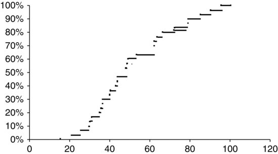
In Figure 2 the empirical relative cumulative frequency distribution is shown as a graph. Note that the values of the function are constant on the extended line between two successive observations, indicated by the solid point to the left of each horizontal line. At each observation, the vertical distance between the horizontal line extending to the right from the preceding observation and the value of the function is exactly the increment 1/30.
The computation of either form of empirical cumulative distribution function is obviously not intuitive for categorical data unless we assign some meaningless numerical proxy to each value such as “Sector A” = 1, “Sector B” = 2, and so on.
DATA CLASSES
Reasons for Classifying
When quantitative variables are such that the set of values—whether observed or theoretically possible— includes intervals or the entire real numbers, then the variable is continuous. This is in contrast to discrete variables, which assume values only from a limited or countable set. Variables on a nominal scale cannot be considered in this context. And because of the difficulties with interpreting the results, we will not attempt to explain the issue of classes for rank data either.
When one counts the frequency of observed values of a continuous variable, one notices that hardly any value occurs more than once. (Naturally, the precision given by the number of digits rounded may result in higher occurrences of certain values.) Theoretically, with 100% chance, all observations will yield different values. Thus, the method of counting the frequency of each value is not feasible. Instead, the continuous set of values is divided into mutually exclusive intervals. Then, for each such interval, the number of values falling within that interval can be counted again. In other words, one groups the data into classes for which the frequencies can be computed. Classes should be such that their respective lower and upper bounds are real numbers. Also, whether the class bounds are elements of the classes or not must be specified. The class bounds of a class must be bounds of the respective adjacent classes as well, such that the classes seamlessly cover the entire data. The width should be the same for all classes. However, if there are areas where the data are very intensely dense in contrast to areas of lesser density, then the class width can vary according to significant changes in value density. In certain cases, most of the data are relatively evenly scattered within some range, while there are extreme values that are located in isolated areas on either end of the data array. Then, it is sometimes advisable to specify no lower bound to the lowest class and no upper bound to the uppermost class. Classes of this sort are called “open classes.” Moreover, one should consider the precision to which the data are given. If values are rounded to the first decimal but there is the chance that the exact value might vary within half a decimal about the value given, class bounds have to consider this lack of certainty by admitting plus half a decimal on either end of the class.
Formal Procedure of Classifying
Formally, there are four criteria that the classes need to meet:
It is intuitive that the number of classes should increase with an increasing range of values and increasing number of data. Though there are no stringent rules, two rules of thumb are given here with respect to the advised number of classes (first rule) and the best class width (second rule). The first, the so-called Sturge’s rule, states that for a given set of continuous data of size n, one should use the nearest integer figure to
![]()
Here, logan denotes the logarithm of n to the base a, with a being either 2 or 10.
The second guideline is the so-called Freedman-Diaconis rule for the appropriate class width or bin size. Before turning to the second rule of thumb in more detail, we have to introduce the notion of the inner quartile range (IQR). This quantity measures the distance between the value where ![]() is closest to 0.25 (that is, the so-called 0.25-quantile), and the value where
is closest to 0.25 (that is, the so-called 0.25-quantile), and the value where ![]() is closest to 0.75 (that is, the so-called 0.75-quantile). (The term “percentile” is used interchangeably with “quantile.”) So the IQR range states how remote the lowest 25% of the observations are from the highest 25%.2 As a consequence, the IQR comprises the central 50% of a data sample. A little more attention will be given to the determination of the above-mentioned quantiles when we discuss sample moments and quantiles, since formally there might arise some ambiguity when computing them. (Note that the IQR cannot be computed for nominal or categorial data in a natural way.)
is closest to 0.75 (that is, the so-called 0.75-quantile). (The term “percentile” is used interchangeably with “quantile.”) So the IQR range states how remote the lowest 25% of the observations are from the highest 25%.2 As a consequence, the IQR comprises the central 50% of a data sample. A little more attention will be given to the determination of the above-mentioned quantiles when we discuss sample moments and quantiles, since formally there might arise some ambiguity when computing them. (Note that the IQR cannot be computed for nominal or categorial data in a natural way.)
Now we can return to the Freedman-Diaconis rule. It states that a good class width is given by the nearest integer to
![]()
where N is the number of observations in the dataset. Note that there is an inverse relationship between the class width and the number of classes for each set of data. That is, given that the partitioning of the values into classes covers all observations, the number of classes n has to be equal to the difference between largest and smallest value divided by the class width, if classes are all of equal size w. Mathematically, that means
![]()
where xmax denotes the largest value and xmin denotes the smallest value considered, respectively.
One should not be intimidated by all these rules. Generally, by mere ordering of the data in an array, intuition produces quite a good feeling of what the classes should look like. Some thought can be given to the timing of the formation of the classes. That is, when classes are formed prior to the data-gathering process, one does not have to store the specific values but rather count only the number of hits within each class.
Example of Classing Procedures
Let’s illustrate these rules. Table 7 gives the 12-month returns (in percent) of the 235 Franklin Templeton Investments Funds on January 11, 2007. With this many data, it becomes obvious that it cannot be helpful to anyone to know the relative performance for the 235 funds. To obtain an overall impression of the distribution of the data without getting lost in detail, one has to aggregate the information given by classifying the data.
Table 7 12-Month Returns (in %) for the 235 Franklin Templeton Investment Funds (Luxembourg) on January 11, 2007
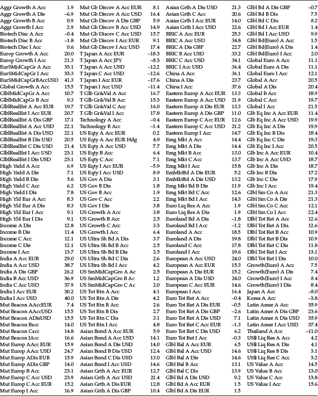
Table 8 Ordered Array of the 235 12-month Returns for the Franklin Templeton Investment Funds (Luxembourg)
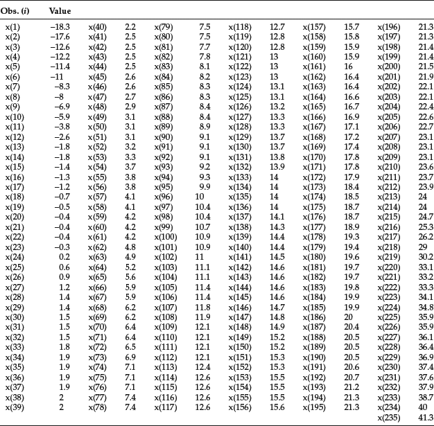
For the sake of a better overview, the ordered array is given in Table 8. A quick glance at the data sorted in ascending order gives us the lowest (minimum) and largest (maximum) return, respectively. Here, we have xmin = −18.3% and xmax = 41.3%, respectively, yielding a range of 59.6% to cover.
We first classify the data according to Sturge’s rule. For the number of classes, n, we obtain the nearest integer to 1+log2235 = 8.877, which is 9. The class width is then determined by the range divided by the number of classes, 56.6%/9, yielding a width of roughly 6.62%. This is not a nice number to deal with, so we may choose 7% instead without deviating noticeably from the exact numbers given by Sturge’s rule. We now cover a range of 9 × 7% = 63%, which is slightly larger than the original range of the data.
Selecting a value for the lower class bound of the lowest class slightly below our minimum, say −20.0%, and an upper class bound of the highest class, say 43.0%, we spread the surplus of the range (3.4%) evenly. The resulting classes can be viewed in Table 9, where in the first row the index of the respective class is given. The second row contains the class bounds. Brackets indicate that the value belongs to the class, whereas parentheses exclude given values. So, we obtain a half-open interval for each class containing all real numbers between the lower bound and just below the upper bound, thus excluding that value. In row three, we have the number of observations that fall into the respective classes.
We can check for the compliance with the four criteria given earlier. Because we use half-open intervals, we guarantee that Criterion 1 is fulfilled. Since the lowest class starts at −20%, and the highest class ends at 43%, Criterion 2 is satisfied. All nine classes are of width 7%, which complies with Criterion 3. Finally, the compliance with Criterion 4 can be checked easily.
Next, we apply the Freedman-Diaconis rule. With our ordered array of data, we can determine the 0.25 quartile by selecting the observation whose index is the first to exceed 0.25 × N = .25 × 235 = 58.75. This yields the value of observation 59, which is 4.2%. Accordingly, the 0.75-quartile is given by the value whose index is the first to exceed 0.75 × 235 = 176.25. For our return data, it is x177, which is 18.9%. The IQR is computed as
![]()
such that the bin size of the classes (or class width) is now determined according to ![]() . Taking the data range of 59.6% from the previous calculation, we obtain as the suggested number of classes 59.6%/4.764 = 12.511. Once again, this is not a neat-looking figure. We stick with the initial class width of w = 4.764% as closely as possible by selecting the next integer, say 5%. And, without any loss, we extend the range artificially to 60%. So, we obtain for the number of classes 60%/5 = 12, which is close to our original real number, 12.511, computed according to the Freedman-Diaconis rule but much nicer to handle. We again spread the range surplus of 0.4% (60% − 59.6%) evenly across either end of the range such that we begin our lowest class at −18.5% and end our highest class at 41.5%. The classes are given in Table 10. The first row of the table indicates the index of the respective class, while the second row gives the class bounds. The number of observations that fall into each class is shown in the last row. (One can easily check that the four requirements for the classes are met again.)
. Taking the data range of 59.6% from the previous calculation, we obtain as the suggested number of classes 59.6%/4.764 = 12.511. Once again, this is not a neat-looking figure. We stick with the initial class width of w = 4.764% as closely as possible by selecting the next integer, say 5%. And, without any loss, we extend the range artificially to 60%. So, we obtain for the number of classes 60%/5 = 12, which is close to our original real number, 12.511, computed according to the Freedman-Diaconis rule but much nicer to handle. We again spread the range surplus of 0.4% (60% − 59.6%) evenly across either end of the range such that we begin our lowest class at −18.5% and end our highest class at 41.5%. The classes are given in Table 10. The first row of the table indicates the index of the respective class, while the second row gives the class bounds. The number of observations that fall into each class is shown in the last row. (One can easily check that the four requirements for the classes are met again.)
Let us next compare Tables 9 and 10. We observe a finer distribution when the Freedman-Diaconis rule is employed because this rule generates more classes for the same data. However, it is generally difficult to judge which rule provides us with the better information because, as is seen, the two rules set up completely different classes. But the choice of class bounds is essential. By just slightly shifting the bounds between two adjacent classes, many observations may fall from one class into the other due to this alteration. As a result, this might produce a totally different picture about the data distribution. So, we have to be very careful when we interpret the two different results.
Table 9 Classes for the 235 Fund Returns According to Sturge’s Rule
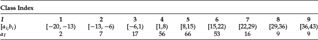
Table 10 Classes for the 235 Fund Returns According to the Freedman-Diaconis Rule
![]()
For example, class 7, that is, [22,29) in Table 9 contains 16 observations. Classes 9 and 10 of Table 10 cover approximately the same range, [21.5,31.5). Together they account for 20 observations. We could now easily present two scenarios that would provide rather different conceptions about the frequency. In scenario one, suppose one assumes that two observations are between 21.5 and 22.0. Then, there would have to be 16 observations between 22.0 and 26.5 to add up to 18 observations in class 9 of Table 10. This, in return, would mean that the 16 observations of class 7 from Table 9 would all have to lie between 22.0 and 26.5 as well. Then, the two observations from class 10 of Table 10 must lie beyond 29.0. The other scenario could assume that we have four observations between 21.5 and 22.0. Then, for similar reasons as before, we would have 14 observations between 22.0 and 26.5. The two observations from class 10 of Table 10 would now have to be between 26.5 and 29.0, so that the total of 16 observations in class 7 of Table 9 is met. See how easily slightly different classes can lead to ambiguous interpretation? Looking at all classes at once, many of these puzzles can be solved. However, some uncertainty remains. As can be seen, the choice of the number of classes and thus the class bounds can have a significant impact on the information that the data conveys when condensed into classes.
CUMULATIVE FREQUENCY DISTRIBUTIONS
In contrast to the empirical cumulative frequency distributions, in this section we will introduce functions that convey basically the same information, that is, the frequency distribution, but rely on a few more assumptions. These cumulative frequency distributions introduced here, however, should not be confused with the theoretical definitions given in probability theory even though the notion is akin to both.
The absolute cumulative frequency at each class bound states how many observations have been counted up to this particular class bound. However, we do not exactly know how the data are distributed within the classes. When relative frequencies are used, though, the cumulative relative frequency distribution states the overall proportion of all values up to a certain lower or upper bound of some class.
So far, things are not much different from the definition of the empirical cumulative frequency distribution and empirical cumulative relative frequency distribution. At each bound, the empirical cumulative frequency distribution and cumulative frequency coincide. However, an additional assumption is made regarding the distribution of the values between bounds of each class when computing the cumulative frequency distribution. The data are thought of as being continuously distributed and equally spread between the particular bounds. (This type of assumed behavior is defined as a “uniform distribution of data.”) Hence, both forms (absolute and relative) of the cumulative frequency distributions increase in a linear fashion between the two class bounds. So, for both forms of cumulative distribution functions, one can compute the accumulated frequencies at values inside of classes.
For a more thorough summary of this, let’s use a more formal presentation. Let I denote the set of all class index i with i being some integer value between 1 and nI = |I| (that is, the number of classes). Moreover, let aj and fj denote the (absolute) frequency and relative frequency of some class j, respectively. The cumulative frequency distribution at some upper bound, xiu, of a given class i is computed as
In words, this means that we sum up the frequencies of all classes whose upper bound is less than xiu plus the frequency of class i itself. The corresponding cumulative relative frequency distribution at the same value is then
This describes the same procedure as in equation (1) using relative frequencies instead of frequencies. For any value x in between the boundaries of, say, class i, xil and xiu, the cumulative relative frequency distribution is defined by
In words, this means that we compute the cumulative relative frequency distribution at value x as the sum of two things. First, we take the cumulative relative frequency distribution at the lower bound of class i. Second, we add that share of the relative frequency of class i that is determined by the part of the whole interval of class i that is covered by x.
Figure 3 Determination of Frequency Distribution within Class Bounds
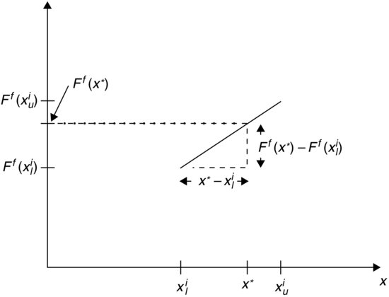
Figure 3 might appeal more to intuition. At the bounds of class i, we have values of the cumulative relative frequency given by Ff(xil) and Ff(xiu) respectively. We assume that the cumulative relative frequency increases linearly along the line connecting Ff(x1l) and Ff(xiu). Then, at any value x* inside of class i, we find the corresponding value Ff(x*) by the intersection of the dashed line and the vertical axis as shown. The dashed line is obtained by extending a horizontal line through the intersection of the vertical line through x* and the line connecting Ff(x1l) and Ff(xiu) with slope ![]() .
.
KEY POINTS
- The field of descriptive statistics discerns different types of data. Very generally, there are two types: qualitative and quantitative data. If certain attributes of an item can only be assigned to categories, these data are referred to as qualitative. However, if an item is assigned a quantitative variable, the value of this variable is numerical. Generally, all real numbers are eligible.
- In descriptive statistics, data are grouped according to measurement levels. The measurement level gives an indication as to the sophistication of the analysis techniques that can be applied to the data collected. Typically, a hierarchy with five levels of measurement---nominal, ordinal, interval, ratio, and absolute data—are used to group data. The latter three form the set of quantitative data. If the data are of a certain measurement level, they are said to be scaled accordingly. That is, the data are referred to as nominally scaled, and so on.
- Another way of classifying data is in terms of cross-sectional and time series data. Cross-sectional data are values of a particular variable across some universe of items observed at a unique point in time. Time series data are data related to a variable successively observed at a sequence of points in time.
- Frequency (absolute and relative) distributions can be computed for all types of data since they do not require that the data have a numerical value. The cumulative frequency distribution is another quantity of interest for comparing data that is closely related to the absolute or relative frequency distribution.
- Four criteria that data classes need to satisfy are (1) each value can be placed in only one class (mutual exclusiveness), (2) the set of classes needs to cover all values (completeness), (3) if possible, form classes of equal width (equidistance), and (4) if possible, avoid forming empty classes (nonemptiness).
NOTES
1. For a more detailed discussion, see Rachev et al. (2010).
2. The 0.75-quantile divides the data into the lowest 75% and the highest 25%.
REFERENCES
Rachev, S. T., Hoechstoetter, S., Fabozzi, F. J., and Focardi, S. M. (2010). Probability and Statistics for Finance. Hoboken, NJ: John Wiley & Sons.
Rachev, S. T., Mittnik, S., Fabozzi, F. J., Focardi, S. M., and Jasic, R. (2007). Financial Econometrics: From Basics to Advanced Modeling Techniques. Hoboken, NJ: John Wiley & Sons.