
i
i
i
i
i
i
i
i
27.4. Visual Encoding Principles 685
need to search across more than one channel simultaneously, the length of time
it takes to find the target object depends linearly on the number of objects in the
scene.
27.4.2 Color
Color can be a very powerful channel, but many people do not understand its
properties and use it improperly. As discussed in Section 22.2.2, we can consider
color in terms of three separate visual channels: hue, saturation, and lightness.
Region size strongly affects our ability to sense color. Color in small regions is
relatively difficult to perceive, and designers should use bright, highly saturated
colors to ensure that the color coding is distinguishable. The inverse situation
is true when colored regions are large, as in backgrounds, where low saturation
pastel colors should be used to avoid blinding the viewer.
Hue is a very strong cue for encoding categorical data. However, the available
dynamic range is very limited. People can reliably distinguish only around a
dozen hues when the colored regions are small and scattered around the display.
A good guideline for color coding is to keep the number of categories less than 8,
keeping in mind that the background and the neutral object color also count in the
total.
For ordered data, lightness and saturation are effective because they have an
implicit perceptual ordering. People can reliably order by lightness, always plac-
ing gray in between black and white. With saturation, people reliably place the
less saturated pink between fully saturated red and zero-saturation white. How-
ever, hue is not as as good a channel for ordered data because it does not have
an implicit perceptual ordering. When asked to create an ordering of red, blue,
green, and yellow, people do not all give the same answer. People can and do learn
conventions, such as green-yellow-red for traffic lights, or the order of colors in
the rainbow, but these constructions are at a higher level than pure perception.
Ordered data is typically shown with a discrete set of color values.
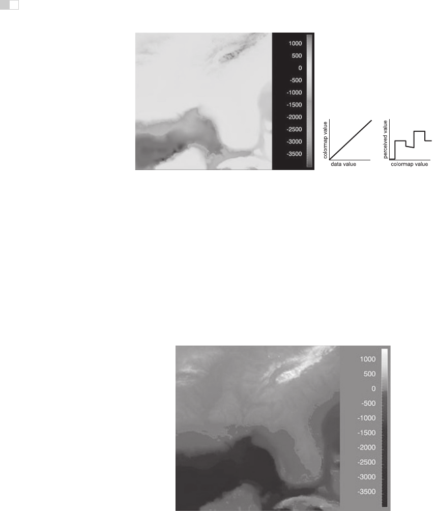
Quantitative data is shown with a colormap, a range of color values that can
be continuous or discrete. A very unfortunate default in many software packages
is the rainbow colormap, as shown in Figure 27.8. The standard rainbow scale
suffers from three problems. First, hue is used to indicate order. A better choice
would be to use lightness because it has an implicit perceptual ordering. Even
more importantly, the human eye responds most strongly to luminance. Second,
the scale is not perceptually linear: equal steps in the continuous range are not
perceived as equal steps by our eyes. Figure 27.8 shows an example, where the
rainbow colormap obfuscates the data. While the range from −2000 to −1000
i
i
i
i
i
i
i
i
686 27. Visualization
Figure 27.8. The standard rainbow colormap has two defects: it uses hue to denote
ordering, and it is not perceptually isolinear.
Image courtesy Bernice Rogowitz.
(See also
Plate XLIV.
has three distinct colors, cyan, green, and yellow, a range of the same size from
−1000 to 0 simply looks yellow throughout. The graphs on the right show that the
perceived value is strongly tied to the luminance, which is not even monotonically
increasing in this scale.
In contrast, Figure 27.9 shows the same data with a more appropriate col-
ormap, where the lightness increases monotonically. Hue is used to create a
semantically meaningful categorization: the viewer can discuss structure in the
dataset, such as the dark blue sea, the cyan continental shelf, the green lowlands,
and the white mountains.
Figure 27.9. The structure of the same dataset is far more clear with a colormap where
monotonically increasing lightness is used to show ordering and hue is used instead for
segmenting into categorical regions.
Image courtesy Bernice Rogowitz.
(See also Plate
XLIV.)
i
i
i
i
i
i
i
i
27.4. Visual Encoding Principles 687
In both the discrete and continuous cases, colormaps should take into account
whether the data is sequential or diverging. The ColorBrewer application (www.
colorbrewer.org)is an excellent resource for colormapconstruction(Brewer, 1999).
Another important issue when encoding with color is that a significant fraction
of the population, roughly 10% of men, is red-green color deficient. If a coding
using red and green is chosen because of conventions in the target domain, re-
dundantly coding lightness or saturation in addition to hue is wise. Tools such as
the web site http://www.vischeck.com should be used to check whether a color
scheme is distinguishable to people with color deficient vision.
27.4.3 2D vs. 3D Spatial Layouts
The question of whether to use two or three channels for spatial position has been
extensively studied. When computer-based visualization began in the late 1980s,
and interactive 3D graphics was a new capability, there was a lot of enthusiasm
for 3D representations. As the field matured, researchers began to understand the
costs of 3D approaches when used for abstract datasets (Ware, 2001).
Occlusion, where some parts of the dataset are hidden behind others, is a
major problem with 3D. Although hidden surface removal algorithms such as Z-
buffers and BSP trees allow fast computation of a correct 2D image, people must
still synthesize many of these images into an internal mental map. When peo-
ple look at realistic scenes made from familiar objects, usually they can quickly
understand what they see. However, when they see an unfamiliar dataset, where
a chosen visual encoding maps abstract dimensions into spatial positions, under-
standing the details of its 3D structure can be challenging even when they can use
interactive navigation controls to change their 3D viewpoint. The reason is once
again the limited capacity of human working memory (Plumlee & Ware, 2006).
Another problem with 3D is perspective distortion. Although real-world ob-
jects do indeed appear smaller when they are further from our eyes, foreshorten-
ing makes direct comparison of object heights difficult (Tory et al., 2006). Once
again, although we can often judge the heights of familiar objects in the real world
based on past experience, we cannot necessarily do so with completely abstract
data that has a visual encoding where the height conveys meaning. For exam-
ple, it is more difficult to judge bar heights in a 3D bar chart than in multiple
horizontally aligned 2D bar charts.
Another problem with unconstrained 3D representations is that text at arbi-
trary orientations in 3D space is far more difficult to read than text aligned in the
2D image plane (Grossman et al., 2007).
Figure 27.10 illustrates how carefully chosen 2D views of an abstract dataset
can avoid the problems with occlusion and perspective distortion inherent in 3D

i
i
i
i
i
i
i
i
688 27. Visualization
Figure 27.10. Left: A 3D representation of this time series dataset introduces the prob-
lems of occlusion and perspective distortion. Right: The linked 2D views of derived aggre-
gate curves and the calendar allow direct comparison and show more fine-grained patterns.
Image courtesy Jarke van Wijk
(van Wijk & van Selow, 1999),
c
1999 IEEE. (See also
Plate XLV.)
views. The top view shows a 3D representation created directly from the origi-
nal time-series data, where each cross-section is a 2D time-series curve showing
power consumption for one day, with one curve for each day of the year along the
extruded third axis. Although this representation is straightforward to create, we
can only see large-scale patterns such as the higher consumption during working
hours and the seasonal variation between winter and summer. To create the 2D
linked views at the bottom, the curves were hierarchically clustered, and only ag-
gregate curves representing the top clusters are drawn superimposed in the same
2D frame. Direct comparison between the curve heights at all times of the day
is easy because there is no perspective distortion or occlusion. The same color
coding is used in the calendar view, which is very effective for understanding
temporal patterns.
In contrast, if a dataset consists of inherently 3D spatial data, such as showing
fluid flow over an airplane wing or a medical imaging dataset from an MRI scan,
then the costs of a 3D view are outweighed by its benefits in helping the user
construct a useful mental model of the dataset structure.
27.4.4 Text Labels
Text in the form of labels and legends is a very important factor in creating visu-
alizations that are useful rather than simply pretty. Axes and tick marks should be
labelled. Legends should indicate the meaning of colors, whether used as discrete
patches or in continuous color ramps. Individual items in a dataset typically have
i
i
i
i
i
i
i
i
27.5. Interaction Principles 689
meaningful text labels associated with them. In many cases showing all labels
at all times would result in too much visual clutter, so labels can be shown for
a subset of the items using label positioning algorithms that show labels at a de-
sired density while avoiding overlap (Luboschik et al., 2008). A straightforward
way to choose the best label to represent a group of items is to use a greedy algo-
rithm based on some measure of label importance, but synthesizing a new label
based on the characteristics of the group remains a difficult problem. A more
interaction-centric approach is to only show labels for individual items based on
an interactive indication from the user.
27.5 Interaction Principles
Several principles of interaction are important when designing a visualization.
Low-latency visual feedback allows users to explore more fluidly, for example
by showing more detail when the cursor simply hovers over an object rather than
requiring the user to explicitly click. Selecting items is a fundamental operation
when interacting with large datasets, as is visually indicating the selected set with
highlighting. Color coding is a common form of highlighting, but other channels
can also be used.
Many forms of interaction can be considered in terms of what aspect of the
display they change. Navigation can be considered a change of viewport. Sorting
is a change to the spatial ordering; that is, changing how data is mapped to the
spatial position visual channel. The entire visual encoding can also be changed.
27.5.1 Overview First, Zoom and Filter, Details on Demand
The influential mantra “Overview first, zoom and filter, details on demand” (Shnei-
derman, 1996) elucidates the role of interaction and navigation in visualization
design. Overviews help the user notice regions where further investigation might
be productive, whether through spatial navigation or through filtering. As we dis-
cuss below, details can be presented in many ways: with popups from clicking or
cursor hovering, in a separate window, and by changing the layout on the flyto
make room to show additional information.
27.5.2 Interactivity Costs
Interactivity has both power and cost. The benefit of interaction is that people can
explore a larger information space than can be understood in a single static image.
..................Content has been hidden....................
You can't read the all page of ebook, please click here login for view all page.