i
i
i
i
i
i
i
i
690 27. Visualization
However, a cost to interaction is that it requires human time and attention. If the
user must exhaustively check every possibility, use of the visualization system
may degenerate into human-powered search. Automatically detecting features
of interest to explicitly bring to the user’s attention via the visual encoding is a
useful goal for the visualization designer. However, if the task at hand could be
completely solved by automatic means, there would be no need for a visualization
in the first place. Thus, there is always a tradeoff between finding automatable
aspects and relying on the human in the loop to detect patterns.
27.5.3 Animation
Animation shows change using time. We distinguish animation, where succes-
sive frames can only be played, paused, or stopped, from true interactive control.
There is considerable evidence that animated transitions can be more effective
than jump cuts, by helping people track changes in object positions or camera
viewpoints (Heer & Robertson, 2007). Although animation can be very effec-
tive for narrative and storytelling, it is often used ineffectively in a visualization
context (Tversky et al., 2002). It might seem obvious to show data that changes
over time by using animation, a visual modality that changes over time. How-
ever, people have difficulty in making specific comparisons between individual
frames that are not contiguous when they see an animation consisting of many
frames. The very limited capacity of human visual memory means that we are
much worse at comparing memories of things that we have seen in the past than
at comparing things that are in our current field of view. For tasks requiring com-
parison between up to several dozen frames, side-by-side comparison is often
more effective than animation. Moreover, if the number of objects that change
between frames is large, people will have a hard time tracking everything that
occurs (Robertson et al., 2008). Narrative animations are carefully designed to
avoid having too many actions occurring simultaneously, whereas a dataset being
visualized has no such constraint. For the special case of just two frames with a
limited amount of change, the very simple animation of flipping back and forth
between the two can be a useful way to identify the differences between them.
27.6 Composite and Adjacent Views
A very fundamental visual encoding choice is whether to have a single composite
view showing everything in the same frame or window, or to have multiple views
adjacent to each other.

i
i
i
i
i
i
i
i
27.6. Composite and Adjacent Views 691
27.6.1 Single Drawing
When there are only one or two data dimensions to encode, then horizontal and
vertical spatial position are the obvious visual channel to use, because we perceive
them most accurately and position has the strongest influence on our internal men-
tal model of the dataset. The traditional statistical graphics displays of line charts,
bar charts, and scatterplots all use spatial ordering of marks to encode informa-
tion. These displays can be augmented with additional visual channels, such as
color and size and shape, as in the scatterplot shown in Figure 27.4.
The simplest possible mark is a single pixel. In pixel-oriented displays, the
goal is to provide an overview of as many items as possible. These approaches use
the spatial position and color channels at a high information density, but preclude
the use of the size and shape channels. Figure 27.11 shows the Tarantula software
visualization tool (Jones et al., 2002), where most of the screen is devoted to an
overview of source code using one-pixel high lines (Eick et al., 1992). The color
and brightness of each line shows whether it passed, failed, or had mixed results
when executing a suite of test cases.
Figure 27.11. Tarantula shows an overview of source code using one-pixel lines color
coded by execution status of a software test suite.
Image courtesy John Stasko
(Jones et
al., 2002). (See also Plate XLVI.)

i
i
i
i
i
i
i
i
692 27. Visualization
Figure 27.12. Visual layering with size, saturation, and brightness in the Constellation
system (Munzner, 2000). (See also Plate XLVII.)
27.6.2 Superimposing and Layering
Multiple items can be superimposed in the same frame when their spatial position
is compatible. Several lines can be shown in the same line chart, and many dots in
the same scatterplot, when the axes are shared across all items. One benefitofa
single shared view is that comparing the position of different items is very easy. If
the number of items in the dataset is limited, then a single view will often suffice.
Visual layering can extend the usefulness of a single view when there are enough
items that visual clutter becomes a concern. Figure 27.12 shows how a redundant
combination of the size, saturation, and brightness channels serves to distinguish
a foreground layer from a background layer when the user moves the cursor over
ablockofwords.
27.6.3 Glyphs
We have been discussing the idea of visual encoding using simple marks, where
a single mark can only have one value for each visual channel used. With more
complex marks, which we will call glyphs, there is internal structure where sub-
regions have different visual channel encodings.
i
i
i
i
i
i
i
i
27.6. Composite and Adjacent Views 693
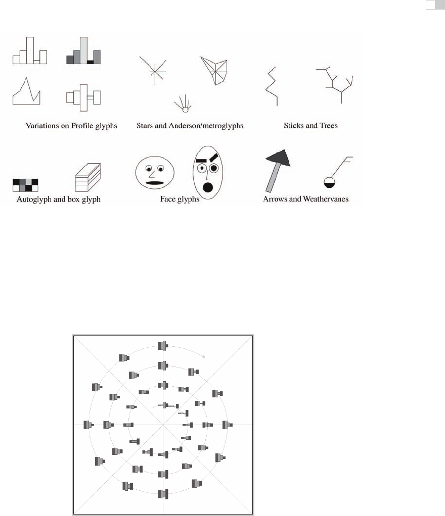
Figure 27.13. Complex marks, which we call
glyphs
, have subsections that visually encode
different data dimensions.
Image courtesy Matt Ward
(M. O. Ward, 2002).
Designing appropriate glyphs has the same challenges as designing visual en-
codings. Figure 27.13 shows a variety of glyphs, including the notorious faces
originally proposed by Chernoff. The danger of using faces to show abstract data
dimensions is that our perceptual and emotional response to different facial fea-
Figure 27.14. Complex glyphs require significant display area so that the encoded informa-
tion can be read.
Image courtesy Matt Ward, created with the SpiralGlyphics software
(M. O.
Ward, 2002). (See also Plate XLIII.)

i
i
i
i
i
i
i
i
694 27. Visualization
Figure 27.15. A dense array of simple glyphs.
Image courtesy Georges Grinstein
(S. Smith
et al., 1991),
c
1991 IEEE.
tures is highly nonlinear in a way that is not fully understood, but the variability
is greater than between the visual channels that we have discussed so far. We
are probably far more attuned to features that indicate emotional state such as
eyebrow orientation than other features such as nose size or face shape.
Complex glyphs require significant display area for each glyph, as shown in
Figure 27.14 where miniature bar charts show the value of four different dimen-
sions at many points along a spiral path. Simpler glyphs can be used to create
a global visual texture, the glyph size is so small that individual values cannot
be read out without zooming but region boundaries can be discerned from the
overview level. Figure 27.15 shows an example using stick figures of the kind in
the upper right in Figure 27.13. Glyphs may be placed at regular intervals, or in
data-driven spatial positions using an original or derived data dimension.
27.6.4 Multiple Views
We now turn from approaches with only a single frame to those which use mul-
tiple views that are linked together. The most common form of linkage is linked
highlighting, where items selected in one view are highlighted in all others. In
linked navigation, movement in one view triggers movement in the others.
There are many kinds of multiple-view approaches. In what is usually called
simply the multiple-view approach, the same data is shown in several views, each
of which has a different visual encoding that shows certain aspects of the dataset
..................Content has been hidden....................
You can't read the all page of ebook, please click here login for view all page.