
Looking at Ripples
One incredibly cool feature of Google+ that often goes unnoticed is Ripples. This is a diagram that shows how a story has spread throughout Google+ over time.
It’s particularly satisfying if something you post goes viral because you can visually witness how it spreads throughout the Google+ network.
To look at the Ripples, click the small arrow icon in the top-right corner of a news story and choose View Ripples. This opens a new window displaying a graphic of the story, as shown in Figure 9-2.

FIGURE 9-2 A Google+ Ripples diagram.
The Ripples diagram consists of a number of circles with arrows pointing between them. The name of the person who originally created the post is in the middle, and the circles surrounding it are other people who shared it. These circles vary in size and have circles within them that represent the number of times the post has been reshared; therefore, the larger circles represent people who have had a lot of reshares.
The graphic is interactive (it works similar to Google Maps). You can zoom in and out using the slider on the left side, and click on and drag the image around to view the different circles. If you hover your mouse over a person’s name, you see his or her post sharing the Ripple, and if you click a circle, you see the comments made by people sharing that post in the right-hand column (as shown in Figure 9-3).
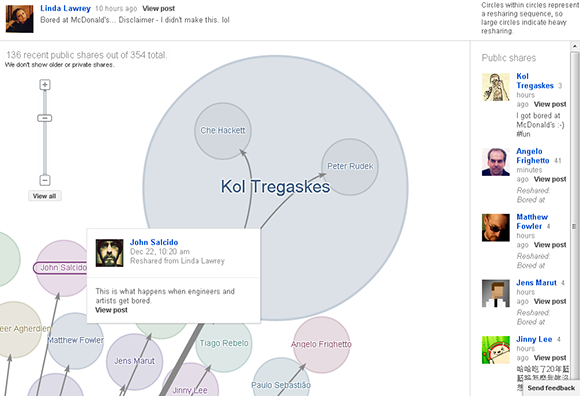
FIGURE 9-3 Checking out circles in a Ripple.
Below the circles graphic is a timeline where you can see how a post spreads over time (as shown in Figure 9-4). To the left of the graph is a number showing the maximum number of shares by a single person, and the names of some sharers appear throughout.
The graph below the Ripples diagram isn’t interactive, but below the graph is a time slider you can use to view the circle as it progresses over time. A really neat trick is to drag the slider all the way to the left and click Play, and then watch the Ripples diagram grow as it develops over time.
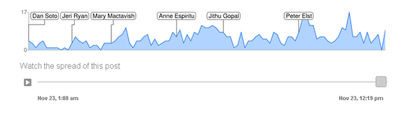
FIGURE 9-4 A timeline of how a post has spread.
Below the timeline are three sets of data about the post that you can use for further information:
+ Influencers. This is a list of the top five people who shared a post, and got the most public reshares. This is a useful way to find influential people.
+ Statistics. This list displays the following statistics on a publicly shared post:
+ Avg. chain length. The average number of people who shared the link one after another.
+ Longest chain. The highest number of people who shared the link one after another in a straight line.
+ Shares/Hour. The average number of times the link was shared in an hour.
+ Languages. This pie chart shows the different languages used to share the post.
Above all, I find Ripples a great way to discover interesting and influential people. It’s also gratifying to see how my posts have spread. Clicking View Ripples is particularly useful if you’re running a Google+ Page for a business or brand and want metric information on how your posts are doing. (Chapter 16 has more information on using Google+ to promote a brand.)
Can I View Ripples on My Own Posts? Yes. You can view Ripples on any public post that has been reshared. Click the arrow in the top-right of the post and look for View Ripples.