118 slide:ology
Backgrounds are intended as a surface
on which to place elements. They are not
in themselves a work of art.
They are a setting, surface, or platform. In print design,
designers start with a white or blank piece of paper and
then place objects on it. You rarely see a brochure where
every page has been covered with a crazy design like
the one here.
A background creates a sense of space. That space
should be open, spacious, and simple. A slide back-
ground is like real estate: it’s very valuable, so build
on it wisely. Avoid the trend to make the background
ornamented, crowded, and distracting. Keep the back-
ground as simple and intentionally clean as possible.
Your background is there to host your objects, not
be an object.
Backgrounds should never compete
with content.
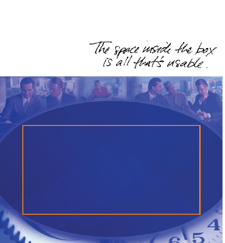
Backgrounds Are a Surface for Digital Assets
This is an ineffectual slide template with useless ornamentation
around the edges. The orange box highlights the active or “live”
area of the slide that can be used for graphics. The designer of
this template used at least one-third of the available real estate
for meaningless graphical elements.
Using Visual Elements: Background, Color, and Text 119
So now that you’ve seen a case for open space, what do
you do with this nice large open canvas?
Ignore all the default masters and look through your
company’s marketing material to identify visual elements
of the brand that are timeless. You can usually identify a
grid system, line structures, bounding boxes, color palette,
or visual elements that anchor the designs. Pick the more
timeless elements that will never change. You can start
there as a basis for the background design. If you don’t
work for a company, then the sky is the limit. However,
your decisions still need to reflect your personality.
..................Content has been hidden....................
You can't read the all page of ebook, please click here login for view all page.