As shown by the recipes up until this point, there is vast intelligence that can be attained by building visualizations that summarize the current application state, analyze performance data over time, or compare values to one another. However, what about those discrete events that appear off in the distance at odd or random times? These events might not be correctly reflected when looking at a column chart, single value gauge, or pie chart, as to most calculations, they are just a blip in the radar somewhere off in the distance. However, there could be times where these discrete events are indicative of an issue or simply the start of one.
In this recipe, you will write a very simple Splunk search to plot a few elements of web request data in a tabular format. The real power comes next, when you will graphically represent these values using a scatter chart.
To step through this recipe, you will need a running Splunk Enterprise server, with the sample data loaded from Chapter 1, Play Time – Getting Data In. You should be familiar with the Splunk search bar, the time range picker, and the Visualization tab. It is not required, but is advisable, that you complete the recipes up until this point.
Follow the given steps to use a scatter chart to identify discrete requests by size and response time:
- Log in to your Splunk server.
- Select the default Search & Reporting application.
- Ensure that the time range picker is set to Last 24 hours and type the following search into the Splunk search bar. Then, click on Search or hit Enter:
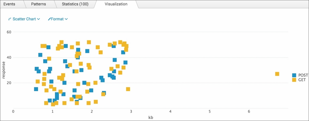
index=main sourcetype=access_combined | eval kb=bytes/1024 | table method kb response
- Splunk will return a tabulated list of the
method,kb, andresponsefields for each event. - Click on the Visualization tab and select Scatter from the drop-down list of visualization types to see the data represented as a scatter plot chart. You should see the cluster of normal activity and then some discrete values that are off on their own:
- Save this report by clicking on Save As and then on Report. Name the report
cp03_discrete_requests_size_responseand click on Save. On the next screen, click on Add to Dashboard. - You will now add this to the Website Monitoring dashboard. Select the button labeled Existing, and from the drop-down menu that appears, select the Website Monitoring dashboard. For the Panel Title field value, enter Discrete Requests by Size and Response and select Report in Panel Powered By; then, click on Save.
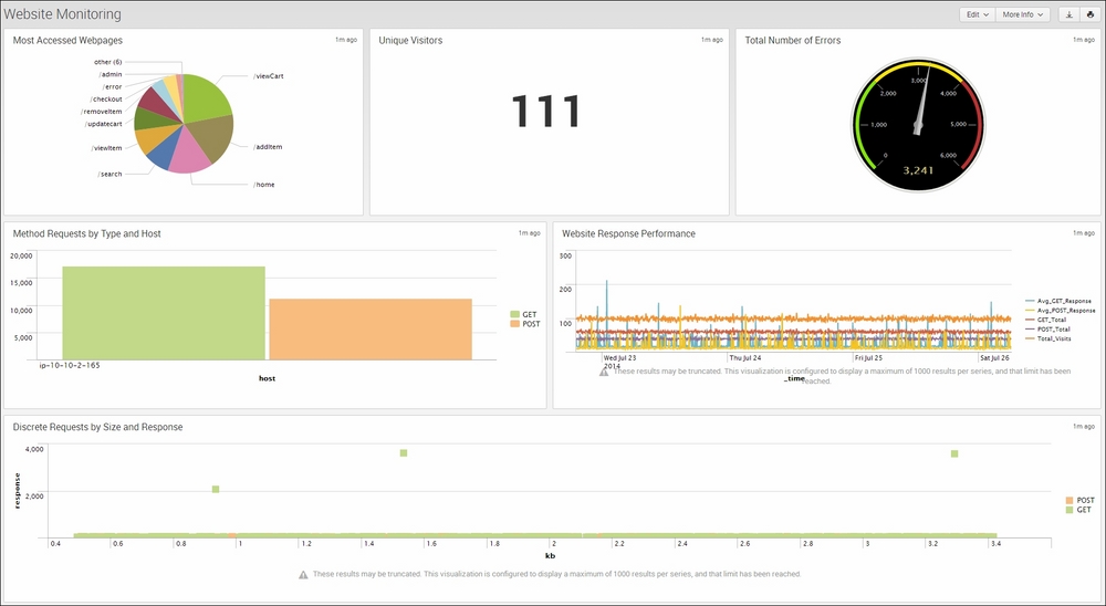
- The next screen will confirm that the dashboard has been created and the panel has been added. Click on View Dashboard to see for yourself. The scatter chart visualization should now be positioned on the dashboard below the previously added panels:
Let's break down the search piece by piece:
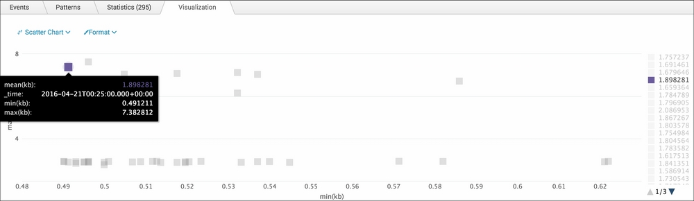
Aside from simply plotting the data points for a scatter chart in tabular form, you can leverage the timechart command and its available functions to better identify and provide more context to these discrete values.
The Splunk search you ran in this recipe can be modified to make use of the timechart command and all the functions it has to offer. Using the Visualization tab and scatter chart, run the following Splunk search over the last 24 hours:
index=main sourcetype=access_combined | eval kb=bytes/1024 | timechart span=5m mean(kb) min(kb) max(kb)
As you can see, with the timechart command, you first bucket the events into 5-minute intervals, as specified by the span parameter. Next, the mean, min, and max values of the kb field for that given time span are calculated. This way, if there is an identified discrete value, you can see more clearly what drove that span of events to be discrete. An example of this can be found in the following screenshot. In this scatter chart, we have highlighted one discrete value that is far outside the normal cluster of events. You can see why this might have stood out using the min and max values from this event series: