
It is always good to understand the number of page views and identify those that are accessed the most, but sometimes it is even better to understand how many of these page views are from unique visitors. Through the web access logs, we can get an understanding of how many unique visitors we have had to our website. For example, it could be helpful to understand whether times of high load are due to the true number of sessions on the website.
In this recipe, you will write a Splunk search to find the unique number of visitors to a website over a given period of time. You will then graphically display this value on a dashboard using the single value visualization.
To step through this recipe, you will need a running Splunk Enterprise server, with the sample data loaded from Chapter 1, Play Time – Getting Data In. You should be familiar with the Splunk search bar, the time range picker, and the Visualization tab. It is not required, but is advisable, that you complete all the recipes up until this point.
Follow the given steps to display the unique number of website visitors:
- Log in to your Splunk server.
- Select the default Search & Reporting application.
- Ensure that the time range picker is set to Last 24 hours and type the following search into the Splunk search bar. Then, click on Search or hit Enter.
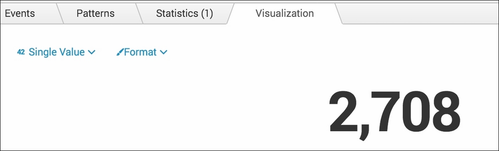
index=main sourcetype=access_combined | stats dc(JSESSIONID)
- Splunk will return a single value that represents the distinct count (unique) of values in the field named
JSESSIONID. - Click on the Visualization tab.
- As there are a number of visualizations within Splunk, the Single Value visualization might not be displayed by default within the Visualization tab. Click on the dropdown that lists the visualization types and select Single Value:

- Your data should now be visualized as a single value:
- Save this search by clicking on Save As and then on Report. Name the report
cp03_unique_visitorsand click on Save. On the next screen, click on Add to Dashboard. - You will now add this to the Website Monitoring dashboard. Select the button labeled Existing, and from the drop-down menu that appears, select the Website Monitoring dashboard. For the Panel Title field value, enter
Unique Visitorsand select for the Panel Powered By field as Report. Then, click on Save: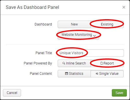
- The next screen will confirm that the dashboard has been created and the panel has been added. Click on View Dashboard to see for yourself. The single value visualization should be placed below the pie chart you created in the previous recipe.
- You will now arrange the dashboard such that the Pie Chart panel and the Single Value panel are side by side. Click on the Edit button, and from the drop-down menu, select Edit Panels:

- A gray bar will now appear at the top of your panel. Using this bar, click-and-drag the panel to be aligned onto the same row as the Pie Chart panel, as shown in the following screenshot:
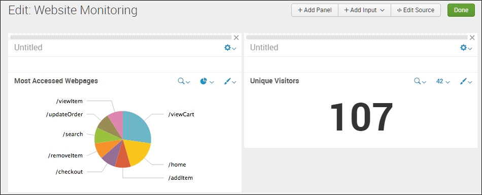
- Finally, click on Done to save the changes to your dashboard.
Let's break down the search piece by piece:
The Visualization tab simply takes the numeric output of the stats command and overlays the given visualization. In this case, you overlaid the single value visualization on a distinct count of visitor sessions.
A single value on the dashboard is very useful, but providing some visual colors and context to the value can prove even more useful.
Adding labels to a single value panel
Run the same search from this recipe, and when the search completes, click on the Visualization tab and choose the Single Value visualization type. Next, click on the Format button, and in the drop-down menu that appears, you have the option to enter a Caption text value:

After entering your desired values, click Enter. The changes will appear immediately, as shown in the following screenshot:
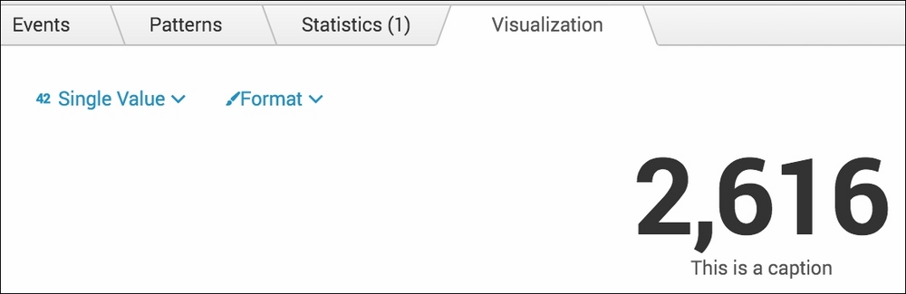
You can now save this single value report as a panel on a dashboard, as you did earlier, but can leave the Panel Title field empty as the description of the value is now part of the data itself.
After adding labels, it can be useful to provide some visual color to the numeric value displayed, based on a given range within which the number might be. This can be done directly from the Single Value formatting option by clicking on the Color tab and selecting Use Colors as follows:

From this screen you can set the colors and ranges that you wish to use for your value. You can also select whether you want a color mode where the number is colored or the background is colored. Once you have made your selection, click anywhere on the page.
The Single
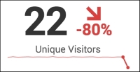
Value visualization is also able to display trends and sparklines. However, for this to happen, the search must be based on the timechart command. We can modify the search from the recipe to illustrate this functionality, as follows:
index=main sourcetype=access_combined | timechart span=1h dc(JSESSIONID)
Run this modified search and when the search completes, click on the Visualization tab and choose the Single Value visualization type. Next, click on the Format button. On the General tab, you will now notice that there are many more options available to select from, specifically around trending. Leave the default options selected, but select Show trend in Percent. Now select the Color tab from the formatting box. Again, you will notice some additional options. Select Color by Trend and then select Apply. You will now see the Single Value visualization represented as a number, with a Sparkline illustrating the last 24 hours and also a downward or upward trend percentage compared against the previous hour:
Note
For further information on the formatting options available for the Single Value visualization, visit http://docs.splunk.com/Documentation/Splunk/latest/Viz/Visualizationreference#Single_value_visualizations.