
Understanding not only how your web page is performing and responding to requests but also how underlying applications that you rely on is critical to the success of any website. You need to have a constant pulse on how the application is behaving and if any trends are emerging or correlations are being observed between interdependent pieces of data. The experience a customer has with your website is reliant on the constant high performance of all its components.
In this recipe, you will write a Splunk search using the timechart command to plot web application memory and response time statistics over a given time period. You will then graphically present these values using an area chart.
To step through this recipe, you will need a running Splunk Enterprise server, with the sample data loaded from Chapter 1, Play Time – Getting Data In. You should be familiar with the Splunk search bar, the time range picker, and the Visualization tab. It is not required, but is advisable, that you complete all the recipes up until this point.
Follow the given steps to create an area chart of an application's functional statistics:
- Log in to your Splunk server.
- Select the default Search & Reporting application.
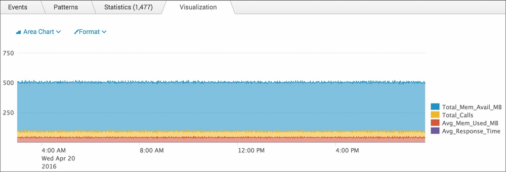
- Ensure that the time range picker is set to Last 24 hours and type the following search into the Splunk search bar. Then, click on Search or hit Enter:
index=main sourcetype=log4j | eval mem_used_MB=(mem_used/1024)/1024 | eval mem_total_MB=(mem_total/1024)/1024 | timechart span=1m values(mem_total_MB) AS Total_Mem_Avail_MB, count AS Total_Calls, avg(mem_used_MB) AS Avg_Mem_Used_MB, avg(response_time) AS Avg_Response_Time
- Splunk will return a time series chart of values for the average response time of
GETandPOSTrequests, the count ofGETandPOSTrequests, and the total count of web page visits. - Click on the Visualization tab and select Area from the drop-down list of visualization types to see the data represented as an area chart. Note how the data is stacked for better visual representation of the given data:
- Save this report by clicking on Save As and then on Report. Name the report
cp03_webapp_functional_statsand click on Save. On the next screen, click on Add to Dashboard. - You will now add this to the Website Monitoring dashboard. Select the button labeled Existing, and from the dropdown menu that appears, select the Website Monitoring dashboard. For the Panel Title field value, enter
Web Application Functional Statisticsand select Report in Panel Powered By; then, click on Save. - The next screen will confirm that the dashboard has been created and the panel has been added. Click on View Dashboard to see for yourself.
Let's break down the search piece by piece:
|
Search Fragment |
Description |
|---|---|
|
|
In this example, we search for our application's logs that have the |
|
|
Using the |
|
|
Using the |
|
|
Using the |
The Visualization tab takes the time series output of the timechart command and overlays the given visualization. In this case, you overlaid an area chart.