
In our environment, where multiple hosts are responding to web requests for customers who browse the website, it is good to get an idea of the current number of each method request split by the host. Methods relate to request/response actions between a customer's web client and our web hosts. Having this type of information can enable us to understand if these requests are properly being balanced across the hosts or if one host is receiving the majority of the load.
In this recipe, you will write a Splunk search to chart the number of method requests split by type and host. You will then graphically represent these values on a dashboard, using a column chart.
To step through this recipe, you will need a running Splunk Enterprise server, with the sample data loaded from Chapter 1, Play Time – Getting Data In. You should be familiar with the Splunk search bar, the time range picker, and the Visualization tab. It is not required, but is advisable, that you also complete all the recipes up until this point.
Follow the given steps to chart the number of method requests by type and host:
- Log in to your Splunk server.
- Select the default Search & Reporting application.
- Ensure that the time range picker is set to Last 24 hours and type the following search into the Splunk search bar. Then, click on Search or hit Enter:
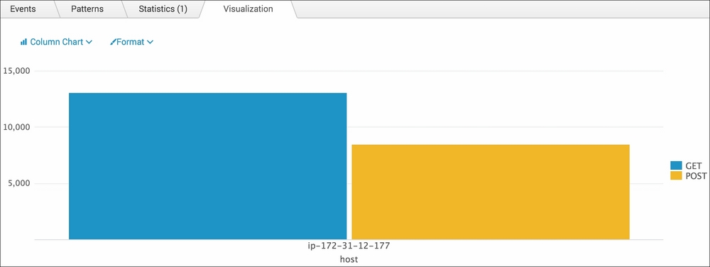
index=main sourcetype=access_combined | chart count by host,method
- Splunk will return a tabulated list of the total counts for each method request split by host.
- Click on the Visualization tab.
- Click on the dropdown that lists the visualization types and select Column.
- Your data should now be visualized as shown in the following screenshot:
- Save this report by clicking on Save As and then on Report. Name the report cp03_methods_by_host and click on Save. On the next screen, click on Add to Dashboard.
- You will now add this to the Website Monitoring dashboard. Select the button labeled Existing, and from the drop-down menu that appears, select the Website Monitoring dashboard. For the Panel Title field value, enter Method Requests by Type and Host and select Report in the Panel Powered By field; then, click on Save.
- The next screen will confirm that the dashboard has been created and the panel has been added. Click on View Dashboard to see for yourself.
- Edit the dashboard to position the column chart visualization below the previously added panels.
Let's break down the search piece by piece:
|
Search fragment |
Description |
|---|---|
|
|
You should now be familiar with this search from the earlier recipes. |
|
|
The |
The Visualization tab simply takes the tabulated output of the stats command and overlays the given visualization. In this case, you overlaid a column chart visualization on the total count for each method split by host.