
Operational intelligence doesn't always need to come in the form of pie charts, bar charts, and data tables. With a wide range of operational data being collected from IT systems, there is the opportunity to display this data in ways that can be more meaningful to users or help present it in ways that can be easier to identify trends or anomalies.
One way that always provides great visibility is representing your data using a geographical map. With geolocation data available for many different data types, it becomes very easy to plot them. Using IP addresses from web server logs is a very common use case for this type of visualization. Splunk allows the easy addition of a map to a dashboard with the capability to zoom and update the portion of the map that the user is viewing.
This recipe will show you how you can configure a map panel within a dashboard and link it to a search that contains IP addresses in order to visualize from where in the world the IP traffic is originating.
To step through this recipe, you will need a running Splunk Enterprise server, with the sample data loaded from Chapter 1, Play Time – Getting Data In, and you should have completed the earlier recipes in this chapter. You should also be familiar with navigating the Splunk user interface.
Follow these steps to add a map to your form-driven dashboard:
- Log in to your Splunk server.
- Select the Operational Intelligence application.
- Click on the Dashboards menu item.

- Select the Visitor Monitoring dashboard.
- Click on the Edit button.

- Click on the Add Panel button.

- From the fly-out panel, expand the New section and then click on Choropleth Map.
- Set the Content Title panel to Sessions By Location.
- Set the Search String field to the following:
index=main sourcetype=access_combined clientip="$ip$" | iplocation clientip | fillnull value="Unknown" Country | search City="$city$" Region="$region$" Country="$country$" | stats count by Country | fields Country, count | geom geo_countries featureIdField=Country
- Set the Time Range Scope field to Shared Time Picker (field1).
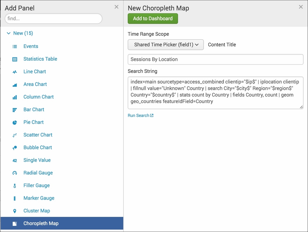
- Click on the Add to Dashboard button.
- Click anywhere on the dashboard to make the fly-out panel disappear.
- Click on Done to finish editing the dashboard.

- Filter by an IP of 134 or similar again, and you should now see that the map panel also changes along with the table and chart panels you added earlier.

Mapping support has been available since Splunk 4 using a third-party developed application. Since Splunk 6, native map support has been available and can be used easily within your dashboards. It was given a big boost in 6.3 with the addition of geo-lookups and Choropleth maps.
The rendering of the map is done in the same way in which most browser-based maps are generated - using many small images known as tiles that are put together in a grid layout and swapped in and out depending on the zoom level and the visible area being requested. This results in the browser and services not needing to load an entire world's worth of image data into memory. Layers are then rendered on top of the tiles based on either markers or shapes (polygons).
Splunk currently has two mapping types that can be used:
Splunk supports both a native tile server that can be used to serve the actual map images or can be configured to use the external OpenStreetMap service (http://www.openstreetmap.org/#map=5/51.500/-0.100). The native tiles do not have a very granular level of mapping detail but work in situations where there is no external connectivity or there are security reasons for not calling the external service.
In this recipe, the map panel depends on the result of the geom command, which looks for the necessary feature ID fields in the search results and adds its own data to that the map can use to render the shapes properly. The iplocation command is commonly used to map network traffic-originating locations.
The built-in IP location data within Splunk is provided by Splunk as part of Splunk Enterprise but is not always the most up-to-date data available from the Internet. It's often best practice to purchase a third-party service to get the most accurate and real-time data available, especially when it is used on critical security-monitoring dashboards and searches.
The map panel has many different configuration options that can be used to specify the initial latitude, longitude, and zoom level that should be applied when the map is initially loaded, as well as the minimum and maximum zoom levels. Drilldown in the maps is also supported.
Tip
More details on Mapping in Splunk is available at http://docs.splunk.com/Documentation/Splunk/latest/Viz/Choroplethmaps.
A full reference of map drilldown options can be found in the Splunk documentation at http://docs.splunk.com/Documentation/Splunk/latest/Viz/PanelreferenceforSimplifiedXML#Panel_visualization_elements.
The map panel option can also be configured in several different ways in Splunk.
A map panel can be added directly to a dashboard by adding the following Simple XML when editing the dashboard source:
<row><panel>
<map>
        <title>Count by location</title>
        <searchString>index=main sourcetype=access_combined clientip="$ip$" | iplocation clientip  | fillnull value="Unknown" City, Country, Region| replace "" with "Unknown" in City, Country, Region | search City="$city$" Region="$region$" Country="$country$" | geostats count</searchString>
        <earliestTime>-24h@m</earliestTime>
        <latestTime>now</latestTime>
        <option name="mapping.data.maxClusters">100</option>
        <option name="mapping.drilldown">all</option>
        <option name="mapping.map.center">(0,0)</option>
</map>
</panel></row>The geostats command takes an aggregation term as its main argument. This term is what is used to render the pie charts that are located on the map. In this recipe, we simply ran | geostats count, which is the most commonly used command and simply does a single count. However, you can break out the data by product, and then the pie charts will provide segmented visual information and can be moused over to see the breakdown.
MySearch | geostats count by product