
Having the right single values displayed on a dashboard can be beneficial to understanding key metrics, but can also be limiting in providing true operational intelligence on how the different metrics of our website affect one another. By plotting values such as the number of method requests, the number of total views, and the average response times over a given time range, you can begin to understand if there is any correlation between these numbers. This can be very beneficial in understanding things such as if the average response time of pages is growing due to the number of active POST requests to the website or if one type of request is making up for the majority of the total number of requests at that given time.
In this recipe, you will create a Splunk search using the timechart command to plot values over a given time period. You will then graphically represent these values using a line chart.
To step through this recipe, you will need a running Splunk Enterprise server, with the sample data loaded from Chapter 1, Play Time – Getting Data In. You should be familiar with the Splunk search bar, the time range picker, and the Visualization tab. It is not required, but is advisable, that you also complete all the recipes up until this point.
Follow the given steps to create a timechart of method requests, views, and response times:
- Log in to your Splunk server.
- Select the default Search & Reporting application.
- Ensure that the time range picker is set to Last 7 days and type the following search into the Splunk search bar. Then, click on Search or hit Enter:
index=main sourcetype=access_combined | eval GET_response=if(method=="GET",response,0) | eval POST_response=if(method=="POST",response,0) | timechart span=5m avg(GET_response) AS Avg_GET_Response, avg(POST_response) AS Avg_POST_Response, count(eval(method=="GET")) AS GET_Total, count(eval(method=="POST")) AS POST_Total, count AS Total_Visits
- Splunk will return a time series chart of values for the average response time of
GETandPOSTrequests, the count ofGETandPOSTrequests, and the total count of web page visits: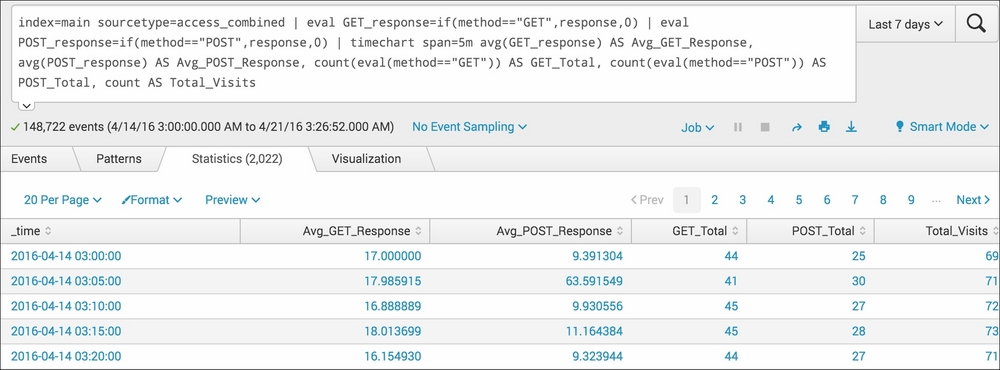
- Click on the Visualization tab and select Line from the drop-down listing of visualization types to visualize the data as a line chart:

- Save this report by clicking on Save As and then on Report. Name the report
cp03_method_view_reponseand click on Save. On the next screen, click on Add to Dashboard. - You will now add this report to the Website Monitoring dashboard. Select the button labeled Existing, and from the drop-down menu that appears, select the Website Monitoring dashboard. For the Panel Title field value, enter
Website Response Performanceand select Report in Panel Powered By field; then, click Save. - The next screen will confirm that the dashboard has been created and the panel has been added. Click on View Dashboard to see for yourself. The line chart visualization should now be positioned on the dashboard below the previously added panels.
- Arrange the dashboard so that the line chart panel is on the right-hand side of the column chart panel created in the previous recipe. Click on the Edit button, and from the drop-down menu, select Edit Panels. Move the line chart panel accordingly.
- Finally, click on Done to save the changes to your dashboard.
Let's break down the search piece by piece:
|
Search fragment |
Description |
|---|---|
|
|
You should now be familiar with this search from the earlier recipes in this book. |
|
|
Using the |
|
|
Using the |
|
|
Using the |
The Visualization tab takes the time series output of the timechart command and overlays the given visualization. In this case, you overlaid the line chart visualization.
In this recipe, we looked at the values represented as a whole across our web server environment. However, in instances like ours, where web traffic is balanced across multiple servers, it is a good idea to split the values based on their respective hosts.
It is very easy to obtain a more granular view of events split by the host where the events are occurring. All we need to do is add the by clause to the end of our previous Splunk search, as follows:
index=main sourcetype=access_combined | eval GET_response=if(method=="GET",response,0) | eval POST_response=if(method=="POST",response,0) | timechart span=5m avg(GET_response) AS Avg_GET_Response, avg(POST_response) AS Avg_POST_Response, count(eval(method=="GET")) AS GET_Total, count(eval(method=="POST")) AS POST_Total, count AS Total_Visits by host
As simple as this is, we can now visualize the values broken down by the host on which these values originated. In a distributed environment, this can be most crucial in understanding where latency or irregular volumes exist.
Following are some recipes that will give you more information:
- The Charting the number of method requests by type and host recipe
- The Using a scatter chart to identify discrete requests by size and response time recipe
- The Creating an area chart of the application's functional statistics recipe