
Throughout this chapter, you have been building visualizations to provide insight into the operational performance of our e-commerce website. It can also be useful to understand the customers' views and the factors that might drive them to the website. This type of information is traditionally most useful for product or marketing folks. However, it can also be useful to gain an understanding around whether an item is increasing in popularity and if this could ultimately lead to additional customers and heavier load on the site.
In this recipe, you will write a Splunk search to calculate the average amount of money spent, split out by product category. You will then graphically present this data using a bar chart on a new Product Monitoring dashboard.
To step through this recipe, you will need a running Splunk Enterprise server, with the sample data loaded from Chapter 1, Play Time – Getting Data In. You should be familiar with the Splunk search bar, the time range picker, and the Visualization tab. It is not required, but is advisable, that you complete all the recipes up until this point.
Follow the given steps to use a bar chart to show average amount spent by category:
- Log in to your Splunk server.
- Select the default Search & Reporting application.
- Ensure that the time range picker is set to Last 24 hours and type the following search into the Splunk search bar. Then, click on Search or hit Enter:
index=main sourcetype=log4j | transaction sessionId maxspan=30m | search requestType="checkout" | stats avg(total) AS Avg_Spent by category
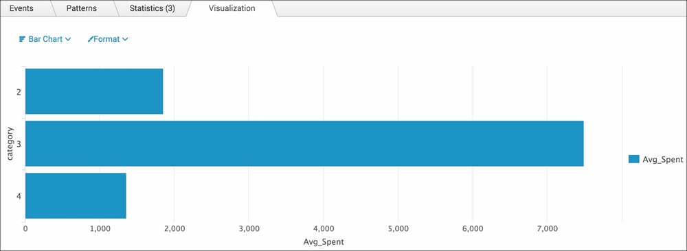
- Splunk will return a tabulated list, detailing the category and the associated average amount spent.
- Click on the Visualization tab and select Bar from the drop-down list of visualization types to see the data represented as a bar chart:
- Save this report by clicking on Save As and then on Report. Name the report
cp03_average_spent_categoryand click on Save. On the next screen, click on Add to Dashboard. - You will now add this to a new Product Monitoring dashboard. Select the button labeled New and enter the dashboard title Product Monitoring. For the Panel Title field value, enter
Average Spent by Categoryand select Report in the Panel Powered By field; then, click on Save: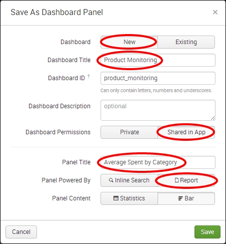
- The next screen will confirm that the dashboard has been created and the panel has been added. Click on View Dashboard to see for yourself.
Let's break down the search piece by piece:
|
Search Fragment |
Description |
|---|---|
|
|
In this example, we search for our application's logs that have the |
|
|
Using the |
|
|
Using the |
|
|
Using the |
The Visualization tab simply takes the time series output of the stats command and overlays the given visualization. In this case, you overlaid a bar chart visualization.